PAINT WITH AN UNFAIR ADVANTAGE
06 - 03
2014
Imprimatura, or Underpainting
Some painters never discover the explosive goodness of an imprimatura. They resist laying down a color opposite to the one they see. That runs counter to logic, evokes fear, speaks of time wastage. It messes with their sense of what is right. If you can’t see it, logic argues, why do it? What good is something you can’t see? Fair question, faulty answer. Because by taking this extra painting step, they would give themselves a leg up over all other artists.
 By not doing so, they delete a step in the painting process which so enhances a painting, it receives an unfair advantage over any similar painting. Let’s explore the question of what good an underlayer provides. Hmmm: What value does a skeleton add? What does the third deeper layer of skin provide? The third layer of insulated glass? For the first, it provides the form to shape the flesh hung upon it. For the second, levels to prevent burns from reaching vital organs. For glass, the doubled cost keeps out ultra-violet rays which damage fiber and fade color. It also provides the painting with a skeleton, a third layer of skin, and protects against light damage, and more.
Let’s define imprimatura. The National Gallery of Art defines imprimatura as a thin, translucent layer of color applied to the ground (the ground is the board, canvas, paper or skirt painted onto) before beginning the actual painting. The imprimatura reduces the absorbency of the ground. What does that mean? Simply spoken, it means that all that luscious color you apply to the canvas, wood, paper, or wall will not sink down into the fabric, lost, a condition referred to as ‘sunken color.’ Instead, it will happily stay up near the top on the surface to shine in all its glory.
The word ‘imprimatura’ is Italian, meaning ‘first paint layer.’ Before dabbing the canvas with the first drop of paint, a thin, transparent layer of paint known as imprimatura, is applied on the entire canvas. Usually it is done in neutral olive or earthen shades derived from raw sienna. Imprimatura helps reduce the radiant bright light on the canvas and allows the final coats to exude their true colors.
Sometimes, the National Gallery says, it is used as a middle tone for the painting itself. Another way to put that in current terms is, an imprimatura gets rid of all the white. White is confusing to the eye, and the eye needs not to be confused. Any white that returns to the canvas is then, and should be, one hundred percent intentional.
In Old Masters training, I was taught that there should not be any more than three highlights (whitest whites, or brightest brights) in any given painting. That insures a better result to any painting right away. Historically, the imprimatura is a glaze coat intended to rid the canvas of white–one sees the drawing underneath, and proceeds by blocking in thin layers of paint once the imprimatura is dry.
Even when some painting has begun, it is important to bring the progress forward slowly, painting on firstglazes, then a reasonably thick layer of paint in middle versions of the differences you see. You needn’t paint entirely flatly in this stage of roughing in the large color shapes. You help your craft by approximating what you see without slavishly breaking out the small 3-hair brushes for intense detail, as with adding highlights to the hair. As the painting dries, you slowly and deliberately decrease your brush and stroke size, not over correcting at this point. Continue the progression of the professional process as you have laid it out, following techniques that the Old Masters have used for centuries.
This primer paint, the imprimatura, is mixed with half Liquin ™ (the masters used turpentine oil) and half turpentine. This makes contrasts between bright & dark, while preparing the canvas for further layers of paint. When applying imprimatura, it is important to know the final color scheme in advance. The base shade is then chosen for the desired color and brightness effects.
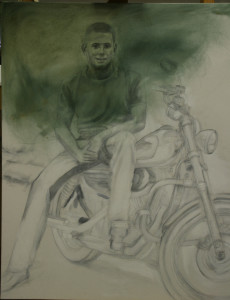
Typically, using the opposite, or complementary color to the final color, will yield pleasing results, but trial and experimentation are key to discovery. Work fast and all at once. This is no time to fuss for detail, as The mix will likely become tacky when it is laid onto canvas surfaces. Before it has turned sticky is the time to stop. When the initial layer is done in the shade of gray instead of olive, it is known as Grisaille. I Personally do both a grisaille (first) and an imprimatura over it (second).
The key purpose of imprimatura is to seal with a priming layer so that the ground becomes nonabsorbent and radiates its colors instead of sucking them up, while also providing a quality visual unity. Imprimaturas are used in indirect paintings where the sketch and first painting are allowed to dry for further work to be done. At times, one could proceed in the opposite fashion, making a primary draft of the desired picture on canvas and an imprimatura coat applied over it. This safely seals the sketch as a foundational layer, while the artist prepares to paint over it (my preference).
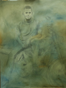
When I have worked on commission and allowed the client to see the initial stages, the imprimatura stage has confused them. I say, “it isn’t painted,” and they say, but there is green all over your canvas. How can you say it isn’t painted? Then they begin with the directions. ‘Make the rose petal whiter, take out the brown. Make it more pastel, balance with the same length on the right.’ To think of an imprimatura, think of the concept of what a photographic negative is to a photo print. The colors are opposite to what you see. This is what lends the painting depth.Using an imprimatura actually causes the colors to multiply. The painter does not have to work so laboriously to accomplish slight variations in shades; they happen naturally with succeeding layers of paint, because the paint is not entirely opaque that tops it.
While in no way a final product, customers have loved the swimmy effect of the imprimatura and wanted to buy it just that way. Not using one, in my opinion, lessens the professional quality of the finished product. Succeeding glazes build up the color gradually, from underneath. Goya, I was told, used red as an underpainting for his faces. The Dutch masters used the olive or earth green.
Either is good, but the effects are dramatically different. The process cannot be rushed. The stages of painting are all necessary if you want the professional product I am committed to, which I produce each time, and struggle to convince my students of their necessity. All of my own portraits always begin with an imprimatura and a grisaille. On the portrait page, in the stationary shots, I am actually working on an imprimatura glazed over a grisaille. The other two portraits were painted using an imprimatura and grisaille, as well. 
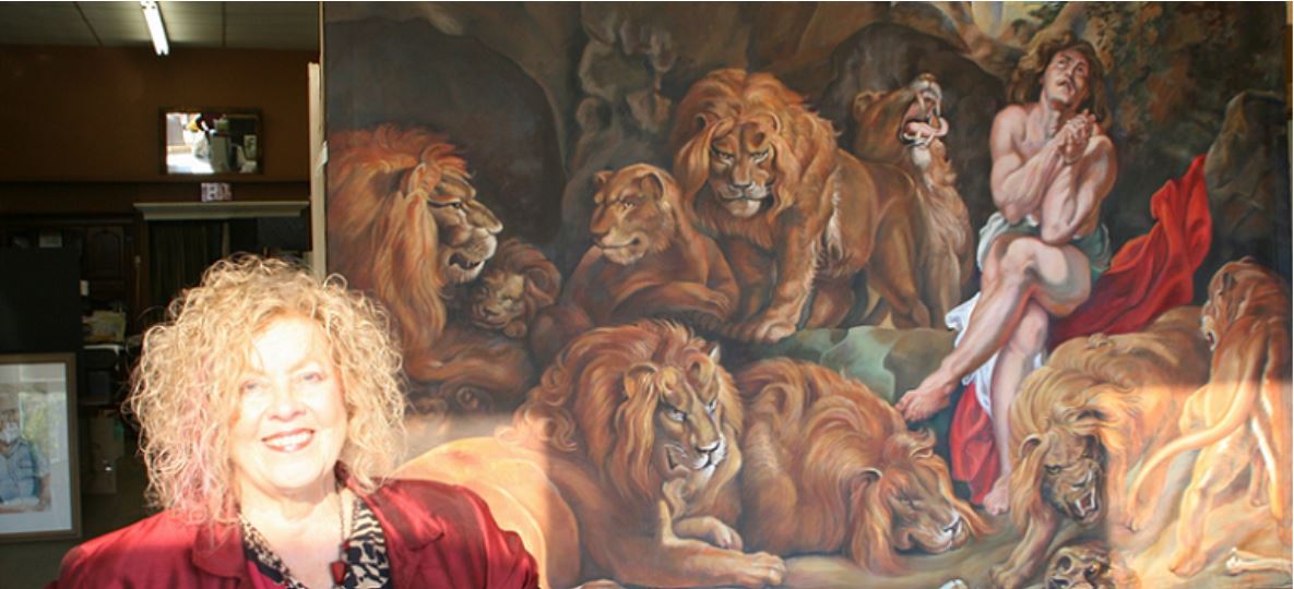
In this portrait, I did not use the grisaille, only the imprimatura.
When you begin with an imprimatura, what is unseen gives you the clear advantage.

Leave A Reply
You must be logged in to post a comment.