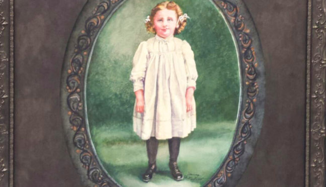
Painting Added to Collection at Hobson Private Home
“Earthweave” is the title of one of my most experimental paintings in watercolor. The painting, framed in a gold-gilded shadowbox frame, could be called a watercolor weaving, since individual strips of watercolor paper were painted and woven in and out of a stationary piece of 300# Arches watercolor paper, also painted.
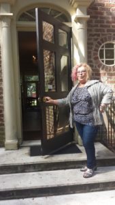
David and Carole, former classmates of mine,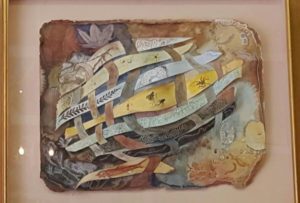 kept looking at the painting before deciding they had to have it. David helped get it down from the second story portion of my gallery/atelier. Now it hangs in David’s study in his new home in Pinehurst. Although a color match was not a primary concern, the effect was striking.
“I study it every day,” David said.
At the time the idea came to me I was fascinated with what fossils showed up in different earth layers. As a watercolorist, I loved painting with ‘earth’ colors, known in the trade as sedimenting colors–as opposed to the clearer, more transparent ones which leave no bits of pigment. Pigment that sediments approximates the earthy layers of ground I wanted to depict. Encased within these layers were all kinds of fossils, skeletons, flora and fauna.
These were painted to look dimensional which gave the shadowbox the overall effect of an aquarium. The work was one a colleague and friend of mine called “cutting edge” in a Henley Southeastern Spectrum juried watercolor show we both had paintings in in Winston-Salem some years back.
Over the years, “Earthweave” has remained viewers’ most popular pick when they visit j’Originals’, appealing equally to realists and abstract lovers. It just never found where it belonged until now.
Anybody who knows me knows I love research. This painting caused me to explore earth science in a new way. How exciting it was, then, in the last little while to have two friends and collectors–separately before they were married, and together–afterwards, decide they were fascinated by the painting and want to place it in their new home.
For my work, I used 300-lb Arches watercolor paper, a thick, multi-ply surface which I then tore the edges of to show the depth of the paper, and rubbed color into those edges to give the overall page shape interest. Organic, like the subject. I then thought of the warp and woof of a weaving’s cross pieces, a craft that fascinated me. I let each strand signify a different layer of earth. Each earth layer took the color that earth layer tended toward, whether blue, red, brown, or amber. Each strand, aka layer, contained the fossils and skeletons that would be contained in that layer. The finished work was an overwhelming hit. Everyone loved it. I nearly sold it several times. An ob/gynecologist from Fayetteville loved it so much he wanted me to paint a similar one, but in oils, on a light polyester canvas that could be turned into a motorized screen that would pull it down to hide the 70″ television, or roll up to hide for viewing programs. For him, I picked fossils indigenous to his home country, Costa Rica. Trompe l’oeil, a popular art term which means ‘fool the eye,’ it looked three-dimensional, but was not. David’s and Carole’s work is actually three-dimensional.
Fossils in furniture, coffee tables and counter tops turned quite popular, and to me was an artistry all its own. Although my research was extensive into earth science for both paintings for me, I only scraped the surface, to make a pun. However, the results are wide-ranged and expansive, rather than laser pin-pointed. In short, there are many layers in many different locales, and I am not knowledgeable enough to speak authoritative conclusions of how many there are, and the implications of evolution. So since there seem to be any numbers of earth layers, others are shown in the ground watercolor page, the colors on it continuing beyond those begun on the woven strands, around the surface of the painting.
There is, for instance, burial of nautiloids in a widespread limestone deposit at the Grand Canyon that formed rapidly, while other layers formed more slowly.
My chosen colors were amber/gold (middle), light blue, lime green, phthalo, green aqua, charcoal, pinkish-brownish: sandstone, light-colored like in the Grand Canyon’s bathtub ring. Fossils that can be found in this layer are brachiopods, coral, mollusks, sea lilies, worms and fish teeth. In the Tonto Platform, the color is a deep, rust-colored red. Fossils to be found in this layer consist of ferns, conifers and other plants, as well as some fossilized tracks of reptiles and amphibians. The Supai Formation displays a range of color from red for shale to tan for sandstone caps. Numerous fossils of amphibians, reptiles and terrestrial plants exist in the eastern portion which are replaced by marine fossils. 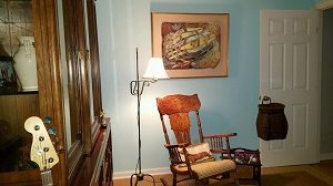
There is Redwall Limestone in the Grand Canyon, and behind the reddish face, the rock is a dark brownish color. Numerous marine fossils can be found in the Redwall Limestone including brachiopods, clams, snails, corals, fish and trilobites. In the layer called Bright Angel Shale, which averages about 530 million years old is primarily of mudstone shale, intermixed with small sections of sandstone and sandy limestone. The retreat of the Canyon rim is attributed primarily to the erosion of this layer which forms the top of the Tonto Platform, wider in the eastern portions of the Canyon where the Bright Angel Shale contains less sand and is more easily eroded. The color of this layer varies with its composition, but it is mostly various shades of green with some grey, brown and tan thrown in here and there. Fossils found in this layer are marine animals, trilobites and brachiopods.
The layer of Tapeats Sandstone is approximately 545 million years old, composed of medium-grained and coarse-grained sandstone. Ripple marks formed by ocean waves of an early Cambrian sea are common in the upper layer. The Tapeats is similar to the Redwall in that it forms a barrier between upper and lower reaches of the Canyon that can only be traversed where a fault has caused its collapse. The color of this layer is dark brown and it contains fossils of trilobites. brachiopods, and trilobite trails.
The Bass Formation layer of about 1,250 million years old, made up primarily of limestone with shale is grayish, its fossil record consists of stromatolites. Vishnu Schist and Zoroaster Granite layer is 1,700 to 2,000 million years old and consists of mica schist, containing sediments of sandstone, limestone and shale that were metamorphosed and combined with metamorphosed lava flows to form the schist. This layer along with the Zoroaster Granite were once the roots of an ancient mountain range that could have been as high as today’s Rocky Mountains. The mountains were eroded away over a long period of time and new sediments were they deposited over them by advancing and retreating seas. The color of this layer is dark grey or black.
Fossils gathered from shales of the Stephen Formation are in two strata, the lower quarry Raymond’s quarry. The dark blue indicates deep ocean basins, while light blue denotes shallow seas. Rocks found in blue strata belong to the Devonian Period.
This comprises only a fraction of the overwhelming information on earth’s layers.
It took two attempts for “Earthweave” to come to life, because the size of the strip must slip through the slit made in the paper at the right points without gaping open, as when too wide a slit is made for a wide passage. The heavy paper must then be affixed to the mat backing of the shadowbox. The box is between 4 and 5 inches deep. It was not easy working the woofs into the solid, stationery sheet.
That the owners of this work are fascinated with the story of its creation, as with the painting itself, and that they like paintings that are intellectually stimulating, is gratifying. I’m looking forward to visiting Carole and David in Pinehurst, and seeing my ‘baby’ in their new home.
Learn more »
 Plus, I got to demonstrate my watercolor skill on the following day, Saturday, April 8, from 10 am until 4 pm, during the 2017 Southern Pines Home and Garden Tour.
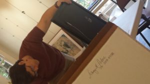
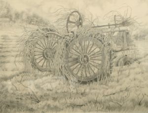 One drawing I did of an old John Deere tractor in a field is all that is left of the real thing. A strip mall in the outskirts of Fuquay-Varina exists there, now, but my drawing, “Reclaimed,” shows it with the Southeastern greenery, briars and vines, growing up through its wheels, seat, and steering wheel. I went every day for a couple of weeks and sat in my car finishing my piece in graphite black and white. So I guess the series began way back when I did that picture.
 was picked, along with a mat that made the unit hang together in a way that seemed inevitable, as if it had always existed. The prince of all boxes was ordered at a princely price, and the work was sent off in fear and trembling through my favorite service who picks it up at my studio. Then I followed it on pins and needles until it was received.