Painting a Keepsake Portrait: Olive Grace

When to Use Photographs

Discussion abounds among portrait painters about the good-vs-bad points of painting from a photograph, as opposed to painting from a live model.

Painting from life brings clarity to just how soft the transitions within the face are, especially in the seamless contours of a baby’s face. However, even the folds of the wrinkles of a 95-year-old are soft. It clarifies the softness of the extreme edges, showing how they round into the light. However, painting from a photograph clarifies the absolute boundaries of eyes, ears, nose, hair, in a forever-fixed position. This brings resolution to many internal disputes the artist faces the moment she begins fixing lines on a piece of paper.

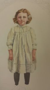
The problems with painting from life are in ever-changing lines and movements, left-right, up-down, and not having a head full enough of every angle and curve of a roundly 3-dimensional object. The problems with a photograph are many–distortions in the planes, misreading the data, not understanding the 3-dimensionality at any point along the way, interpreting light and shadows, and more.

Most veteran artists maneuver both paths.

So, when I received a request to paint a life-like portrait of a woman’s 50-year dead grandmother when she was a young child, I was not alarmed. I’ve had a lot of experience over many years in ‘reading’ photographs when I worked ten years as artist in a photographic studio enhancing portraits. So I had a wide acquaintance with old photographs and enhancing them, making the project only marginally intimidating. My emphasis with anything photographic is in making subjects jump off the page to greet you. And one fact alone ends the portrait painting discussion–if the subject is not alive, you don’t have any option other than using a photograph. My client wanted her own picture of her beloved grandmother, as another sibling owned the original one, because she had seen my work, and had concluded she would prefer a work of art rather than merely a photograph.

She lives in another state. She had visited my studio several times, however, visiting someone in the area and acquired one of my gel pen paintings. She had the vision for a piece of fine art, as well as a likeness.

So, of course she wanted the feel and sense of an old photograph. Once our back and forth was firmed up, I received an 8 x 10 black and white with all the colors described to me verbally.

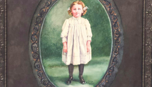
We discussed parameters, found samples and examples of the exact colors desired. Her color sense was exacting and precise, and her willingness to respect and work with me as artist was an artist’s dream. She wanted a certain finished size, so I had to work backwards in designing the figure in the space, allowing the amount of space for painting in what had been the original oval mat, the pattern on it, the actual matting, and the frame width. Every aspect of frame, mat, background colors, dress color, hair, eye, complexion color were described. We decided on watercolor paint as the medium to more accurately and sensitively express an old photograph. That meant bringing back all of the lost integrity of the image. If you have ever seen chalked-in old photographs, you probably know what I mean about so much detail having been lost.

She sent me an 8 x 10 image of the original photograph, and my work began in earnest. I first drew many sketches of her on watercolor paper tinted yellow, the color of the dress. I drew her and re-drew her multiple times. In the end, I was not happy with the effect of the tinted paper, so I scrapped that version and began what would be the final on a 300# Arches cold press piece of watercolor paper, having acquired good practice in nearly memorizing her features one by one in every line variation. By this point, I had a decent hand-done oval. My drawing was nearing the ready phase.

Even then, I had to check and correct tiny little lines multiple times, moving them a hair up or down, a hair right or left. It was tedious work. Don’t ever commission someone who thinks their first line is final. However, extreme caution must be used in erasure, as well, as using the wrong eraser or overworking erasing can ruin a painting in short order, abrading even expensive 300# watercolor paper especially designed for watercolor abuse.

My biggest struggles, besides the hand-done oval, came in the colors, as the copy I had was black and white, and I had to dream up color mixes based on names of colors. I searched the web a lot for examples of ‘chestnut’ hair, and other descriptions. However, it was not my ignorance, but my knowledge that lead me astray. Knowing there is a lot of blue in a shadow color (for which I substitute green added to red to get the perfect complementary), I ended up with more shadow versions of the colors in her face than I needed. Then my client shared a painting she had bought that reminded her of someone in their family, sent me a picture of it, and I freshened up the facial colors using those. Don’t trust someone to do a watercolor portrait who says you can’t tinker with watercolors, either. You just have to know how.

A friend at one point made crucial comments that lead to change and downplaying some detail to greater effect.

At this point, the client preferred to be surprised, so the finished product was taken for its framing, a suitable 
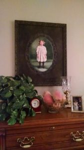
was picked, along with a mat that made the unit hang together in a way that seemed inevitable, as if it had always existed. The prince of all boxes was ordered at a princely price, and the work was sent off in fear and trembling through my favorite service who picks it up at my studio. Then I followed it on pins and needles until it was received.

Finally the longed-for response arrived. “I can’t begin to tell you how ‘over-the-moon’ I am with my grandmother’s portrait!” was the first line in my thank-you letter from my client. Imagine my joy when she told me that the grandmother that was always in her heart was now in her home, too. And the very best thing a portrait artist can ever hope to hear, “You nailed it, girlfriend!”

Sigh. Now I can proceed to my next project. But first, this just came in from my client, “Oh, yes, tell Joanna she has my grandmother’s eyes down perfect. They’re the same as I remember!”

Learn more »
No Comment

‘LITTLE MAN’: A Story of Love, Overcoming, and a Red Tractor

Some portrait commissions fall on me with no forewarning, like this one did, although it came from a former client and someone I knew very well and for whom I had done another portrait earlier of four siblings on one canvas.

This one, however, is about a young boy at the delightful age of 3 years old caught up in his bright red tractor. Now red tractors are truly classic, especially ones large enough to ride on. Or to fix on with real tools. I know my own connections to little boys contain episodes of fixing and unfixing the crib in which they stayed. Every night the gate would collapse, the screws fall out, and the crib door would be dangling in the morning. another-little-man-resized-web

So, the benefactor, or the godmother, of this little boy contacted me for the portrait of a charming little man, and the adventure began. The first sitting with introduction to him and his mother happened on a Saturday, as I recall, and I studied him as he shot all around my studio, a ball of energy. Children are not easy to capture in still shots; did I mention that? In any case, seeing your subject in person is vital, because as every artist of any experience at all knows, photographs can lie. Maybe a better way of saying that is that the truths of a photograph are all internal, and frequently not weighed against other objects, like adults, other small children, nightstands and chairs. Even trees can help in
sizing a person.

We discussed what Little Man would wear, what colors one saw in the tractor, and I was left with a pile of photographs to look at to wonder what angle played him and his personality up best. I remember we decided on going with this look because when he was alone, he was most himself, more than when he was with people; he submerged his personality into the internal process of what he worked on, looking out from there at the world of other people. We set up a schedule, made a contract, and figured out times for the follow-up visits. This work was to be captured on a 3′ x 4′ canvas, and I would add a frame to the basic order as my responsibility.

I started out drawing multiple sketches of his face, which I then sent for comments to the parties involved. We settled on sketches; I made adjustments and then began the grisaille, and the imprimatura. Then, the oil painting.

But let me introduce the godmother with her account of the events. Her Story:

“God’s perfect plan is awesome! Little did a 40-year-old professional and a 20-year-old guest at the North Carolina Correctional Center ever think they would form a life-long friendship and a bond that only God could forge. But they did!”

Nancy was an inmate at the NC Correctional Center for a youthful rebellion with drugs that she knew would destroy her. When the judge, a friend of the family, said he would recommend leniency, she refused and accepted both counts of the indictment which meant a felony on her record and many years in prison, because she knew it was the only way to save her life. On one of those years in spring she met Sarah, a member of a Christian mission group to the prisons who were conducting a Christian weekend for a select few of the inmates. Sarah was the sponsor for Nancy’s best friend at the institution. Months after the weekend, Nancy realized her friend was trying to scam Sarah by pretending not to get the package sent and then selling the extras that came, so she wrote Sarah and let her know the truth.

little-man-with-red-tractor

a precious moment in an oil portrait commission

After that, the relationship Sarah had with the friend ended but a new relationship was started with Nancy. Letters of remorse, truths of scripture, and hope through Jesus Christ was shared. Bibles and books were sent and there was always a visit every month in NC Women’s Correctional Center and later at a minimum security prison. Letters were written to the parole board and when Nancy came up for parole, Sarah was there with Nancy’s mother and aunt.

That long awaited day came when Nancy was released to her mother’s home under house confinement for a year. Nancy got a 2-year degree and was a model parolee and model worker. After several years, she married and wanted children, but after years of drug abuse in her youth and diabetes, her hope for children became an ‘it will happen if It is God’s will.’ Nancy was content with leaving it in His hands. A few years before her 40th birthday, she called Sarah who had been her mentor and friend throughout this ordeal and told her the good news. She was pregnant. little-man-at-home-resized-web

She had a healthy, but premature, baby boy. A miracle child! That child is now 5 years old. The portrait of ‘Little Man’ was made at three years old, commissioned by Sarah as a gift to Nancy to represent the ultimate fulfillment of God’s plan in a life starting out as a failure, to a life completing God’s plan. Nancy is now completing her degree and going for a masters in her chosen field. She has been selected by her director as a future manager of the regional group in her field.

The visits and calls continue every month and every week, and Gi Gi has been added to Sarah’s name, great God mother. What a blessing!

“The painting is beautiful,” Gi Gi told me, “Nancy had a fit over it!”

And Nancy said about their portrait, “This is the oil painting that will soon grace our home. Now I will always have him with me, in everything I do, will see his sweet little face…. It’s wonderful! I am so amazed by the portrait. I cannot wait until next weekend!”

And so the completed portrait went home to live with Nancy, and I get reports of it from time to time from my dear friend Sarah, or Little Man’s Godmother, Gi-Gi. A portrait painter gets such wonderful connections through her portraits. I love my job.

Learn more »
No Comment

BEHIND A GLASS WINDOW, PAINTING IN OIL

The Old Home Place

From painting pictures OF windows, for the past year or so I have painted in the new fashion of painting BEHIND windows. I didn’t want to do it. My lovely client, Tresa Wheeler, was in her quiet way, insistent. She knew I could do it, she loved my work, and no, she didn’t prefer a watercolor of her house on paper, but her house painted on the backside of these wonderful, framed glass windows from a friend’s house. She wanted to look out on it as if she were looking out a window and seeing her old home place.  (link #1, window painting with Tresa) And she wanted my work. I couldn’t even give her to another client.

She brought me all kinds of material–photos of how it used to look, write-ups in journals, before, after, in-between, in different seasons of the year; before and after the swing was added.

This is a funny journey. My doctor’s gal Friday had asked me about painting on glass a year or two before my assignment came. I didn’t know what to tell her. I knew acrylic stuck to anything. Oil did, but it was slippery. I’d done an assignment before, painting on a china pitcher and had bought those paints for it, paints in awful colors that you really couldn’t mix, that cost an arm and a leg. I probably commiserated with her over several months. She laughed her head off when she found out I was doing not one, but two of these paintings. None of the above worked. I knew that acrylic would come off in one slippery plastic piece, if it did delaminate. So I picked oils. I’m not going to bore you with all the details of how I worked each detail out–and there were quite a few of those details–but, over the next year, I did.

Did I say a year? Yes, I did. My client did not complain, although she must have been tempted. I would make a little progress, hate what was happening and stop. A little more, stop. My students laughed at me, and wondered why their master teacher could make something so hard. Well, in my defense, hundreds of strokes for windows, a swing, chain, shutters, roof, yard, road, things I could see in the pictures provided and things that had been added later I couldn’t were all things I had to pull together into that one image. Reverse perspective for a dyslexic. I had to get transparencies of the house, so I could turn them over. Hundreds of times turning it over, seeing back to front, front to back. Some days I had to scrape it off and start over. No fun.

But finally, and eventually, I began to make progress in the right brush, paint, brushstroke, paint markers, when to wipe off, scrape, and even when to add a touch or two on the front side, and we had the first one of the two ready for Christmas. Tresa had us set up a Christmas arrangement with the picture at its center. (link #2, window painted, with Christmas decorations) We photographed it, and she made her Christmas card out of it, giving me, the artist, due recognition on the card. Well, but, the card was delayed by a fall, an operation, a husband in the hospital and daily trips to Chapel Hill even in sleet with a newly operated on shoulder.

Meanwhile, I finished the second painting behind a glass window for the friend she gifted the painting to, the one who had given her the windows. Ice and snow, more trips to Chapel Hill with a healing, freshly-operated on, shoulder. Yes, people’s life stories continue in and around art work, and actually, I think, make the whole process more precious. Make the outcomes more stunning. The second painting was of bales of hay, a hay field, a tall tree, and a Carolina sky. (link #3, window painting with hay bales) Now it was my turn to wait. Tresa couldn’t come because of the hospital commute and no one to help her carry the finished work in and out her car.

Finally, the day came and the delivery was made, and I am waiting to call the friend for permission to share her picture abroad with her name. Until then, I will just share the picture with thanks to one of the loveliest clients of all times, Tresa Wheeling, who has sent me numerous cards of thank you’s and praised my work to the skies, and made me feel like one of the luckiest artists alive today. May every artist friend of mine be so lucky. She not only valued art for herself, but as a way of giving to others and blessed me in doing so, and my ability to keep my doors open.

To the woman, the veteran school teacher, and one who has become a lifelong friend, thanks for turning the trial of painting on glass into a learning experience, a long-term relationship, and a total delight!

Learn more »
No Comment

Phase 10 – A Final Coat, Acacia Wood, and Prime Time Unveiling

The time had come. The last strokes had been administered and were all dry to the touch.

My professional adult student had asked me to show her how I did a finishing glossy coat over the painting. I am not talking about the final varnish coat at this point, because I was a little afraid of using one due to the floppiness of the ground, the loose hanging, sewn canvas. Varnish can yellow and go brittle on you.

The method I was taught to use was with Liquin TM by my mentor Thomas Buechner, now deceased. Depending on the degree of gloss you wished your painting to have, you mixed turpentine with the gel medium and brushed it over the surface. This gives a similar effect to that achieved by oiling out which uses linseed oil. This substance I had already determined by my contact with Portrait Society of America to avoid, as the top chemist in the country had commented on the rigidity of the linseed oil medium, a rigidity which increased over time as the drying of the oils continued over the years.

This was an effect to be avoided at all costs as it causes cracking. So in proportions of approximately half-half, I mixed the two substances in a bubble gum container and applied the mix to the painting, under the watchful eye of my master student, who kept pointing out any dry spots that tried to hide as I painted it on. That whole process took an approximate hour, and was left to cure out until the next day. The difference in the look was astounding, similar to that of oiling out because it calls any pigment to the surface that had begun to sink into the ground or canvas, thereby turning duller. It added a sheen, but a matte sheen. Had I wanted shinier, I would have used no thinner solvent.

IMG_3195That day The Daily Record arrived to take a photograph of the painting and that was published in color in order to draw people to the Cotton Festival in Dunn, an event which probably brought in 200-some-plus visitors to see it.

My photographers came to take a picture of it that would then form the base for my annual Christmas card.

My client had a dowel rod made for the rod pocket at the top out of acacia wood, in the red tones, or burnt sienna tones of the lions’ manes, with carved wooden finials at the end, all beautifully finished.


jmck_daniel_fin - Copythe artist’s copy of the original one that hangs in the National Gallery of Art in Washington, D. C.


IMG_9696 - Copy
Peter Paul Rubens’ original work which hangs in Washington, D.C.


541886_10151867873104694_1243631060_n[1]


And this, folks is the tail end of the story.

At the present writing, Daniel was rolled up on the sidewalk inside a protective sheet and delivered to the client’s house where it now hangs. Overtures have been made to the National Gallery for news purposes. I am about to send out my Christmas cards. My client is thinking about a new project to busy me. And I have begun my next portrait commission.

Learn more »
No Comment

Phase 9 – Daniel Sees the Light of Day

In the final stages comes the verisimilitude, or the reality, of a large scale painting. Heck, in the final stages comes me being overjoyed. It’s been forever. It’s been a year and a half of agony—my own struggles, others critiques—a year and a half of scrutiny and revision and staring at the same painting. I’m ready for Daniel to be finished. Now it really looks like a major painting. Now it begins to work as a whole. Now people look at it to appraise it. But the artist, who has labored in love for the whole of it, is feeling the pull of the painting itself wanting to be finished.

I suppose it’s a little like letting the characters in your book write your story for you. The heroine has been thwarted in her goals the whole time, the end is in sight, and she wants the golden ring.

In the painting, each lion wants his own destiny. The den has been opened, and Daniel wants to get out like never before. He’s grateful to God for the very air he breathes and he doesn’t yell at the king who had him thrown in there, however kind his words were, I hope your God can save you. He knows he now has a future.

It is at this point, with only a few areas left to pull together that I am compelled forward beyond my physical tiredness and fight with the elements to bring out Daniel’s hair, the lift in his forehead, the shrubs at the top, the greenery and branches of the trees and shrubs that are almost above my reach. My bum shoulder is being stretched to its maximum capacity, and right there at the last, it was literally screaming at me, not wanting to function.

IMG_3235I can’t tell you how many times I thought the painting was finished before it was, or that “only one little stroke” wouldn’t take any time. Towards the end when my client was also getting antsy and wanting the work he’d paid major bucks for, we thought it was ready. Three men had moved it in and set it up. We thought it would take three to move it up to the front of my studio. However, instead, I tore down my studio to slide Daniel up front and into place right in front of my big show windows where the Southern sun shines in and lights Daniel up. I pulled down 6 foot tables and we moved furniture, and just my husband and I slid the whole 5’ x 8’ x 8’ easel, with Daniel attached, up and in place. An epic battle had ended. But those niggling little details—so many yet to be done.

IMG_3233You can see from here the depth already in the figures. Shadows have been enhanced by multiple layers of glazes, the snarling lion’s teeth have been sharpened and darkened. The wrinkles in the snarling lion’s face have been smoothed once again, the whiskers quickly scumbled over the face as they emerge from the black freckle which starts it. A hotter red has been added to strengthen the robe’s impact. I am fiddling at this point with the finest detail, the separations in the fingers, adjustment of the fingernails, highlights in Daniel’s hair, in short, the part that most artists want to begin with and want to see first.

In this position on the ladder, miserable, every time a rock seems flat in the upper right, I add a facet. The slightest shadow I find missing on Daniel’s face, I add.

IMG_3231But up front here in my studio the painting which has stayed in the back the whole year and a half is bathed with golden light and truly comes alive. At this point, Daniel’s story is illustrated once again, an epic battle that began with petty jealousy over Daniel’s success, that took him through the legal decree that anyone who worshipped a God other than the king should be killed, but who won the love and the favor of the king who hated what he had done himself to Daniel—and who, when God had been able to save Daniel, declared that everyone should served Daniel’s God. Well, wow. That’s a story worth pulling out of the 1600’s and illustrating again. An old story made new.

Next: Phase 10

Learn more »
No Comment

Phase 4 – Fast Forward Using Photographs

Fortunately, I learned how to develop stories from tidbits of information when I worked overseas as a writer, using the information I obtained from interviews with certain people to write feature stories about someone they met in an important trip they took.

This skill is very similar to the skill obtained by intense study of photographs for extracting information that is useful in making a dimensional view of a subject. I do not use the term “copying photographs,” because it hints at an inexpert slavishness. I do not recommend painting from photographs to my beginning painters, either. Oh, all right, if you are a self-declared hobbyist who wants a one-time likeness, go ahead. However, my emphasis is on, rather than training copyists, training ‘informationists.’

Fortunately, I had all of that background including training in Old Masters’ figure drawing and painting in Europe. The Master Painter, Herr Bergheim, who taught in his studio in Munich specialized in developing awareness of common flaws in perspectives of facial and figure anatomy and three-dimensionality.

drawing 001 positiveFigure of Woman w Musical Instrument 001 Positive

For a committed painter who aims higher on the spectrum, you want to learn figure drawing. You want to have had multiple courses of drawing from a model, 10-second poses, 30-second poses, 1-3 minutes, 5-10-15, etc. You want to understand the human body as an s-bend and not a straight stick. You want to know how the arms hang in apposition to the hips when standing. You want to know, on a face, why the lines are there, why the eyebrow dips further down on a 3-quarter pose—because it bends around a corner—as in, the head is a rounded square. You want to know dark side/light side on a head.

Then, and only then, can I turn you loose on a photograph.

Daniel in the Lions’ Den hangs in D.C., and daily visits are way too expensive. The photographs I took of Daniel were integral to the process, and the main reason I took the trip. They were my ‘takeaway’ from the experience. Let me share the progress of one view.

IMG_9710 partial of museum painting

Here is one of the smaller portraits photographed from the whole. This lion took multiple revisions, but a revision merely pushes and pulls on the painting you have begun. They are close. No huge erasures are necessary, just pushing and pulling.


1175134_595792013806191_1972117313_n[2]

I began by blocking in colors which I immediately began tweaking.


1378769_606341199417939_456327840_n[2] - Copy

As the painting developed, the lion’s head rounded, the eye became distinct, the chin hair thickened, the teeth moved slightly. Differences in coloring were due somewhat to glazes added, but are also due to differences in photography.


IMG_2971 (2)

In this version, behind the lion’s tongue was deepened, teeth grayed down, roof of the mouth corrected, mouth opening decreased, and hair layers built up. Daniel’s face and hair were corrected to the original. The cave opening was not lightened; that caught the light of the flash.


IMG_9721


IMG_2971 (3)


IMG_9726


541886_10151867873104694_1243631060_n[1]


This is from a photograph of my final version, with the added notation of the original painter, Peter Paul Rubens and the one who followed his original with my own original of his…moi.


Back to my thread in the article, to the knowledge of anatomy: This knowledge leads me to the correction of what photographs and students mis-saw in Daniel’s anatomy for a period of months. In fact, I was the one who had the ‘aha’ moment and showed them. They then saw what the original drawing was rather than the illusionary distortion we had all accepted that made us think Peter Paul had gotten it all wrong.

This was due to the painting of light next to light, light stomach next to light arm, an abutment thereby fusing the two sections in the mind’s eye. So a conjoined bloated body and a malformed arm were, with only minor changes, corrected in contour line as well as in subtle color, which performed the separating operation and perceptibly altered the original misconception.

Similar distortions appeared in Daniel’s hands and feet which leant a grotesque nature to them. Continued staring, concentration on the original photograph, meshing this knowledge with the knowledge of correct anatomy as seen by posing living models in these positions helped work out these kinks.

Squinting is another Old Masters’ technique for achieving proportion and color contrast. It creates the relative lights and darks which cause high level accuracy in transferring a painting, as does walking backwards ten feet to view your work at frequent intervals. Colors are rarely absolute, but rather are proportional to one another.

After determining that the lines and masses from left to right were primarily safe to follow, I began to change the drawing from top to bottom, as the extending had occurred primarily in the front center involving the snoozing lion, the snarling lion, and the retreating lion. This allowed me to re-position the bones as well.

So in segments, using the photographed mini-portraits within the big portrait, the work moved forward—each lion individually, Daniel, the drape, the right rock, the bottom strip, and the top opening which went through several corrective phases.

Proportional corrections were most profound in the feet of the standing lion due to another illusion created by the protruding toes of one lion lining up with the receding toes of another. Another problem solved by the use of photographs was finding Lion Number 10, the sleeping lion on the left, at all.

In conclusion, I can only say that photographs provide a well of information to be mined.

Next: Phase 5

Learn more »
No Comment

Phase 8 – Use Any Color and Glaze to Correct

My Granddaughter Visits

This was a fun and playful phase. Most of my lions were at least in there, all settled, even if they had not been thoroughly developed. Two in particular lay there rather latently and I knew I would have to deal with them sooner or later, but I wasn’t worried about them. The colors were coming along. I know complementaries like the back of my hand and can correct any color into its total opposite, if I have to, so that was of no concern to me. Most parts of Daniel’s anatomy and the lions that had eluded me had been long since solved.

My client kept asking me, “Have you done the bones? Have you done the bones?” Well, no I hadn’t done the bones, but I had re-designed the whole drawing using the negative space function on the lower horizontal strip, so I knew they would fit. That didn’t worry me a bit. I had built up momentum and excitement.

Then I learned my baby granddaughter was coming to town. Well, five-year-old granddaughters trump any commission and any scale, if you know what I mean. Fortunately for me, my granddaughter loved to paint, so I knew I’d get to come to my studio where she never tired of the things to do in it, and get some much needed stroke work done on the canvas. Any amount of work you put on in one day helps take you leaps and bounds further the next.

I started her out in the student section with watercolors, which she began painting very eagerly, while I added and corrected the forms in the bottom strip of the painting. Soon enough, she

IMG_2327finished that station and wanted to join mine. I was not surprised. I decided to turn her loose with my paints, gave her a little instruction concerning the area she was to paint in, the brush strokes, and left her to it. I didn’t have to interrupt in terror or worry over it. She was quite skillful in her handling of the brush, in brush stroking, making movements with them like a professional with her left hand.

Colby was so immersed in her project that she did not speak. You can say she went into her right brain mode of working—where, as I teach my students—you are infinitely smarter than you are when you work in the showy left side of your brain.

IMG_2332This drowsy lion looks as though “a little child has lead” and soothed him.

I began by mixing the colors for her and handing them to her, knowing I could paint over what she had done if it were totally rough, but to my great surprise, her undercoats were excellent, and not blending as well as a more seasoned painter would did not deter me from proceeding. It also was not a deterrent in giving the painting what it needed at this point. Soon, as I gained confidence in her painting, I began to ask Colby what color she wanted in order to paint the bones, and she responded with many of the colors of the rainbow. I responded in kind, mixed them and presented them to her. She took them from me and painted with them, gaining more and more control.

Having said that, I must hasten to add that Colby could have mixed the colors as well. At five, she knows all of her primary and secondary colors and can tell you at the drop of a hat what they are.

Colby took her post quite seriously and painted in the designated spots, making circular motion sweeps or straight ones along the length of the bones quite naturally. The colors added into the bones were perfect tinting for their grey, lending them translucency, and I let a lot of that shine through any additional layers.

IMG_2329

I was quite excited to see the painting moving along so nicely while still enjoying my granddaughter’s visit. At one point I looked up and saw how menacingly the snarling lion glared directly into Colby’s eyes, symbolically warning me to care and keep watch on her against the viciousness of evil in the world trying to engulf her. This is a wonderful image in the spirit of the painting to keep in mind for praying for my lovely gal. Not once did she show any fear of the image at all, a fact that increased my respect for her and her professional handling of the situation while yet so young.

IMG_2328At the end of our session, Colby looked up at me and said, “Grandma, can I be an artist when I grow up?”

“Oh, yes, you can!” I replied enthusiastically, loving that she so intensely desired this.

Nor did I say what rough times she would have. Everyone in every business has rough times. And who is more fulfilled than an artist who gets to do what they love every day of their lives?

So much for the lessons Daniel in the Lions’ Den gave us. I have the distinct feeling that not only my client would approve of the day, but that Peter Paul Rubens would peer down from a window in heaven and delight in the fact that a new artist was being birthed and encouraged over a work he had done millennia ago.

Next: Phase 9

Learn more »
No Comment

Phase 7 – First Sweep at Daniel and His Red Cloak

I remember the order of my painting, from left to right, and I had always planned to lay in most of the lions before starting Daniel, working in a circular fashion that would return to the place I began. I didn’t remember how “all at once” I had painted Daniel. You can tell we are in the first stages of the flesh tones in this photograph. As always, however—and this is integral to my techniques of painting—every layer must have the lights and darks that belong to in an average amount, and this is the system I teach all of my students without exception, because it is the only system I have found that works so well.

No covering the space with white or any solid color, as that only takes you two steps backward from creating form. This is why any step, even a mistake, is a step forward. Once you have a moderate version of a three-dimensional layer, you build on it by adding lighter colors in the light areas, and darker colors in the dark areas, further rounding an object. You can see I have left my drowsy lion to take a nap while I rough in Daniel’s right upper side and his lower left side. I brought the bar stool from home to lift me higher.

IMG_0860Somewhere about this time it became obvious that further work would require a scaffolding, so my client had a long bench-like riser made that I could set my chair up on, thus raising me to almost full height of the canvas. It’s times like this when you are glad space is tight and things are jammed together, because that prevented me from inching the chair off the far end of the scaffolding, a possibility which worried my client quite a bit, and which I am quite capable of providing.


IMG_1734You can tell I have worked further on drowsy lion in this picture, due to his stand-out golden tones. These more golden tones are not a worry at all, because succeeding glazes will tone the shadow areas. When you glaze, you always keep the end colors in mind and know what your next steps will be in achieving that goal. Meanwhile, I have also added more shading to the lounging lion, left, and corrected his foot and toe shapes. I have begun now to lay in all of the greenish-brown tones on the floor, carefully minding the highlighted areas and the shadow areas. I never lose my differences.

It is also quite obvious that Daniel has emerged quite successfully and that only the toes will be further shaped as well as glaze coats added for emphasizing shadows on the flesh. I will return to work on the hand anatomy with a model, as well, shift the green pants or drape, create more hair. I will also do at least three more revisions on the roaring lion above. I will grey down the teeth even further after a visit from a lovely Dunn dentist made sure I would not make their teeth a fake white. I had them on a 3-point scale and toned them down to a four after his visit.

You can see certain “holes” in the painting layer at top in the rock still to do, and none of the shrubbery has been put in. By the time of this photograph, the red drape has received several coats of paint in specific areas. When I say “coats,” don’t think of wall paint and painters. All succeeding layers are added in ways that do not fully cover over any work already done. They only enhance.

IMG_2364In this semi-final version you can see that the last two lions, the snarling one and the one seen from behind have been finished the most thoroughly, allowing me time to return to all the problem areas and the two small lions tucked in far left. The lion from behind was amazing; he came together faster than any of the others. In spite of that, he did receive one major butt lift, a case where the eye drug out and extended the foreshortened back at the top. Also, the feet were reworked several times, one pointed out by the client.

Two major teaching tools for the Old Master painter are using squinting and distance, and the distance is two-fold, back up by ten feet is the first, and leave some time in between, the second. As my master mentor in Munich, Bergheim taught me, the best time to catch discrepancies is first thing upon arrival after an overnight, or after an extended break. Another trick I have discovered myself is to walk past it at angles, checking it out the whole way. If an angle is off a little bit, it will seem way off and can be caught this way.

Also, the most beautiful standing lion received a hair lift and the little female to his right needed a whole 5-hour session to set her hair, shade her, and make her look as real as Peter Paul’s. At this point, I am still in love with Peter Paul Rubens, and even though I have quite some ways to go—the bones have yet to be painted, the skull must be worked on, and the lion on the far upper left must have a hairdo and shadows added, I am quite excited at the progress of the painting so far. I have corrected the color in the middle bottom lion to redder, but now it is a little too red. Anyone know what color will correct that? Why it’s complementary, green.

I leave Daniel closed in with the lions for just a little longer.


Next: Phase 8

Learn more »
No Comment

Phase 6 – Mind the Negative Spaces—and Mine, Them, as Well

Today I want to share one of my single most guiding secrets to mastering a project of this size and fulfilling my commission to paint a stunning likeness of the Daniel in the Lions’ Den that hangs in the National Gallery of Art in Washington, D.C.

That secret would rest in finding and acknowledging the negative spaces in any work. By the correctness of the negative spaces, the whole is judged. The negative spaces join the parts. I have mentioned this before, but in the middle to advanced stages, these spots are re-delineated and perfected, their virtual lengths and distances, ins and outs.

There are innumerable negative spaces in a painting, so I will go into detail in only three spots, and try to show you how mastering the relationships in negative spaces went a long way towards resolving the whole painting.

First, to bring everyone aboard—a “negative” space is the space surrounding an object and does not include the positive image of the object itself. If you think of camera negatives, you are not far off. It is these spots which give the character of the painting. No matter how much likeness you transfer onto an object, if you do not echo the spaces in between correctly, your painting will look all askew.

Negative Space (2), Daniel, 20131211_130156 from my sketchbook, sketch made while I was in Washington, D.C., visiting Rubens’ painting


One of the first major conjunctions and well-formed negative spaces I saw was the area surrounding the base of Daniel’s feet. I drew this section as though it were an object itself. The best part of this is that getting the negative space right sets in, in this case, the two tails of the drapes, white and red, both Daniel’s feet, the mane on the lion’s left (our right side) which nails down the drowsy lion’s position, and shows the profile of hairs in his mane.

If you are painting by object alone, you might not get them in the right relationship to one another and that alone would sound an immediate jarring note to the whole work—a mistake far greater than a slightly larger or smaller proportion of an object would give.

If you look at the actual painting I have pulled the negative space from, you can see a larger negative shape which includes the red drape, and not just the sub-negative black space, the smaller one, indicated by the drawing. The larger negative space includes the red drape, the white drape which forms a “V” and thus defines the distance between Daniel’s legs, even to the setting up of the mane hanging down by the ear of the snarling lion on the right as we face it, on his left side as viewed by us.

1175134_595792013806191_1972117313_n[1]Next to these negative spaces is another, easily seen in this same snippet of Daniel’s lower half—this space begins a long, narrow horizontal space that starts from the far left with the groggy lion on the left side, travels under his whole face and extended mane, follows the shadow, turns and follows the snarling lion’s extended foot, establishes the rise on his upper toe and bounces up and down over the bones below it. The negative space establishes: drowsy lion’s underside, end of shadow under Daniel’s grounded foot, the foot of the snarling lion, and four or five bones, showing me exactly where I needed to correct the drawing and therefore, the painting.

This is quite a windfall for an artist mapping out so many distinct details by clumping them into a negative-space image that orders their placement.

Above the snoozing or drowsy lion is another section of negative space, that formed by a wide-open “V” of the top of Daniel’s crossed foot and follows the upper mane of drowsy lion, turning and running up the leg of the standing lion, runs along his belly, down the inside of the final leg, along the ledge of the rock surface and the edge of the curled white drape, following the white drape along Daniel’s leg and down to the topside of the big toe. This area joins the lion, Daniel’s leg and bottom drape, the standing lion and captures his legs and tail and a small triangle of light, plus the whole rock inside.

I hope you are beginning to see how useful the notion of negative space is in joining objects—in my opinion, this technique is so far superior to grid work that throws in unsympathetic, opposed straight lines as to be virtually confusing, an act that would obliterate the relative simplicity of the free shape of objects joined by negative space.

Negative Space (3), Daniel, 20131211_130341Let’s take one more drawing of mine which you can see in the same part of my painting shown in color here. This is the shape between Daniel and the roaring lion which forms another “V,” descending. This shape defines the entire right side of Daniel (seen as on our right) and the entire left side of the roaring lion seen on our left. It even takes in his teeth and his tongue. Drawing this negative shape as a positive fits all of the segments of Daniel and the roaring lion properly in place without the tedious and lengthy mistakes made by using a grid.

This is much easier on the eyes, more intuitive, and allows forgivingly for many small differences. In conclusion, this is a tool that can be mined to the full extent of the artist’s skill,  intelligence, and patience.

I’m excited, now. Let’s move on to the next phase of layering, one which begins to bring the final clarity.

Next: Phase 7

Learn more »
No Comment

Phase 5 – Peter Paul Rubens Continues My Old Masters Training

Daniel in the Lions’ Den has continued my lifelong training. Clients sometimes misunderstand your admission that you are a student and think that means you are not a professional. Believe me, the best artists never claim to have learned everything. I claim two old world mentors. Whether or not they would claim me is another issue. Artists brag about their mentors because they are so enamored with them. And we artists all have near mentors and ones from the past.

I am not talking about the Masters who personally taught me—Phillip Moose, George Shealey, Herr Bergheim, Leon Jonczyk, and Thomas Buechner—but rather the greats under whose shadow we all work and judge us purely by their body of work.

My Old Masters training in Germany was in the school of Rembrandt and the layerists. Not until just recently did I discover that one of the reasons I had such an affinity for Peter Paul Rubens when I began painting “Daniel in the Lions’ Den” was that he also was a layerist, at least for quite some time. In Peter Paul Rubens the two diverging paths of atelier expertise that have taken an upsurge in our country in the last half a century began—the à la primas (prima volte) or those who do it the first time, all at once, and those who lay carefully layer upon layer.

Such excitement I am feeling right now, as I have just discovered how painting this magnificent work of Peter Paul Rubens at the behest of my client is more that a random brick in an artist’s career. It is part of the incredible fabric of my art training that, although I believed it random, shows itself all of one piece.

IMG_9711(1)

In this portion of Daniel by Peter Paul Rubens from the National Gallery, it is obvious that the hairs have been flicked up at the end of the stroke, accomplishing a lightness at the hair tips that is the result of the background shining through. This technique was taught in the Old Masters atelier, and believe me, it is not an easy one to learn.

In all the highlighted single hairs, you can see the thickness of the paint and discern these are layered on top of darker passages, giving them greater luminosity and stand out effects.

With my life committed to a mission in Germany, I found a private atelier in Munich in order to get back into my art, begun way earlier, continued in U.S. schools and universities, and resumed after a 10-year hiatus. I was longing to resume my art training. In this atelier, we learned art by learning how to copy the masters. The training was rigorous, intelligent, and artsy. To ensure good motivation, our teacher required us to do two copies. He kept the best of the two. These were artistically sensitive works that immersed the participating artists in the very best techniques of the Masters. Forget the superiority of those who disparage “copyists” in ignorance. Ignoring the discipline of knowledge transference of painting skills has lead directly to the extremes in today’s painting world where original is the sole criteria of worth.

This makes my client, in my opinion, divinely inspired. It lets me know my own life shows evidences of intelligent design. As I have a carefree, random abandon coupled with a borderline obsessive streak, it certainly was not my intelligent choice, even though I did pick similar schools of teaching when I went for training.

Who would know the extent of my training in such an art school in Germany, and who would know this 17th century painter painted in this fashion? No one would have, certainly not my client. Not even myself, until I analyzed my own work and my response to the painting, and did the research.

Who in the U.S. teaches through copying Old Masters paintings? The tradition began in Europe and the respect for it lies primarily there.

I was just reading about Rembrandt von Rijn’s double primed layers, one reddish orange overlaid by a gray, about his brown imprimatura which lends the painting a golden glow from the background forward, how he sometimes paints a thick layer, disturbs it and lets it dry, and drops another layer on it, wiping off the extra paint and leaving it in the crevices.

According to Anthony Christian of the UK, Peter Paul Rubens captured the best facial flesh tones in three of his paintings, two of his young wife, Helen. These, he said, were quick sketches. Peter Paul worked fast, and could turn out his works in a day. Others have claimed that Rembrandt and Peter Paul Rubens were arguably the best portraitists of any age.

However fast Peter Paul painted “Daniel,” I know he worked longer than a day on them. I found obvious evidences of layers in his paintings, in particular in the white hairs of the lion at the top, a white made whiter by being scumbled over a darker color and left intact. You can almost tell more by looking at this step in my own painting along the way, where the left hand lion has less distinctions yet made, and the right hand lions have more separations made by adding lighter hairs on top. Even so, there are more layers to come to accomplish the total effect of receding hairs and the topmost ones in each.

1002335_581905468528179_106879984_n[3]the artist’s in-progress painting


1098305_586382878080438_1748309898_n[1] the artist’s in-progress painting


So to hammer my experience home, or to call it out step by step, layering emerges as the only conceivable journey to a realism of the detail of a work like Daniel. There are numerous ways layering shows up:

  • in the laying on of base colors freely, setting the tone and the use of small amounts of dimension, as in the buildup of paint
  • in the usage of complementary colors to strengthen the impacting effect of the final color
  • in the use of underpainting or imprimatura to encourage bonding and adhesion of paint
  • in the use of lighter colors on top of darker, yielding a blued version of whatever the color, even yellow
  • in certain techniques such as scumbling and flicking which reveal the under layers to the discerning eye
  • in the buildup of light next to dark subtly, without caricaturish lines forming (seen in the four conjoined lions’ snippet)
  • in the dry brushing of the edges of one color passage over another (seen in the highlight on the upper leg and other highlights in the musculature)


Next: Phase 6

Learn more »
No Comment

Back to Top