Phase 2 – I Work with What My Client Gives Me

IMG_8373(1)My client begged me to paint Daniel months, no even a year, before I agreed. Frankly, I knew just how many hours I was looking at, and it took me almost that long to get my studio ready, inching the furniture over the whole 30 feet of it to provide a working space for not only a 5’ x 8’ canvas, loose hanging, but for the footprint of the homemade easel he had built, about 5’ out into the room, ca. 5’ x 8’ x 8’. That cuts a swath out of any artist’s studio.

Several attempts had been made to produce a Daniel in his classroom (not in art, but another subject) where he called me in to teach his students how to paint Daniel on burlap. Seams ran through the whole thing; the raw burlap ate up his paint. It was during that time that I groused enough about following the discoveries artists had made over the centuries for building lasting canvas art, like putting gesso on the surface—as glue for succeeding layers and assurance the chemicals in paint would not eat through the cloth and to keep the color from being leeched away—that the client adapted his model and perfected his vision.

I couldn’t talk him out of the loose hanging tapestry look, which I tried to do simply because when oil paint ages, it rigidifies, and we didn’t want it cracking and falling off a loose ground (that’s the surface). But I researched the chemical nature of classical additives through the Portrait Society of America, an awesome society to which I have belonged some years.

IMG_8374 (1) I discovered from one of the top fine art chemical specialists in the U.S. that the newer product for glazing oils maintains its elasticity over time, while linseed oil grows ever more rigid when it dries. That reassured me. I hunkered down to paint the canvas lying flat on a smooth board.

The new canvas was doubled and painted on the back, the top and bottom seamed to hang over a large rod, according to the client’s vision. Obviously, the molding showing was provisional and would be replaced later by a fine one.

Some of the initial work had been drawn in by a student,

IMG_8376 (1) 
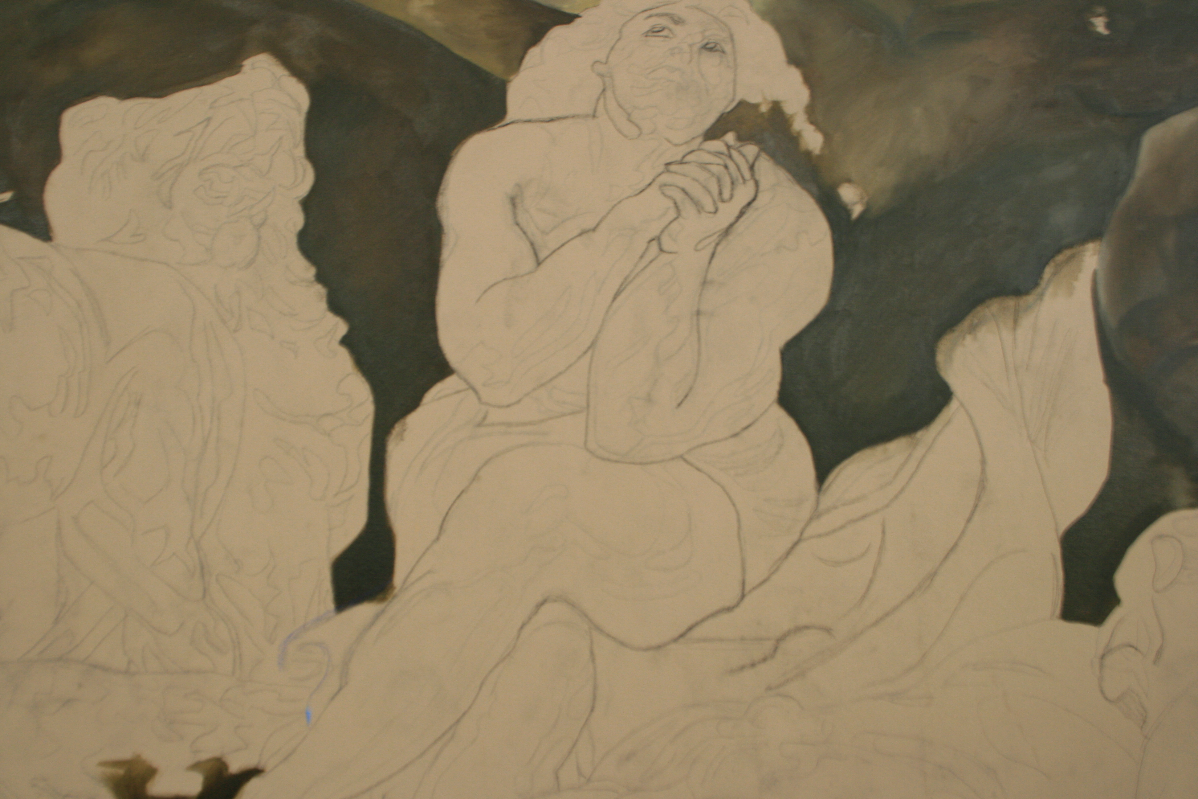
who, though very talented, had not been trained in any way by a skilled artist and had only used a projector to transfer lines. The client and the student shared a common misconception that this process brings accuracy. Peter Pauls’ lines had to be repeatedly studied to bring revelation to lines drawn on by projector following. Take for instance the distortion in the shoulder to the viewer’s right which gives him a very fat and distorted lower arm. This was, in fact, a confusion of the arm with Daniel’s belly, and the subtle changes resulted in a major improvement.

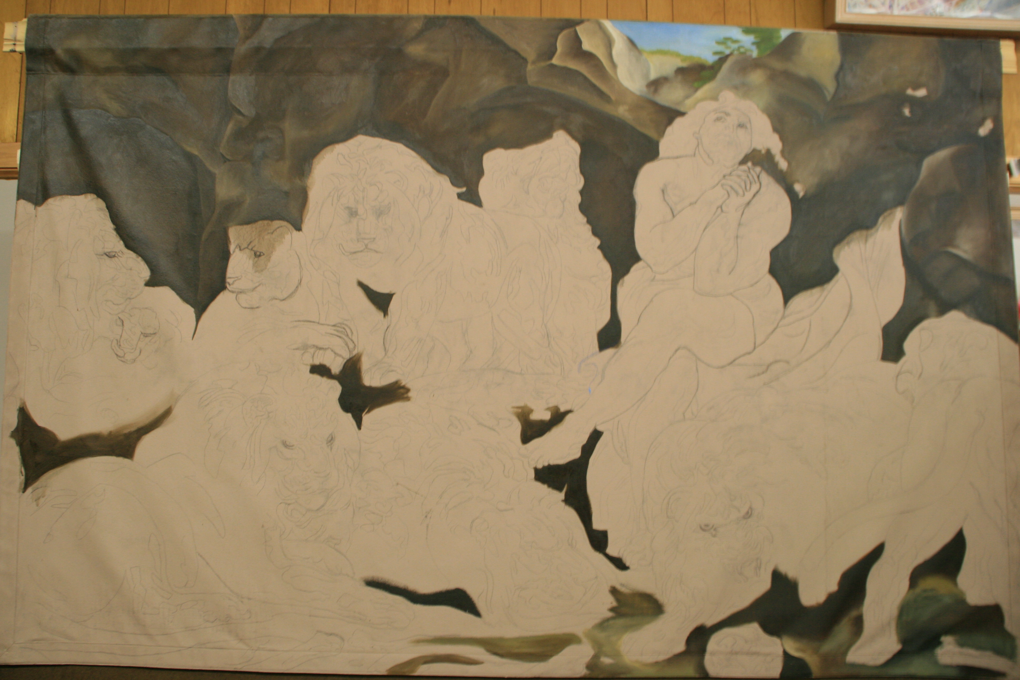
In fact, lines and masses are frequently mis-drawn and mis-interpreted using this system. Without a 3-dimensional working knowledge of figures, many systems for so-called accuracy break down, so I was faced with redrawing radically. Did the drawing beneath help? Of course, almost any drawing helps, but the lines were done in a melted illustration fashion, and the difficult passages like hands, drapes, feet, eyes, obtained a warp that needed re-drawing, a process that continued well into the final phases of the painting.

I was so grateful for my training in Germany years back from a German oil painting master in figure and Old Masters’ painting. Not that no mistakes can be made even then, but major ones are certainly avoided with eye checks of various sorts, and with understanding of actual masses of flesh.

IMG_8383 (1)

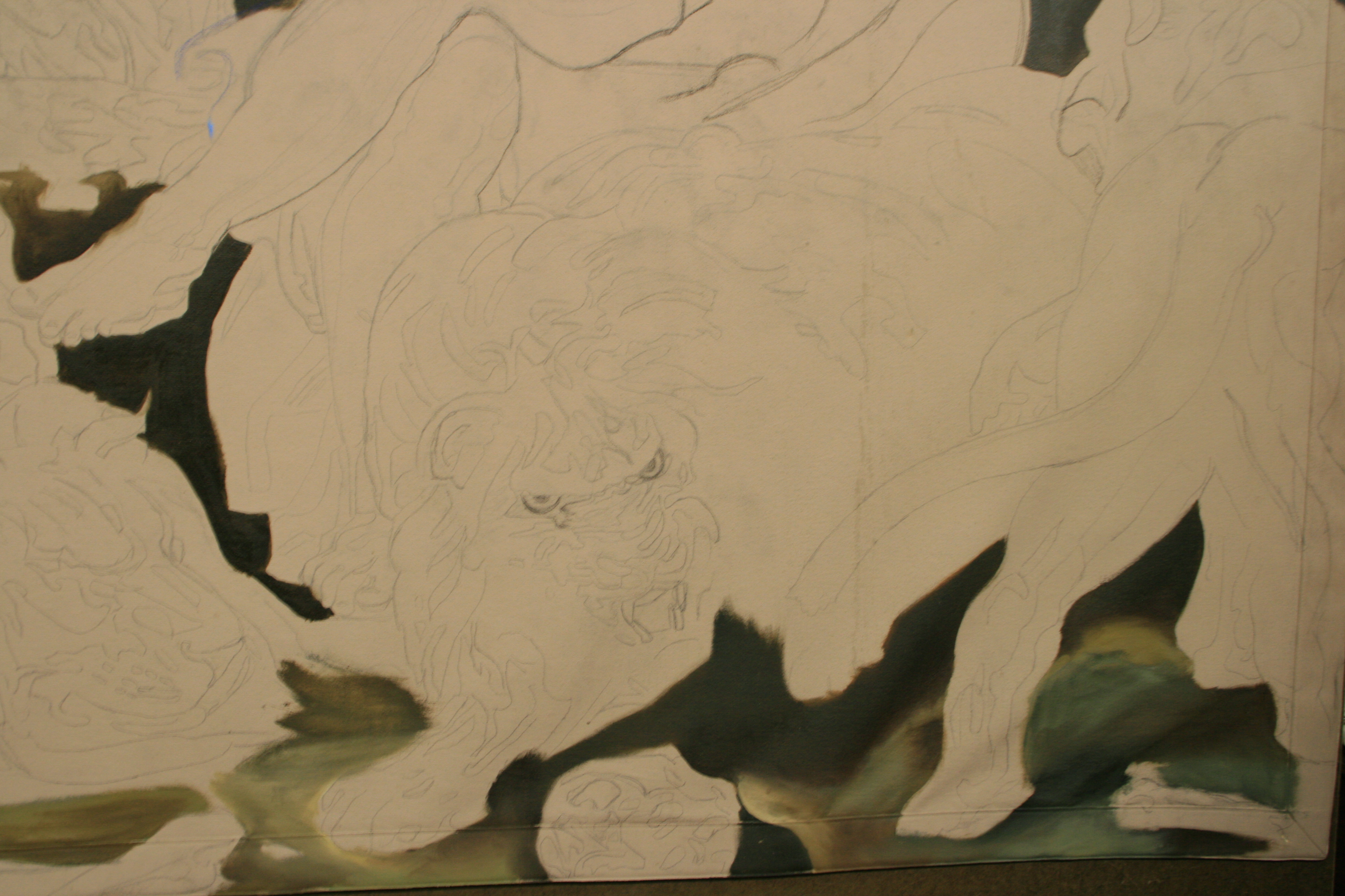
To boot, the drawing actually fell off the final edge in IMG 8383, due to a common distortion of extending the figures seen to fit a knowledge base which ignores a size decrease inherent in foreshortening.

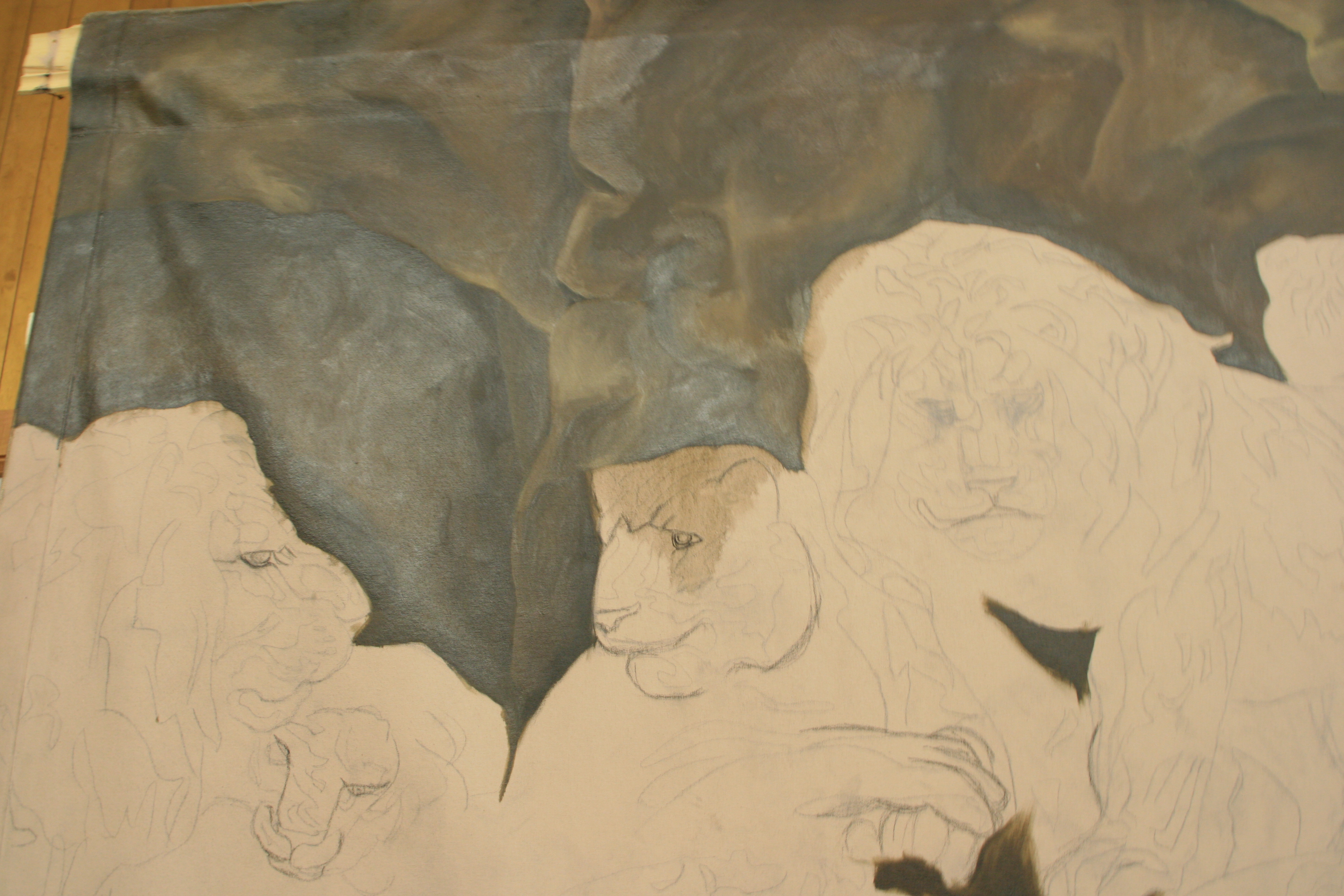
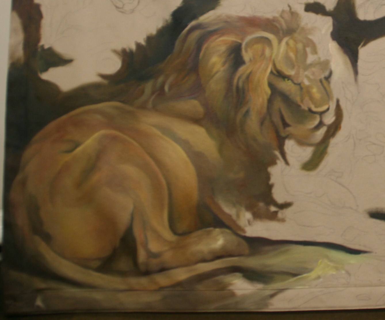
Also, the rock formations were extremely flat and painted an unsympathetic brown, but that I determined to ignore until I made headway with a lion here and there, so I squeezed out paint from my tubes and sat down to begin my work.

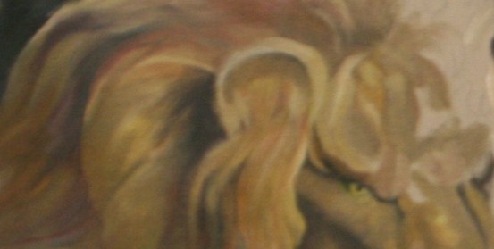
I discovered that the seamed double canvas, much to my delight, was easy to work on. Its decided ‘tooth’—it was almost scratchy—caught the paint. You might say it actually grabbed it. I mixed my neutral colors, the colors of your basic metallics which I excel at, and began to use my foolproof system for laying on the paint. You paint on the larger shapes beneath, and you put in a medium range of the shades and colors you are painting.

Without obsessing on detail, an artist can make great progress, exact enough to return to with lighter lights and darker darks at a future sitting. Colors need a base and depth, especially hair, and this system ensures that succeeding stages do not look ‘tacked on’ and caricaturish. This happens when you paint flat colors to begin with and prolongs the buildup unnecessarily.

Even a final color of gold is much enhanced by an underpinning of the famous Old Masters’ green which reverberates well under flesh tones. In a way those are the tones of the painting, including the lions in their golds and burnt siennas, and the the bright red drape. It sits well even under the more iridescent greys of the bones.

Next:  Phase 3

Learn more »
No Comment

Phase 3 – Bearding the Lion in His Den

IMG_9984Jumping in is always the best way to approach anything. Planning, waiting, scheming just postpones the inevitable moment of truth.

My art teacher in printmaking at Methodist University told me once when looking at my work, “you obviously have confidence.” I didn’t think so, but leaping in told her I did. Well, it takes a lot of nerve to walk into a lion’s den, home to 10 hearty lions, even if they are some five millennia removed. Let’s face it, I accepted this project willingly—I wasn’t thrown in by outsiders like Daniel.

The longest journey begins with the first step, right? And I had already had nerve enough to rough in some yellows and darker skin tones on Daniel’s leg. That decided me that I would go back to the lion.

This journey began with the right brushes, beautiful new long handles appropriately named Renaissance (it was a rebirth for me) acquired from the top class vendors at the Portrait Society of America’s annual convention the year before. I used the paints and palette supplied me by my client who still prefers to remain anonymous. I poured out the mineral spirits and the turpentine and flexed my muscles before the gi-normous canvas.

IMG_9984_(1)_1

I began with the lovely color yellow ochre, a classical Old Masters’ color, rich and muted, bright and toned at the same time. Using my own personally-derived version of the color wheel, I punched it up into the light zone and down into the shadow zone in a continuous spectrum, avoiding the little numbered piles of paint used by some of the masters for left brain insertion. My style is particularly right-brain-achieved flow, tempered by left brain analysis.

In so doing I established a range of dark to light of this one color that took it from near black to near white. In the shadow zone I tinted it in one area with alizarin crimson, something I do knowledgeably after developing the base with burnt sienna and green. Deep colors don’t have to be browns and blacks from a tube with a factory name. My skill that I pass on to my students is in using complementary colors named in a way that evoke the color in a right-brained fashion—so you see it instantaneously—rather than learning by rote memory the factory names. This comes later and is a terrific brag point for art teaching, but has nothing to do with the visual effect of color and slows the process. It’s more a matter of pride in head knowledge over experiential

I milk the range of complementaries, internalizing by trial and error what others leave on the wheel (the color wheel chart). But this is getting too abstract for most of us, so I will save that for my advanced students. Although every artist worth his salt knows the color wheel and terrific methods of color mixing, I don’t know many who lean as heavily as I do on using the complementaries entirely for mixing, without resorting to adding browns and blacks from the tube. In learned discussions of museum pieces, I have heard my colleagues state from viewing a painting by a master that “he added black.” Now I don’t know about you, but how can you tell unless you see a bluish tint on a dark color? Personally, even my darkest colors are achieved by mixing colors, but I am not giving all my secrets away in one article.

IMG_9984_(3)Strokes—this is an all important area for drawing or painting anything organic—and must always follow the contours. Painting contours—indeed, even seeing the correct circular distortion of a contour—is one of the single most defining moments of a painting. In my classes I train my students to look for the warps. These are set in in pencil, then strengthened with every stroke of the brush…even when the brush is large and you are filling in, the difference shows immediately.

Notice how the contour of the lion’s belly defines his position and the angle of distortion is determined by the eye of the viewer. In fact, every muscle distinction that is defined by only color minus line is also painted in specific contours. Look in particular at the area of the hip just above the tail. Even the burnt siennas in the top of the belly are contoured.

At this point I lay in the color of everything in a wide range of differences done in a non-detailed manner. No fussiness at this phase, rather I am establishing a smooth undersurface for all the exciting movements of color—hair to glaze of eyes—that will come later. Yes, I differentiate the under layer of the hair from the under layer of the smooth belly to lay the groundwork for seamless additions, to achieve the look of hairs underneath, in mid-range, and sticking out, or the look of smoothed-down leather of the stomach, back and upper legs.

I am ecstatic.

At last, some color emerges, along with the total look of the lion. Believe me, this is only the beginning, but I do believe it is a good beginning, and I am raging to start the next phase, but must lay down my tools for now.

Next: Phase 4

Learn more »
No Comment

Phase 1, I Begin the Journey

The first thing I set out to do was to visit the famous painting, Daniel in the Lions’ Den, painted by Peter Paul Rubens between 1614 and 1616. My client sent me to the National Gallery of Art in D.C. for a day to study the painting and absorb its grandeur and its nuances. The Gallery has a copyist program that they sponsor, and artists may come in and set up their easels and start to work…, so they have no objections to copying the painting as no copyright exists on the original.

However, no paintings anywhere near the size of mine are allowed on the premises.

Although the reported size of the canvas was only approximately twice the size of my 5’ x 8’ canvas, I still can’t believe that when I look at me next to the painting.

I took multiple photographs of the painting. My strategy was to overlap sizes in order to study the content in every possible part. I halved it horizontally, and thirded it vertically. Then I took photographs of each of the different lions. I studied Peter Paul’s stroke work and where the brightest lights and darkest darks fell, and wrote it all down in my sketch book. I recorded his use of color and layering, his free use of brush strokes.

The next thing I did was to use my large-sized sketch book to draw the shapes of all the significant negative areas, like the area formed at Daniel’s feet with one lion, the space under a tail, under the standing lion, on the rock ledge in between, in the dip into the cave, and more. What good would it do me to get the faces and bodies but not in the right relationship to one another?

I recorded the colors, in particular, the inordinate use of the wonderful Old Master’s green that pervaded the browns, the shades of gold and burnt sienna on the lions, where the brightest highlights in the eyes fell, how the whiskers were—well, whisked in.

I particularly studied Daniel,

IMG_9816 
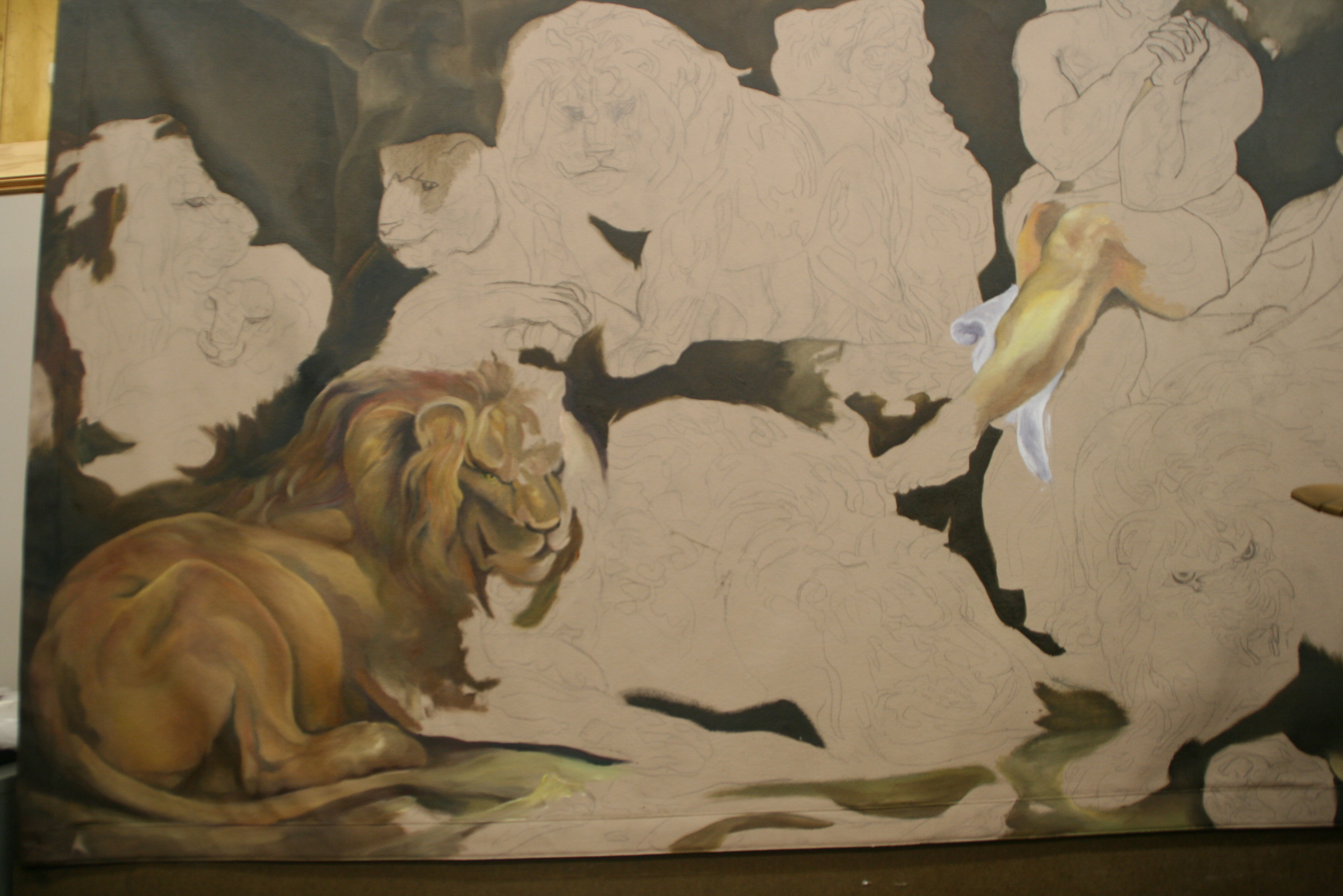
the centerpiece of the Biblical story, at his moment of deliverance, when the King looked in and asked, “Daniel, was your God able to deliver you?” Even in the presence of the snarling lions, it is obvious this was not his moment of greatest fear, but was at a moment when he had a certain amount of peace and knew that the lions’ mouths were indeed shut, as the account goes. Emotion, attitude, and composition joined in this work of Rubens, and I had to study the emotional impact. I took particular note of the lighting and shadowing while I was there.

It was a long day, sitting on the low bench and studying the painting from afar. Often I would near the painting for close-ups, but of course, my telephoto lens saved the day, and even so, I was elated to find out from the very friendly staff that the museum had a site which showed Daniel in his proper coloring. They gave me the link for using later. I also bought the museum book which has the painting in it to take home with me.

Usually you can’t keep me from the other paintings in a museum, but for this trip, I allowed myself only a few forays to nearby works.

My husband played tote and carry. For this project, I had no problems focusing—at least on one painting, even though I got to jump around within the painting.

This one view alone shows how packed the composition was, and yet how deftly the spaces and the overlapping of figures was handled. My biggest hurdle once I got home would be to transfer this complex drawing to the canvas and to edit what I knew would be inaccurate lines from a film projector—although the student who used it was quite talented, if you are not taught in the three dimensional techniques of the masters as I had been in Germany, you tend to flatten out what you see and extend the figures where they should have been foreshortened.

Certainly in the extreme detail alone I had my work cut out for me. The hardest act an artist makes in the initial phases is to strip away all of the detail in his or her mind and take the figures down to their largest shapes and color. Think about it—you just can’t paint around a freckle or a hair, so it is useless to try setting that type of detail in in the beginning. However, Peter Paul gave his successors a road map in creating his wonderfully complex composition of organic shapes.

  Next: Phase 2

Learn more »
No Comment

OLD MASTERS MURAL

OLD MASTERS MURAL PAINTED BY JOANNA McKETHAN


The original painting of “Daniel in the Lions’ Den” executed by Sir Peter Paul Rubens in 1615 hangs in the National Gallery of Art in Washington, D.C. It is slightly under 8’ by 11’ in size, but looks twice that.

However, a copy of Daniel hangs in Art on Broad Atelier at 217 East Broad in Dunn, a division of j’Originals Art Studio, owned by artist Joanna McKethan. It is there because she has painted a copy of the master’s work, and she is adding finishing touches to the lions’ hairs, whiskers, and the highlights in the eyes before delivering the painting to its final destination. Like the original, the painted tapestry will be oil on canvas.

Noting the artist’s training in Old Masters’ techniques in Munich Germany, a local entrepreneur and professional who currently prefers to remain anonymous has commissioned McKethan to do the work, which will not be an exact copy due to the difference in dimensions. The painting has been done on a hanging canvas sized approximately 5’ x 8’. McKethan received in-depth Old Masters’ painting training in Munich, Germany, some thirty years ago from German master painter Bergheim, where students in the studio were required to paint two copies of a master painting, of which the teacher kept the best, “an excellent training in the discipline required to copy a Master painting,” says the artist.

The painting will hang in the patron’s house, or will possibly be resold.

‘Daniel in the Lions’ Den’ depicts a man surrounded by nine angry lions. A product of the Baroque period, the painting uses dark and light color shades. The technique of chiaroscuro sets a dramatic tone appropriate to Daniel’s scary situation. Chiaroscuro, a technique for creating reality with light and shadow, is evidenced in the strong contrasts widely used during the Baroque period.

Peter Paul Rubens, 1577-1640, Flemish, was the best known European artist of his day. He is now widely recognized as one of the top artists in Western art history.

The subject, Daniel, an Old Testament prophet and chief counselor to the Persian king Darius, aroused the envy of the other royal ministers. Conspiring against the young Hebrew, they forced the king into condemning Daniel to a den of lions and what they hoped would be instant death.

In the painting he is sitting, looking upwards at the light now streaming into the cave. Although his face is serious, his body is in repose; he is not hiding his eyes or bowed over in distress. The nine lions (or is it 10?) affect different poses–some asleep, some roaring and some just sitting.

The light streaming in illustrates that Darius, anxious about his friend on the following dawn, had the stone removed that sealed the entrance to discover Daniel had been miraculously saved. The artist made an accurate Scriptural rendering of the moment of Daniel’s delivery as he, the artist envisioned it. The king cries out to him, “Daniel, was your God able to deliver you?” The beasts squint and yawn at the morning light streaming into their lair, and Daniel gives thanks to his God.

The composition is crowded, without much place for the eye to rest.  Most of the space is occupied by lions. Rubens used dark colors beside the white cloth upon which Daniel is sitting. Rubens’ colors are well-blended. Tense energy is depicted through Daniel’s facial expression. Daniel is the focal point of the painting, positioned under the light from the opening. This captures the spiritual and physical emphasis of the painting: that Daniel is God’s man, and Daniel will be delivered, a figure of Christ’s resurrection.

The monumental size places the ten lions close to the viewer, heightening the sense of immediacy and danger. Within the asymmetrical baroque design, Daniel is the focal point even though his position is off-center. Against the brown tones of animals and rocks, his pale flesh is accented by his red and white robes and by blue sky and green vines overhead.

According to the National Gallery, in 1618, Rubens traded Daniel along with eight other paintings and some cash for a collection of over a hundred ancient Roman busts and statues—the prize material of any art gallery in that era. During the transaction, Rubens described his own canvas as: “Daniel among many lions, taken from life. Original, entirely by my hand.” According to the National Gallery, The North African lions Rubens used as his models were kept in the royal menagerie at Brussels. The Gallery has a study of the lion in its collection facing the viewer, standing to Daniel’s right. This Moroccan species, now extinct in the wild, they say, may be seen at Washington’s National Zoo.

Like the original, the painted tapestry will be oil on canvas. Ms. McKethan spent months rearranging her studio to accommodate the 8’ X 8’ X 9’ easel upon which the tapestry hangs. The tapestry can be viewed through the wall of mirrors at the back of her studio, easily seen. Students have kept up with the progress which sharpens their eyes and memories, making them notice improvements each new lesson.

McKethan traveled to Washington, D.C. and sat with the painting for a full day’s sketching, photographing and absorbing the placement and movement of the lions, noting specifically the negative spaces that join four or five parts of objects together. “Although it is a work of antiquity, it is also an experimental work,” she adds, “and that, of course, increases the excitement of participating in the process.

Her teaching studio is based on principles of the Masters, bolstered by courses from master painters in the U.S. and abroad. “Since we don’t know exactly how the Masters achieved their results,” her German teacher would say, “we must learn visually how to achieve what they did, and the easiest way is to look through the eyes of the Impressionist painter.” Through painting samples designed to illustrate the point, he brought the students closer to their goal and proved his thesis.


Ms. McKethan has done work for this patron before.


Learn more »
No Comment

MY FIRST PORTRAIT COMMISSION


“A Father’s Blessing”


          Painting emotionally: how much can an artist afford to invest of herself in each commission? That was the subject under discussion in the high school art class I taught one Thursday afternoon at Art on Broad Atelier. Since one of my students was painting a watercolor, another an oil, I wanted to teach things that bridge both media.


I think I had just explained what a mood sensitive medium watercolor is: in fact, if you’re not feeling appropriately sassy, just don’t begin a new watercolor that day. Even in painting oils, how you are feeling about yourself transmits when you paint. That is a separate issue from, yet connected with, another emotional factor. How do you transfer emotion to the painting you are working on?


Then my first commission sprang to mind: a portrait of my grandmother for my daddy. Daddy had always talked to me about learning to paint oils, and wanted me to buy transparent oils to tint photographs, in case, as he said, “I would ever have to make a living for myself.” Now my dad was very forward thinking, especially if you consider he was born in 1891. He referred to a man he knew in Toast, North Carolina, where my father was born, Bob Watson. Bob Watson evidently was highly in demand as a photographic portrait colorist, the profession my father envisioned for me.


My artistic talent had been enough to receive some notice through the years, and so my mom and dad had bought me a correspondence art course. I had made something like a “95” on a picture I drew for “Draw Me” ads put out by Art Instruction Schools in Minneapolis. I had studied a concentration of foundational fine art courses at Queens University (then College) and sculpture at the University of North Carolina at Chapel Hill. Anyhow, all that evidently gave Dad enough confidence to commission me one day on a visit home from abroad to paint a portrait of his mother.


He approached me very seriously, a small, framed photograph in his hands. “My mother was very beautiful,” he said. I stared at the photograph and for the life of me could not see the ‘beautiful’ part, but I listened attentively. “Yes, I want you to paint her portrait. Take your time; I want it to be good. I will pay you one hundred dollars, and I’ll give it to you up front.” He handed me the hundred dollars.


One hundred dollars might not sound like a lot, but for me, on my first commission, it was a princely sum, and it felt like magic, conjuring up a face with paint and getting hard cash for it. I was living in Germany at the time, but had not yet taken the Old Masters courses I would later. So I began carrying out the commission, getting paint, brushes, canvas, and setting up the painting spot.


“Beautiful, beautiful,” the words rang in my head as I proceeded to paint her face, her bust. I kept at it, adding tones demanded by the photograph, faithfully. Finally, I had something, but, alas, it was not her. What I had was someone dollish, pretty in a frothy sort of way. That was not my grandmother. Her lineage was fine, but she was mountain stock, and had lived a hard life which showed in her face. ‘Handsome’ might express her appearance better. I tried again.


I took another tack and changed angles, colors, whatnot, all the right technical things to produce the right end. Yet once again, this attempt failed. Now I was frustrated, knocked down, and finally, angry. Yes, I got angry with the paint, the brushes, the canvas, myself. “She’s not that sort of fussy pretty,” I told myself. “She is beautiful in character, a strong woman. I’ll have to paint her that way.”


Setting the canvas paper up on board, I drew the face first. Then I mixed grayed blues, near-blacks of her hair, beige skin color, and slung paint onto the canvas. Back and forth in the most energetic strokes I had ever used, I threw the strokes down, not waiting to re-think and second guess myself into tight technical precision.


Precision, perfection. My dad always spoke of his mother with near reverence. It made me nervous, but still I pushed ahead. First, the face emerged, the hair, the body. As if by magic, this woman appeared in the painting, strong, regal, a woman tempered by life and hard times, but yes, “beautiful.” Daddy would be proud. He would love the portrait of his mother.


Unfortunately, that was never to be. Before I was able to mat and frame the picture and bring it to him, he died while I was overseas. I was devastated, capsized. My father was my rock, even though admittedly, a somewhat volcanic rock. He was an emotional man who felt and loved intensely and deposited his love of painting and of poetry in me, quoting poems in French, and telling me stories about his people. And I felt that I had failed him in not getting him the finished portrait he had paid me for, not so much for the ‘hard, cold cash’ he gave me up front, but for the emotional investment it was for him.


Years later, my own children grown, I know that I was wrong to feel that way. We parents are always happy when our attempts to help launch our children succeed, even, I believe, from beyond the grave.


And so my father launched me into portrait painting with that first commission. Some days I am better than others. Still now I remember thinking, “Lord, I won’t paint long if I must get this emotional about every painting I do.” And yet, my first commission proved that emotional input harvests a better product and response from the viewer, because when it comes from the heart, it speaks to the heart.


That is why with every commission, I get to know my subjects. The better I engage them, the better the result. Yes, technical specifics convey differing emotions, but the non-technical must is the feeling and passion to portray the truth of one particular person. How can an artist NOT invest emotionally in every portrait, as though a first commission?

SEE PORTRAITS


Learn more »
No Comment

Back to Top