EBook Acrylic Painting Techniques Easy(ier), Article #3

Affecting a Painterly Attitude

Today I want to get us in the painting mode or mood. You are at home, practicing your arrival at a group course in acrylics. Maybe it’s a wine and shine, deal, or maybe it’s a month-long course. You’re feeling nervous. Yes, you are a newbie, you know you’re a newbie, but you don’t want to look like a newbie. You’d rather look more–well, French.

So put on your beret, slide your easel up to the edge. Put your canvas board on the easel and pick up the longest brush you have. Don’t get right at it, walk around the room several times first, hand under chin, pondering. Then slowly approach your easel, hand extended with long brush. Pick up some paint, put your non-brush hand behind your back, and pause, then flick in a stroke of paint. It can be approximately where you want it to be or it can be exactly where you want it. You’ve already drawn your picture on there, much like I described in my eBook, Pencil Portrait Drawing Techniques Easy(ier), (link) so you have no doubts about where.

Don’t say, but my hand shakes, held out that far (even if it does). Today is about attitude. We want to strike a pose. Do it several times more, until you forget the crowds surrounding you, staring at you. Oh, that actually felt good, you think, and two of those five strokes weren’t bad. I might be able to really do this. Well, I’m gonna tell you now, that that’s how a lot of professional painters paint even their fine details. What? you scream, freezing up into a tight sculpture, losing all that loose poise. You’ll grow to it, if you want to. Nobody’s saying you have to. We just want you to look and feel like an artist, now.

Is it beginning to feel natural? So for your first day at the course, you may take off your beret and not affect the long-distance stance. Maybe you’ll work on a table beside your friends, and you’ll laugh and cut up to take the edge off your nervousness at trying something entirely new. Soon, though, you’ll be used to the look and feel of the paint, how much or how little water to add to the mix.Your teacher will be telling you, maybe step by step, how to paint the rusty red tin on the top of the barn, how to paint the blue sky, how to swirl in the white with each stroke to make fluffy clouds. You find out how to make the separate slats, how to make one side lighter than the other because the sun can’t possibly light two sides of a barn equally. That, of course, is what will add to your look of three-dimensions that will mark you as a bit further along than a rank beginner. Even in the drawing I’m sure she showed you how to turn the corner from front to side so you don’t have one straight line to fit both front and side on, like the naive artists.

You’ll learn how to paint the grass in, in random sweeps, perhaps using a triple-loaded brush of green, neon green, olive green in a fake handwriting style, for a little added flair to your realism. When it dries, you can add some dandelion puffs, sticks, a mud puddle, anything to bring the painting forward into more pronounced detail, while leaving the sky and clouds more wispy and hinted at, suggested, rather than stiffly over painted.

Your stems can be done all of a stroke, slightly curved, never stick straight, with the end of a long brush. While we want to be realists, that doesn’t necessarily mean we can’t have style, flair, or that we can’t let our strokes show. There’s time enough to decide about all that and going with Old Master’s stroke-less looks or thick paint. If you don’t hang on to your attitude, you will become beat down, submissive, tedious little dot painters with one-hair brushes, and that’s not a fate I would wish on any of my students.

That’s not to say it isn’t hard work. I think it is probably the hardest work I have ever done in my life. I describe the process this way, “Well, think about it. You are dragging a brush with limp bristles, laden with a clump of heavy, thick paint, over a bumpy canvas, trying to make perfect lines or what-have-you. What’s not hard about that? Then you are hearing, at least later on down the line, the voices of a hundred different teachers saying this, pointing out that, all to the good of your craft, but just how much can you actively absorb at once?

So I want to thank you for reading my eBook, (link) Acrylic Painting Techniques Easy(ier) which I keep deliberately and deceptively easy so as not to put off any beginners, and to lure you into the craft, struggle, and hard work of creation, birthing what did not exist before, with some attitude, some fun, a thirst for increased knowledge about the medium and the art. Here’s to you and your painting. I would love to see some of your products and welcome your questions.

Learn more »
No Comment

EBook Oil Painting Techniques Easy(ier), Article #3

Oils Are Bestsellers; or, Subjects to Oil Paint

If you are picking a medium to paint in based on how well it sells, oils are a good choice. Beyond prints, oils are the best sellers. Real artists have to compete with galleries, high end markets, low end furniture markets, starving artists sales, the Wally World complex, and people who really don’t care about provenance, skill, color, texture, little details like that. People who say they prefer prints to the real thing. Sometimes they let a decorator put originals in their homes with no artist’s names on the front. I suppose they trust the decorator’s taste. So plan to paint really well and sell high. Or turn them out like hotcakes and sell low. Or better yet, keep the local charities afloat with your gifts and donations of your hard-earned substance.

If you are still on the making money kick, try painting landscapes in an old masters’ style as one of the favorite sellers. Landscapes are neutral in content and everyone loves them. They are soothing. I’ve actually had someone come in and say, do you have something very soothing? And another friend said, Oh, I couldn’t have these in my house! They are too high energy! Well, okay and allrightee, then. I have even been told they couldn’t buy my art because it was too interesting, and stimulated your mind too much, that they would have to stay there all day just looking at it and admiring it and never getting any work done. (Thought that was a compliment, didn’t we?)

I have heard that local views sell. In my town I’ve sold a commissioned painting of the Market House in Fayetteville. (link) I’ve been asked about lighthouses and have sold one. I have done pen-and-ink commissions of local churches. I have sold many house portraits, both painted and drawn. I sold the archway in Dorfen, Germany, when I was there. However, selling art of local views has its downside, as people in a town often develop what I call the Nazareth complex. “Can anything good come from here?” So, of course, they up-snob you to the city, where only good artists dwell. Doesn’t matter that you are requested for national shows, that you have status in national societies. So in that regard, maybe someone outside your town would come closer to buying you.

Then there are abstract versions of all of this. Speculation is what we are dealing with, if you put it in financial terms. That means, in horse terms, long shots. You can do people’s pets, a cat or a dog. Put a sample up at the local vet. I’ve heard that figure studies of nudes sell well. And there are all the genre paintings of tigers, lions, giraffe, deer, ducks, etcetera. There are seascapes, harbours, and beach scenes. Some love impressionism. I have loved painting glass with reflections, and upon reflection, have sold a lot of paintings with glass as the subject, even broken glass. Perhaps on balance, pictures containing glass have probably been my best sellers, if you discount house portraits and face or figure portraits.

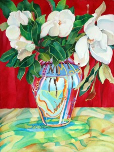
Other sellers have been red leaves, gel pens, seashells. Isn’t it interesting I have not mentioned fruit, or wine bottles. However, I have sold wine bottle still lifes in oil. I’ve sold a horse. I’ve sold countless magnolias; although unmentioned on all the national lists, they are a good Southern staple. I was told that in times past, every Southern lady had a magnolia painting over her mantelpiece. (link to magnolia painting) Another two subjects that were popular sellers were glass jugs in bright colors and bubbles

So, the key is to find from these subjects those that you love and paint them. Then, of course, you must frame them. And make it really big and classy, more money to invest in your long shot, while you’re buying the best paints, the best brushes, the best canvases and rigid supports, the easels, the palettes, the acid-free, all the things connected to your trade. But do not think you will get paid for your time. Everyone knows an artist is a giver. He gives his work away so the buyer can pay his dentist and the artist can’t.

Probably the best explanation for that is that people make up reasons not to buy what you sell, unless they have to have it. Having to have it can be psychological, as in, you are such a hot property, but it could be that people just can’t afford it. They sure do afford that luxury yacht trip, though, these same people. They can’t afford your courses, but they can afford the top-dollar universities and schools even when content is lacking. Oh, did I say that? Purely generic, the statement. Can’t afford your portrait, but a new fishing rod, that’s okay.

I was just talking to my pedicurist, who said people her age weren’t buying antiques and things of ‘value’ anymore. Look at the furniture stores and local chop shops that are really selling now. I was told the same thing by an antique dealer who said you couldn’t give brown furniture away. It has to be cheap, quick, and out the door.

The other thing I have noticed is that $500 is the magic price point. People come into my studio and think I will leap at the figure $500, so they try to get paintings they see priced at 800, 1000, 1200, 1500, and even 2000 for $500. That is the top imaginable ‘big buck’ item for art. Oh, really.  Art is the bargain basement mentality, the I bet she’ll take anything so she won’t starve. Hey, I’ll come wave a $100 bill in her face so she’ll swoon and get her down even lower. Then there’s the call on the phone, ‘I’m thinking about getting an original picture; can you tell me about that?’ Snap, snap, snap, if you hesitate, then you’re thinking how to raise the price on me. Really.

In any case, now that I’ve had my little cynical bit of fun, let’s get back to subjects that one paints in oils, and let me say this. Make your own list. Check it several times. And I would end up painting things I like since that may be decorating your own house and blessing yourself and your children, rather than being given to strangers. I hope you’ve read my eBook, Oil Painting Techniques Easy(ier), and if not, make sure you do. I teach you how to do the real expensive stuff that is worth it, whether painting or selling.

Learn more »
No Comment

Ebook Watercolor Painting Techniques Easy(ier), Article #3

Am I a Candidate for Painting Watercolors?

So many students over the years have asked me what they should start their art experience out in, when they are ready to invest time and money in learning a new craft. Should they pick acrylic, oil, colored pencil, pencil drawing, or some other exotic type of painting?

In this article, I will try to address this question. I’ve addressed myths surrounding watercolor, how it is different from other types of painting, but now I’d like to consider the emotional response of a viewer to watercolor, and the emotional input of the artist. Is there a type of person who would prefer watercolors, and just who might that be and why will busy me in the next little bit.

Personally, I loved the J.M.W. Turner movie, Mr. Turner. It seemed to be set in an Old Masters’ kind of time frame, the very days dark and the colors drenched with shadow. The man himself was a tad nasty, but still, I felt it was authentic, and the famed watercolorist certainly had a soul for beauty, as well as strategy. He experimented to the nth degree, stretching the medium. I’ve often referred to his strapping himself to the prow of his boat to study the effects on the water of a storm at sea. Very eccentric and costly; I think his health went after that experimental venture.

Although offered megabucks at one point for his whole collection of paintings, Turner held out to turn them over to a museum according to the movie, a strategy at which he succeeded–doubly good, in that not only do museums care for and restore their paintings from time to time, but they would also be less likely to store them in their basement or attic equivalent if they formed a whole dramatic collection. Thus, his heritage wouldn’t fall victim to the museum’s hiding away, either. So, what does this have to do with who likes them?

As with anything new or resurging, watercolors had a time ‘coming off’ with the public, but maybe less with public opinion than the art club he showed with. So you could say his admirers were the great unwashed, people, just like you and me. Queen Victoria hated him and was overheard to say about one of his works in an exhibit, “This one is vile!” She also passed him over for knighthood. He exhibited for the last time in 1850, produced thousands of pieces over the course of his career. Some 2,000 paintings were sold to private collectors. One source says 19,000 drawings and sketches plus nearly 300 finished and unfinished oil paintings were left behind at two studios.

So perhaps the Queen and highbrow artists did not like watercolor in Turner’s day, at the very least, Turner’s watercolors, which dispersed and broke up light. However today, the Prince dabbles rather competently in watercolors. So the look of a watercolor might vary with the fashion of the time, the nobility of the time, the prevailing ‘state’ or ‘town’ opinion.

Watercolor is best known for its spontaneity, its sprightliness, its unexpected nature, so you can probably venture a guess that the most pronounced personalities will probably swarm over it, while the more conservative or classical might prefer the stately oil or acrylic. These are over-generalizations, I am sure, and invite the exceptions to the rule to stand up and speak out. If you look at Turner’s watercolors, many have the same depth and deep coloring of the oils one expects to see of the masters.

Now to the would-be watercolorist him or herself. Is there a type of person who prefers watercolor? Or a type who eschews watercolor?

From my experience, indeed, there are types who strongly prefer one or the other.

For the main part, those people who are primarily cut and dried, who consider themselves plain-spoken, straightforward, and don’t like to be surprised will opt out of watercolor, even though watercolor can be ideal for getting what you want eventually.

“I want what I paint to look exactly like what I see,” is the viewpoint of those people, and so I steer them to acrylic, oil, or even gouache, the watercolor that uses white that many extremely detailed painters in naturalist areas love.

Those who like a pronounced atmospheric, different textural effects, surprise colors and spreads, should definitely try out watercolor and as playfully as possible. It becomes a system of push and pull, play and concentration, loose and tight, sketchy and studied, not only in the piece of work itself, but also in the seasons of learning the craft. When one starts getting too tight, dry, stingy, and cramped, one needs to enter a season of loosening up. When the washes fly all over the place and don’t look like anything at all, maybe it’s time to pull in and push color with more specific goals in mind.

I can’t think of a medium better suited to à la prima or au plein air (please, folks, learn some French from whence these terms come, and don’t butcher the French language and turn these words into hideous amalgams like alla prima and plain air; it makes one sound hilarious and uneducated). See, you get more training than you opted in for. Plus, you may buy a beret and sound French when you talk about art.

Color mixing is quite fun in watercolor, as well. For me, it seems easier to experiment with mixes, and the conclusions you get in watercolor hold for the other media, as well. Check out the palette in my eBook, Watercolor Painting Techniques Easy(ier).

One category of people who would opt for watercolors would be nursing mothers and mothers of young children, since the issues of solvents and mediums is so great. My aunt thought pregnancy would prevent my advance in art, but I picked watercolor, since I could do it fast in a small space, and the smell and toxins of mineral spirits used with oils would not endanger my family and little ones. So then would a newly married couple be able to paint in a small house. Whether he or she, the use of watercolors adapts itself to small spaces nicely. It is compact, easy to fold up and easy to put back out to use, pour used water down the sink. It is also the medium of choice for someone prone to have a sudden moment of ‘I want to paint, now’!

Watercolors beg for show and tell time. They are good across generations and skill levels, so that moms can do them with their children, beginners and experts alike. With a medium so quick and vibrant, creativity does not have to be strapped down and made to wait, and freedom has an open road. If you try it, you might discover that some of the surprises are quite happy ones and maybe you would prefer the possibility of an overwhelming ‘wow’ to a ‘yes, that’s all right.’ So come on over to my studio where we will allow our mood to be pumped by the plump brushes, the water, the vibrant colors, and bits of different sizes of nice, heavy paper. Oh, there’s a piece with some light lavender washes already on it! I think I’ll paint some red across it, maybe a little neon green. Who knows what it might become? I don’t think it really matters, as long as we are having fun along the way to producing something beautiful. Do you?

Tomorrow we will do it in steps of one, two, three.

Learn more »
No Comment

Ebook Pencil Portrait Drawing Techniques Easy(ier), Article #2

Circles Spiral An Artist’s Career Upwards

Drawing is a learned skill. Every course along the way helps, but as one who has drawn for over 30 years, I can help anybody start drawing better pencil portraits. Everyone loves a likeness, and I can help break down what is a mega-task into small, doable increments. My students and their friends will be amazed at what happens when they follow me. These exercises will help make drawing faces easy and even the hardest steps easier.

This article specializes in an introductory overview for facing drawing via the circle. Now we are not made to conveniently draw circles. Think of the needlepoint of a protractor, the position for holding a pencil, the grip it has to have, and the limited radius of the instrument. A human hand cannot make this maneuver. It is a very mechanical thing. My whole stance as an art teacher is making our bodies into machines on the one hand, and taking the machine out of drawing, on the other. So your products will at once become warmer, more human, on the one hand, and more accurate on the other. I teach all of my students just how to do this.

Let’s visualize a face in general. A face is made up of so many round areas. Name them. the frontal face is an oval, the neck is a column, the ears are a wedged oval. The cheeks are circular, the lips are arced, the eyeball is a round sphere, the iris is a round color, the pupil is round darkness. The upper head is a round to where the nape of the neck begins. The nose is made up of circular motions, as well, the chin is curved or it is squared.

What is a square other than a circle with edges? Or a circle other than a square with the edges rounded off?

In any case, if one holds a pencil and lifts his hand up off the table, going around in circles without stopping, then approached the paper still making those circles, hits the paper with the circling  pencil, then will result some of the most rounded and best lines for circular and oval objects going. The deal is, the person has become the protractor and so hit the paper without ‘drawing’ from a point that distorts the circle. Hard to explain, easy to show. However, in my eBook, Pencil Portrait Drawing Techniques Easy(ier), there is a sample of multiple circles which illustrates this procedure, and I can’t emphasize enough just how important getting REAL circles is. They can have no warp in them, at all. Eyes must have only circular lines, no flat ones. Pupils must be exactly concentric, a circle in a circle, the exact same distance showing between the two circular lines at every point.

Once the concept of a friction-less circle is mastered, one can lean on hand on the table and make fingers go round and round in fast movement, and they will produce a small, but perfect circle.

Nothing beats practicing circles. It is mindlessly entertaining. Practice making thin ovals and all continuously rounded objects in-between. This will take a student so far, so fast. See the picture in my eBook, Pencil Portrait Drawing Techniques Easy(ier). link-link

Then, when preparing to copy the face chosen to draw, the artist will be ready to do the right shape of an oval. Try one from a magazine. Too thin? Throw out a rounded extension on either side, and connect. Now that the concept of perfect circle making is within the realm of possible, the psychological barrier is broken, and constructing faces in rapid fashion has begun.

The next thing to do is to consider the form, and actually shade in the dark side. I tell my students these things, they shake their heads up and down enthusiastically, and then they start drawing a tedious outline just like they always did. No one knows about the passage in the Bible in the book of James, which talks about looking in the mirror, seeing what’s wrong, and walking away without doing anything about it. The problem is, they can’t ‘see’ beyond, or maybe I should say beneath those circles to the whole form and where the shadows fall on it. Nor where the features fall, yet they think the contour of a face can be drawn without any reference to the features. They think it has no reference to the basic light-side, dark-side, as well.

Now when one draws a face straight on from a perfectly symmetrical viewpoint, everything is the ‘same in reverse.’ The tear duct on the right-facing eye is on the left. The tear duct on the left-facing eye is right, mirror images of each other. But wait. Maybe the nose is slightly at an angle: it may be a five-eighths or a three-quarter view of the face. That face with the two sides the same width will succeed in making a ‘fat-flat’ face, which I have seen coming out of a whole high school class of students. No, no, no. When drawing a three-quarters view, there is a smaller side and a larger side. Think literally, one-quarter for the less seen side, three-quarters for the larger view. Literally. Actually. For real. I mean this. The eye is as high on the smaller side, but it is not as wide. It is scrunched together, telescoped. Try it: this achieves a 3-dimensional face perspective in 2 dimensions.

With a conical round shape, one must not forget eye level. Eye level is the most important thing. Looking down on it? Then all three curves of a cross-section will be concave, starting from top down, the next more so, the final, more so still. I just saw a professional painter miss this on a lighthouse. At the eye level, the cross stripe is straight, but he had all three straight. He might have been a professional painter, but he was by far not a professional draw-er. The top would have been convex; the bottom concave, the middle one only slightly one way or the other, almost straight.

There is so much to learn, folks, and it is a fun process, doing so. I love guiding people into ‘seeing’ correctly for 3-dimensional placement on a 2-dimensional surface. More to it than some might think.


Learn more »
No Comment

Ebook Pencil Portrait Drawing Techniques Easy(ier), Article #3

Face Features

Ideally, face features come last in the process of building a face. However, that’s the pat answer given by the experts in ateliers. In reality, you have to align it all at the same time or nearly so. Having experience in sculpting is a tremendous help in seeing 3-dimensionally. One of the first things a sculptor or sculptress might do to his or her clay oval, would be to punch a fist or thumb into the middle on either side to make cavities for the eye sockets, and then add a protrusion between those sockets to approximate a nose.

Into that would come the features.

Yes, but how does one apply the sense of sculpting to free and easy white paper and soft graphite pencil? One way is to commit to the axiom: the eyes are halfway down the head. In my classes with my students, I make them prove this axiom by sticking their index finger in their eye, thumb under chin, and keeping the distance in their fingers intact, moving them up: the thumb in the eye, the index finger at the top of the head. Once convinced from their own head, they are much more likely to believe it of others’ heads. The truth is, artists fail to allow actual depth for the hair, ‘knowing’ that the hair barely protrudes from the scalp and forgetting it has to crawl up the crown. Aha, there’s the added thickness to the head. Not observing this one axiom throws the head off all haywire, and makes the subject look less than intelligent, because they literally are not leaving any room for the brain.

So, not eyebrows, not under the eyes, but the eyes themselves are halfway down the head. Well then, there’s where to start it. By forming a loose, exterior oval for the shape of the face part of the head, followed by one slightly curved cross-section line halfway down it, left to right.

Another hard-won truth I have to convince my students of is that there are no straight lines on anything round. Think about it. Any cross-section must travel around a round surface, thereby bending the line. Which way does it bend, is the only question. Now, if you look at a glass of water, half full, and your line of vision directly from eyeball to height of water in glass is even, that will give the closest thing possible to a straight line on a round object, but in only one place across the glass, at the water level. Slightly curved. Check it out. Stay perfectly still and look up at the rim of the glass. Does it not cup in an upward fashion? Look at the base without turning your head. Does it not cup under in the middle?

So now we have the rough sculpted form of a preliminary face at eye level. What? Now, we’ve changed our minds. Instead, we want to look up at the face. Aha! There goes that middle line, or better yet, leave it, and curve another line up from it to descend to and merge with the ear starting point on either side. This has formed the underside of the nose which you would see on an up angle. You’ll need a double line at the chin, not for a double chin, but for the extension beneath the jaw that we never look at. There it is. The cheeks will keep the bottom part of the eyes curved downward, and you won’t see that scalp thickness I just proved existed. Don’t like having to draw in nostrils? Tough, that is a must with the up-view.

You know, I’ve been looking at topnotch art drawn by topnotch artists, and only a few seem to really get this. If I ever get eyes to ‘see,’ however, it’s too late. It can’t be ‘unseen,’ and that is the hope I base all my teaching on. Getting the eyes to really see, and having done that, getting the eyes to see what is really there, not what they think is there. Not what they were taught was there. Not the absolute knowledgeable truth of it, but how it looks from a given angle, a specific viewpoint.

All right, now we have a middle cross section, two holes for eye sockets–wait, we only did that in clay. For the paper, let’s use the side of our pencils and deposit a 2 on a 10-point scale amount of grey in the whole socket–the socket is below the eyebrow to the cheek bone–on each side. Better to make the socket bigger than smaller, erasing with a knead eraser will only make your drawing more precise. Shade from one socket to the other to begin with. After that is done, one can use the knead eraser to lift the bridge of the nose between the sockets out. Looks better than two dark lines on either side of the nose on white paper, doesn’t it? Anyone who has followed me this far is off and running.

We have only to place the under part of the nose and the mouth. From halfway point to chin, the features divide into three fairly equal sections. So down from the halfway line one-third, that’s the nose tip, down another third, there’s the lip section.

Oh, it must be lined up left-right, as well as up, down. Make sure the two front teeth are right under the mouth peak and the center of the nose between the nostrils. See Pix in my eBook, Pencil Portrait Drawing Techniques Easy(ier). (link-link)

Now to the artistic over-view of the mouth. There are so many ways to get it wrong. Let’s divide this into steps. The top line is one line that extends into the cheeks. The bottom line doesn’t start where the top lips end, it comes in and is somewhat squarer. The top lip line is like an archer’s bow. The dips down descend below the middle line between the lips. Nobody believes this. They will erase it a thousand times to correct it back wrong. Start looking, folks. This one secret alone is key to marvelous portraits of the pencil variety, as well as oil, acrylic, and watercolor.

This is a lot to think of about the placement of the features of a face that goes way beyond just copying. This goes to understanding, in a 3-dimensional, sculptural way, how the face is made.

Learn more »
No Comment

EBook Watercolor Painting Techniques Easy(ier), Article #2

Dispelling Myths about a Good Friend

Have you ever dreaded meeting somebody because other people have said so many inaccurate things about them? Then, when you did, you said to yourself, they weren’t anything like that. I really like Joe Smith. And you become fast friends with him, shaking your head at the misconceptions their statements had painted in your mind.

This article is all about discovering the strengths and fun of watercolor and dispelling watercolor myths. As a teacher of watercolor of 32-plus years, a painter of same who exhibits nationally, I’d like to do you all a favor by clearing the deck of some very misplaced old wives’ tales people consider ‘truths’ about my favorite medium.

MYTH # 1. Watercolor Is Hard.
No, it’s not, watercolor is one of the easiest, most forgiving mediums I know. All you do is put out color, add water, rub the brush around and around and around, and go. I don’t mean you can’t get so complicated with it that you can’t make it hard, but basically, if you compare it to oils and what you have to learn to keep abreast of that medium, it’s a piece of cake. I mean, if children do it happily, that is testimony to its friendliness as a medium. Don’t be shy with it, and barely touch it, but go around in it heartily, and you will find a wide range of effects you can make happen, which is highly recommended.

MYTH # 2. Watercolor Is Too Wet.
This one I understand, because I started out wetting my whole piece of paper, then inserting watercolor strokes into it that faded away faster than I could get the next color in. The effect was nice, but it spread so fast, and I was so timid, you couldn’t see much color. If you begin with dry paper and put a whole dollop of water on it, the water spreads fast, too fast to control, and that is scary. The solution to this myth/problem is to begin with an area no larger than half of a dollar bill, and keep adding color (mixed with water, touching water). Don’t hop all over your page making endless oases with dry patches in between.

MYTH #3. You Can’t Make a Mistake.
Oh? Well just watch me. Soon’s I do, however, I add water and with a paper towel, press down to absorb the now almost indistinguishable color and excess water in the paper. Or I flood with a brush, dry the brush, and suck the color back up with the brush. If you dab it with a paper towel before adding the water, forget it. You have then made a mistake you can’t erase. You can still get around it some other way, however. Rubbing the color into the paper dry bonds it with the paper. As a matter of fact, making mistakes is so easy to cure, and the result attendant with the correction so much better, that I get excited when I do make mistakes, knowing something better is going to result from it. Yes, honestly.

MYTH #4. You Must Plan Every Inch Ahead of Time.
Or, said another way, watercolor is only for the left-brained individual, and I can’t plan a picture from start to finish ahead of time. Nor do you need to. Take it from one of the most right-brained people around, me. Even when I try to plan ahead, I forget major things. Watercolor is the perfect medium for us. You can connect color passages later, extend them, glaze over them, reverse color directions, almost anything except make a black spot white.You don’t even have to plan your light areas all that fastidiously. Maybe one or two, but you can lighten and lift color, let it dry, then paint dark up to it for contrast, and it will look white.

MYTH #5. You Have to Get It Right the First Time.
This is such a false accusation of my beloved friend watercolor that I have to defend it. I have moved eyes up and down, moved noses left and right, doubled the size of a hand, etc., etc. Just train yourself in the art of restoration, breaking of patterns, building up patterns, complementaries which return the color to neutral so you can go the opposite color direction. It works, really, it does. I have over 34 years had a bevvy of students from beginning to advanced to try it out on, and have achieved amazing detours every time. We’ve even turned an ink blob into an ink fish swimming behind another fish and saved a student from a nervous breakdown.

MYTH #6. You Can’t Make Even Color.
My answer to this myth is, why would you want to? Save that effect for vats of ink printing the same picture over a thousand copies. If you brush your color mix back and forth, back and forth, back and forth, you might get close, but you will kill all the color crystals, all the nuance of color, all the spontaneity of effect to produce a dull wall effect. Why bother? If you’re going to do all the work with your hand and brush and not let the lovely water have a say in the matter at all–water, which steps in and lightens your load and keeps you from all that tedious arm movement–go to another medium, and work yourself to death.

MYTH #7. You Can’t Make a Straight Line.
Well, yes, you can. Just drag a liner brush in one direction, fast. There, that wasn’t so hard, now was it? I can’t was twin brother of never could. Why are you so afraid of making a mistake? Go back to Myth 3, and loosen up. And please, don’t make your teacher do it for you, or you’ll never learn how.

MYTH #8. Watercolor Colors Are Not as Strong as Oils.
It is difficult to find colors which, color for color, come out as strong as watercolor pigments. Now there are charts of longevity and light-fastness that would be smart to follow. Alizarin crimson has had a long history of changing in different environs, even turning black–a bad surprise for a customer who bought a painting where red was a prominent part, but when you compare one or two colors like that to the list I now have in oils, your job is a minor blip on the radar. Also you need to buy the best. Don’t get cheap imitations or foreign imports. Don’t get anything but transparent watercolors, no colors mixed with white; white corrupts the pigment strength.

MYTH #9. You Can’t Paint Large Scale.
All you have to do is attend one session of Portrait Society of America and watch watercolorist Mary Whyte do a demonstration, then learn of her monumental watercolor series of workers in the South Carolina region to put that myth to flight. My questions now are, where do you find mats that large, frames that big, and how do you transport and ship such monumental entities?

MYTH #10. You Must Paint It All at Once.
The a la prima myth. No, you mustn’t. You can build watercolors infinitely, model them without lines, just by learning a few techniques. The main thing is not painting over everything and thereby losing all the freshness to the work. It must have areas of white, or near white, of one or two passes along with the built-up areas of dark. Admittedly, not many watercolorists do Old Masters’ type modeling and shading, but it can be done. I do them.

MYTH #11. You Must Be Able to Paint with No Lines Drawn.
Why? To fulfill the transparent watercolor society’s rules, is the only reason I know. If you are doing extremely complex paintings which do leave a network of white, or you are painting furniture or even a face, why would you race in with no line at all? Granted, you don’t want to fill it up like a jigsaw puzzle like one lady’s proposed painting was, but having a worked out drawing fulfills the requirements I have always heard for painting anything–solve all the drawing problems you can in the drawing phase. Deal only with color problems in the painting phase. That information goes beyond my eBook that you have seen or read, EBook, Watercolor Painting Techniques Easy(ier). link

I have just renewed my watercolor excitement to the extent that I am now dying to start a new one. I have one ready over on my watercolor table–or almost ready. The drawing is just as exciting. Now, then, I hope I have re- introduced you to a friendly and fascinating way to paint and express yourself in color…my good friend, watercolor.

Learn more »
No Comment

EBook Oil Painting Techniques Easy(ier), Article #2

Painting Stuff with Oils

Oil paints are luxurious, regal even. They lounge on your palette and radiate under the light. Oil paints are never in a hurry. If the tubes you bought are too dry or tight or stringy, buy another, quick. Once you put out a little scoop of the colors on a palette (read, pie tin), you might have them moist and usable for two or three days. If a skin forms on top, it is easily pulled aside to the fresh color. The general concensus among oil painting professionals is that linseed oil as a binder is more stable and trustworthy over time, especially for the under layers. It is faster drying than other media. You can use walnut oil based colors later on in the process. Someone said ‘layers.’ That’s right, layers. Even a la prima artists concede they really don’t do it all at once, usually, except maybe in a demonstration.

Painting with oils raises all sorts of issues that we innocents fail to consider. Things like, if it will stick on the canvas and stay there for years. I bet most people just thought, well if they sell paint and canvases, then, duh. No, but it isn’t so easy. You are right that a manufacturer has thought it all out for you, but are you right that they have made the best choices? The information I am receiving is that our assumptions are somewhat faulty, at best. For instance, the existence of zinc in a white makes it instantly problematic. Yet zinc is in almost all whites on the market. Who’d have thought. So maybe, just maybe, it pays to ask hard questions and get good answers. There’s even a course going around just now on the best oil practices to use which I would give a pretty penny to join. Yet I soak up all the answers to the questions given on oil materials’ feeds. And lead white, extremely poisonous, is the white of the Old Masters, and without zinc, it makes the strongest bond on the canvas.

Then there’s the matter of surface; in art, this is called ‘ground.’ Which ground is best? Linen canvas has been used for centuries. Seeing Old Masters in museums has lured us into complacency thinking that linen canvas survives all forever. Maybe we ignore the news stories on restorations. Nearly every Old Master painting has undergone some restoration. Now I am all for knowing as much as I can, but controlling all the variables in an oil painting? Let’s just say the variables are myriad. Stretched canvases are superior to those student ones, 3 to a pack, where canvas is wrapped around cardboard–and everyone who’s been in any part of the industry for a period of time knows that cardboard has high acid content which will turn the cardboard and the canvas yellow and brittle. The same will warp if allowed to dry in the back dash of a car.

So, use some of the rigid boards that are new on the maket. That’s great, actually better, because then some of the paints that dry stiffer than the loose-but-stretched linen won’t pop off or ‘de-laminate.’ But then you have to see what the panel itself has in it. Formaldehyde? Really. Well, then there’s tin, treated, with all its attendant nature and problems. Or there’s wood, which we already know, warps. Some types are better than others. And then you must consider whether or not it has been sized to keep out moisture on both sides, and whether with the right materials or does it contain that ubiquitous zinc again. Oh-oh. And after the sizing comes the gesso. People just think the white surface is pretty, but that gesso or acrylic or alkyd stuff is a necessary layer that helps paint adhere to canvas, and yes, it is also up for discussion.

Wait. I didn’t sign up for this brow-beating, I can hear you saying. Well, just don’t try to sell your paintings at all, and you will be all right.

So forget it all for now, or start laboriously learning the ingredients like a health food fanatic. I think you should go that direction right away, while you are learning, studying, and maybe making progress producing some lovely paintings. For now, let’s forget business and turn to pleasure, the pleasure of mixing rich, creamy, oil colors and laying them onto whatever your choice of canvas or board was.

We have to assume you bought a great brand of oil paints, and mostly straight-edged brushes to begin with, probably synthetic, as they have a fineness and a spring to them. I assume, since it is cheap, that you bought odorless mineral spirits to mix them with, because, as we all know, you can’t rinse them or use water with them at all. Now just because that mineral spirits can is odorless doesn’t mean it is harmless. It is a solvent, and people shouldn’t be breathing its fumes.

Newbies to the delights of oil painting will need to pick a subject. I discourage an abstract subject because it leads to uneven coverage and under-par, off-the-cuff painting, in my experience. So, find a photograph of some stuff, or a photograph of a painting of some stuff, or set up an apple in the light, and let’s start.

Now for the drawing, which is really the most important phase, and anyone can refer to my drawing eBook, or any of my articles on drawing. (link, links) Those who follow my training exercises know I like to begin with circles, one for the overall shape, and an oval for the top of the apple, say, with a smaller one inside it. That way your apple will turn 3-dimensional in no time.

Now back to your oils. Go for the color the way you see it. Just one little tip for free, mix a tiny bit of white into your color, and even the most transparent color will achieve coverage so you don’t have to add repeated layers just to keep the squares of the canvas from showing through. The mixing is really such fun. I put my white in the middle of a circle, the other colors surrounding it, and make a little trail from the sides of the white to the sides of each color. And that tempting little peak of white that looks like whipped cream? Don’t stick a color in it. Your white won’t be that much longer, if you do. I have hundreds of students who would agree, whose white turned grey way too soon.

Change colors every time your subject presents you with a new facet of his character. It’s wet. It will mix and blend. Over-blending is frowned upon, if you want to keep the colors showing. Since all colors begin with only three, red, yellow, and blue, it doesn’t take very much mixing to lose your hues, your tints, your chroma. Think mottled, think stripes, think patches, think modeling, think dark to light, and splotches, anything to keep your mind from settling on one drab tone of wall paint and you end up with a flat apple a truck ran over.

While I’ve been talking on and on, I bet 3,000 paintings have been successfully begun. Know your obstacles and maneuver through or around them. Much to learn and my eBook, Oil Painting Techniques Easy(ier) (link) will help you spread that luscious oil color.

Learn more »
No Comment

EBook Pencil Portrait Drawing Techniques Easy(ier), Article #1

In this little talk, I want to draw a line for you. I want to separate two categories of uses of a pencil. This will help us avoid a lot of confusion in what to do when we pick up a pencil to use it for visual expression. As I’ve said so many times, there is not a right way and a wrong way to express yourself in art. What there may, however, be is a right and a wrong time to do things with a pencil. Maybe you have already read my eBook, Pencil Portrait Drawing Techniques Easy(ier).  link

Having said that, I want to separate and redefine two terms: Drawing and Sketching. People tend to use the terms interchangeably, and they are anything but that. To call a finished drawing a sketch is an insult, but to say that a sketch is more wonderful than a full-fledged drawing, is not. Let’s start with sketching, because the eBook I’ve written is on drawing a pencil portrait, and I’d like to work up to what I want to stick in your mind for the wonderful odyssey of drawing pencil portraits, while enticing you to make a lifelong artistic commitment to the wonderful art of sketching.

Sketching
First of all, as implied by the name, sketching is a fast, free, off-the-cuff rendering of anything.Three very apropos words defining sketch that Mr. Webster gives are “outline, rough, and quickly.” That is the best possible way to think of sketching. It is not precise or pinpointed, but rather, it is an in-motion activity, as the term suggests. The hand flies all over the paper at once, not discriminating its marks, but rather, intentionally diffusing them, and finding one’s way to marks one likes better. Sketch lines are soft. They can employ the techniques of the trade–hatching, cross-hatching, pointillism, shading, but in a much less directed manner than one would in a drawing.

Can sketching be taught? Oh, yes, and how. It has its own look and feel. Whole notebooks are kept by master artists full of radically wonderful sketches. Sketches catch the energy and power of line more than anything, and it is no wonder that, although there are oil sketches and acrylic sketches, more often the pencil and watercolor sketches are more powerful and distinctive, each being a direct and immediate medium. I must admit that when SAS Institute asked me to teach sketching, I was blown away with the concept. But I quickly grew to the subject, reading reams of material about sketching and the supplies one uses to do so.

These pencils included the blackest of graphite, the gradual darkening pencils from 2B to 8B, charcoal, white pastel, a wonderful pencil which turns into a wash, and knead erasers, as well as rubbing erases which are harder. Sketches basically never need anything but a knead eraser to bring to completion.feathered edge of non-connected lines. Another style could be using the soft side of a pencil. It could be repeating the stroke over and over as you move forward.

It may necessitate lifting the finger, while another style doesn’t. It could be in color or black and white. Perhaps it means dipping your finger in graphite and smudging a sketch. In short, the term is only limited by the artist, his creative imagination, and his purpose. You can sketch in watercolor, or in oils. In short, you can get better or worse at sketching. You can transition from sketching phase to drawing phase, but in this case, the drawing begins to eat up the sketching, as more and more is erased when more accurate lines are saved.

One of the best sketching methods in the world is using either vine charcoal or stick graphite the way one would a piece of pastel, on the side, to slide a movement into part of a figure’s anatomy. They are perfectly adapted to the S-curve of a human body, and make delicious shaded turns on the quick. Figure drawing sessions force you to sketch with their 10-second, 15-second, 30-second, 1 minute, and 3-minute poses. And if you don’t use the pose time that way, you are losing out on its purpose.

After several times of going at it, the mind adapts and finds new inroads to expressing what it sees. Perhaps it is the fluidity of the curve; it could be the bends the body has taken on. Maybe it is even a geometrical shape with curved lines and extensions. This process sets the mind into overview position. If anyone has taken a speed-reading course, she knows about the power of the mind to absorb in overview mode quickly. Quick passes over the whole page can pull out single words, even. This is the part of our brain we tune into when we cooperate with fast mode. Whining, grinding and protesting must yield to participation.

Which brings the discussion to one of the major uses for sketching and sketch books–the trip diary. Whenever you fly to Jamaica, you want your trip journal with you. You might also take a few watercolor postcards to send some lucky friend an original back to frame. Fill your pages with quick sketches to remember the moment, the scene, but also if you have any intentions of doing a major work based on it, this quick and therefore, often, personality-packed version of the spot may wake your tired photograph back up once your return home. Label the parts with their colors and you can make a full-blown study later.

Another related use of sketch is a composition thumbnail. Small squares can reduce composition to a few lines dividing space in an interesting or dramatic fashion.

And the last point to consider is developing sophistication in the sketch itself, something a beginning sketcher should not worry about. A left brained person or a control maniac should discard this goal. Sophistication in sketching develops naturally from filling up book after sketchbook of fun, quick, different, quirky, original, expressive, and communicative sketches.

Drawing
Different in nature and intent, the drawing is a pompous version of the sketch. In a drawing, you find the ‘right’ lines, the right tilt of the chin, distance between eyes, division of face into parts. In a drawing one wants the lines to be crisper, and not to have to keep erasing them forever. There are rules for ascertaining lines in faces, in perspective, in shadows, and in many other ways.

You will notice that I refer to the drawing in the book as a ‘minimal drawing,’ because, in the end, you don’t want extra lines. You don’t want inexact lines. You don’t allow the fudge factor to set up shop, or come in at all. No feathering, hesitant, hit and miss lines which are the staple of sketching in exact drawing.

Now, there are many ‘techniques in drawing that are valid techniques. I mention hatching. Hatching is a series of parallel lines next to each other to shade a section of face, say. These are not back and forth zigzags, but fast, one-only lines which have a flick at the end. So a drawing entails nuance, light and dark, think and thick, curvilinear lines. It is built up with different types of lines.

However, for a painting, one uses a minimal drawing that only suggests where shading begins, and does no fill in of any kind whatsoever. It does not make the pupil black, for instance. It is close in nature to a coloring book drawing, but I hate to use the comparison, because the lines are not all black as in a coloring book.

So, while hatching, cross-hatching, soft modeling, rubbing, are all valid techniques in drawing, they are not used in minimal drawing for painting or for transferring onto a canvas for painting.

One rule of thumb in drawing for a painting is to indicate a major change of color with a line, but nothing that would turn your canvas or paper into a map or a paint-by-numbers look. You want a lot of wide open, free space to maneuver paint in.

Some painters do a combination of the sketch and drawing techniques with a brush dipped in paint and in medium, which flows more like a sketch, but can be corrected. A la prima painters do this as their underdrawing.

Indirect painters have a well-developed drawing that they keep, transfer onto the surface to be painted, and may even save until later to reapply once the painting is underway to check how much deviation from the original drawing there has been. Many will adjust the drawing to their original. One reason for this is that constant staring at a subject and transferring it onto some surface yields more accuracy the longer one looks. So you don’t want to throw away the progress made from steady observation, but you do want those observations to continue with even greater subtlety.

In general, one must conclude these things about a drawing:
Keep it as light as possible while being clear.
Put in dips and turns; do not average out.
Make sure the eyes are even.
If you do 3/4 views, make sure one side is smaller than the other: 1/4-3/4.
Make sure eyes are halfway down a head.
Get your proportions right, even if you have to multiply fractions.
Practice making a circle and ovals to teach yourself their distinctive nature.
Erase anything wrong or confusing.
Remember the oval and the square.


Learn more »
No Comment

RED, GLORIOUS RED

Seeing Red Is a Good Thing

‘Seeing red’ is an expression for extreme anger, and cheeks turn red with embarrassment. Red stands for the spilling of blood or fires gone wild decimating acres of timberland.

However, we see red in so many ways that red does not just evoke negative emotions. Hearts in love are typically pictured as red. Red is the heat of a fire or ‘hot’ lipstick. Red is symbolic for the blood flowing through our veins, for life itself–blue inside, but red when it appears from a cut. Red is one of the most beautiful of the fall colors for leaves.

Red shouts the return of spring in canna lilies, tulips, roses, and azaleas. The color red commands attention and speaks hope every bit as much as it says danger. Red is the language of passion.Red is a language of its own that poets speak using various names–carmine, claret, wine-red, burgundy, fire-engine red, crimson, rouge, blood red, blush, rose red, poppy red, valentine, and alizarin crimson.

When I led the Artists Anonymous sessions of creativity at Manna Church in Fayetteville, our group brain-stormed names. This exercise was fun, and opened the mind to expansive use of its faculties rather than fill-in-the-blank answers which tend to limit, control, and shut its faculties down.

One remembers the seasons by the arrival of velvety red roses. Anniversaries are commemorated with red roses. Mother’s Day is honored by the red rose you wear on Sunday if your mother is alive. I remember red poppies blooming around Mother’s Day, as well, because they filled the ground sections along I-95 enroute to Rocky Mount, NC, the route I traveled for the juried art show I entered every year. In my attempts to advance I often missed being celebrated on that day, but I remember at least one occasion of my daughter’s taking me out to eat and her meeting me upon my return…usually after returning home with my non-accepted paintings.

Red connotes health, as when we say ‘in the pink of health.’ Late summer is set off by healthy, bright red tomatoes. The delicious tomato-mayonnaise gravy on gooey white bread, a Southern treat, was so delicious just the mention of them by my North Carolina friend at Waldschloessl made me homesick. Red tomatoes were instrumental in calling me home from our Youth with a Mission service in foreign countries surrounding Germany and Austria.

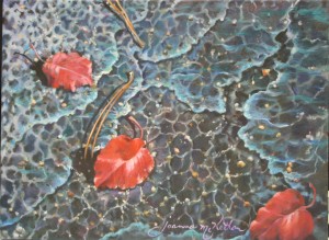
When fall comes, its beauty seems always measured by leaves turning to lustrous shades of red to herald in that season. My early primary family went on fall vacations to the mountains, in particular, Mt. Pilot of Andy Griffin fame, where my father grew up. Our eyes feasted on the view of leaves ever more glorious the higher we climbed. I collect leaves. Even now I have batches of leaves at my studio, waiting for the still life muse to prompt me to leap, set them up and create a new painting. Leaves have occupied some ten or more of my paintings in both oil and watercolor. Two of my red leaf paintings are in Cary, NC. I doodle leaves, as well.

At Christmas, the memory of my father-in-law’s greenhouse filled with rows on rows of red poinsettias he grew to sell fill the season with an aura of his generosity and his permanence. This was one of those things he always did, regular as rain. At some point he would tell us each to come pick one or two out for our Christmas decorations, a major part of our Christmas, his gift to each of us. Red poinsettias just are Christmas, along with all the other red Christmas decorations.

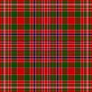
Really, I never realized until I started writing this article how many seasons use red. Add to the aforementioned: one bright red valentine in February. Not getting any shiny red hearts hurts the Charlie Brown’s among us. untitledThen there is the red of heritage. My McAlester strain is characterized by a bright red tartan.

Recently I read an article that claimed sales on red lipstick rose to new heights in a down-turned economy. An odd claim at first, it makes absolute sense. If a woman doesn’t have much to spend to make herself look good, then she buys what gives the most pizzazz for the penny. Red will certainly do that: just thinking about buying red lipstick at the drug store makes my hope surge. Just the other day as I bought the makeup I had forgotten to take with me on my trip to my granddaughter’s, I saw a shade of red lipstick I couldn’t resist. That reminded me of the time I taught Sunday School at a church in Massachusetts, my pastor called me in to ask me not to wear a shade ‘quite so red’ for my internship from divinity school.

Then there is the red carpet treatment one gets as a special favor, such as the runway for celebrities. Maybe I should do more paintings in red. The color certainly seems to sell them. One of my favorites was of red poinsettias floating in deep blue, “Herald,” which was juried into the Durham Arts Council’s annual exhibit by a D.C. major juror, a curator for the Phillips Collection. It sold in Harnett County. One red leaf painting  hangs in Cary and another in the complex of buildings that is SAS Institute, Cary, NC, one of the largest privately owned businesses in the U.S. I believe the elephant-sized painting of bubbles that hangs in the insurance building in Raleigh sports a lot of reds. Three Red Leaves, IMG_8625Just for fun, I’ll include samples of sold and unsold paintings with red in them.

One of my students who branched out to take a weekend course in Raleigh was told that in her beach scenes, one should never paint a walker wearing any red apparel. Tell that to some of the greats in museums, right? I suppose the taboo of today shows you ‘know’ what and who the current trendsetters are. Telling most artists not to paint something red is more than likely, however, just to make them see redder. Which reminds me of another way of seeing red–Spanish bullfighters waving the red scarf in front of the bull to make him charge. It definitely inflames the eye!

There’s a little bit of red in my most recent commissioned portrait, in the plaid of the little boy’s shirt. I changed his sweatshirt top to the plaid shirt in other pictures, and it ‘made’ the picture, my client said. Along with capturing his essence, which is what his mother claimed the painting did. In another article we’ll examine all the different red paints, which ones are reliable, and which ones we are told to avoid. Right now, I need to rest my eyes on a little gray.


Learn more »
No Comment

PAINT WITH AN UNFAIR ADVANTAGE

Imprimatura, or Underpainting

Some painters never discover the explosive goodness of an imprimatura. They resist laying down a color opposite to the one they see. That runs counter to logic, evokes fear, speaks of time wastage. It messes with their sense of what is right. If you can’t see it, logic argues, why do it? What good is something you can’t see? Fair question, faulty answer. Because by taking this extra painting step, they would give themselves a leg up over all other artists.

408 - CopyBy not doing so, they delete a step in the painting process which so enhances a painting, it receives an unfair advantage over any similar painting. Let’s explore the question of what good an underlayer provides. Hmmm: What value does a skeleton add?  What does the third deeper layer of skin provide? The third layer of insulated glass? For the first, it provides the form to shape the flesh hung upon it. For the second, levels to prevent burns from reaching vital organs. For glass, the doubled cost keeps out ultra-violet rays which damage fiber and fade color. It also provides the painting with a skeleton, a third layer of skin, and protects against light damage, and more.

Let’s define imprimatura. The National Gallery of Art defines imprimatura as a thin, translucent layer of color applied to the ground (the ground is the board, canvas, paper or skirt painted onto) before beginning the actual painting. The imprimatura reduces the absorbency of the ground. What does that mean? Simply spoken, it means that all that luscious color you apply to the canvas, wood, paper, or wall will not sink down into the fabric, lost, a condition referred to as ‘sunken color.’ Instead, it will happily stay up near the top on the surface to shine in all its glory.

The word ‘imprimatura’ is Italian, meaning ‘first paint layer.’ Before dabbing the canvas with the first drop of paint, a thin, transparent layer of paint known as imprimatura, is applied on the entire canvas. Usually it is done in neutral olive or earthen shades derived from raw sienna. Imprimatura helps reduce the radiant bright light on the canvas and allows the final coats to exude their true colors.

Sometimes, the National Gallery says, it is used as a middle tone for the painting itself. Another way to put that in current terms is, an imprimatura gets rid of all the white. White is confusing to the eye, and the eye needs not to be confused. Any white that returns to the canvas is then, and should be, one hundred percent intentional.

In Old Masters training, I was taught that there should not be any more than three highlights (whitest whites, or brightest brights) in any given painting. That insures a better result to any painting right away. Historically, the imprimatura is a glaze coat intended to rid the canvas of white–one sees the drawing underneath, and proceeds by blocking in thin layers of paint once the imprimatura is dry.

Even when some painting has begun, it is important to bring the progress forward slowly, painting on firstglazes, then a reasonably thick layer of paint in middle versions of the differences you see. You needn’t paint entirely flatly in this stage of roughing in the large color shapes. You help your craft by approximating what you see without slavishly breaking out the small 3-hair brushes for intense detail, as with adding highlights to the hair.  As the painting dries, you slowly and deliberately decrease your brush and stroke size, not over correcting at this point. Continue the progression of the professional process as you have laid it out, following techniques that the Old Masters have used for centuries.

This primer paint, the imprimatura, is mixed with half Liquin ™ (the masters used turpentine oil) and half turpentine. This makes contrasts between bright & dark, while preparing the canvas for further layers of paint. When applying imprimatura, it is important to know the final color scheme in advance. The base shade is then chosen for the desired color and brightness effects.

Typically, using the opposite, or complementary color to the final color, will yield pleasing results, but trial and experimentation are key to discovery. Work fast and all at once. This is no time to fuss for detail, as The mix will likely become tacky when it is laid onto canvas surfaces. Before it has turned sticky is the time to stop. When the initial layer is done in the shade of gray instead of olive, it is known as Grisaille. I Personally do both a grisaille (first) and an imprimatura over it (second).

The key purpose of imprimatura is to seal with a priming layer so that the ground becomes nonabsorbent and radiates its colors instead of sucking them up, while also providing a quality visual unity.  Imprimaturas are used in indirect paintings where the sketch and first painting are allowed to dry for further work to be done. At times, one could proceed in the opposite fashion, making  a primary draft of the desired picture on canvas and an imprimatura coat applied over it. This safely seals the sketch as a foundational layer, while the artist prepares to paint over it (my preference).

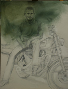
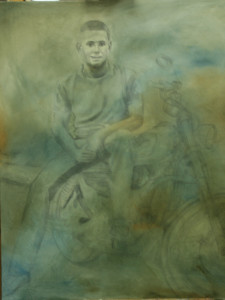
When I have worked on commission and allowed the client to see the initial stages, the imprimatura stage has confused them. I say, “it isn’t painted,” and they say, but there is green all over your canvas. How can you say it isn’t painted? Then they begin with the directions. ‘Make the rose petal whiter, take out the brown. Make it more pastel, balance with the same length on the right.’ To think of an imprimatura, think of the concept of what a photographic negative is to a photo print. The colors are opposite to what you see. This is what lends the painting depth.Using an imprimatura actually causes the colors to multiply. The painter does not have to work so laboriously to accomplish slight variations in shades; they happen naturally with succeeding layers of paint, because the paint is not entirely opaque that tops it.Thomas High Drawing with Imprimatura

While in no way a final product, customers have loved the swimmy effect of the imprimatura and wanted to buy it just that way. Not using one, in my opinion, lessens the professional quality of the finished product. Succeeding glazes build up the color gradually, from underneath.  Goya, I was told, used red as an underpainting for his faces. The Dutch masters used the olive or earth green.

Either is good, but the effects are dramatically different. The process cannot be rushed. The stages of  painting are all necessary if you want the professional product I am committed to, which I produce each time, and struggle to convince my students of their necessity.  All of my own portraits always begin with an imprimatura and a grisaille. On the portrait page, in the stationary shots, I am actually working on an imprimatura glazed over a grisaille. The other two portraits were painted using an imprimatura and grisaille, as well. 014, Thomas for Twyford

In this portrait, I did not use the grisaille, only the imprimatura.

When you begin with an imprimatura, what is unseen gives you the clear advantage.

Learn more »
No Comment

Back to Top