Writing in Wilmington–Work Vaycay 2017

Highlights of a Writer’s Retreat

Today I was thinking about my three week work vacation. That’s right, vacation not away from work but purposed to work.

Nothing like freedom from trivia connected to a place–sweeping, framing, entertaining salesmen unawares, dealing with computer problems, functioning as Dunn’s Welcome Center–to get to the guts, the meat, and for this A-D-D child, to keep the thread going. A novel of 400 pages, let’s face it, requires some concentration.

And the distractions in Hilton Homewood Suites were the kind of distractions which built me up–the occasional morning poolside beside palm trees, close to refreshments, under umbrellas, the ride to Wrightsville Beach for a seafood supper, mostly oysters, sitting by yatchetts (lol) and feasting on seaside beauty. All of that only eased me into a grueling schedule of writing, hard editing, and final spots of intensive research. The hotel was generous in their help with their business center printouts and outlets, connections, and even, printer.

Because this time, although I took painting supplies with me, and even a French easel for plein air painting which I fully intended to pursue, and a beret just because–I didn’t. Go figure. My internal editor and the One to whom I trust my steps functioned beautifully, totally in sync.

Oh, and did I mention free breakfasts and 4 nights a week suppers?

My husband even came to help me edit the book. Folks, you can’t imagine the benefits of an interpreter/translator’s editing and the precision of his words. We are not talking elementary rough exchange of words in a language, here, but fine-tuned, way-beyond-thesaurus moments of expertise. Not to mention his gift of geography and history. I appreciated his dogging my tracks immensely. He grounds my fantasy in real roads and streets, many of which we actually traveled in Scotland. Stone of Her Destiny milks that wonderful trip we made to Scotland a few years back, staying in castles, taking falconing lessons, and happening into Campbell and McAllister history and territory that figures into the novel’s structure and fabric.

We just went through all those slides again–for my husband, for the first time. I think I may have neglected seeing all 6,000 as well, but now I am quite stoked and prepared with wonderful exemplars of the Gothic experience that is Stone of Her Destiny, my soon to be forthcoming novel.

I’ve discovered an awesome new editing technique which enhances and builds upon having done 3 edits already. Going over the novel with a reader/editor, discussing by paragraph what is needed. My friend Sandra Mowery is excellent at this; we covered a lot of ground. She helped me ramp up action on celebratory events, menus, and clothes. Wendy McLeod challenges my love scenes. And Sandy, word choice, history, and geography. Well, they say it takes a village. I would be so missing a great opportunity not to use available friends, oops, I mean resources.

And the very last night we were there, July 4, we worked the whole holiday on it until 9p.m., doing some poolside and some in the front lobby to ease the pain of working while others played. And as providence would have it went up on the elevator to fourth floor with a man who held it for us to climb in.

I looked at him and said, “You look like the English TV actor.”

He looked at me and replied, “Well, that’s because I am!” It took me a second to realize he really was Charlie Shaughnessy in our brief convo, but when I did, said, “Well, you have to give me your autograph!”

“Don’t you have a camera? Just take a picture!” he replied. So there we are in the photograph, I am standing with the man who played “Mr. Sheffield” in one of my all-time favorite sit-coms, The Nanny.

He told us, I think I remember correctly, he was on location working on a film. To which I responded I was working on a book. “Fiction?” he asked, actually waiting for me to respond, and so for the first time in my life after having been taught it over and over by RWA and their wonderful writing conferences, I delivered my perfect elevator pitch. “Yes, Gothic romance–with a little Armageddon 7 thrown in.”

We said goodnight. I imagined he looked interested, an interpretation I’ll hang onto fiercely.

Learn more »
No Comment

FRESH, FUN ART @ ART ON BROAD ATELIER

Art on Broad

Announces the opening of a new service, and a new partner for that service! The launch event will take place on Tuesday, July 11, 2017 from 6-8p.m. Guests may arrive at 5:45p.m. and are invited to bring their own refreshments. Class begins promptly @ 6:00p.m.

j’Originals’ Art Studio welcomes Heather Miles Byrd, a fun-loving public school art teacher for 15 years, veteran teacher of 4 years at Merlot & VanGogh, a division of Wine and Design in the Triad. She and Joanna McKethan, owner of j’Originals, who has taught studio art for 36 years in Dunn without a break are excited to offer Tuesday evening acrylic painting classes at their shared business, Downtown Cork n Palette located at 217 East Broad in Dunn!

Heather began her art career in the art department and production work for the film commission with the state of North Carolina. She has done theatre and scenic work for Community productions in Winston-Salem. She received her Bachelor of Science, Appalachian State University, and her art education from UNC-Greensboro.

Joanna’s training in art was at Queens University in Charlotte, UNC-Chapel Hill, and additionally she received 4 years’ Old Masters training in oil and watercolor in Germany.

With their combined teaching experience, they will offer a wide range of themes to paint as well as changing up with a variety of colors and surfaces. They are hoping to meet fun-loving participants who are eager to give the arts a go! Bring your friends for a great night of music, painting, and revelry.

Class fills up at 15 students, and will be an ongoing Tuesday night class at this location.

Cork n Palette On-the-Go features special events like birthday parties at other locations on other nights that can be set up, as well.

Any questions, call the studio or shoot us an email.

Learn more »
No Comment

Art Student Treasures

My art students are like family.

When they fall short on maximizing their art potential, I get so sad, I can’t believe it. Sometimes I have whole families of students come in. I race the clock, trying to pour in as much as I can to each individual, seeking to pull out as much as I can while I have them. I always believe they’ll stay with me the ten years of many of my art disciples (Old Masters’ painting is a master-disciple system based on loyal imparting of pertinent skills). However, sometimes they just don’t see it my way and I am ineffective in imparting my vision to them for themselves. Sometimes, they just have another vision.

Sometimes I Cry
When a student I have primed and prepped to really make it begins a portrait, and leaves before I can show them how to paint the face, the agony is palpable. I show my disappointment or come close to showing my hurt beyond what is socially acceptable. Maybe there’s even a little bit of anger that what I hoped and dreamed for a finish we will never see.

Painting is a living thing. You can’t just toss aside a painting one day, pick it up 5 years later, and expect a viable image to emerge. It might, but more than likely you will have grown past it or in some way find yourself unable to patch the time frames together. Or the paint will have aged beyond good adhesion. So I have to yield, give up, and have a good cry.
 * When a student fails to finish the face after working on it for months. I can’t fathom it, you know, when only a few lessons would do it. Why won’t people pay for the little extra stretch the professional is waiting to give? To me, it seems like false economy.

*  When a mom leaves her son’s sketch book in my studio and I save it for years, and she finally tells me to throw it away. It’s unbelievable that discarding it causes me more pain than the mom!

* When a student quits before a final lesson would complete her absolute masterpiece, and won’t even pick it up from my studio.

* When parents and grandparents won’t pick up their daughter’s framed, beautiful art work to hang at home. I still have one. It makes me cry, since her sweet grandmother wanted so badly for her to study art with me. Now she has died, her hope, with her.

My Failings as Teacher
  •  I regret the days I am sad, preoccupied, or so tired I can barely move–even when it motivates the student to push harder.
  •  When I am so into the art medium’s struggles that I fail to hear some current struggle, major or minor, that the student is going through.
  • When so much is going on I fail to mention their prom night pictures, which were awesome.
  • Making students struggle on his or her own. I know so many teachers cut it up finer and finer to make the bites smaller and more appetizing, and somehow, instead, I try to get them to fight their medium and push and pull it beyond their current capabilities without much demonstration and with just a little help, by prodding and a well-placed idea. Sometimes the student finds this unforgivable. Once, telling a student to go to the bathroom to study her eye in the mirror hurt her feelings so badly I lost her.
  • Not going to all of the extra things my students are interested in. Some weeks it is all I can do to make it through my own paintings, framing, struggles, roof leaks, some sort of showing, texting, posting students’ art pictures to Facebook.
  • Talking to future student possibilities or makeups at 10p.m. at night.
Surprised into Joy: Other times this art teacher is surprised and delighted with unexpected pleasures like the following:hands-in-marriage-stuart
  • an old student walking in just because they knew and loved me, just wanting to catch up and remember old times.
  • A 10-year student bringing his two children to art years later for a year.
  • A former student returning for adult lessons, wanting to really go far, knowing he and the teacher left a lot on the table.
  • Amazing conversations with people on the deepest of levels, at vulnerable moments when they want a meeting of souls.
  • A granddaughter picking up her father’s discarded art talent and loving doing it with me.
  • A daughter painting a funky painting on her own and hanging it in her house.
  • Someone pinpointing in your paintings what you hadn’t even seen yourself.
  • Turning a student’s tragedy into a raging success. I don’t think Thorne Gregory would mind my telling his story of working on a beautiful rendering of a fish from an educational coloring book. He had almost finished his free-hand version in pen and ink, when the pen nib (the medium is always a pain), hit a bump in the paper and ejected a filled pen’s worth of black ink onto the paper.
Poor Thorne; I thought he would have a nervous breakdown. It was all I could do to keep him from tearing his work up. It was all I could do to calm him down. He was devastated and despairing. His mamma came quickly. She helped calm him. I had no idea what I would do, so I asked him to wait until the following week.
Meanwhile, I did research. I looked up exotic, deep-sea fishes on the web. Finally, I found the impossible, the unthinkable: the existence of a creature called an ink fish! The ink fish’s quills looked just like the spikes in the projectiles of Thorne’s black ink. So we painted the first fish’s shadow companion, the Ink Fish, which went on to win a show prize, it was so good, better, even, than the original!
My Number One Goal is to turn good art students into master art students. Step One being to sign them up today. And then to find a way to write, draw, or paint a happy ending.
Learn more »
No Comment

Everything’s Coming up Portraits

Ahh, well. Today we’re gonna talk about something big: the Portrait Society of America. You see, I just came back from my 10th year at the event.

I’ve been looking at others’ pictures of features offered there, and I have to ask. Were you at the same conference? I’m beginning to conclude this annual is not just one event, but multiple conferences rolled into one. The unifying code was the featured honoree, Richard Schmid, so that’s definitely where I was, in the right place. It’s just that in every corner of the Atlanta

Hyatt at Buckhead on the lower level, something else was going on which could be a whole conference. There were little groups painting a model–oh, that’s besides the huge Thursday evening Bake-Off, excuse me, I mean Face-Off, with at least 4 models and fifteen or more painters of some renown. We lifetime portrait painters, gallery owners, and occasional newcomers to the scene got to walk around in circles the whole evening watching how they all progressed. Or sit in one space and watch only one.

That event insures we’ll make it to the conference early.

Those paintings are then sold at silent auction. At the 6 x 9 auction-of-another-kind on Friday evening, the price remained the same, the identity of the painter was hidden, the mystery was how quickly you could pick the number off of one of many boards containing maybe 25 of these, and actually get the painting. I buy one every year, but this year, I didn’t go. Here’s the reason: I was so bombed out with the mega sessions in the big auditorium with big art celebrities and those teaching from apostolic ‘schools’ of those great teachers, I just had to collapse before enjoying the evening session with artists demonstrating. (Later, I found out I could have gone into another room and had a whole other experience.) Actually, I already knew that from Gordon I met in the great lounge of the Onyx’s legère restaurant and bar.  He was a scheduled model for a session.

The kick-off address with Jeffrey Hein was phenomenal. His theme was color, and several neighbors I sat next to in the huge auditorium and I agreed, just one of his revelations/our discoveries more than paid for the price of the tuition there. Transforming–and he had pictorial aides to proves his theses, which spoke volumes. One slide I caught, but one I should have taken a picture of, but the camera just didn’t happen to be in my hand for the few seconds the slide showed.

I had an amazing lunch with two other artists and discovered near the end that that was the time critiques were being given to portfolios, so I headed off to that with my cellphone and my ipad. The pad wouldn’t dance with the hotel’s wi-fi, so I switched to my cell phone, while waiting for whichever person was next available to critique. What a divine appointment, I actually got the lady I’d talked with earlier in friendly terms down front, and had instantly loved her because she appreciated my slightly wack humor. Well, wouldn’t you know it, the same principle Jeffrey Hein pointed out was the one place (in my dark’s) that she kept referring to: the same principle. And another area where my overly fix-it mode had made strokes in the hair too same-same. It was at the end of the whole critique session, so I got laid-back treatment which helped me more than I can say. I can even remember it without having written it down (although I did, of course.)

I always look forward to Mary Whyte’s presentation. I loved the watercolor session in which she painted on stage from the model in the picture. I follow her on line, as well. Seeing the sketchbook of Edward Raymond Kinstler on big screen is also incredible visual stimulation, and I enjoyed his stories of painting the greats like Kathryn Hepburn and Tony Bennett.

The break-out sessions were phenomenal. I participated in the one led by Kate Stone and Tony Pro. (Why couldn’t my name have been Joanna Success?) We had three nude models to choose from, or follow the teachers around and watch them work, or whatever. I came away with four new pencil drawings this year, two from this session and two from the on-stage demonstrations. You couldn’t tear me away from them. I took exactly the right tools, ones you can maneuver in a tight auditorium space with the three hands I’ve always got going. I never even spilled my coffee this time. The other was a forum of the portrait painters who sell at mega prices and travel all over the world doing so, who were kind enough to display and tell their secrets on the equipment they carry with them and pack into their plane, to the contracts they use, to what portrait painting conventions to use and what never to use. Information overload is what I love–and I devoured this like a cannibal fresh meat.

I don’t know when I dipped into the superior products arena and quickly bought some more brushes from one of the vendors–I had fully intended to talk to George O’Hanlon, owner of Rublev paints and buy the chromium yellow they’d just been talking about on Facebook, but alas, I didn’t get to go back. Too much to do. Too many faces to observe. Too many seminars at which to dance. Please understand, for an INTP Introverted-Intuitive-Thinking-Perceiver, Myers Brigs), there is never “too much or too many.” They do, however, give out at too much extroversion and show touchy-feely strain early. Please, you must forgive them for that; it’s how they were made.

Then there is the International winners’ exhibit in a separate space which you can visit as many times as you would like during the conference, but in which you get to have happy hour and speak to the painters on a Friday evening. Truly phenomenal, these paintings, ranging from huge to one mini this year from Anna that I absolutely adored (as well as her). We had to wait until the Emmy’s on Saturday night to know just which place they had won, and which received people’s choice. Don’t laugh at my calling it the Emmy’s; we listened to the Curator of Atlanta’s High Museum who spoke to us with an invigorating message on Brave Spaces and honored Richard Schmid who has made it to the top of the art and portrait arena. Worldwide, folks. As to the winning portraits, the styles ranged from moody to crisp, high-focused realism to diffuse, but the winners won out over 2000+ entries and deserved all the applause they were given, plus more.

Before my second break-out session, I got to talk with Virgil Elliott of Traditional Oil Painting fame. He didn’t come on his motorcycle this year, but flew in from California. Well, I got my own private session with him–an opportunity of a lifetime. He was not presenting this year, only signing his books. Which is another area you could spend a conference on, although I didn’t see as many doing that this year as in former years. I got to ask Virgil in-depth questions that you can pursue in person like you can’t on Facebook before others needed his audience and I needed to go to my break-out. I loved the session I was signed up for, but somehow, I didn’t want another demonstration, so I moved one door down, paused at the forum talking to a Raleigh compatriot, Luana Lucona Winner, and snuck into it, uninvited. I found out later there were several of us who had. Edward Jonas of the teaching faculty was on the panel; Ed is always so accessible and kind.

We connected with Virgil again at the end of the conference. Four of us went by hotel car to Marta, rode Marta to the airport, and got to talk in-between. I didn’t envy Virgil having to carry his guitar, but I see by Facebook this morning that he made it back. (Hey, Virgil!)

It was good to see that the young disciples of Richard Schmid’s  lifetime accomplishments–each going in their direction–are making a second wave of younger teachers and keeping the organization revitalized. They were winning prizes and leading seminars and the inspirational hour…all wonderful, perhaps a changing of the guards.

At the end on Sunday, we got to listen to John Howard Sanden tell his fascinating stories of painting Bush’s portrait and going to the White House unveiling, and of his eight full-blown attempts to get just the right moment. Sanden is famous for his paintings and books, one of Billy Graham I have seen at The Cove, just outside Asheville. Of painting the richest women in the world. He confessed that his life work had been only 350 portraits as compared to some in our midst’s 600 already. He, like many other artists there, had been a teacher at The Artist’s League, and instrumental in turning the small class format for learning portraiture around a model and a painter into the auditorium format which turned into the: you guessed it….the Portrait Society of America (see their materials for real facts and answers to your burning questions). Several of us deemed this year’s conference of some 800 folks different. Mysteriously wonderful.

What a historical moment of intersections this was. How delighted to be a portrait painter I was when I woke up this morning. I think I am in one of the most important arenas of the world, that of portrait painting. See you next year in D.C.

Learn more »
No Comment

Demonstrating Watercolor in Southern Pines

Two Paintings Hang in the Watercolor Society of North Carolina’s Central Region Show “Fluidity of Vision”

This past weekend stretched me during an already busy season.

Two of my watercolors hang along with 67 others at the exhibit  at Campbell House Gallery through the Arts Council of Moore County. Plus, I got to demonstrate my watercolor skill on the following day, Saturday, April 8, from 10 am until 4 pm, during the 2017 Southern Pines Home and Garden Tour.

The show included members from the Central Region Exhibit, on view April 7 to April 28, 2017, “Fluidity of Vision.” Our works hang in Campbell House Galleries in Southern Pines, NC. “We are working with the Arts Council of Moore County to deliver a terrific exhibit of our art in this impressive locale. Campbell House is a much-sought-after venue for art exhibits. Surrounded by a lovely, 14-acre public park and garden, the Campbell House is a stately manor which functions daily as an art gallery and cultural center. Art exhibits change monthly and the gallery offers you an elegant and warm atmosphere that will add to any special occasion,” said Beth Bale, who is the Central Region co-director of the Society.

Two of my large Sea-Escape series hang prominently in the exhibit, Crab-Net and Clam Chow-Down.  We met our friends Carole and David Hobson there for the reception and exhibit viewing. We roamed the rooms, examined all the paintings, sipped beverages and hoes-d’oevres. We met new people who complimented me on my paintings, even recognizing them by name.

We followed our friends out to eat afterwards in Southern Pines, and then, on to their home, their new house in Pinehurst in which hangs three of my paintings –one over the mantel, the other two in David’s study. The next morning over toasted English muffins and cream cheese and coffee, we talked again, and they led us out to a safe connect back to the Campbell House.

“The Campbell House is traditionally first stop on the tour and there should be a lot of people coming through the gallery. In addition to the art exhibit, we thought it would be nice to have members of the WSNC (Watercolor Society of North Carolina) in the gallery or on the property, sort of like a plein air event,” said Chris Dunn, executive director of the Arts Council of Moore County. So yours truly became one of the three exhibiting artists for that Saturday.

When we arrived around 10a.m., the grounds were already sealed off, and we had to drive through the field saved for cars to the closest entrance. I went in with my new French easel, which unfolded and popped into place immediately. I congratulated myself on having brought that. Kathryn McCrae had showed me the day before the place I could spread out. Chris Dunn greeted me, pointing me to doughnuts and coffee, just what every plein-air artist needs.

I had brought two unfinished paintings with me. Each one was a portrait of a shell. I had brought photographs of sea scenes with similar colors to inspire my expression of a background, and the bright sun that flowed in definitely affected my choice of colors, which were very bright and vibrant in the first painting. I reasoned that I would not have to struggle with my main subject and prove I could paint. The seashell said enough to give me the confidence to create the rest in front of people since this was my first public demonstration. Many people came and watched, gave compliments, chatted about the picture and themselves, and signed my sheet for future contact.

Remembering several conversations, one was with a woman who worked in a correctional institute, and we agreed it was nice to appreciate each other’s expertise. I got to share my notion that people who are creatives who do not have an outlet can really get into trouble.

Another lady, a math teacher in Sanford, kept staring and walking around the painting, looking at it in new angles. “It reminds me of math,” she said. “How so?” I asked her, but she stayed busy looking. “I guess it does have a rhythm to it,” I answered. “Yes, and it reminds me of that mathematical sequence.” I agreed, and remembered the sequence which some artists actually use in placing the subjects in their compositions. I thought of Juliette Aristides and Virgil Elliott who had written about this in their authoritative art books.

She thought and thought and finally exclaimed, “Yes, it’s the golden mean. And the series is the Fibonacci series.” So naturally, “Golden Mean” had to be the title for my seashell.

We laughed. “The colors are exciting.”

Another person admired the red, and said it could be the blood of the dying sea life in the shell.

I finished that background and started on my next with more subdued colors. The lights had begun to fall and shadows descend in the garden. I did not finish that one’s background, but got it up to about mid-zone under the shell. However, back in the studio, I set it up with my camera, deciding I would talk about it as I painted it to get in practice for my teaching videos. Wouldn’t you know? I finished it in record time, and made a breakthrough with techniques I can use in painting sea atmospherically, in that time. I have just named the work, “Castle Forsaken.” It looks so regal. The colors are soft and subdued, and the waves are breaking over it.

Yours truly also got her name written down on the exhibition calendar for a two-person exhibit…in October of 2019! That is a total loop, a circling around. The Campbell House held a one-person show for me years back. I guess you could say the events were a real success. You can find all those pictures at Instagram, so check them out  The new paintings will be up soon on paintings.joriginals.net/

Learn more »
No Comment

NOSTALGIA SERIES LAUNCHED IN WATERCOLOR:

“Delayed Return”

Living in the South has distinct advantages. Language is one, with its soft, genteel brushing of the ear, or its amusing to the Northern ear craziness that can be rough or fine. Beautiful surrounds is another, as our Northern friends prove by relocating. Raleigh has an astounding number of new residents daily. Friendly and personal are still a plus, and hometown business contact, proverbial, still exists.

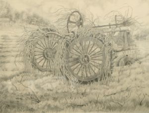
Another advantage is actively living with our decay. The famed tobacco barns from another culture, another day, are all but disappearing from our landscapes. I took dozens of pictures of our barn before we had to dismantle it on liability grounds. One drawing I did of an old John Deere tractor in a field is all that is left of the real thing. A strip mall in the outskirts of Fuquay-Varina exists there, now, but my drawing, “Reclaimed,” shows it with the Southeastern greenery, briars and vines, growing up through its wheels, seat, and steering wheel. I went every day for a couple of weeks and sat in my car finishing my piece in graphite black and white. So I guess the series began way back when I did that picture.

That tractor may be gone. But not all the country roads that lead up to such scenes have been lost or paved. And country roads will again do what the John Denver song reminds you they will do; they will take you home.

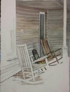
On my last photographic road trip–that’s one where you get to stop and photograph whatever you see, whenever you see it–I drove into a community that looked like a scene from “Left Behind.” The rocking chairs were set up on the porch still, the curtains hung in the windows, the folding chair made temporary sitting pleasure for a grandchild or a visitor, and the spray bottles of some household activity were still sitting in place like someone had just momentarily gone inside. This painting I’ve entitled, “Come Back Soon,” because it is so deeply inviting.

The front porch Southern mystique has faded somewhat, although two ice cream shops have grown up around Coats and Angier that have that front porch charm, and restaurants like Ron’s Barn promote the feel. We just ate ice cream with friends there the other night, sat a spell, and talked with them and the owner of the business who even on Saturday, had been working all that day. We take our grandchild there and to the other that’s become world famous in Angier (or almost, with umpteen homemade flavors).

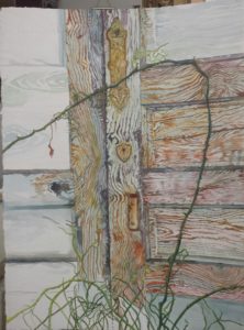
The first of the series of the paintings is already finished, ready to enter into a show, “Grooves.”   This was a stunning building, boasting fine locks and hardware that had been left to baste in the sun and rust in the rain, impregnating the curing grain of the wood with reddish browns and the briars and greenery shooting up green tones into the wood. The famous paint crackle shows up beautifully, and the panels in the doors say it was once a fine house. Why such a lovely house would be left to ruin is a question which begs for a story, and I will investigate that one day. Now, however, it was enough to save its artistry with some photographs and paintings of what the artist sees when she looks at these moments, and enters the once private quarters to merge now and then.

Another picture is a close up of the windows, the soul of a house. Another shows a rake leaned up on the house as if the owner went inside for a meal and some sweet iced tea and somehow, just forgot to come back outside.

Another shows the gate into the garden. Yet another shows the slow dismantling of a fine structure over time and benign neglect.

I’ve avoided the clichés that came to mind first, like Come on Back, Now, Ya Hear? and Sit Down and Rest a Spell. I don’t mind the caricature, but somehow it’s a shield against all that poignant warmth and the pain of loss these pictures represent. I want you to go with me and dip into a simpler time and feel where children played outside, got dirty, knew nature, responded to the dinner bell, and the art of calls and whistles and hollering rang out across fields to other people. I wanted you to smell biscuits baking, fried chicken popping, hear the singing, take part in Catch the handkerchief, Who’s afraid of the big, bad wolf, and Red Rover, Red Rover, let Mary come over. It’s the back porch communion with aging parents and grandparents who made sorghum and homemade ice cream, and love so strongly.

My beloved South. The long walks in the woods, the grove, building play homes in tree roots with moss and acorns, roaming in and out our outbuildings–the old kitchen, the smokehouse, the barns. I wanted to draw you in to what was significant in my world for so long, and just a setting like these pictures has the power to conjure back a past so poignant with memories it leaves me crying, still. The aging process itself carries with it a poignant beauty, as well.

Learn more »
No Comment

BRUSHES AN ARTIST LIVES FOR

Some painters bore me to tears with their talk of products. This is no reflection on them, you understand. It simply means it’s hard enough for me to focus on my paintings, the colors, the color mixes, temperature, chroma, ohmigosh–and really, ideas, symbols of my own, composition, magic, aura, and a few other semi-important things.

Not to say that materials are not important; I would not insult my materials mentors/gurus in such a way. I need them too much to do the work for me that drives me batty. Even when I draw what seem to be iron-clad, irresistible, case-closed conclusions out of the principles they give, I sometimes miss. Usually, that’s because there’s a missing product that my logic did not consider, hidden in the mix. For that reason, I’m gong to explore a fairly simple product, one that doesn’t chemically change a hundred times in the space of putting it on my palette, mixing it, adding turpentine or mineral spirits or 101 other additives, getting it on the canvas, and allowing it to gently (we hope) age. Inside, not outside.

What in the world? I hope you are asking.

My new paint brushes, that’s what! Both the watercolor, water-media ones and the made-for-oil brushes are among the best I have ever used. I ‘afforded’ them when my favorite art supply retailer went out of business. Basically, this is overview, since I am including both the watercolor media and the oil painting media within my comments.

Here is a watercolor I finished using them almost exclusively, adding the occasional slightly more candletip-shaped watercolor brush. The slight more control helped me complete the linear look of this textured house while broadening the stroke into wet, wider shapes without a change of brush.

Which brand it it? you ask, dying to know by now.

“Grey MattersTM” by Jack Richeson. First of all, the color of the brushes is outstanding. The color whispers quality, class. That first impression doesn’t let you down, either, among this cluster of mostly long-handled brushes. The shaft is easy to hold, its texture a soft matte which doesn’t peel off like some of the lacquered brushes. The bristles are thick, sensitive to nuance, and yet, not floppy, like some very good brushes I have and have used in watercolor. This makes for easy, wet control, not dry, single-hair control: what I call THE difference in expert watercolors and simply nice ones.

As a European classical watercolorist, I have tended to buy no flats, as they control watercolor flow way too much. I use them now primarily for edges, sliding the straight edge along a straight passage to get a single stroke edge with wet watercolor. In this brand, however, I bought filberts, flats, rounds, shaders–every conceivable shape, simply because I could. I have to say the RichesonTM flats and filberts do not over-control watercolor flow. Nor does medium damage or alter the brush hairs when working in oils. Simply put, in opposing media usage, they hold their shape equally well. They allow for nuanced strokes and color additions. The natural-looking bristles are grey-brown, as well, and simply put, the best synthetic I have ever put to paper or canvas.

You probably got it–I am buggy over these brushes. Thanks, Jack Richeson GreyMattersTM.

This is an oil painting of mine in progress. I feel the canvas and first paint layer literally glows in welcome to the strokes from these brushes.

I am about to buy some of their Quiller Synthetic Watercolor brushes, too. Their ad copy says what I have been saying about their other line: ‘truly advanced synthetic brushes.’  It seems they are designed by a renowned water media painter, Steve Quiller. “Years ago, synthetic brushes were not much more than chopped up fishing line bundled up and stuck on the end of a handle. They were horrible for the user, especially for the young student who often received this budget-priced creation.” Yes, I agree.

Richeson discovered a way to taper fiber strands so each strand comes to a fine point. He selects 11 different weights of fiber strands, creatively mixing them into “a marvelous brush head.” Mixing weights makes the difference in getting the snap back you need, a solution to the floppy, sloppy brush, as I call it.

Here’s one happy painter. Some days your choices get you singing someone else’s praises. And that’s snap back for you, too. Check out the finished product: http://paintings.joriginals.net/product/grooves/

Learn more »
No Comment

HOBSON’S COLLECT ANOTHER ‘McKETHAN’: “Earthweave”

Painting Added to Collection at Hobson Private Home

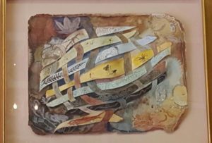
“Earthweave” is the title of one of my most experimental paintings in watercolor. The painting, framed in a gold-gilded shadowbox frame, could be called a watercolor weaving, since individual strips of watercolor paper were painted and woven in and out of a stationary piece of 300# Arches watercolor paper, also painted.

David and Carole, former classmates of mine, kept looking at the painting before deciding they had to have it. David helped get it down from the second story portion of my gallery/atelier. Now it hangs in David’s study in his new home in Pinehurst. Although a color match was not a primary concern, the effect was striking.

“I study it every day,” David said.

At the time the idea came to me I was fascinated with what fossils showed up in different earth layers. As a watercolorist, I loved painting with ‘earth’ colors, known in the trade as sedimenting colors–as opposed to the clearer, more transparent ones which leave no bits of pigment. Pigment that sediments approximates the earthy layers of ground I wanted to depict. Encased within these layers were all kinds of fossils, skeletons, flora and fauna.

These were painted to look dimensional which gave the shadowbox the overall effect of an aquarium. The work was one a colleague and friend of mine called “cutting edge” in a Henley Southeastern Spectrum juried watercolor show we both had paintings in in Winston-Salem some years back.

Over the years, “Earthweave” has remained viewers’ most popular pick when they visit j’Originals’, appealing equally to realists and abstract lovers. It just never found where it belonged until now.

Anybody who knows me knows I love research. This painting caused me to explore earth science in a new way. How exciting it was, then, in the last little while to have two friends and collectors–separately before they were married, and together–afterwards, decide they were fascinated by the painting and want to place it in their new home.

For my work, I used 300-lb Arches watercolor paper, a thick, multi-ply surface which I then tore the edges of to show the depth of the paper, and rubbed color into those edges to give the overall page shape interest. Organic, like the subject. I then thought of the warp and woof of a weaving’s cross pieces, a craft that fascinated me. I let each strand signify a different layer of earth. Each earth layer took the color that earth layer tended toward, whether blue, red, brown, or amber. Each strand, aka layer, contained the fossils and skeletons that would be contained in that layer. The finished work was an overwhelming hit. Everyone loved it. I nearly sold it several times. An ob/gynecologist from Fayetteville loved it so much he wanted me to paint a similar one, but in oils, on a light polyester canvas that could be turned into a motorized screen that would pull it down to hide the 70″ television, or roll up to hide for viewing programs. For him, I picked fossils indigenous to his home country, Costa Rica. Trompe l’oeil, a popular art term which means ‘fool the eye,’ it looked three-dimensional, but was not. David’s and Carole’s work is actually three-dimensional.

Fossils in furniture, coffee tables and counter tops turned quite popular, and to me was an artistry all its own. Although my research was extensive into earth science for both paintings for me, I only scraped the surface, to make a pun. However, the results are wide-ranged and expansive, rather than laser pin-pointed. In short, there are many layers in many different locales, and I am not knowledgeable enough to speak authoritative conclusions of how many there are, and the implications of evolution. So since there seem to be any numbers of earth layers, others are shown in the ground watercolor page, the colors on it continuing beyond those begun on the woven strands, around the surface of the painting.

There is, for instance, burial of nautiloids in a widespread limestone deposit at the Grand Canyon that formed rapidly, while other layers formed more slowly.

My chosen colors were amber/gold (middle), light blue, lime green, phthalo, green aqua, charcoal, pinkish-brownish: sandstone, light-colored like in the Grand Canyon’s bathtub ring. Fossils that can be found in this layer are brachiopods, coral, mollusks, sea lilies, worms and fish teeth. In the Tonto Platform, the color is a deep, rust-colored red. Fossils to be found in this layer consist of ferns, conifers and other plants, as well as some fossilized tracks of reptiles and amphibians. The Supai Formation displays a range of color from red for shale to tan for sandstone caps. Numerous fossils of amphibians, reptiles and terrestrial plants exist in the eastern portion which are replaced by marine fossils.

There is Redwall Limestone in the Grand Canyon, and behind the reddish face, the rock is a dark brownish color. Numerous marine fossils can be found in the Redwall Limestone including brachiopods, clams, snails, corals, fish and trilobites. In the layer called Bright Angel Shale, which averages about 530 million years old is primarily of mudstone shale, intermixed with small sections of sandstone and sandy limestone. The retreat of the Canyon rim is attributed primarily to the erosion of this layer which forms the top of the Tonto Platform, wider in the eastern portions of the Canyon where the Bright Angel Shale contains less sand and is more easily eroded. The color of this layer varies with its composition, but it is mostly various shades of green with some grey, brown and tan thrown in here and there. Fossils found in this layer are marine animals, trilobites and brachiopods.

The layer of Tapeats Sandstone is approximately 545 million years old, composed of medium-grained and coarse-grained sandstone. Ripple marks formed by ocean waves of an early Cambrian sea are common in the upper layer. The Tapeats is similar to the Redwall in that it forms a barrier between upper and lower reaches of the Canyon that can only be traversed where a fault has caused its collapse. The color of this layer is dark brown and it contains fossils of trilobites. brachiopods, and trilobite trails.

The Bass Formation layer of about 1,250 million years old, made up primarily of limestone with shale is grayish, its fossil record consists of stromatolites. Vishnu Schist and Zoroaster Granite layer is 1,700 to 2,000 million years old and consists of mica schist, containing sediments of sandstone, limestone and shale that were metamorphosed and combined with metamorphosed lava flows to form the schist. This layer along with the Zoroaster Granite were once the roots of an ancient mountain range that could have been as high as today’s Rocky Mountains. The mountains were eroded away over a long period of time and new sediments were they deposited over them by advancing and retreating seas. The color of this layer is dark grey or black.

Fossils gathered from shales of the Stephen Formation are in two strata, the lower quarry Raymond’s quarry. The dark blue indicates deep ocean basins, while light blue denotes shallow seas. Rocks found in blue strata belong to the Devonian Period.

This comprises only a fraction of the overwhelming information on earth’s layers.

It took two attempts for “Earthweave” to come to life, because the size of the strip must slip through the slit made in the paper at the right points without gaping open, as when too wide a slit is made for a wide passage. The heavy paper must then be affixed to the mat backing of the shadowbox. The box is between 4 and 5 inches deep. It was not easy working the woofs into the solid, stationery sheet.

That the owners of this work are fascinated with the story of its creation, as with the painting itself, and that they like paintings that are intellectually stimulating, is gratifying. I’m looking forward to visiting Carole and David in Pinehurst, and seeing my ‘baby’ in their new home.

Learn more »
No Comment

JOURNAL TO 8 HEALTHY, CREATIVE RESULTS


How much does creativity depend on our well-being?

Many of us acknowledge a creative bent. We are committed to creativity. But how much, and would we benefit from more?

Investing in personal creativity is a process of discovery. We can augment our senses by daily journaling. In 8 specific ways, I have learned the art of keeping a journal from actions taken after reading Julia Cameron’s The Artist’s Way. You can probably find the book on Amazon. I have written daily in my journal for two-digit years, now. What this exciting practice does is nurture the inner being in content and quality of spirit and soul. Writing in a daily journal deposits differences in one’s life. It makes you a more creative, productive artist.

1.By increasing our commitment to the inner person, we lose fragmentation. We start with signing a contract with ourselves that increases our commitment to ourselves. We respond by toughing out writing three journal pages every morning, in helter-skelter, error-filled, random mutterings before we leave our nest. My best moment is first thing in the morning when my husband brings me a cup of coffee where I sit on a nice couch and between sips of strong brew, I pen stream of consciousness outpourings without correcting. I resist the urge to make an essay, or in any way to perfect what emerges. Sometimes I make random lists. I use a black gel pen from a dollar store that has good ink-flow. In this manner as the weeks have flown, I have worked my way to big decisions, surprising revelations, and the germs of literary products. If you are like me and are “here, there, and everywhere,” this integrates your person into continuity, enough to surprise the talkative extrovert.

2.Valuing yourself and your thoughts. We owe ourselves the luxury and time of processing what happens to us. We need to take time out to understand things–who said, the unexamined life is not worth living? Other people do not exist for that purpose. While they may listen to us occasionally, it’s a serious time drain, which works up to a relationship drain. Therefore, talk to yourself. Ruminate. Writing fixes the unfocused mind in a way that verbal, spoken interchange does not. If you let others in too far, their thoughts will supplant yours, and you may never know what you would have thought. Value your thinking space. One good morning processing is a dip into the well, equals a smoother, more creative day.

3.Writing things down brings an internal order. Internal order is also a by-product of consistent journal writing. Most artists–writers or visual–do not think in linear fashion. We leap to conclusions. Chronology links things together, even if in a written exercise. While you can use your page time for making grocery lists, you must do it in as organic and informal a way as possible. Then recall will occur as a natural outcome to your day. Uncanny, really, how this works. Artists are not easily ordered externally. It is not rebelliousness, as some like to think. Such people cannot enforce order on themselves from outside; it must come from within.

4.Journaling decreases second-guessing and waffling. Creatives are not always good decision makers. Your writing nest is the best place to try out alternatives. Write what comes to your heart each day. Verbalize why you feel one way, why you tend to the other. Insights will begin to seep in, tell you why you can’t decide, why others think you are doomed to continual flipping. Eventually, what is really bothering will come to the fore. It might be some choice you don’t want to have to make between two good things. Being mathematically inclined, one day I began figuring out just how much time—driving, teaching, preparing, marketing, I was doing to teach in a town 40 minutes away. When I arrived at the grand total figure in terms of months in a year, I stopped writing and got vocal. I don’t want to spend that kind of time on it! Within 2 weeks, I quit, and brought my whole business closer into my home town. In the same way I figured how much time staying in the beautiful building I loved and that looked so much like the art gallery of my dream vision cost me in meetings with the landlord, swarming of termites, interviewing pest control, rushing to take my paintings out of the beautiful rain forest windows—and as I wrote and added sums of time lost–suddenly, the answer was clear. Two weeks, and I was free.

5.Fertile ideas come in the mornings. Poems and paintings are not just an intellectual process that have to be drummed up and designed. One doesn’t sit down and start doing them, or rarely. Many times my heart would pour itself into words heavy with pathos, a treasured memory or some lilting spun lyrical phrase. Even articles began in the twilight of my sitting couch. The ideas came spontaneously, but needed work. So I do the seed work in private, dark, intimate time on the couch. By the end of the three pages, the idea can stand the light of day in a cold, clacking re-write.

6.Insights that approach the intensity of revelations come as bonuses. This happens in the write time, or any time, so it’s always good to have a small notebook to catch these dew drops. Struggling through words in the morning brings new connections like clustering does, where one word leads to another, to puns, to things out of context. This is the wellspring of all—visual or mental—that takes you new places. New thoughts, revelation, connections newly forged—this is the magic of discovery. Childlike fun is at the heart of creativity.

7.By delving into yourself you go outside yourself in a sort of abandonment. In accepting yourself, you escape rejection. Confidence leads to being carefree, making wiser decisions. Even your doodling becomes the beginning of good work. My whole gel pen series began as a part of playful doodling. “Grand opening” is the 24 x 24 inch painting shown here.

8.A sense of continuity and uniqueness emerge. Artists with deep-seated issues don’t arrive here easily, but in a growing awareness that comes when composition books pile up, when you realize some disasters have been averted, and you have produced exemplars of which you are proud. You have actually become your own best friend, a reasonable assurance against self sabotage.

Read Julia Cameron’s book, The Artist’s Way, for more, because this is my takeaway of eight bonuses journaling has brought to me as an artist. Validation, authority, and assurance come from committed journaling, and lead a string of other friends by the hand. Happy writing, painting, and healing.

See the rest of the gel pens in paintings.joriginals.net/


Learn more »
No Comment

PAINTING FACES, FIGURES, FROM PHOTOGRAPHS

To Do or Not to Do, That is the Question

Every painter knows there are pros and cons to painting from a photograph, especially when painting a face or figure. Most master painters know beginners do not do so well, working from a photograph. Most know that the only way beginners get a good start is from a photograph. It’s the typical Catch 22 problem to solve when launching out into portrait painting.

With this in mind, I am writing this article: (1) to outline the opportunities one has in painting from a photograph or live model, the times one can choose, (2) to specify the times it is best to work from a model, (3) specify the times best to use photographic reference, (4) to list the obvious, as in times one can only work from a photograph, and (5) to point out photographic errors one should ignore and revisit. This will not be all-inclusive, I’ll tell you from the get-go. This will be an introductory pass at a a very deep subject. To be very fair, I must say that the masters prefer to err on the side of painting from life. This viewpoint is that of the Portrait Society of America with which I have been associated 8 years or more, including attending their annual conference.

This is the viewpoint of masters with whom I have contact, as well, such as Virgil Elliott, a master portraitist I met at the PSoA conference, who is a guru of oil painting and author of the textbook on completing portraiture entitled Traditional Painting, Advanced Techniques and Concepts from the Renaissance to the Present. Attach link to: www.goodreads.com/book/show/595646.Traditional_Oil_Painting.

1.Opportunities: Shall I get a live model, or use a wonderful photograph?

By far the best opportunities for working from a live model are in workshops where at least one day offers painting from a sitting model. These courses are usually week-longer’s and are very pricey. If you have chance and money, go for it once a year. Once you are home from the experience, write up everything you have learned. Teaching can be actively mined for decades afterwards, but it must be actively recalled and used to qualify.

Take your sketchbook with you everywhere you go. It helps to have a reputation as an artist to give you the nerve to whip out a sketchbook, but go ahead, and it will work both ways. Sketching will build your abilities and your reputation as an artist.
In portrait conferences like the Portrait Society of America’s annual which I have attended 7 or 8 times, topnotch models are hired for a multiplicity of the sessions, of which I take every single possible advantage, even the paint-out session at the beginning which has 6 to 8 models to choose from or change up and do quick sketches. You’re already paying, so get your money’s worth.

Harass your family when they are sitting or sleeping or doing any minimal activity that keeps them relatively still for a half hour or more by whipping out your sketch book and sketching them.

When no one presents themselves to your studio or your near presence, pull out a photograph, preferably one of your own, and go at it. You don’t have to have your $2-grand easel set up for this; one piece of hardboard will lean on anything and you can tape the photo to it. Have your sketch bag ready and filled up with pencil sets and watercolor tin.

2. Times Best to Work from a Model.
When you are doing a portrait, it is always advisable to invite the model in. I do this for startup sessions, at mid-point, and at the conclusion of the work. If the personage is retired or available for longer stints of time, by all means, set them up for 3-hour sessions. When you want a quick portrait, and you are working outside, pull in any willing body and start sketching with brush and paint. Always, if you can manage that, it is the preference.

3. and 4.Times to Pull Out the Old Photo.
* When the subject is dead (set up manikins to supplement).
* When the subject lives on another continent.
* When the subject lives too far away for frequent side trips.
* When the subject is a baby.
* When the subject is a wiggly child, especially a 2-year-old.
* When the subject always scowls and you have one photo with a pleasant look.
* When the subject is a nervous dog.
* When the subject is a racing horse.
* When you like. However, just know that it will only be as good as the amount of expertise you have under your best.

5.Photographic no-no’s, or what to avoid when using a photograph.

Using someone else’s photo without permission, unless you sign their name with a slash and your name on a non-commercial basis.

Using someone else’s photo even with permission in a juried art exhibit. The composition must be your own.

First,and most obvious in the list of what to avoid might be transcribing, or point-by-point transference of a photograph with a grid, like so many artists are taught to do. They always look fake and wooden to me. Unless the artist is already good at three-dimensional drawing, in which case, it could be stupendous (which means they really didn’t need it, anyhow, except as you would use a mirror or walk a distance away).

The second thing evolves out of this and would include distortions, especially those caused by foreshortening, as in when the face is nearly on top of the camera lens, or the subject is in a tree house and the foot is in your face nearly covering his whole figure, things like that. This might be a good opportunity to mention that I have a book on drawing faces in pencil. (

That leads to a third ‘no-no.’ Sometimes the most pleasant faces are smiling ones, and I have to slap myself every time to not paint a portrait with a grin in it. I know I mustn’t, but those snapshot moments just keep enticing me. I don’t have my fellow professionals’ love for lack of personality, the back of a head, the downcast look which I always suspect is because they can’t paint eyes very well. I prefer a model with a pleasant look, anywhere from a Mona Lisa smirk to a full inner smile. I have done a couple with big, toothy smiles, but then, I’ve learned how to paint teeth and want to show that off. Teeth are very telling in the likeness of a face and small differences are really big. Still, in the world of portraiture, teeth are best avoided.

Shadowing is another danger zone in photographs. Hard shadows should are the mark of a rank beginner who has not learned a shadow begins with a hard edge and slowly fades to nothing. One must really apply the Old Masters’ squint technique to gain a sense of proportion, based on knowing the 10-gradient gray scale and how to apply that to the shadows you see. Photographs flatten altogether which hardens shadows with lines which don’t exist. You must have learned how to grade a gradient shadow on round surfaces or do a cast shadow moving away from round surfaces. Shadows begin with a line and end with none, is just one for-instance. It is amazing how soft the shadow wrinkles on a 95-year old are. They are never the black lines which beginners pass off as being Old Masters when they are really New-Beginners-Without-Teachers’ looks.

Another insight I got in doing the last portrait of a no-longer-living person was in portraying flesh colors. All colors translate into grey tones. These greys are frequently translated back from a photograph into colors containing blue or green, which darken areas more than they should. Going softer and pinker in flesh tones adds to the look of a living child. Key to this might be that red copies as black.
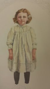
Cast shadows can also be a problem, as in just behind the subject on a wall. I find these best to avoid altogether, but if you must, do way less than you think is called for. Much more to be said, here, but–

Misinterpretation of light and shadow is the biggest of all problems, and can pop up anywhere to form an eye, a nose, or an ear incorrectly. There is no cure for this except years of formal training in how to draw the angles of the face, and how to create the correct perspective of a round object or a figure. The best reference book I have is one that shows the face from every possible angle, even up the nose. No one can memorize every possible angle of every possible figure as in a hologram. Light source is important, but tricky.

Proportional figures. There’s not much cure for this over wide acquaintance with figures. I think the cartoon book on Captain Marvel comics is one of the best self-help figure drawing books available, you just need to remember to give a real person the 5 or 6 heads and not the 8-3/4 heads that build a superhero. Photos run rampant all over figures and their proportionality, so accurate physiology is the only cure for this. Having said that, the individual anomalies must be considered. I remember arguing with a student who forgot her snapshot of her grandparents that ears didn’t exist on a cross line as low as the lips, but only to the nose. She insisted. When she brought the photo, boy was she right, and this was of course one of the very differences in the norm which achieved likeness of the pair. Yes, it was true for both of the grandparents. A good figure drawing book I have used in teaching classes is How to Draw Comics the Marvel Way by Stan Lee and John Buscema.

Odd coloring. Don’t insist on using odd colors that just happen in a photograph. For this, you really need familiarity with color, shading in color, and persistence.

Use the largest photo you can find or have made. If it is of a face, then the face should be 4 x 6 inches, approximately.

Use a photo that has lots of detailed information in it, and not one that is so faded, all the tones are light.
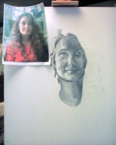
In conclusion, I need to say that you have to use a photograph as though you were a detective. You search for the truth that lies within it. Knowledge plus experience plus training. You can’t get around it, and the smartest thing is not to try, but to avail yourself of practice from life and photos, training from a good teacher, a good self-help book in addition, and time to grow. Jump in wherever you will, but if you short-change yourself in any one of these four directions, you will in some way warp the art product you want perfect.

Learn more »
No Comment

Back to Top