LADY AT CASTLE OIL PAINTING
13 - 02
2016
Heroine of My Novel Is Real-Life Model
Now this painting has story written all over it, starting with the last person who asked me about the novel I was writing and asked me, “Are you doing the cover for it?” To which I responded that I needed a professional in book covers for that. However, that’s when I was introduced to a real, live cover artist who painted the dreamiest romance covers I had ever seen. I was painting on my Lady and the Falcon, or Self-Portrait with a Falcon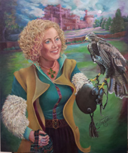 , so I decided to try my hand at making my current painting look like the cover for a book, and based on my success or not with that, I might try it. I studied my social media friend’s work and extracted some good pointers. They were not copycat observations, but they were stylistic touches which pulled the eye always toward the center.
So, I am in the middle of a sea-change. I am creating a series look, usually involving a castle or stately home. My books, being Gothic in nature, have a whole different suspense look than romances. Still, all the questions emerge, face or figure, woman or couple, closeup or far back…things the genre more or less dictates. I have had good cover artists, all of whom deal with clip-art art. They prefer it, since they are able to pick and give the twist they prefer to it. I set my sights on original cover art from the beginning, but thought I would have to get rich first. I mean I love Agatha Christie, and I devour her books, but I do not necessarily love her cover art. So I preferred it from at least three different angles–originality or custom work which no one else would see on anybody else’s book like they do the clip-art covers, the mood and ability to have an original painting connected to the book for different branding and advertising purposes, plus the excitement of staging a model and setting. I will just add to that, the excitement of pushing my vision with words as well as images.
One of my books, A Deadly Provenance, is the result of a photo shoot with a model from a photographer-artist friend who sold me her copyright. I had to override one of my cover artist’s opinions to use it, but it is my and many others absolute favorites so far. I hope that means it was a good market choice. Dark, fearful, an exotic setting–the setting itself is considered a character in Gothics, so it should be about right.
Meanwhile, my work with oils increased and one of my paintings landed in a large show, Woman Painters of the Southeast (WPSE),
Colby in the Morning
so now I had two goals to fulfill simultaneously. It had to be original as well, so I had to take pictures as well as the photographers who were helping me by setting up and showing me theirs. So now I was in to choosing the model, helping set up the scene, choosing the setting, and finally, making sure the pose, composition, and model were all mine. So the painting for my novel and forthcoming book, Stone of Her Destiny, has been proceeding for quite some time with a beautiful Scottish redhead who I almost rejected the first time through due to the prevailing model look not being in line with my expectations for a Scottish lass.
Combining her with a castle appropriate to the story from my photographs from our trip to Scotland was the next order of the day. Giving her my ancestry was another. Then I added layer after layer of oil paints to drench the colors, recede the time of day to sunset, incorporate the Stone of Destiny, Scotland and earlier Ireland’s coronation stone, another. Expanding the Paul Green amphitheater in Chapel Hill to a full blown castle and grounds setting was another. Then came the colors, ramped up and running gold plus orange.
The day of the photo shoot was wonderful and started with a trip to the drugstore for fake eyelashes, full hair salon visit to make the model’s hair very curly, and try-on of several dresses from the wardrobe of the photographer who does this sort of thing all the time for her art photography. We finally agreed on a beautiful teal green dress with wonderful blue undercurrents that set off her red hair picture book fashion. I thought I would re-work the dress, but it’s simplicity actually added to the beauty, and the accidental split in the dress gave rise to the provocative bit of underpants showing. I love it because it is not deliberately provocative, but just an unguarded moment, a look which to me is classier than the all-out front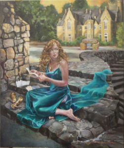 al attack.
I loved doing the jewelry and working up to just enough accent to complete the impression. It’s so easy to ruin a face by just a little too much, so I have had to add slowly. I have shared it in stages and been told how much people loved the expression on her face.
All of these changes to the composite picture are both realistic and atmospheric, lending a whole different look and feel in the almost finished work from the absolutely dazzling covers my mentor produces, a result which pleases me even more. This way, the end result is a piece of artwork peculiar to me, indicative of my style of realism, one I want and have some degree of say-so in, one which I am hoping anchors the story in the readers’ minds.
Kenna’s Castle: Cover of Stone of Her Destiny Coming Soon
Leave A Reply
You must be logged in to post a comment.