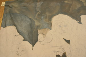
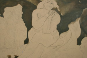
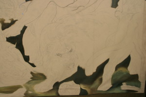
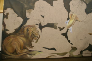
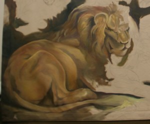
Phase 9 – Daniel Sees the Light of Day

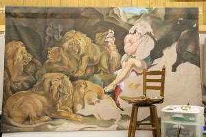
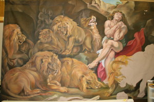
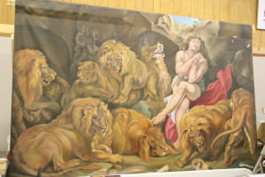
In the final stages comes the verisimilitude, or the reality, of a large scale painting. Heck, in the final stages comes me being overjoyed. It’s been forever. It’s been a year and a half of agony—my own struggles, others critiques—a year and a half of scrutiny and revision and staring at the same painting. I’m ready for Daniel to be finished. Now it really looks like a major painting. Now it begins to work as a whole. Now people look at it to appraise it. But the artist, who has labored in love for the whole of it, is feeling the pull of the painting itself wanting to be finished.

I suppose it’s a little like letting the characters in your book write your story for you. The heroine has been thwarted in her goals the whole time, the end is in sight, and she wants the golden ring.

In the painting, each lion wants his own destiny. The den has been opened, and Daniel wants to get out like never before. He’s grateful to God for the very air he breathes and he doesn’t yell at the king who had him thrown in there, however kind his words were, I hope your God can save you. He knows he now has a future.

It is at this point, with only a few areas left to pull together that I am compelled forward beyond my physical tiredness and fight with the elements to bring out Daniel’s hair, the lift in his forehead, the shrubs at the top, the greenery and branches of the trees and shrubs that are almost above my reach. My bum shoulder is being stretched to its maximum capacity, and right there at the last, it was literally screaming at me, not wanting to function.
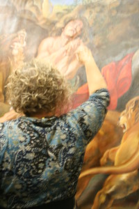
IMG_3235I can’t tell you how many times I thought the painting was finished before it was, or that “only one little stroke” wouldn’t take any time. Towards the end when my client was also getting antsy and wanting the work he’d paid major bucks for, we thought it was ready. Three men had moved it in and set it up. We thought it would take three to move it up to the front of my studio. However, instead, I tore down my studio to slide Daniel up front and into place right in front of my big show windows where the Southern sun shines in and lights Daniel up. I pulled down 6 foot tables and we moved furniture, and just my husband and I slid the whole 5’ x 8’ x 8’ easel, with Daniel attached, up and in place. An epic battle had ended. But those niggling little details—so many yet to be done.
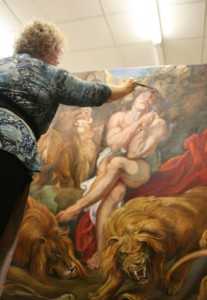
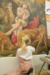
IMG_3233You can see from here the depth already in the figures. Shadows have been enhanced by multiple layers of glazes, the snarling lion’s teeth have been sharpened and darkened. The wrinkles in the snarling lion’s face have been smoothed once again, the whiskers quickly scumbled over the face as they emerge from the black freckle which starts it. A hotter red has been added to strengthen the robe’s impact. I am fiddling at this point with the finest detail, the separations in the fingers, adjustment of the fingernails, highlights in Daniel’s hair, in short, the part that most artists want to begin with and want to see first.

In this position on the ladder, miserable, every time a rock seems flat in the upper right, I add a facet. The slightest shadow I find missing on Daniel’s face, I add.
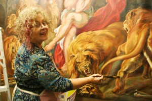
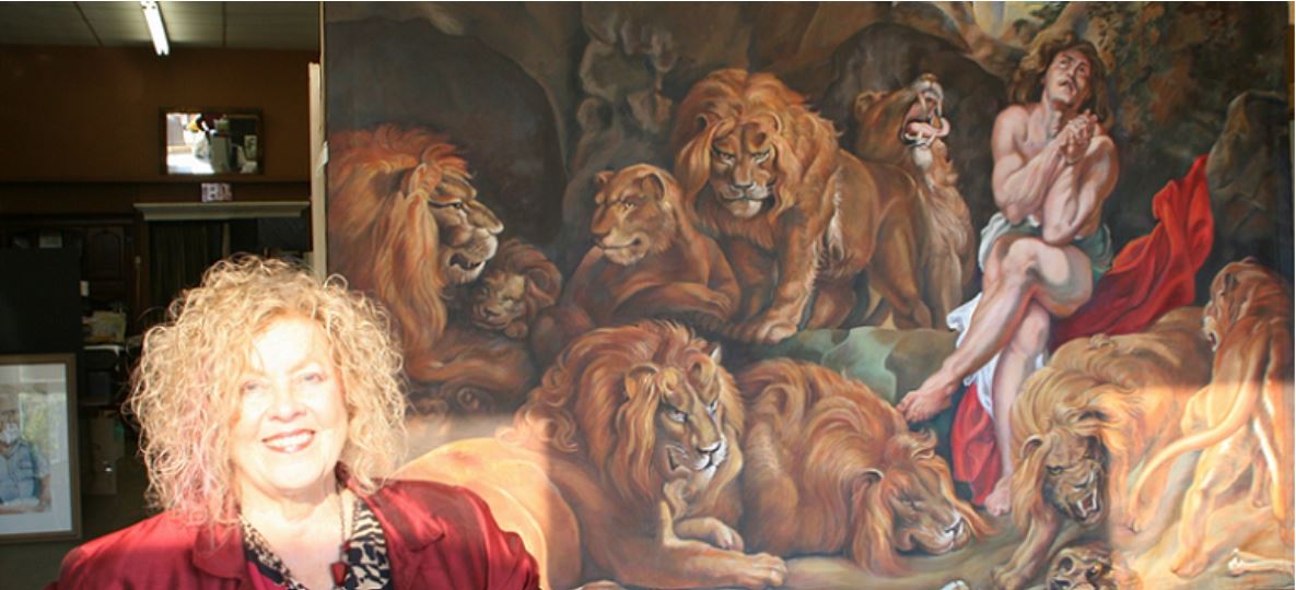
IMG_3231But up front here in my studio the painting which has stayed in the back the whole year and a half is bathed with golden light and truly comes alive. At this point, Daniel’s story is illustrated once again, an epic battle that began with petty jealousy over Daniel’s success, that took him through the legal decree that anyone who worshipped a God other than the king should be killed, but who won the love and the favor of the king who hated what he had done himself to Daniel—and who, when God had been able to save Daniel, declared that everyone should served Daniel’s God. Well, wow. That’s a story worth pulling out of the 1600’s and illustrating again. An old story made new.
Next: Phase 10

Learn more »
No Comment

Phase 4 – Fast Forward Using Photographs

Fortunately, I learned how to develop stories from tidbits of information when I worked overseas as a writer, using the information I obtained from interviews with certain people to write feature stories about someone they met in an important trip they took.

This skill is very similar to the skill obtained by intense study of photographs for extracting information that is useful in making a dimensional view of a subject. I do not use the term “copying photographs,” because it hints at an inexpert slavishness. I do not recommend painting from photographs to my beginning painters, either. Oh, all right, if you are a self-declared hobbyist who wants a one-time likeness, go ahead. However, my emphasis is on, rather than training copyists, training ‘informationists.’

Fortunately, I had all of that background including training in Old Masters’ figure drawing and painting in Europe. The Master Painter, Herr Bergheim, who taught in his studio in Munich specialized in developing awareness of common flaws in perspectives of facial and figure anatomy and three-dimensionality.

drawing 001 positiveFigure of Woman w Musical Instrument 001 Positive

For a committed painter who aims higher on the spectrum, you want to learn figure drawing. You want to have had multiple courses of drawing from a model, 10-second poses, 30-second poses, 1-3 minutes, 5-10-15, etc. You want to understand the human body as an s-bend and not a straight stick. You want to know how the arms hang in apposition to the hips when standing. You want to know, on a face, why the lines are there, why the eyebrow dips further down on a 3-quarter pose—because it bends around a corner—as in, the head is a rounded square. You want to know dark side/light side on a head.

Then, and only then, can I turn you loose on a photograph.

Daniel in the Lions’ Den hangs in D.C., and daily visits are way too expensive. The photographs I took of Daniel were integral to the process, and the main reason I took the trip. They were my ‘takeaway’ from the experience. Let me share the progress of one view.

IMG_9710 partial of museum painting

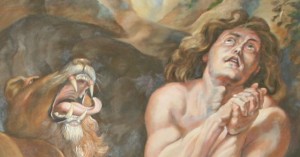
Here is one of the smaller portraits photographed from the whole. This lion took multiple revisions, but a revision merely pushes and pulls on the painting you have begun. They are close. No huge erasures are necessary, just pushing and pulling.


1175134_595792013806191_1972117313_n[2]

I began by blocking in colors which I immediately began tweaking.


1378769_606341199417939_456327840_n[2] - Copy

As the painting developed, the lion’s head rounded, the eye became distinct, the chin hair thickened, the teeth moved slightly. Differences in coloring were due somewhat to glazes added, but are also due to differences in photography.


IMG_2971 (2)

In this version, behind the lion’s tongue was deepened, teeth grayed down, roof of the mouth corrected, mouth opening decreased, and hair layers built up. Daniel’s face and hair were corrected to the original. The cave opening was not lightened; that caught the light of the flash.


IMG_9721


IMG_2971 (3)


IMG_9726


541886_10151867873104694_1243631060_n[1]


This is from a photograph of my final version, with the added notation of the original painter, Peter Paul Rubens and the one who followed his original with my own original of his…moi.


Back to my thread in the article, to the knowledge of anatomy: This knowledge leads me to the correction of what photographs and students mis-saw in Daniel’s anatomy for a period of months. In fact, I was the one who had the ‘aha’ moment and showed them. They then saw what the original drawing was rather than the illusionary distortion we had all accepted that made us think Peter Paul had gotten it all wrong.

This was due to the painting of light next to light, light stomach next to light arm, an abutment thereby fusing the two sections in the mind’s eye. So a conjoined bloated body and a malformed arm were, with only minor changes, corrected in contour line as well as in subtle color, which performed the separating operation and perceptibly altered the original misconception.

Similar distortions appeared in Daniel’s hands and feet which leant a grotesque nature to them. Continued staring, concentration on the original photograph, meshing this knowledge with the knowledge of correct anatomy as seen by posing living models in these positions helped work out these kinks.

Squinting is another Old Masters’ technique for achieving proportion and color contrast. It creates the relative lights and darks which cause high level accuracy in transferring a painting, as does walking backwards ten feet to view your work at frequent intervals. Colors are rarely absolute, but rather are proportional to one another.

After determining that the lines and masses from left to right were primarily safe to follow, I began to change the drawing from top to bottom, as the extending had occurred primarily in the front center involving the snoozing lion, the snarling lion, and the retreating lion. This allowed me to re-position the bones as well.

So in segments, using the photographed mini-portraits within the big portrait, the work moved forward—each lion individually, Daniel, the drape, the right rock, the bottom strip, and the top opening which went through several corrective phases.

Proportional corrections were most profound in the feet of the standing lion due to another illusion created by the protruding toes of one lion lining up with the receding toes of another. Another problem solved by the use of photographs was finding Lion Number 10, the sleeping lion on the left, at all.

In conclusion, I can only say that photographs provide a well of information to be mined.

Next: Phase 5

Learn more »
No Comment

Phase 8 – Use Any Color and Glaze to Correct

My Granddaughter Visits

This was a fun and playful phase. Most of my lions were at least in there, all settled, even if they had not been thoroughly developed. Two in particular lay there rather latently and I knew I would have to deal with them sooner or later, but I wasn’t worried about them. The colors were coming along. I know complementaries like the back of my hand and can correct any color into its total opposite, if I have to, so that was of no concern to me. Most parts of Daniel’s anatomy and the lions that had eluded me had been long since solved.

My client kept asking me, “Have you done the bones? Have you done the bones?” Well, no I hadn’t done the bones, but I had re-designed the whole drawing using the negative space function on the lower horizontal strip, so I knew they would fit. That didn’t worry me a bit. I had built up momentum and excitement.

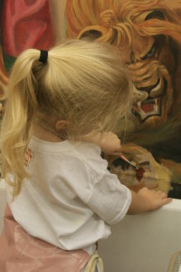
Then I learned my baby granddaughter was coming to town. Well, five-year-old granddaughters trump any commission and any scale, if you know what I mean. Fortunately for me, my granddaughter loved to paint, so I knew I’d get to come to my studio where she never tired of the things to do in it, and get some much needed stroke work done on the canvas. Any amount of work you put on in one day helps take you leaps and bounds further the next.

I started her out in the student section with watercolors, which she began painting very eagerly, while I added and corrected the forms in the bottom strip of the painting. Soon enough, she

IMG_2327finished that station and wanted to join mine. I was not surprised. I decided to turn her loose with my paints, gave her a little instruction concerning the area she was to paint in, the brush strokes, and left her to it. I didn’t have to interrupt in terror or worry over it. She was quite skillful in her handling of the brush, in brush stroking, making movements with them like a professional with her left hand.

Colby was so immersed in her project that she did not speak. You can say she went into her right brain mode of working—where, as I teach my students—you are infinitely smarter than you are when you work in the showy left side of your brain.

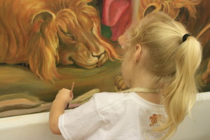
IMG_2332This drowsy lion looks as though “a little child has lead” and soothed him.

I began by mixing the colors for her and handing them to her, knowing I could paint over what she had done if it were totally rough, but to my great surprise, her undercoats were excellent, and not blending as well as a more seasoned painter would did not deter me from proceeding. It also was not a deterrent in giving the painting what it needed at this point. Soon, as I gained confidence in her painting, I began to ask Colby what color she wanted in order to paint the bones, and she responded with many of the colors of the rainbow. I responded in kind, mixed them and presented them to her. She took them from me and painted with them, gaining more and more control.

Having said that, I must hasten to add that Colby could have mixed the colors as well. At five, she knows all of her primary and secondary colors and can tell you at the drop of a hat what they are.

Colby took her post quite seriously and painted in the designated spots, making circular motion sweeps or straight ones along the length of the bones quite naturally. The colors added into the bones were perfect tinting for their grey, lending them translucency, and I let a lot of that shine through any additional layers.

IMG_2329

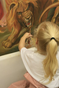
I was quite excited to see the painting moving along so nicely while still enjoying my granddaughter’s visit. At one point I looked up and saw how menacingly the snarling lion glared directly into Colby’s eyes, symbolically warning me to care and keep watch on her against the viciousness of evil in the world trying to engulf her. This is a wonderful image in the spirit of the painting to keep in mind for praying for my lovely gal. Not once did she show any fear of the image at all, a fact that increased my respect for her and her professional handling of the situation while yet so young.

IMG_2328At the end of our session, Colby looked up at me and said, “Grandma, can I be an artist when I grow up?”

“Oh, yes, you can!” I replied enthusiastically, loving that she so intensely desired this.

Nor did I say what rough times she would have. Everyone in every business has rough times. And who is more fulfilled than an artist who gets to do what they love every day of their lives?

So much for the lessons Daniel in the Lions’ Den gave us. I have the distinct feeling that not only my client would approve of the day, but that Peter Paul Rubens would peer down from a window in heaven and delight in the fact that a new artist was being birthed and encouraged over a work he had done millennia ago.

Next: Phase 9

Learn more »
No Comment

Phase 7 – First Sweep at Daniel and His Red Cloak

I remember the order of my painting, from left to right, and I had always planned to lay in most of the lions before starting Daniel, working in a circular fashion that would return to the place I began. I didn’t remember how “all at once” I had painted Daniel. You can tell we are in the first stages of the flesh tones in this photograph. As always, however—and this is integral to my techniques of painting—every layer must have the lights and darks that belong to in an average amount, and this is the system I teach all of my students without exception, because it is the only system I have found that works so well.

No covering the space with white or any solid color, as that only takes you two steps backward from creating form. This is why any step, even a mistake, is a step forward. Once you have a moderate version of a three-dimensional layer, you build on it by adding lighter colors in the light areas, and darker colors in the dark areas, further rounding an object. You can see I have left my drowsy lion to take a nap while I rough in Daniel’s right upper side and his lower left side. I brought the bar stool from home to lift me higher.

IMG_0860Somewhere about this time it became obvious that further work would require a scaffolding, so my client had a long bench-like riser made that I could set my chair up on, thus raising me to almost full height of the canvas. It’s times like this when you are glad space is tight and things are jammed together, because that prevented me from inching the chair off the far end of the scaffolding, a possibility which worried my client quite a bit, and which I am quite capable of providing.


IMG_1734You can tell I have worked further on drowsy lion in this picture, due to his stand-out golden tones. These more golden tones are not a worry at all, because succeeding glazes will tone the shadow areas. When you glaze, you always keep the end colors in mind and know what your next steps will be in achieving that goal. Meanwhile, I have also added more shading to the lounging lion, left, and corrected his foot and toe shapes. I have begun now to lay in all of the greenish-brown tones on the floor, carefully minding the highlighted areas and the shadow areas. I never lose my differences.

It is also quite obvious that Daniel has emerged quite successfully and that only the toes will be further shaped as well as glaze coats added for emphasizing shadows on the flesh. I will return to work on the hand anatomy with a model, as well, shift the green pants or drape, create more hair. I will also do at least three more revisions on the roaring lion above. I will grey down the teeth even further after a visit from a lovely Dunn dentist made sure I would not make their teeth a fake white. I had them on a 3-point scale and toned them down to a four after his visit.

You can see certain “holes” in the painting layer at top in the rock still to do, and none of the shrubbery has been put in. By the time of this photograph, the red drape has received several coats of paint in specific areas. When I say “coats,” don’t think of wall paint and painters. All succeeding layers are added in ways that do not fully cover over any work already done. They only enhance.

IMG_2364In this semi-final version you can see that the last two lions, the snarling one and the one seen from behind have been finished the most thoroughly, allowing me time to return to all the problem areas and the two small lions tucked in far left. The lion from behind was amazing; he came together faster than any of the others. In spite of that, he did receive one major butt lift, a case where the eye drug out and extended the foreshortened back at the top. Also, the feet were reworked several times, one pointed out by the client.

Two major teaching tools for the Old Master painter are using squinting and distance, and the distance is two-fold, back up by ten feet is the first, and leave some time in between, the second. As my master mentor in Munich, Bergheim taught me, the best time to catch discrepancies is first thing upon arrival after an overnight, or after an extended break. Another trick I have discovered myself is to walk past it at angles, checking it out the whole way. If an angle is off a little bit, it will seem way off and can be caught this way.

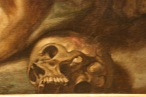
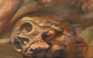
Also, the most beautiful standing lion received a hair lift and the little female to his right needed a whole 5-hour session to set her hair, shade her, and make her look as real as Peter Paul’s. At this point, I am still in love with Peter Paul Rubens, and even though I have quite some ways to go—the bones have yet to be painted, the skull must be worked on, and the lion on the far upper left must have a hairdo and shadows added, I am quite excited at the progress of the painting so far. I have corrected the color in the middle bottom lion to redder, but now it is a little too red. Anyone know what color will correct that? Why it’s complementary, green.

I leave Daniel closed in with the lions for just a little longer.


Next: Phase 8

Learn more »
No Comment

Phase 6 – Mind the Negative Spaces—and Mine, Them, as Well

Today I want to share one of my single most guiding secrets to mastering a project of this size and fulfilling my commission to paint a stunning likeness of the Daniel in the Lions’ Den that hangs in the National Gallery of Art in Washington, D.C.

That secret would rest in finding and acknowledging the negative spaces in any work. By the correctness of the negative spaces, the whole is judged. The negative spaces join the parts. I have mentioned this before, but in the middle to advanced stages, these spots are re-delineated and perfected, their virtual lengths and distances, ins and outs.

There are innumerable negative spaces in a painting, so I will go into detail in only three spots, and try to show you how mastering the relationships in negative spaces went a long way towards resolving the whole painting.

First, to bring everyone aboard—a “negative” space is the space surrounding an object and does not include the positive image of the object itself. If you think of camera negatives, you are not far off. It is these spots which give the character of the painting. No matter how much likeness you transfer onto an object, if you do not echo the spaces in between correctly, your painting will look all askew.

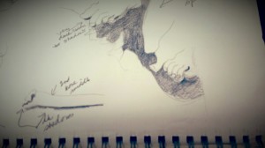
Negative Space (2), Daniel, 20131211_130156 from my sketchbook, sketch made while I was in Washington, D.C., visiting Rubens’ painting


One of the first major conjunctions and well-formed negative spaces I saw was the area surrounding the base of Daniel’s feet. I drew this section as though it were an object itself. The best part of this is that getting the negative space right sets in, in this case, the two tails of the drapes, white and red, both Daniel’s feet, the mane on the lion’s left (our right side) which nails down the drowsy lion’s position, and shows the profile of hairs in his mane.

If you are painting by object alone, you might not get them in the right relationship to one another and that alone would sound an immediate jarring note to the whole work—a mistake far greater than a slightly larger or smaller proportion of an object would give.

If you look at the actual painting I have pulled the negative space from, you can see a larger negative shape which includes the red drape, and not just the sub-negative black space, the smaller one, indicated by the drawing. The larger negative space includes the red drape, the white drape which forms a “V” and thus defines the distance between Daniel’s legs, even to the setting up of the mane hanging down by the ear of the snarling lion on the right as we face it, on his left side as viewed by us.

1175134_595792013806191_1972117313_n[1]Next to these negative spaces is another, easily seen in this same snippet of Daniel’s lower half—this space begins a long, narrow horizontal space that starts from the far left with the groggy lion on the left side, travels under his whole face and extended mane, follows the shadow, turns and follows the snarling lion’s extended foot, establishes the rise on his upper toe and bounces up and down over the bones below it. The negative space establishes: drowsy lion’s underside, end of shadow under Daniel’s grounded foot, the foot of the snarling lion, and four or five bones, showing me exactly where I needed to correct the drawing and therefore, the painting.

This is quite a windfall for an artist mapping out so many distinct details by clumping them into a negative-space image that orders their placement.

Above the snoozing or drowsy lion is another section of negative space, that formed by a wide-open “V” of the top of Daniel’s crossed foot and follows the upper mane of drowsy lion, turning and running up the leg of the standing lion, runs along his belly, down the inside of the final leg, along the ledge of the rock surface and the edge of the curled white drape, following the white drape along Daniel’s leg and down to the topside of the big toe. This area joins the lion, Daniel’s leg and bottom drape, the standing lion and captures his legs and tail and a small triangle of light, plus the whole rock inside.

I hope you are beginning to see how useful the notion of negative space is in joining objects—in my opinion, this technique is so far superior to grid work that throws in unsympathetic, opposed straight lines as to be virtually confusing, an act that would obliterate the relative simplicity of the free shape of objects joined by negative space.

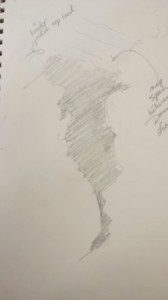
Negative Space (3), Daniel, 20131211_130341Let’s take one more drawing of mine which you can see in the same part of my painting shown in color here. This is the shape between Daniel and the roaring lion which forms another “V,” descending. This shape defines the entire right side of Daniel (seen as on our right) and the entire left side of the roaring lion seen on our left. It even takes in his teeth and his tongue. Drawing this negative shape as a positive fits all of the segments of Daniel and the roaring lion properly in place without the tedious and lengthy mistakes made by using a grid.

This is much easier on the eyes, more intuitive, and allows forgivingly for many small differences. In conclusion, this is a tool that can be mined to the full extent of the artist’s skill,  intelligence, and patience.

I’m excited, now. Let’s move on to the next phase of layering, one which begins to bring the final clarity.

Next: Phase 7

Learn more »
No Comment

Phase 5 – Peter Paul Rubens Continues My Old Masters Training

Daniel in the Lions’ Den has continued my lifelong training. Clients sometimes misunderstand your admission that you are a student and think that means you are not a professional. Believe me, the best artists never claim to have learned everything. I claim two old world mentors. Whether or not they would claim me is another issue. Artists brag about their mentors because they are so enamored with them. And we artists all have near mentors and ones from the past.

I am not talking about the Masters who personally taught me—Phillip Moose, George Shealey, Herr Bergheim, Leon Jonczyk, and Thomas Buechner—but rather the greats under whose shadow we all work and judge us purely by their body of work.

My Old Masters training in Germany was in the school of Rembrandt and the layerists. Not until just recently did I discover that one of the reasons I had such an affinity for Peter Paul Rubens when I began painting “Daniel in the Lions’ Den” was that he also was a layerist, at least for quite some time. In Peter Paul Rubens the two diverging paths of atelier expertise that have taken an upsurge in our country in the last half a century began—the à la primas (prima volte) or those who do it the first time, all at once, and those who lay carefully layer upon layer.

Such excitement I am feeling right now, as I have just discovered how painting this magnificent work of Peter Paul Rubens at the behest of my client is more that a random brick in an artist’s career. It is part of the incredible fabric of my art training that, although I believed it random, shows itself all of one piece.

IMG_9711(1)

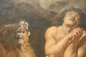
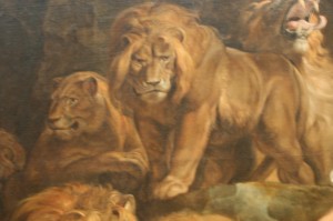
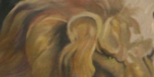
In this portion of Daniel by Peter Paul Rubens from the National Gallery, it is obvious that the hairs have been flicked up at the end of the stroke, accomplishing a lightness at the hair tips that is the result of the background shining through. This technique was taught in the Old Masters atelier, and believe me, it is not an easy one to learn.

In all the highlighted single hairs, you can see the thickness of the paint and discern these are layered on top of darker passages, giving them greater luminosity and stand out effects.

With my life committed to a mission in Germany, I found a private atelier in Munich in order to get back into my art, begun way earlier, continued in U.S. schools and universities, and resumed after a 10-year hiatus. I was longing to resume my art training. In this atelier, we learned art by learning how to copy the masters. The training was rigorous, intelligent, and artsy. To ensure good motivation, our teacher required us to do two copies. He kept the best of the two. These were artistically sensitive works that immersed the participating artists in the very best techniques of the Masters. Forget the superiority of those who disparage “copyists” in ignorance. Ignoring the discipline of knowledge transference of painting skills has lead directly to the extremes in today’s painting world where original is the sole criteria of worth.

This makes my client, in my opinion, divinely inspired. It lets me know my own life shows evidences of intelligent design. As I have a carefree, random abandon coupled with a borderline obsessive streak, it certainly was not my intelligent choice, even though I did pick similar schools of teaching when I went for training.

Who would know the extent of my training in such an art school in Germany, and who would know this 17th century painter painted in this fashion? No one would have, certainly not my client. Not even myself, until I analyzed my own work and my response to the painting, and did the research.

Who in the U.S. teaches through copying Old Masters paintings? The tradition began in Europe and the respect for it lies primarily there.

I was just reading about Rembrandt von Rijn’s double primed layers, one reddish orange overlaid by a gray, about his brown imprimatura which lends the painting a golden glow from the background forward, how he sometimes paints a thick layer, disturbs it and lets it dry, and drops another layer on it, wiping off the extra paint and leaving it in the crevices.

According to Anthony Christian of the UK, Peter Paul Rubens captured the best facial flesh tones in three of his paintings, two of his young wife, Helen. These, he said, were quick sketches. Peter Paul worked fast, and could turn out his works in a day. Others have claimed that Rembrandt and Peter Paul Rubens were arguably the best portraitists of any age.

However fast Peter Paul painted “Daniel,” I know he worked longer than a day on them. I found obvious evidences of layers in his paintings, in particular in the white hairs of the lion at the top, a white made whiter by being scumbled over a darker color and left intact. You can almost tell more by looking at this step in my own painting along the way, where the left hand lion has less distinctions yet made, and the right hand lions have more separations made by adding lighter hairs on top. Even so, there are more layers to come to accomplish the total effect of receding hairs and the topmost ones in each.

1002335_581905468528179_106879984_n[3]the artist’s in-progress painting


1098305_586382878080438_1748309898_n[1] the artist’s in-progress painting


So to hammer my experience home, or to call it out step by step, layering emerges as the only conceivable journey to a realism of the detail of a work like Daniel. There are numerous ways layering shows up:

  • in the laying on of base colors freely, setting the tone and the use of small amounts of dimension, as in the buildup of paint
  • in the usage of complementary colors to strengthen the impacting effect of the final color
  • in the use of underpainting or imprimatura to encourage bonding and adhesion of paint
  • in the use of lighter colors on top of darker, yielding a blued version of whatever the color, even yellow
  • in certain techniques such as scumbling and flicking which reveal the under layers to the discerning eye
  • in the buildup of light next to dark subtly, without caricaturish lines forming (seen in the four conjoined lions’ snippet)
  • in the dry brushing of the edges of one color passage over another (seen in the highlight on the upper leg and other highlights in the musculature)


Next: Phase 6

Learn more »
No Comment

Phase 2 – I Work with What My Client Gives Me

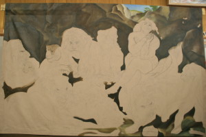
IMG_8373(1)My client begged me to paint Daniel months, no even a year, before I agreed. Frankly, I knew just how many hours I was looking at, and it took me almost that long to get my studio ready, inching the furniture over the whole 30 feet of it to provide a working space for not only a 5’ x 8’ canvas, loose hanging, but for the footprint of the homemade easel he had built, about 5’ out into the room, ca. 5’ x 8’ x 8’. That cuts a swath out of any artist’s studio.

Several attempts had been made to produce a Daniel in his classroom (not in art, but another subject) where he called me in to teach his students how to paint Daniel on burlap. Seams ran through the whole thing; the raw burlap ate up his paint. It was during that time that I groused enough about following the discoveries artists had made over the centuries for building lasting canvas art, like putting gesso on the surface—as glue for succeeding layers and assurance the chemicals in paint would not eat through the cloth and to keep the color from being leeched away—that the client adapted his model and perfected his vision.

I couldn’t talk him out of the loose hanging tapestry look, which I tried to do simply because when oil paint ages, it rigidifies, and we didn’t want it cracking and falling off a loose ground (that’s the surface). But I researched the chemical nature of classical additives through the Portrait Society of America, an awesome society to which I have belonged some years.

IMG_8374 (1) I discovered from one of the top fine art chemical specialists in the U.S. that the newer product for glazing oils maintains its elasticity over time, while linseed oil grows ever more rigid when it dries. That reassured me. I hunkered down to paint the canvas lying flat on a smooth board.

The new canvas was doubled and painted on the back, the top and bottom seamed to hang over a large rod, according to the client’s vision. Obviously, the molding showing was provisional and would be replaced later by a fine one.

Some of the initial work had been drawn in by a student,

IMG_8376 (1) who, though very talented, had not been trained in any way by a skilled artist and had only used a projector to transfer lines. The client and the student shared a common misconception that this process brings accuracy. Peter Pauls’ lines had to be repeatedly studied to bring revelation to lines drawn on by projector following. Take for instance the distortion in the shoulder to the viewer’s right which gives him a very fat and distorted lower arm. This was, in fact, a confusion of the arm with Daniel’s belly, and the subtle changes resulted in a major improvement.

In fact, lines and masses are frequently mis-drawn and mis-interpreted using this system. Without a 3-dimensional working knowledge of figures, many systems for so-called accuracy break down, so I was faced with redrawing radically. Did the drawing beneath help? Of course, almost any drawing helps, but the lines were done in a melted illustration fashion, and the difficult passages like hands, drapes, feet, eyes, obtained a warp that needed re-drawing, a process that continued well into the final phases of the painting.

I was so grateful for my training in Germany years back from a German oil painting master in figure and Old Masters’ painting. Not that no mistakes can be made even then, but major ones are certainly avoided with eye checks of various sorts, and with understanding of actual masses of flesh.

IMG_8383 (1)

To boot, the drawing actually fell off the final edge in IMG 8383, due to a common distortion of extending the figures seen to fit a knowledge base which ignores a size decrease inherent in foreshortening.

Also, the rock formations were extremely flat and painted an unsympathetic brown, but that I determined to ignore until I made headway with a lion here and there, so I squeezed out paint from my tubes and sat down to begin my work.

I discovered that the seamed double canvas, much to my delight, was easy to work on. Its decided ‘tooth’—it was almost scratchy—caught the paint. You might say it actually grabbed it. I mixed my neutral colors, the colors of your basic metallics which I excel at, and began to use my foolproof system for laying on the paint. You paint on the larger shapes beneath, and you put in a medium range of the shades and colors you are painting.

Without obsessing on detail, an artist can make great progress, exact enough to return to with lighter lights and darker darks at a future sitting. Colors need a base and depth, especially hair, and this system ensures that succeeding stages do not look ‘tacked on’ and caricaturish. This happens when you paint flat colors to begin with and prolongs the buildup unnecessarily.

Even a final color of gold is much enhanced by an underpinning of the famous Old Masters’ green which reverberates well under flesh tones. In a way those are the tones of the painting, including the lions in their golds and burnt siennas, and the the bright red drape. It sits well even under the more iridescent greys of the bones.

Next:  Phase 3

Learn more »
No Comment

Phase 3 – Bearding the Lion in His Den

IMG_9984Jumping in is always the best way to approach anything. Planning, waiting, scheming just postpones the inevitable moment of truth.

My art teacher in printmaking at Methodist University told me once when looking at my work, “you obviously have confidence.” I didn’t think so, but leaping in told her I did. Well, it takes a lot of nerve to walk into a lion’s den, home to 10 hearty lions, even if they are some five millennia removed. Let’s face it, I accepted this project willingly—I wasn’t thrown in by outsiders like Daniel.

The longest journey begins with the first step, right? And I had already had nerve enough to rough in some yellows and darker skin tones on Daniel’s leg. That decided me that I would go back to the lion.

This journey began with the right brushes, beautiful new long handles appropriately named Renaissance (it was a rebirth for me) acquired from the top class vendors at the Portrait Society of America’s annual convention the year before. I used the paints and palette supplied me by my client who still prefers to remain anonymous. I poured out the mineral spirits and the turpentine and flexed my muscles before the gi-normous canvas.

IMG_9984_(1)_1

I began with the lovely color yellow ochre, a classical Old Masters’ color, rich and muted, bright and toned at the same time. Using my own personally-derived version of the color wheel, I punched it up into the light zone and down into the shadow zone in a continuous spectrum, avoiding the little numbered piles of paint used by some of the masters for left brain insertion. My style is particularly right-brain-achieved flow, tempered by left brain analysis.

In so doing I established a range of dark to light of this one color that took it from near black to near white. In the shadow zone I tinted it in one area with alizarin crimson, something I do knowledgeably after developing the base with burnt sienna and green. Deep colors don’t have to be browns and blacks from a tube with a factory name. My skill that I pass on to my students is in using complementary colors named in a way that evoke the color in a right-brained fashion—so you see it instantaneously—rather than learning by rote memory the factory names. This comes later and is a terrific brag point for art teaching, but has nothing to do with the visual effect of color and slows the process. It’s more a matter of pride in head knowledge over experiential

I milk the range of complementaries, internalizing by trial and error what others leave on the wheel (the color wheel chart). But this is getting too abstract for most of us, so I will save that for my advanced students. Although every artist worth his salt knows the color wheel and terrific methods of color mixing, I don’t know many who lean as heavily as I do on using the complementaries entirely for mixing, without resorting to adding browns and blacks from the tube. In learned discussions of museum pieces, I have heard my colleagues state from viewing a painting by a master that “he added black.” Now I don’t know about you, but how can you tell unless you see a bluish tint on a dark color? Personally, even my darkest colors are achieved by mixing colors, but I am not giving all my secrets away in one article.

IMG_9984_(3)Strokes—this is an all important area for drawing or painting anything organic—and must always follow the contours. Painting contours—indeed, even seeing the correct circular distortion of a contour—is one of the single most defining moments of a painting. In my classes I train my students to look for the warps. These are set in in pencil, then strengthened with every stroke of the brush…even when the brush is large and you are filling in, the difference shows immediately.

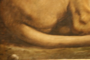
Notice how the contour of the lion’s belly defines his position and the angle of distortion is determined by the eye of the viewer. In fact, every muscle distinction that is defined by only color minus line is also painted in specific contours. Look in particular at the area of the hip just above the tail. Even the burnt siennas in the top of the belly are contoured.

At this point I lay in the color of everything in a wide range of differences done in a non-detailed manner. No fussiness at this phase, rather I am establishing a smooth undersurface for all the exciting movements of color—hair to glaze of eyes—that will come later. Yes, I differentiate the under layer of the hair from the under layer of the smooth belly to lay the groundwork for seamless additions, to achieve the look of hairs underneath, in mid-range, and sticking out, or the look of smoothed-down leather of the stomach, back and upper legs.

I am ecstatic.

At last, some color emerges, along with the total look of the lion. Believe me, this is only the beginning, but I do believe it is a good beginning, and I am raging to start the next phase, but must lay down my tools for now.

Next: Phase 4

Learn more »
No Comment

Phase 1, I Begin the Journey

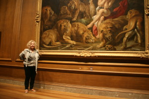
The first thing I set out to do was to visit the famous painting, Daniel in the Lions’ Den, painted by Peter Paul Rubens between 1614 and 1616. My client sent me to the National Gallery of Art in D.C. for a day to study the painting and absorb its grandeur and its nuances. The Gallery has a copyist program that they sponsor, and artists may come in and set up their easels and start to work…, so they have no objections to copying the painting as no copyright exists on the original.

However, no paintings anywhere near the size of mine are allowed on the premises.

Although the reported size of the canvas was only approximately twice the size of my 5’ x 8’ canvas, I still can’t believe that when I look at me next to the painting.

I took multiple photographs of the painting. My strategy was to overlap sizes in order to study the content in every possible part. I halved it horizontally, and thirded it vertically. Then I took photographs of each of the different lions. I studied Peter Paul’s stroke work and where the brightest lights and darkest darks fell, and wrote it all down in my sketch book. I recorded his use of color and layering, his free use of brush strokes.

The next thing I did was to use my large-sized sketch book to draw the shapes of all the significant negative areas, like the area formed at Daniel’s feet with one lion, the space under a tail, under the standing lion, on the rock ledge in between, in the dip into the cave, and more. What good would it do me to get the faces and bodies but not in the right relationship to one another?

I recorded the colors, in particular, the inordinate use of the wonderful Old Master’s green that pervaded the browns, the shades of gold and burnt sienna on the lions, where the brightest highlights in the eyes fell, how the whiskers were—well, whisked in.

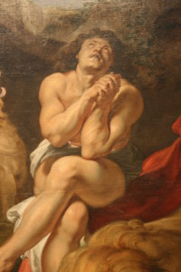
I particularly studied Daniel,

IMG_9816 the centerpiece of the Biblical story, at his moment of deliverance, when the King looked in and asked, “Daniel, was your God able to deliver you?” Even in the presence of the snarling lions, it is obvious this was not his moment of greatest fear, but was at a moment when he had a certain amount of peace and knew that the lions’ mouths were indeed shut, as the account goes. Emotion, attitude, and composition joined in this work of Rubens, and I had to study the emotional impact. I took particular note of the lighting and shadowing while I was there.
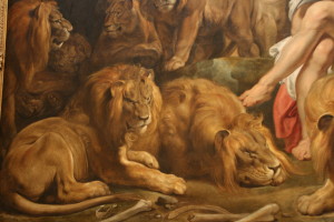
It was a long day, sitting on the low bench and studying the painting from afar. Often I would near the painting for close-ups, but of course, my telephoto lens saved the day, and even so, I was elated to find out from the very friendly staff that the museum had a site which showed Daniel in his proper coloring. They gave me the link for using later. I also bought the museum book which has the painting in it to take home with me.

Usually you can’t keep me from the other paintings in a museum, but for this trip, I allowed myself only a few forays to nearby works.

My husband played tote and carry. For this project, I had no problems focusing—at least on one painting, even though I got to jump around within the painting.

This one view alone shows how packed the composition was, and yet how deftly the spaces and the overlapping of figures was handled. My biggest hurdle once I got home would be to transfer this complex drawing to the canvas and to edit what I knew would be inaccurate lines from a film projector—although the student who used it was quite talented, if you are not taught in the three dimensional techniques of the masters as I had been in Germany, you tend to flatten out what you see and extend the figures where they should have been foreshortened.

Certainly in the extreme detail alone I had my work cut out for me. The hardest act an artist makes in the initial phases is to strip away all of the detail in his or her mind and take the figures down to their largest shapes and color. Think about it—you just can’t paint around a freckle or a hair, so it is useless to try setting that type of detail in in the beginning. However, Peter Paul gave his successors a road map in creating his wonderfully complex composition of organic shapes.

  Next: Phase 2

Learn more »
No Comment

j’ORIGINALS’ ART STUDENT TO TRAVEL ABROAD

Art Student Austin Risner Garrett

Austin Travels with Delegates of People to People Ambassador Program

            Some students have all the good fortune. Austin Risner Garrett appears to be one of those. At 15 years old, as a Sophomore at Triton High School, Austin has already been to Germany, Austria, Switzerland, Ireland, Scotland, England, Italy, Vatican City, Luxembourg, Czech Republic, France, and Canada. Now he’s getting the chance to do it all over again—well, not all of it, but at least a few of these countries, e.g., Switzerland, Austria, and France.

How did he get to travel so extensively before? That was courtesy of the U.S. military where his father, Paul Garrett, worked with and retired from the military, in particular, the Airborne. His mother Mia Garrett now works for the military base at Fort Bragg. They have lived in Nebraska, Angier, and now live in Dunn.

How did Austin win the honor of representing Harnett County in this program? Austin is one of those students who is all-round, smart at everything. However, he was pre-selected and nominated anonymously by a teacher, along with four other nominees from other areas.

He then received a flyer in the mail that encouraged him to register to attend a seminar on eligibility. Austin went to the seminar and chose the delegation he wanted to attend with from North Carolina. Austin knows of one other delegation from Charlotte. Adults pick the students they believe qualified to go on. Austin, along with four other students from other areas, was then interviewed. That very night he found out that he and the other four were accepted to participate in the program. Austin is the only one picked from the Harnett area.

Austin leaves in June, flying from Chicago to Rome and Florence in Italy, after which he will spend several days in Switzerland and France, as well. The delegation will lodge in hotel rooms except for the three days he will spend with a host family in Austria.

Not that it was all that easy. To accomplish the goal of the opportunity offered him, he applied for and won a scholarship, Austin had to write and submit a 2000-word essay. He did that and won a $500 People to People Ambassador Program Scholarship. He won an additional $1000 scholarship from the Ambassador Program by competing in trivia answering on Twitter.

He is now selling to help his family by earning spending money.

Austin is now working on finishing a full-sheet watercolor collage of five different famous buildings in various countries with the Ambassador’s emblem in the middle. His watercolor work is excellent. “Austin is a natural at watercolor painting,” Joanna McKethan, his teacher who owns in Dunn, says. He takes to it “like a duck to water. Having said that, I’ve taught him a lot as well—how to make quality strokes, how to make thin lines, how to mix colors, and move seamlessly from one color to another, to name a few skills.”

This large painting will be only Austin’s third watercolor ever completed. After it is matted and framed, it will be approximately 29” x 36”. Austin chose to do the painting for a project fair for which each delegate presents his own display of culture from other countries.  He believes his will be the only original art work there. Some have Austrian dishes, a tri-fold of information, a power point presentation., but, says Austin, “I’m entering a painting.”

The painting has vivid colors and loose washes and includes the Eiffel Tower in France, gondolas and the leaning tower of Pisa in Italy, and the Alps in Switzerland. His painting has taken three months to complete and is just one more example of his excellence. Austin is a frequent actor in plays put on by Harnett Regional Theater, as well.

What is the People to People Ambassador Program? The People to People Movement was launched in 1956 by President Dwight D. Eisenhower who firmly believed that peaceful relations between nations require mutual respect between individuals within the different countries. The People to People Ambassador Programs has served for 50 years as the “international global educational travel provider, organizing and promoting opportunities for bridging cultural and political borders through direct interaction, unparalleled access, and unique experiences.”

Today it travels to every continent on the globe and offers programs for students, educators, and professionals and boasts a legacy of White House support which includes the Bushes, Johnson, Kennedy, and Ford, and is as varied in its outreach as the individuals who offer their unique gifts.

Austin Garrett will decidedly make his own mark, and a large community that includes his parents, his school, teachers, and definitely his after school hour art teacher, Joanna McKethan, support his trip and believe he will make an excellent ambassador of peace.

Bon voyage, Austin!

Austin has returned from his trip and is finishing school at Triton in Dunn, NC.


Learn more »
No Comment

Back to Top