JOANNA MCKETHAN EXHIBITS

JOANNA MCKETHAN EXHIBITS IN
WSNC 1st SIGNATURE MEMBER SHOW
Watercolor Society of North Carolina Presents
at CCA, Kinston, in their Hampton Gallery
March 28 – June 23, 2012

In an invitational exhibit sponsored by the Watercolor Society of North Carolina for its signature members, Joanna McKethan, SW, WSNC, exhibited two watercolor paintings to hang with the organization in the Hampton Gallery of the CCA in Kinston, from March 28-June 23rd, 2012. The Kinston facility is one of the largest galleries in the state.

Celebrated as the “best of the best,” The Arts Center at 400 North Queen Street in Kinston held the WSNC’s Signature Members’ Exhibit. With its inaugural showing, the society hopes to encourage more watercolorists to join the organization to reach this level of achievement.

The WSNC has approximately 100 Signature Members, all of whom were invited to participate without restriction on the year of execution of their work. They were restricted to work done in water media only.

WSNC is a non-profit art organization whose purpose is to promote watercolor throughout the state and to elevate the standards of excellence in this medium.

A “signature member” has achieved a status which allows the awarded member to use the initials of the accrediting society after his or her name in all advertisements of their painting credentials. Signature membership status is awarded by painting organizations using differing standards to qualify members who excel in one way or another.

WSNC’s excellence guidelines are, as quoted in their brochure, “WSNC Signature Membership is merited by members who win two first through fifth place awards in two separate annual statewide WSNC exhibitions after February 1999.” Since 2002, the status may also be obtained by acceptance of an artist’s entry into three separate annual statewide WSNC exhibitions. Once an artist has begun qualification under either method, “membership in WSNC and payment of annual dues must be continuous to be eligible for and retain Signature Membership status.”

Only Signature Members are entitled to use the initials “WSNC” after their names.
Joanna McKethan, SW, WSNC, had two paintings hang in the Kinston show, the “WSNC Signature Members Exhibit.”
Her full sheet painting, “Paper Trail,” in yellows, pinks, and antique golds, is a trompe l’oeil painted like a collage of gathered letters from loved ones in the poignant past, assembled in random style. Hand-made papers bear holes in them, and other still-life memorabilia of age accompany them. The written words are only partially readable, some showing through the holes; some unhindered.

Painted versions of fallen leaves and seedpods are strewn through the old letters randomly, influenced as much by chiaroscuro as possible to render them lifelike, as though you could pick them up.
An artist friend’s tiny paper booklets were models used in painting, as well. She met this friend at the artist’s retreat at Mt. St. Francis in Indiana, for two weeks over five summers, completing works of art. Some of their working concepts overlapped, in symbols of leaf on leaf and pages from books. Mt. St. Francis no longer uses its house or artist’s center for invited artists with the arts council.

“Paper Trail” was shown in the Southern Watercolor Society’s show, the SW being a regional watercolor society in the Southeast, 18 states including Washington, D.C., of which Ms. McKethan is also a signature member.

The rivulets of color represent the passage of life, the seasons; the stamped letters are destinations reached. Ancestors who found each other who became bearers of my life, the overlapping pages indicate links in generational chains. The leaves are scarred by their journey, with ragged edges like the edges of handmade (deckled) paper. The paper with its holes and stains is folded in ways of happenstance, as when the reader, perhaps in a hurry, creased the paper to fit it into a book to save. Though it bears the marks of rough handling, it is intact, sturdy, and still pliable.

Totally transparent watercolor in a collage style is one of the recurring threads in Ms. McKethan’s work, represented in her second piece as well, “A Rose Is a Rose,” which has a photograph of her mother, and a single rose laid over that ’photograph’ which rests beside the old, stained, handwritten letters.

Created entirely with paint, the theme is melancholic and depicts the artist’s mother before she was married. Layering is a favored technique used by Ms. McKethan. A difficult art, she says, since you must leave portions of the paper free of color, all the way down to the very first washes. For vibrancy, she avoids flushing the paper with all three primary colors, since that produces a grey undertone. She leaves out blue for the light side, utilizing only gold-toned colors, while the dark side which must contain the blue (and less yellow, except for making green). This sharpens contrast when the two meet, and allows the light side to emerge much more brightly.

“People forget that grey forms immediately when you have all three colors,” she confides a teaching secret with us. “Used well, one avoids mixing mud, but used poorly, all the colors look alike or end up tired and muddy, producing an inferior watercolor.”

Particularities were disguised enough to make the pieces tell anyone’s story. Other similar works bear exact personal information. Collectors do not seem to mind possessing paintings with names outside their own families.

“In a sense my history becomes yours when you acquire the painting,” the artist says, “and the threads of history are passed on.”

”The only bad watercolors are those which are tired (overworked) and too thirsty (dry),” said my Polish watercolor teacher in Munich, Germany, who taught me classical techniques of watercolor at the outset.
And I agree with him whole-heartedly.

“Mud is just a bad brown. Mixing all three primary colors produces a neutral—either a warm or a cold neutral—brown or black, tan or grey. Show me your mud, and I can diagnose what color you need to add to pull it out of the mud-puddle and bounce it back in any color direction you want it to go. Stick with me and I’ll teach you my color system, which fool proofs you from mud.”

And then it will leave a lovely color trail on paper.

Learn more »
No Comment

How Writing a Gothic Filled in My Family Line

Stone of Her Destiny Coming Soon

Last year, 2012-13, was my first year as a member of the Daughters of the American Revolution (DAR) in the Dunn chapter which meets at Triangle Enterprise South. I came in on my grandmother’s DAR number, and one of my three Scottish lines of ancestry, due to the prompting of my husband’s cousin.

My husband’s cousin first asked me to consider DAR membership in Fayetteville.

That got the ball rolling for me, and now I look forward this fall to continuing to meet other ladies interested in their heritage. Loving your lineage is something I haven’t always appreciated, in spite of living in Averasboro, on the extension of a Civil War battleground, and in spite of descending from seven generations of Scots all the way back to the sister of the first one who entered our area arriving on the boat, The Thistle, in 1736 on the Cape Fear River. These Scots are buried just miles from me, trailing up the land I live on that was owned for seven generations, one past the original land grant.

My uncle, now deceased, was a skilled genealogist who along with another cousin researched our ancestry in Scotland beyond our borders.

My cousin has taken on the history and genealogy of the area and our family.

Grandmother used to recount who was kin to me from 2nd to 32nd cousins.

Lebanon, an antebellum plantation, figures in my current work in progress, the novel Stone of Her Destiny.

When I had the idea of writing a novel set both in Scotland and right here in the U.S.A, I began researching Scottish connections, and suddenly the excitement built, and the picture changed. Nor was it just one thing that accomplished this transformation of mind.

Historical research contributed. I discovered that the Scottish settlement that started near me was among the densest and most important settlements of Scots in America, so the sheer political power and influence of these people who were my own people was immense. One thing that impressed me was the sheer volume of Scottish settlers in the area. I had had an inkling of this earlier, since I knew innumerable “Mc’s,” but never realized the full extent of it. It stretched from Wilmington to Dunn to Fayetteville to Bladenboro and beyond.

Impressive as that was, the next revelation mattered even more to me personally: the land I lived on was the same Scottish settlement that began in 1736 when Colonel Alexander McAlester arrived in North Carolina. And similar tracts of Scottish settlers quilted together from Old Bluff Presbyterian Church cemetery near Wade all the way down to our own piece of property and beyond, property that changed hands only at death and then, to heirs.

The antebellum house my mother was first in line for as the oldest she did not inherit, was a wedding gift of Ferry John Smith and Elizabeth Smith to son Farquhard Campbell Smith and his wife Sally (Sarah Grady) in 1824.

My mother and my father had a go at saving Lebanon

Looking forward to the finished novel, the projected title is Stone of Her Destiny, Kenna, the heroine will have a fictionalized version of my own lineage which takes her to Tarbert and Campbelltown, where her forebears lived and emigrated from in Scotland. It is there that the fictional heroine, Kenna, meets and falls in love with her kilt-wearing Scottish hero, Lane, who she realizes is kin to her. She sets up in a money-losing castle and begins life amongst ghosts and other people’s connections.

Then she travels back to the U.S. and the author’s lineage for half years for relief, a relief that does not come. At Lebanon, her safe home base, she meets more ghosts from the plantation’s past depression years, and—you guessed it—international intrigue which involves her, Lane, Lebanon, Bluff Presbyterian Church, and the Cape Fear River.

All that historical research actually established lineage here and abroad to the degree  that the preposterous plot my fevered brain designed could actually have happened…well, given the other things that come into play in the novel.

I began wearing out the highway to Old Bluff Cemetery, taking photographs of all the tombstones of kin, immersing myself in the history and connections of the area. I knew all the ones who were “kin,” but at that point, I did not know the exact ones who were ‘begets.’ So I traveled from site to site, gleaning information and gathering together as many expert books as I could find.

I consulted a copy of the now out-of-print McAlester book in four parts, one of the four being my direct ancestor’s tracings. On the Fayetteville/Cumberland County site, I pulled up “Descendants of Farquhard Campbell,” and began lifting out only my own direct line and putting them on separate lines.

Suddenly my line linked all the way to the first ship to come over from Scotland. My family descended from the sister of Colonel Alexander McAlester, Isabel McAlester, who married Farquhard Campbell and was his first wife….the link clicked exactly for seven generations and was suddenly complete.

Once the link to my forebears’ past was acknowledged, the Scottish excitement began. Then my husband and I traveled to Scotland in October of 2011 and re-traced as much of our ancestors’ paths as we could document, traveling from Tarbert to Campbelltown, where they set sail.

My husband’s forebears descended from Colonel Alexander McAlester, making us distant cousins on the family tree—an interesting aside. His home place and plantation is just up the same highway from us.

Now those we traced were McAlesters. But let’s have a go at Campbells. And oh, I didn’t mention it, but my DAR connection is not based on the line I completed for the book at all. My grandmother belonged to the DAR’s based on the ‘patriot,’ William Cromartie. Add to that Smith, there may even be a fourth strain. I am pretty certain our Smith forebears are English, but I understand there are Smith Scots, as well, and the overseas connections of this line have not been authenticated as of this writing.

My list passed the unerring critical (the definition here is ‘discerning’) eye of my cousin who is the “laird’ at Lebanon Plantation who looked at my notes and confirmed every single one. Being a Smith, he had been following that line more exclusively and not the McAlester-Campbell connection.

How much does this figure in the book Stone of Her Destiny?

Actually, quite heavily, but I’m not giving any spoiler alert, except that, like all gothic novels, the Scottish castle is dark, the Plantation is dark, ghosts or things that go bump in the night abound, the hero loves the heroine madly, but there is always some question about him.

The heroine is chased from dungeon to parapet, from cemetery to attic, from country to country before she can finally breathe one sigh of relief, and dare we say or hope for it? Live happily ever after.

I am writing madly away at this book, and it is projected as a 95,000-word novel.

Research is one of the more fun aspects of writing a novel, and if even a small percentage of what I read and absorb weaves into my book, I will be happy. My novels are mainstream contemporary gothic romance novels—to string a lot of buzz words together that form the book’s appeal. I hope they string you along as well.

Learn more »
No Comment

OLD MASTERS MURAL

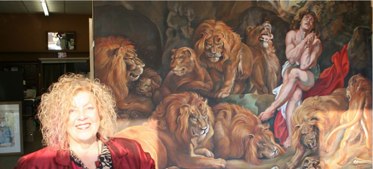
OLD MASTERS MURAL PAINTED BY JOANNA McKETHAN


The original painting of “Daniel in the Lions’ Den” executed by Sir Peter Paul Rubens in 1615 hangs in the National Gallery of Art in Washington, D.C. It is slightly under 8’ by 11’ in size, but looks twice that.

However, a copy of Daniel hangs in Art on Broad Atelier at 217 East Broad in Dunn, a division of j’Originals Art Studio, owned by artist Joanna McKethan. It is there because she has painted a copy of the master’s work, and she is adding finishing touches to the lions’ hairs, whiskers, and the highlights in the eyes before delivering the painting to its final destination. Like the original, the painted tapestry will be oil on canvas.

Noting the artist’s training in Old Masters’ techniques in Munich Germany, a local entrepreneur and professional who currently prefers to remain anonymous has commissioned McKethan to do the work, which will not be an exact copy due to the difference in dimensions. The painting has been done on a hanging canvas sized approximately 5’ x 8’. McKethan received in-depth Old Masters’ painting training in Munich, Germany, some thirty years ago from German master painter Bergheim, where students in the studio were required to paint two copies of a master painting, of which the teacher kept the best, “an excellent training in the discipline required to copy a Master painting,” says the artist.

The painting will hang in the patron’s house, or will possibly be resold.

‘Daniel in the Lions’ Den’ depicts a man surrounded by nine angry lions. A product of the Baroque period, the painting uses dark and light color shades. The technique of chiaroscuro sets a dramatic tone appropriate to Daniel’s scary situation. Chiaroscuro, a technique for creating reality with light and shadow, is evidenced in the strong contrasts widely used during the Baroque period.

Peter Paul Rubens, 1577-1640, Flemish, was the best known European artist of his day. He is now widely recognized as one of the top artists in Western art history.

The subject, Daniel, an Old Testament prophet and chief counselor to the Persian king Darius, aroused the envy of the other royal ministers. Conspiring against the young Hebrew, they forced the king into condemning Daniel to a den of lions and what they hoped would be instant death.

In the painting he is sitting, looking upwards at the light now streaming into the cave. Although his face is serious, his body is in repose; he is not hiding his eyes or bowed over in distress. The nine lions (or is it 10?) affect different poses–some asleep, some roaring and some just sitting.

The light streaming in illustrates that Darius, anxious about his friend on the following dawn, had the stone removed that sealed the entrance to discover Daniel had been miraculously saved. The artist made an accurate Scriptural rendering of the moment of Daniel’s delivery as he, the artist envisioned it. The king cries out to him, “Daniel, was your God able to deliver you?” The beasts squint and yawn at the morning light streaming into their lair, and Daniel gives thanks to his God.

The composition is crowded, without much place for the eye to rest.  Most of the space is occupied by lions. Rubens used dark colors beside the white cloth upon which Daniel is sitting. Rubens’ colors are well-blended. Tense energy is depicted through Daniel’s facial expression. Daniel is the focal point of the painting, positioned under the light from the opening. This captures the spiritual and physical emphasis of the painting: that Daniel is God’s man, and Daniel will be delivered, a figure of Christ’s resurrection.

The monumental size places the ten lions close to the viewer, heightening the sense of immediacy and danger. Within the asymmetrical baroque design, Daniel is the focal point even though his position is off-center. Against the brown tones of animals and rocks, his pale flesh is accented by his red and white robes and by blue sky and green vines overhead.

According to the National Gallery, in 1618, Rubens traded Daniel along with eight other paintings and some cash for a collection of over a hundred ancient Roman busts and statues—the prize material of any art gallery in that era. During the transaction, Rubens described his own canvas as: “Daniel among many lions, taken from life. Original, entirely by my hand.” According to the National Gallery, The North African lions Rubens used as his models were kept in the royal menagerie at Brussels. The Gallery has a study of the lion in its collection facing the viewer, standing to Daniel’s right. This Moroccan species, now extinct in the wild, they say, may be seen at Washington’s National Zoo.

Like the original, the painted tapestry will be oil on canvas. Ms. McKethan spent months rearranging her studio to accommodate the 8’ X 8’ X 9’ easel upon which the tapestry hangs. The tapestry can be viewed through the wall of mirrors at the back of her studio, easily seen. Students have kept up with the progress which sharpens their eyes and memories, making them notice improvements each new lesson.

McKethan traveled to Washington, D.C. and sat with the painting for a full day’s sketching, photographing and absorbing the placement and movement of the lions, noting specifically the negative spaces that join four or five parts of objects together. “Although it is a work of antiquity, it is also an experimental work,” she adds, “and that, of course, increases the excitement of participating in the process.

Her teaching studio is based on principles of the Masters, bolstered by courses from master painters in the U.S. and abroad. “Since we don’t know exactly how the Masters achieved their results,” her German teacher would say, “we must learn visually how to achieve what they did, and the easiest way is to look through the eyes of the Impressionist painter.” Through painting samples designed to illustrate the point, he brought the students closer to their goal and proved his thesis.


Ms. McKethan has done work for this patron before.


Learn more »
No Comment

JOANNA MCKETHAN ONE OF SIGNATURE MEMBERS

IN FIRST SHOW TOGETHER

Watercolor Society of North Carolina Presents at CCA, Kinston

Exhibits at the Arts Center

Hampton Gallery, From the Director

Watercolor Society of North Carolina
Special Exhibition for Signature Members
The Arts Center (400 North Queen Street, Kinston) is eager to announce this exhibition! The Watercolor Society of North Carolina’s Signature Members are celebrated as the “best of the best.” With this showing, they hope to encourage more watercolorists to join the organization so they too can reach this level of achievement. The WSNC has approximately 100 Signature Members, all of whom have been invited to participate in this exhibition. They have placed no restriction on the year of execution, but have restricted the work to be of water media only. The WSNC is a non-profit art organization whose purpose is to promote watercolor throughout the state and to elevate the standards of excellence in this medium.

What is a “signature member”?  Signature membership is a status which painting organizations award certain members who excel in one way or another, which then allows that member to use the initials after their name in all advertisements of their painting credentials.

For WSNC, from their brochure, “WSNC Signature Membership is merited by members who win two first through fifth place awards in two, separate annual statewide WSNC exhibitions after February 1999.  Effective July 2002, a second method of obtaining Signature Membership is acceptance of an artist’s entry into three separate annual statewide WSNC exhibitions.  Once an artist has begun qualification under either method, membership in WSNC and payment of annual dues must be continuous to be eligible for and retain Signature Membership status.  Only Signature Members are entitled to use the initials “WSNC” after their names on any painting in water media.

Joanna McKethan, SW, WSNC, has two paintings hanging in the Kinston show, the “WSNC Signature Members Exhibit.”

Her first painting, full sheet, is “Paper Trail,” which gathers poignant letters from loved ones in the past and assembles them in random style among hand-made papers with holes in them, and other still-life memorabilia. The written words are only partially readable, some showing through the holes; some unhindered.

Fallen leaves and seedpods are strewn through the other leaves randomly, with as much influence of chiaroscuro as possible to make the fallen leaves lifelike, as though you could pick them up. Some of her artist friend’s tiny paper booklets were used as a model for painting, as well. She met this friend who, like her, spent time at the artist’s retreat at Mt. St. Francis in Indiana, for two weeks several summers, completing works of art. The symbolism of leaf on leaf is patently obvious, so it will not be labored. This painting was shown in Southern Watercolor Society’s show, of which Ms. McKethan is also a signature member.

The rivulets of color represent the passage of life, the seasons; the stamped letters are destinations reached and people find each other who became bearers of my life, the pages overlapping indicate the links in generational chains. The leaves are scarred by their journey, with ragged edges like the edges of handmade (deckled) paper, holes, stains, folded in strange ways when the holder, perhaps in a hurry, creased the paper to fit in a book to save. Though it bears the marks of rough handling, it is intact, sturdy, and still pliable.

The randomness is part of the one-hundred-percent transparent watercolor, collage style look in Ms. McKethan’s work, represented in her second piece as well, “A Rose Is a Rose,” which has a photograph of her mother, and a single rose laid over old, stained, handwritten letters. Although they look like collages, the effect is created entirely with paint. This painting is a sad one, a poetic work on the artist’s mother before she was married. Again, a connection is sought after in this painting of overlapping life elements.

Many of the elements are disguised enough to make the pieces anyone’s story. I have been criticized for that, but I have been criticized for the specificity of the information of others. One of my good friends Sandra Mowery owns a full sheet painting with my ancestry clearly designated in it, right down to my great grandfather’s framed photograph holding the bayoneted rifle in his hand.

“In a sense my history becomes yours when you acquire the painting,” she says, “and the threads of history are passed on.”

Ms. McKethan uses layering as a favorite technique. Layering is a difficult art, she says, since you must leave portions of the paper free of color, all the way down to the very first washes. For vibrancy, she avoids the flushing of the paper with all three primaries as a way to make an all-over grey tone. She prefers to leave the light side only for gold-toned colors (leaving one of the triad out) and a dark side which must contain the blue (and less of any yellow, except for making green. This sharpens contrast when the two meet.

“People forget that grey forms immediately when you have all three colors,” she confides a teaching secret with us. “Used well, one avoids mixing mud, but used poorly, all the colors look alike or end up tired and muddy.”

“Weak, tired and muddy are the only types of bad watercolors,” my Polish watercolor teacher in Munich, Germany, taught me at the outset.

And I agree with him whole-heartedly. I would add, “mud is what you get when you were trying to mix something else.” And I would add, “when you mix the right colors together, if you mix all three, you get a neutral—either a warm neutral or a cold neutral—brown or black, tan or grey. And if I see your mud, I can tell you what color to add right away to pull it back from the mud-puddle and take it any direction you want it to go. If you stick with me a bit longer, I’ll teach you enough about my system of color that you can find the right color yourself.”

She smiled and laid her brush down.

Learn more »
No Comment

The Making of : “OF THE ESSENCE”

Watercolor Painting: “OF THE ESSENCE”


Whiff of Opium Watercolor paintingPerfumes and Pills

Orchids and opium, life’s sweeteners. Forever, perfumes and pills have been used to sweeten and enhance life: to increase pleasure and diminish pain.

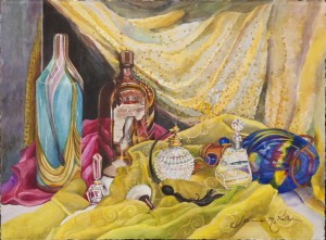
Sometimes an artist doesn’t know why she gathers the pieces of a still life together. She just mixes shapes and colors in a way she thinks pleasing, or perhaps collects them like actors on a stage. That alone could explain why the dark brown bottle, an antique which collected opium camphorate sits on a par with the beautiful perfume bottles to the right of it in the watercolor painting “Of the Essence.”

However, that argument might not work, if you’re going for truth. Artists are through-and-through supporters of the intelligence of the intuitive, or right side of the brain, and the artist who painted this picture, Joanna McKethan, believes this side is the most intelligent side of the two. What was known as “woman’s tuition” receives higher marks in the academic world lately. Why the right side is more intelligent finds its base in at least two attributes: on its quick processing of spatial relationships, the activity which uses the most memory in computer chips, and, exactly because it is not always linear or logical, it calculates nuances. These are the nuances that are subtleties of language and experience that so many scientists must spend disproportionate time on, training the brain of a robot—nuances of juxtaposition and association, requiring the dismissal of logical control so that truths working below the surface, surface.

Watercolor. Such a delicious medium to work with, one full of right brain decisions and colors of orchids, the opiate of the artist. Watercolor is the medium which tells you whether or not the artist had a good day that day. It is a perfect mood ring.

In this full sheet watercolor framed to ca.30” x 38”, Of the Essence, a nearby perfume bottle displays its attached atomizer, dark as the opium bottle, which a hand recently puffed out what we assume is luscious fragrance into the air. In this painting, the slight puff of the atomizer releasing fragrance is seen to cloud the objects around it, suggesting how small an amount can set off a full-blown obsession. This is further validated by the glittering material in the upper right, the richness of the bottles with all the colors of life caught up in their sparkles and the reflective power of both material and glass.

Follow your eye around the perfume bottles to the opium bottle on the left, into the dark passage between the edge and the metallic drape behind the bottle, behind the ceramic bottle with multi-colored swirls which could signify euphoric highs from either perfume or pill. Even the cobalt blue light-catcher has its own darkness to it, and multiple, interlocking swirls which trap the eye at every point like life does. If you do, you can hardly miss the message of the darkness the wrong highs suck you into.

One might say this is far-fetched, but the artist has found this visual theme in at least three major works of hers; the dark hole behind the innocent girl, another, a dark behind the family, and in this one, behind the bright lights and symbols of the rich life. A friend and colleague of the artist, looking at the painting, likened it to Whitney Houston’s life. Artists and consumers both can actually stay ignorant of subconscious messages, but this exercise, the artist says, “has taught me that is not a good idea. ‘The truth will out,’ as Macbeth says.” The warring message reveals itself whether an artist plans it or not. Although not conceived as a theme, and the painting certainly was not meant as a didactic lesson in life, neither should the integrity of what emerges from the subconscious parts of an artist’s processes be edited or removed just to satisfy someone’s need for neutral visual nourishment, if there is such a thing.

All that plays to the message. Now the artist comments on technique: “All of the rich colors used in the painting are built with many layers. Each surface commands a different technique to actualize the differences in texture. Nothing too dry, too soggy, too tired–and when you layer, leave passages down to the first wash (water + pigment), also known as a glaze. That requires knowing how to start and end the new color and where, and the rest really must be taught,” she says. It has taken the artist years to develop her style and to model effectively with watercolor, bringing an Old Master’s quality into the bright sketchiness of the watercolor medium. Watercolor is much too versatile a medium to limit to only one style, viewpoint, or technique. Call or email Joanna @ joartis@aol.com or www.joanna@joriginals.net with questions, and she will be quite happy to share insights and sign you up for her next adventure in watercolor.

As for perfumes, the pleasant side of the equation, research is made constantly for new scents. If you begin with the man-made, you can take the process even as far as the Rain Forest in whichever location one wants to search. Those who search earn megabucks for their efforts and require a connoisseur’s nose. Perfume companies send their representatives to look for new fragrances and scents, mostly from orchids. Employees of one company that creates fragrances for perfumeries and other companies, has sent employees to the rainforest in French Guiana and hired rainforest scientists to assist in the search for new fragrances.

Scientists often check out flowers that attract moths since the scents that attract them usually are considered pleasant by humans. To take samples, scientists use “head space” technology—equipment used by beer brewers to analyze the air above the beer head and determine when the fermentation process is complete. In short, they trap the air and scent around a flower. The air is captured in a globe, then directed through a cylinder of absorbent material and then sealed when filled. The cylinders are taken to a lab and the gases captured are analyzed with a mass spectrometer.

And all of this is done just to enjoy the sweet side of life without getting drawn into the dark side. Which owning a Joanna McKethan original helps one do, as well.

Learn more »
No Comment

MY FIRST PORTRAIT COMMISSION


“A Father’s Blessing”


          Painting emotionally: how much can an artist afford to invest of herself in each commission? That was the subject under discussion in the high school art class I taught one Thursday afternoon at Art on Broad Atelier. Since one of my students was painting a watercolor, another an oil, I wanted to teach things that bridge both media.


I think I had just explained what a mood sensitive medium watercolor is: in fact, if you’re not feeling appropriately sassy, just don’t begin a new watercolor that day. Even in painting oils, how you are feeling about yourself transmits when you paint. That is a separate issue from, yet connected with, another emotional factor. How do you transfer emotion to the painting you are working on?


Then my first commission sprang to mind: a portrait of my grandmother for my daddy. Daddy had always talked to me about learning to paint oils, and wanted me to buy transparent oils to tint photographs, in case, as he said, “I would ever have to make a living for myself.” Now my dad was very forward thinking, especially if you consider he was born in 1891. He referred to a man he knew in Toast, North Carolina, where my father was born, Bob Watson. Bob Watson evidently was highly in demand as a photographic portrait colorist, the profession my father envisioned for me.


My artistic talent had been enough to receive some notice through the years, and so my mom and dad had bought me a correspondence art course. I had made something like a “95” on a picture I drew for “Draw Me” ads put out by Art Instruction Schools in Minneapolis. I had studied a concentration of foundational fine art courses at Queens University (then College) and sculpture at the University of North Carolina at Chapel Hill. Anyhow, all that evidently gave Dad enough confidence to commission me one day on a visit home from abroad to paint a portrait of his mother.


He approached me very seriously, a small, framed photograph in his hands. “My mother was very beautiful,” he said. I stared at the photograph and for the life of me could not see the ‘beautiful’ part, but I listened attentively. “Yes, I want you to paint her portrait. Take your time; I want it to be good. I will pay you one hundred dollars, and I’ll give it to you up front.” He handed me the hundred dollars.


One hundred dollars might not sound like a lot, but for me, on my first commission, it was a princely sum, and it felt like magic, conjuring up a face with paint and getting hard cash for it. I was living in Germany at the time, but had not yet taken the Old Masters courses I would later. So I began carrying out the commission, getting paint, brushes, canvas, and setting up the painting spot.


“Beautiful, beautiful,” the words rang in my head as I proceeded to paint her face, her bust. I kept at it, adding tones demanded by the photograph, faithfully. Finally, I had something, but, alas, it was not her. What I had was someone dollish, pretty in a frothy sort of way. That was not my grandmother. Her lineage was fine, but she was mountain stock, and had lived a hard life which showed in her face. ‘Handsome’ might express her appearance better. I tried again.


I took another tack and changed angles, colors, whatnot, all the right technical things to produce the right end. Yet once again, this attempt failed. Now I was frustrated, knocked down, and finally, angry. Yes, I got angry with the paint, the brushes, the canvas, myself. “She’s not that sort of fussy pretty,” I told myself. “She is beautiful in character, a strong woman. I’ll have to paint her that way.”


Setting the canvas paper up on board, I drew the face first. Then I mixed grayed blues, near-blacks of her hair, beige skin color, and slung paint onto the canvas. Back and forth in the most energetic strokes I had ever used, I threw the strokes down, not waiting to re-think and second guess myself into tight technical precision.


Precision, perfection. My dad always spoke of his mother with near reverence. It made me nervous, but still I pushed ahead. First, the face emerged, the hair, the body. As if by magic, this woman appeared in the painting, strong, regal, a woman tempered by life and hard times, but yes, “beautiful.” Daddy would be proud. He would love the portrait of his mother.


Unfortunately, that was never to be. Before I was able to mat and frame the picture and bring it to him, he died while I was overseas. I was devastated, capsized. My father was my rock, even though admittedly, a somewhat volcanic rock. He was an emotional man who felt and loved intensely and deposited his love of painting and of poetry in me, quoting poems in French, and telling me stories about his people. And I felt that I had failed him in not getting him the finished portrait he had paid me for, not so much for the ‘hard, cold cash’ he gave me up front, but for the emotional investment it was for him.


Years later, my own children grown, I know that I was wrong to feel that way. We parents are always happy when our attempts to help launch our children succeed, even, I believe, from beyond the grave.


And so my father launched me into portrait painting with that first commission. Some days I am better than others. Still now I remember thinking, “Lord, I won’t paint long if I must get this emotional about every painting I do.” And yet, my first commission proved that emotional input harvests a better product and response from the viewer, because when it comes from the heart, it speaks to the heart.


That is why with every commission, I get to know my subjects. The better I engage them, the better the result. Yes, technical specifics convey differing emotions, but the non-technical must is the feeling and passion to portray the truth of one particular person. How can an artist NOT invest emotionally in every portrait, as though a first commission?

SEE PORTRAITS


Learn more »
No Comment

Behind the Watercolor Painting: A Whiff of Opium (Of the Essence)

Orchids and opium, life’s sweeteners.
Forever, perfumes and pills have been used to sweeten and enhance life: to increase pleasure and diminish pain.Sometimes an artist doesn’t know why she gathers the pieces of a still life together. She just mixes shapes and colors in a way she thinks pleasing, or perhaps collects them like actors on a stage. That alone could explain why the dark brown bottle, an antique which collected opium camphorate sits on a par with the beautiful perfume bottles to the right of it in the watercolor painting “Of the Essence.”
However, that argument might not work, if you’re going for truth. Artists are through-and-through supporters of the intelligence of the intuitive, or right side of the brain, and the artist who painted this picture, Joanna McKethan, believes this side is the most intelligent side of the two. What was known as “woman’s tuition” receives higher marks in the academic world lately. Why the right side is more intelligent finds its base in at least two attributes: on its quick processing of spatial relationships, the activity which uses the most memory in computer chips, and, exactly because it is not always linear or logical, it calculates nuances. These are the nuances that are subtleties of language and experience that so many scientists must spend disproportionate time on, training the brain of a robot—nuances of juxtaposition and association, requiring the dismissal of logical control so that truths working below the surface, surface.Watercolor. Such a delicious medium to work with, one full of right brain decisions and colors of orchids, the opiate of the artist. Watercolor is the medium which tells you whether or not the artist had a good day that day. It is a perfect mood ring.In this full sheet watercolor framed to ca.30” x 38”, Of the Essence, a nearby perfume bottle displays its attached atomizer, dark as the opium bottle, which a hand recently puffed out what we assume is luscious fragrance into the air. In this painting, the slight puff of the atomizer releasing fragrance is seen to cloud the objects around it, suggesting how small an amount can set off a full-blown obsession. This is further validated by the glittering material in the upper right, the richness of the bottles with all the colors of life caught up in their sparkles and the reflective power of both material and glass.Follow your eye around the perfume bottles to the opium bottle on the left, into the dark passage between the edge and the metallic drape behind the bottle, behind the ceramic bottle with multi-colored swirls which could signify euphoric highs from either perfume or pill. Even the cobalt blue light-catcher has its own darkness to it, and multiple, interlocking swirls which trap the eye at every point like life does. If you do, you can hardly miss the message of the darkness the wrong highs suck you into.

Whiff of Opium Watercolor paintingOne might say this is far-fetched, but the artist has found this visual theme in at least three major works of hers; the dark hole behind the innocent girl, another, a dark behind the family, and in this one, behind the bright lights and symbols of the rich life. A friend and colleague of the artist, looking at the painting, likened it to Whitney Houston’s life. Artists and consumers both can actually stay ignorant of subconscious messages, but this exercise, the artist says, “has taught me that is not a good idea. ‘The truth will out,’ as Macbeth says.” The warring message reveals itself whether an artist plans it or not. Although not conceived as a theme, and the painting certainly was not meant as a didactic lesson in life, neither should the integrity of what emerges from the subconscious parts of an artist’s processes be edited or removed just to satisfy someone’s need for neutral visual nourishment, if there is such a thing.

All that plays to the message. Now the artist comments on technique: “All of the rich colors used in the painting are built with many layers. Each surface commands a different technique to actualize the differences in texture. Nothing too dry, too soggy, too tired–and when you layer, leave passages down to the first wash (water + pigment), also known as a glaze. That requires knowing how to start and end the new color and where, and the rest really must be taught,” she says. It has taken the artist years to develop her style and to model effectively with watercolor, bringing an Old Master’s quality into the bright sketchiness of the watercolor medium. Watercolor is much too versatile a medium to limit to only one style, viewpoint, or technique. Call or email Joanna @ joartis@aol.com or www.joanna@joriginals.net with questions, and she will be quite happy to share insights and sign you up for her next adventure in watercolor.

As for perfumes, the pleasant side of the equation, research is made constantly for new scents. If you begin with the man-made, you can take the process even as far as the Rain Forest in whichever location one wants to search. Those who search earn megabucks for their efforts and require a connoisseur’s nose. Perfume companies send their representatives to look for new fragrances and scents, mostly from orchids. Employees of one company that creates fragrances for perfumeries and other companies, has sent employees to the rain forest in French Guiana and hired rain forest scientists to assist in the search for new fragrances.

Scientists often check out flowers that attract moths since the scents that attract them usually are considered pleasant by humans. To take samples, scientists use “head space” technology—equipment used by beer brewers to analyze the air above the beer head and determine when the fermentation process is complete. In short, they trap the air and scent around a flower. The air is captured in a globe, then directed through a cylinder of absorbent material and then sealed when filled. The cylinders are taken to a lab and the gases captured are analyzed with a mass spectrometer.

And all of this is done just to enjoy the sweet side of life without getting drawn into the dark side. Which owning a Joanna McKethan original helps one do, as well.

Learn more »
No Comment

What is Gel Pen Art?

GEL PEN FEVER:
The j’Originals’ 2012 Collection Goes Experimental


What happens when you take flowing gel pens that are metallic and begin to draw on black art paper? Why, fine art, of course.That is, if you have a little Old Masters art training like the owner Joanna McKethan and an inkling of how to superimpose hatch strokes on top of one another to make their three-dimensional nature pop out.

Even so, it isn’t easy. The color in some of the pens looks dark, but used on paper, it shines brightly. So the first issue is a light-dark one, and, as in all new genre–the artist knows of no one else who has done this–experimentation is key.

That will be described in more detail, but first, a description of the whole collection. Each year the artist is projecting a launch of two new collections. A ‘collection’ as conceived of by the artist, has one mat, one glass (u-v-ray screening), one frame chosen to give it that certain “look.” The Fall 2012 Collection is a series of nine (sorry, when the nine are gone, they’re gone) ink drawings rich in pinks, yellows, blues, and whites, but metallic versions of these, and especially in copper, a color which really says ‘fall’ even though it is beautiful year-round.

The ‘look’ is brought together by a metallic copper mat of 3 inches, framed in a black frame with a strong protruding profile and fine work on the frame in, you guessed it, copper. Each picture is a dainty slice of life from yesteryear, old horn-rimmed glasses, butterfly on birch bark, antique ink wells, etc. Thus, its antique emphasis makes the paintings come into their own with the mat and frame chosen. The glass used in these original pieces of artwork is ‘clear,’ meaning all u-v-rays are blocked out to keep the painting as close to its conception as possible. That said, when a customer buys a piece, he/she can change it entirely. If someone wants the whole collection, however, they are ready to hang and show exactly like they are.

But taking the discussion back to the technical side of the process. How do you make shadows on a black background? That requires some reverse engineering. One of the artist’s solutions is to use the pens in the general shape of the shadows, and yes, classical training in art does make it easier to know how to proportion the shape of the shadow to keep it within another plane, one bent out from the object itself. The artist leaves plenty of the black paper beneath showing. One thing to know at the outset is that shadows always have a ‘warp.’

The wonderful thing about these drawings is the sheen and the color of the sheen as they are tipped one way or another or as light hits them from one side. Literally, these drawings will change all through the day with the changes in light, while maintaining the integrity of the whole piece, what you started out with. Since black gel pens are merely soaked up by the black paper, to gain maximum ‘trompe l’oeil’ effect, a little charcoal is used to make the black blacker in the darkest, or the ‘accent’ spots, as for example, in the black parts of the butterfly, underneath the edges, and in the back, behind the blue marble.

In the drawing with the tincture (ink) bottles, the little bit of black charcoal is inside the bottles and on the back side of the stopper–oh, and underneath the leaf at front. It is interesting how much metallic sense is in the aging magnolia leaf, a theme the artist has written on many times.

In the drawing of the grand opening ribbon, the edging with one particular color in the gel pens causes the folds of the ribbon to undulate and flow, as well as defining form and making it ‘pop out.’ The hatching is curved to denote form as well.

Along with the problem of conceiving how to produce the letter on black comes another challenge: making it pastel without making it white, or bright. So in this case, the artist has given it a grain reminiscent of vellum and hand-done papers, with the handwriting super-imposed over the grain and running in a different direction. These solutions may look very obvious once detailed, but they were definitely not obvious to the artist at the outset, and there is no book written on the technique and how it is to be done.

In the picture of the antique white doorknob casting its light reflection onto a table, the rounded cross-hatchings were cross-scored many times over until just the right amount of roundedness emerged. The pink and blue flower was made to resemble cross-stitching with the lighter areas actually looking raised.

In the Egyptian-like brass vase, the figures were brought out and then muted, brought out and muted, the process repeated several times over to achieve the proper muting that would occur with antique vases, and the metallic would lose some of its brightness.

The final piece, the antique bell and leaf is a story all its own in getting shades of grey or black with pens that are meant only for local color and not for modeling.

All in all, Fall Collection 2012 was a break-out process for the artist, and she hopes her collectors will enjoy the ones they adopt for many years to come.

If you have any questions, suggestions, or comments, do not hesitate to write to the artist at: joartis@aol.com or www.joriginals.net

See our gel pen collection

Copyright 2012 joanna a. mckethan

Learn more »
No Comment

Poetry: What Are Its Springs?

   Poetry—lovely language, brevity of speech, rhythm—probably all of these are qualities we think of when we think of poetry. A lot of us still must add “end rhyme” to the definition, a process which has fallen into disrepute for poets, probably due to the poor quality of rhyming choices and the demise of good English language useage, not to mention the stilting limitation to poetic patterns of speech that using end-rhymes suggests.

Still we all recognize poetry when we hear it, pretty much.

But whence the poetry, what indescribable place in the soul or psyche is the poem pulled from, and what motivates the writer to draw from this secret place?

I haven’t started writing with a pre-defined answer; this is a discovery article. Still, the first thing that pops into my mind is authority. A poem comes from a place of absolute authority—not the ruler-wielding picture that may come to mind, but the place of knowledge. Poetry comes from a place that you know that you know that you know. You have “seen” something that no one has seen as intensely or clearly or transforming as you. The words may be in question, but the kernel, the inchoate mass of discovery, is not.

Let that thread hang for a minute.

Poetry springs from a voice that you hear. Yes, it is your voice, but it is unlike your everyday voice. It is unlike your tentative, insecure voice. This voice streams in the window of your soul with a pronouncement, “The day swept in, in thirty shades of grey.” “No one kills a succulent.” It bears a finality about it, a certainty, but an oddness that requires an explanation, a paradoxical truth that is not a plain truth in any way. It is a secret discovered and shared with the reader in a spirit of confidentiality and urgency.

Leave out the categories—narrative, lyrical, confessional—for a moment.

A narrator lives in that voice. But where does the voice live? Is it a song? And from what do songs spring? Well, from sadness or joy. From grief, loneliness, fellowship. From a moment of time which impinges to such a degree and in such a strong way that it must be expressed. Urgency: I have so much to say. Things need saying, because they will help people. They will connect with people. Things will burst open inside of me if they are not expressed.

Let me share a couple of my own poems, since I know them best. My dream poem started as an argument. Of course the tension was in my own soul, but the challenge came from outside. My aunt concluded that since I expected a baby, I wouldn’t be able to write. Or paint. And this is the poem that emerged from the internal struggle her comment produced:


“Dream are great, you say,

for nighttime—like wispy clouds

that disappear at noon.

But I say dreams

are spit and fiber

spun and thrown

like spider webs—filmy filament

that sticks mid-air

catches and holds tight enough

for you to climb, run, live

(nest your babies on)

and yet,

still make it there.”


Forget the tendentious “where is ‘there?’” Well, wherever your dream takes you, of course. I can’t spell out where your dream will take you. This poem was published in three different venues—in Sanskrit, Vol.20, Spring, 1989, UNC-Charlotte, and in Earth and Soul, an Anthology of North Carolina Poetry (Semlia I Ludsha, Antologia Rossii Severnoi Karolinia), 1st in English, 2nd in Russian, and parts were used for sectional divisions within that book.

Here is a poem that began with poignancy as the well, the springs that pushed the word and thought further…a kind of poignant revelation that I couldn’t stand until I had expressed to some degree of satisfaction. It’s what a poet does instead of crying; it’s an exquisite agony of soul.


“Re-Creation

When the whippoorwill

begins his evensong,

shadows lengthen, disappear,

as darkness joins them;

the trees turn black:

you want to catch fireflies.


A hundred such evenings

telescope into this one,

gone but here, missing yet

reflected in fragmented

crystals of blinking, cold light,

called, like a cloud of witnesses

to share the sacred moment:

childhood passed on.” Joanna McKethan, The Lyricist, Vo. XXIV, Spring

1990, Campbell University, Buies Creek, NC

Fill This Empty Canvas, A Poetry Chapbook


For me, purity is another spring. I pause with near reverence when I approach something so pure it is almost holy—something you do not want to sully by touching. It is a moment of transcendence when we are lifted higher than our feet can jump. It is a note of a song that haunts us, or a word in a language we knew once, and we must strain to transcribe with any accuracy at all. We struggle, we stutter, we battle words and lines and feelings until we finally hold the best template, the most accurate bowl to the light and fill it with all those marinated moments from the soul. Each one a new dish, an exploding delight, if to no one else, then to the poet who has finally turned her exquisite sadness or joy into words of an otherness not everyday normal. Springs of colder water that refresh. Springs of bitterness expunged. Springs of struggle temporarily resolved.

Authority. Voice. Discovery. Revelation. Extreme emotion. Purity. Something emerges from a deep place and takes you to another deep place with even more precision, even more delight that finally, has a name. A poetic expression is born that lies on a par with the gravity of the moment of revelation. An expression that may sound clever, but was not birthed for cleverness, but for momentous-ness; that really is like slowing down the motion of the ordinary to a delicate dance, or like straining to hear and see the haunting shape notes on a song that suddenly became “more” than you’ve always heard. That’s what poetry is for me. And yes, I think I can say this vaulted expression applies even to humorous poetry. So that’s my story, and for now, I’m sticking to it.


Learn more »
No Comment

Leaf A Float

LEAF A-FLOAT

By Joanna A. McKethan

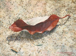
How can I cause you to understand what I see in a leaf? I am quite overwhelmed at the very thought of it, and that is why I painted it instead, but I was challenged by someone I respect to take you there with me and show you me in this leaf.

It all started on one of my ambling walks a mile up from the Cape Fear River around my property. We have always studied the ground, looking for Civil War relics, special rocks, like arrowheads, and of course, leaves.

About ten years ago, when I started painting lush white magnolia blossoms in watercolors, their housing, the magnolia leaves, began fascinating me—the range of their colors back and front, their veins, their backsides…even the texture and material of the leaves. When you feel them, they have a firm, waxy presence, very different from the light, five-fingered sweet gum leaf, for instance. Softer leaves had appealed to me before.

Then I found a magnolia leaf on one of my wanderings which looked metallic in its aging process and as I picked it up, I thought, “Someone used this for Christmas decorations and threw it out.” I turned it around and around, studying its different aspects.

But no, as it turned out, it had not been gilded by a metallic paint; it was just a deep-yet-bright golden color. I started studying the aging process in leaves and wrote many poems about them “more beautiful in life than death.”

And so the one leaf, like the one pictured here, is a portrait of the whole of humanity and the whole of one life in one expression—the form curling in several ways to show the underside which lightened further from salmon colors to lavenders, the veins for all the world like those on an old person’s hands. The coloring aged from a deep green—pretty but rather uninteresting in itself—into the richest burnt sienna’s one could find in her paint pan—radiant, expressive. The form with its curls grew increasingly expressive over time.

And so, it was very easy to lavish on this leaf all the love you would give a person, using paint and the skills taught using them studying the in’s and out’s purely for the appreciation of the individuality of the leaf, showing how it responded to light and to shade.

Of course all the technical expertise you can learn in a lifetime comes to play in this process, equally inspired by spiritual musings as by richness of sensual pleasure in the rolls of light on form. And its title, “Leaf A-Float” is very symbolic of the leaf having been cut loose from its branch and its tree.

We are cynical and say, “yes, so it can die.”

But that very looseness, where it is barely attached to the ground except by one point at its stem, is also a picture of resurrection, and a new life—related, but of another substance. And so the leaf stands alone, its body relaying the whole story.

Learn more »
No Comment

Back to Top