FIGURE PAINTING PRESENCE

“Executive Shoe Shine”–Clin-ton

Two days ago I finished a new full sheet watercolor painting! Plus, I’m getting another watercolor, Grooves,” ready to show in West Jefferson, with the Watercolor Society of North Carolina in their upcoming October annual juried art show, but more about that, later.

In answer to a long-term friend, Rebecca Graham’s question upon seeing my work, “Is this a still that you painted? Where did the inspiration come from?” I have to say, this latest watercolor I’m calling a figure painting launch as it’s my first, makes it, of course, a portrait painting as well. However, I’ve done watercolor portraits before. I’ve done figure painting in watercolor before too, but I haven’t entered any of them in shows. They were done mostly as sketches in figure drawing classes on inferior quick-sketch paper, or as preliminary studies for my oil portraits.

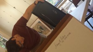
The subject of this painting is a man I met in the downstairs lobby of the Reston Hyatt-Regency in Washington, D.C., or Reston, Virginia, to be more accurate on the very weekend of the Portrait Society of America’s annual convention and International Juried Show. I introduced myself to him and he to me. His name was Clinton, pronounced in a much stronger way than usual, indicated by the dash, Clin-ton. He was so friendly and delightful. I was tired from racing to seminars and convention specials, between venues temporarily. Being the good salesman that he was he wanted to shine my shoes. I looked down at them and saw that, indeed, they could use a good shine, so I said yes, but then remembered I had no change on me and told him I’d have to come down later.

He named his price but told me I could pay him later. Wow, I’m not sure I’d have been so trusting, but he assured me it was okay. I climbed up the massive piece of furniture to the leather seat and watched him shine and polish while we talked random subjects. He told me he hailed from Selma, NC, originally and I was amazed he had lived so close to me. I grimaced a bit and said, “where all the race riots were.” He acted as though he didn’t know what I was talking about.

We talked about Southern delicacies like okra and other good foods he ate when he returned to family reunions in Selma. He asked me why I was there, and I told him I painted portraits. Probably showed him a few I’d done. I had a new business card with a portrait on it I gave him which he exclaimed on and gave me his card for Exec-U-Shine, his second business. He was retired, but he needed the business for his sanity he said, which I understood a hundred percent. I didn’t notice the quote under his business name Exec-U-Shine until after I was home, but I laugh with delight now at “Politically Correct Shoe Polishing.”

When he finished, I was refreshed, my shoes looked great, and I’d made a new friend. He was beautiful in every way, and I asked him if he minded if I took a picture of him. At first I didn’t think he was going to let me, but then he gave me permission to do so along with permission to paint him. I can’t wait to contact him and let him know I think it’s done.

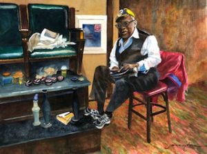
Clinton Hodges, Owner of Exec-U-Shine

I’m about to enter it in a show, now, under my title which I tested on Facebook and got rave reviews from Rebecca Graham that went like this: “Oh My Gosh!!!!!!!!!!!!!!!!!!???????????????????? joANNA ?????? This is flipping INCREDIBLE!!!!!!!!!  “I loooove ‘Executive Shoe Shine.’ Gosh, I’m so struck by him. You have drawn me in and made me want to know everything about him… his birth story, his childhood, his injustices, his triumphs, his great loves, his favorite foods, his view on God, his world view. I just want to connect with him. And is that a cup of java I see?? Ha! Every good gent needs his fuel! Wow. Jo, you make me feel like I’m right there in front of him. I can smell the shoe shine and hear his old man breathing grunts as he positions himself to shine on. His tennis shoes, those chairs! The detail is phenomenal. I can’t quit looking at it!”

Well, here it is, then. Wish me well on my show entries one of my students Allison Coleman who attended two PSoA conferences with me commanded me to do after saying she thought it was her all-time favorite work of mine.

Oh, and I just remembered, Clinton gave us a shortcut home that probably saved us three hours travel or sitting in traffic time. Thanks, Clinton. ‘Til we meet again, because I am sure we shall!

Learn more »
1 Comment

McKETHAN WATERCOLOR “CRAB ART-ATTACK” CLAIMS NEW HOME

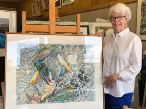
Swirls of blue, orange, yellow and red make an exciting focal point for the eye. Crabs say “beach” and “childhood memories.” And Pat Smith, formerly of Texas which state also claims the blue-shelled crab regaled me with tales of how they caught their crabs on lines. Pat hales from Texas, Virginia, Boston, Connecticut, and now Dunn.

Pat came to j’Originals’ Art Studio/Art on Broad Atelier as an accomplished student already, although she calls herself “a late-starting amateur artist who paints occasionally.” She has turned out some terrific paintings there, so it was particularly flattering to have her fall in love with one of my newest paintings done on 22 x 30-inch, 300-lb Arches watercolor paper, a painting entered into several juried art shows, most notably, however, selected for the 72nd Juried Exhibition of the Watercolor Society of North Carolina (WSNC) at Greensboro College in Greensboro, NC, in October 2017.

The show was juried and judged by nationally-acclaimed watercolorist Mary Whyte where it won the Golden Artist Colors Award. I am a signature member of WSNC.

The painting hung in the Anne Rudd Galyon and Irene Cullis Galleries in the Cowan Building at Greensboro College, October 15 – November 18, 2017. There was a début gala weekend October 14-15, 2017, and the painting was also honored in the WSNC 72nd art exhibition catalog, as well as being selected for the follow-on WSNC Traveling Show.

With the traveling show, the painting hung first at the Florence Thomas Art School in West Jefferson, NC, from December 1, 2017 to January 13, 2018.

It then traveled to Theatre Art Galleries in High Point, NC, where it was on view until January 25 to March 29, 2018.

Finally, the show including her painting hung at Edward C. Smith Civic Center in Lexington, NC, from April 4 to May 19, 2018.

“I love the spontaneity of watercolor, the challenge of a puzzle, and the brilliant-colored blue-shelled crabs caught and encased by a simple-yet-complex spiral net.

“I took multiple pictures of the crabs caught on the pier near Carolina Beach, and produced two paintings. I loved the spiraling rope that issued the challenge of leaving white paper by painting bright colors in reverse up to it. The crabs would’ve bitten my toes off, if they could have. They are a wonderfully-crafted map of color. I loved every minute of my 40 to 60 hours of painting them! I must say as well, they are very tasty.”

“Crab Art-Attack” had several admirers before choosing to go to its new home with my latest collector Pat Smith, mother of Cara Shackelford, both being now from Dunn. Pat has lived around and about. She and her husband have four children all over the U.S. and landed in my studio in Dunn after our meeting as her daughter Cara’s guest at Daughter of the American Revolution (DAR)’s Cornelius-Harnett Chapter before its shut-down.

Learn more »
No Comment

Water in the Art Well

Watercolor Bucket

I’m thirsty. I’m wanting cool, clear water–the water of watercolors.

For a whole year now I’ve painted primarily in oils, building form and surprising it with color. Day after day I’ve painted oils, primarily two major works, sometimes up to 7 hours a day, with only exercise breaks. Not giving it up, though the cry for focus almost wins.

I just heard national watercolorist Mary Whyte, faculty at Portrait Society of America that I’ll go to in April for about the 10th time, and Juror for the Watercolor Society of North Carolina’s 2017 Exhibition in Greensboro confess to giving up painting in oils to pour it all into watercolors. That was during that show which she juried my Crab Art-Attack into, and by the way is still in WSNC’s  traveling art show.

Focus has its rationale.

However, if you have five talents, why turn four of them in? Besides, everyone knows water refreshes. What do you do when the well runs dry, the fire runs cold, writer’s block appears? You take that talent or project back to the well  that was filling and pick up your brush to dip into the new water.

During this same year of oil concentration, I’ve been remembering halcyon watercolor days. Getting thirsty for watercolors. Watching two watercolor students I have grow in their expressions in this medium has primed the well. Teaching different strokes, like wet-in-wet and wet-next-to-wet has pumped me. A set of watercolor paper right next to my oil of a beautiful young lady in a red dress is calling me subliminally each time I walk by.

I’ve been photographing what charms the eye, blue glass with light splashing color from it, a face caught in the trees.

Watercolor is a user-friendly medium, particularly suited for glass, light, the tulip tree blossoms now blooming, and the dragonfly I’ve been saving with his delicate network of wings and iridescent bits of film between the assorted shapes. Perhaps spring itself makes me thirsty for watercolor.

I can’t wait.

At the Portrait Society of America meeting, the professional speakers emphasize our need to paint self-portraits. I shouldn’t be surprised, it’s recommended by the author of Drawing on the Right Side of the Brain, as well. I’ve been struggling with voice and how mine is different and how to make it appealing. I’m struggling up to a new level, and am about to attempt a new effect a step or two away from my strong realism. I’m not giving that up nor am I turning abstract. The image, however, reminds me of the opening to the Dr. Blake mysteries or the Sherlock movie’s beginnings, and there is a tree over my face. The symbolism is heavy and there is a poetry merge going on, as well.

So I am about to talk my way through the difficulties of the new attempt. I can’t just start, like I sometimes do–I tried that on a watercolor a little over a year ago and that one failed I think due to the watery looks of street lights seducing me into believing all my perspective prelim work was unnecessary. When something looks fluid and easy, it can do that. So I’m going to work this one up a bit first. I have to figure out how to get soft colors without turning them all grey.

It’s a spiritual walk as well as a push into a new realm in craft and expression, and I’m nervous.

I’ll probably have several paintings going at once, and while I’m chilling on this one busy in my other subjects, the answers will probably slide in, full blown.

And while I’m teaching watercolor, something will hit me like Colombo solving a mystery and I’ll have the answer. That still doesn’t keep me from having to work hard, struggle with craft and concept until the baby arrives.

I’m feeling expansive right now, and if I’ve made you thirsty I have an ebook Watercolor Painting Techniques Easy(ier) to introduce watercolor to you. Just send your email address to joartis@aol.com, and I’ll get it to you.

P.S. I finished the drawing–now I need to start splashing! And when I go to the Portrait Society of America in D.C. in April, I’ll hear about watercolor, too, from Mary Whyte.

Learn more »
No Comment

Demonstrating Watercolor in Southern Pines

Two Paintings Hang in the Watercolor Society of North Carolina’s Central Region Show “Fluidity of Vision”

This past weekend stretched me during an already busy season.

Two of my watercolors hang along with 67 others at the exhibit  at Campbell House Gallery through the Arts Council of Moore County. Plus, I got to demonstrate my watercolor skill on the following day, Saturday, April 8, from 10 am until 4 pm, during the 2017 Southern Pines Home and Garden Tour.

The show included members from the Central Region Exhibit, on view April 7 to April 28, 2017, “Fluidity of Vision.” Our works hang in Campbell House Galleries in Southern Pines, NC. “We are working with the Arts Council of Moore County to deliver a terrific exhibit of our art in this impressive locale. Campbell House is a much-sought-after venue for art exhibits. Surrounded by a lovely, 14-acre public park and garden, the Campbell House is a stately manor which functions daily as an art gallery and cultural center. Art exhibits change monthly and the gallery offers you an elegant and warm atmosphere that will add to any special occasion,” said Beth Bale, who is the Central Region co-director of the Society.

Two of my large Sea-Escape series hang prominently in the exhibit, Crab-Net and Clam Chow-Down.  We met our friends Carole and David Hobson there for the reception and exhibit viewing. We roamed the rooms, examined all the paintings, sipped beverages and hoes-d’oevres. We met new people who complimented me on my paintings, even recognizing them by name.

We followed our friends out to eat afterwards in Southern Pines, and then, on to their home, their new house in Pinehurst in which hangs three of my paintings –one over the mantel, the other two in David’s study. The next morning over toasted English muffins and cream cheese and coffee, we talked again, and they led us out to a safe connect back to the Campbell House.

“The Campbell House is traditionally first stop on the tour and there should be a lot of people coming through the gallery. In addition to the art exhibit, we thought it would be nice to have members of the WSNC (Watercolor Society of North Carolina) in the gallery or on the property, sort of like a plein air event,” said Chris Dunn, executive director of the Arts Council of Moore County. So yours truly became one of the three exhibiting artists for that Saturday.

When we arrived around 10a.m., the grounds were already sealed off, and we had to drive through the field saved for cars to the closest entrance. I went in with my new French easel, which unfolded and popped into place immediately. I congratulated myself on having brought that. Kathryn McCrae had showed me the day before the place I could spread out. Chris Dunn greeted me, pointing me to doughnuts and coffee, just what every plein-air artist needs.

I had brought two unfinished paintings with me. Each one was a portrait of a shell. I had brought photographs of sea scenes with similar colors to inspire my expression of a background, and the bright sun that flowed in definitely affected my choice of colors, which were very bright and vibrant in the first painting. I reasoned that I would not have to struggle with my main subject and prove I could paint. The seashell said enough to give me the confidence to create the rest in front of people since this was my first public demonstration. Many people came and watched, gave compliments, chatted about the picture and themselves, and signed my sheet for future contact.

Remembering several conversations, one was with a woman who worked in a correctional institute, and we agreed it was nice to appreciate each other’s expertise. I got to share my notion that people who are creatives who do not have an outlet can really get into trouble.

Another lady, a math teacher in Sanford, kept staring and walking around the painting, looking at it in new angles. “It reminds me of math,” she said. “How so?” I asked her, but she stayed busy looking. “I guess it does have a rhythm to it,” I answered. “Yes, and it reminds me of that mathematical sequence.” I agreed, and remembered the sequence which some artists actually use in placing the subjects in their compositions. I thought of Juliette Aristides and Virgil Elliott who had written about this in their authoritative art books.

She thought and thought and finally exclaimed, “Yes, it’s the golden mean. And the series is the Fibonacci series.” So naturally, “Golden Mean” had to be the title for my seashell.

We laughed. “The colors are exciting.”

Another person admired the red, and said it could be the blood of the dying sea life in the shell.

I finished that background and started on my next with more subdued colors. The lights had begun to fall and shadows descend in the garden. I did not finish that one’s background, but got it up to about mid-zone under the shell. However, back in the studio, I set it up with my camera, deciding I would talk about it as I painted it to get in practice for my teaching videos. Wouldn’t you know? I finished it in record time, and made a breakthrough with techniques I can use in painting sea atmospherically, in that time. I have just named the work, “Castle Forsaken.” It looks so regal. The colors are soft and subdued, and the waves are breaking over it.

Yours truly also got her name written down on the exhibition calendar for a two-person exhibit…in October of 2019! That is a total loop, a circling around. The Campbell House held a one-person show for me years back. I guess you could say the events were a real success. You can find all those pictures at Instagram, so check them out  The new paintings will be up soon on paintings.joriginals.net/

Learn more »
No Comment

BRUSHES AN ARTIST LIVES FOR

Some painters bore me to tears with their talk of products. This is no reflection on them, you understand. It simply means it’s hard enough for me to focus on my paintings, the colors, the color mixes, temperature, chroma, ohmigosh–and really, ideas, symbols of my own, composition, magic, aura, and a few other semi-important things.

Not to say that materials are not important; I would not insult my materials mentors/gurus in such a way. I need them too much to do the work for me that drives me batty. Even when I draw what seem to be iron-clad, irresistible, case-closed conclusions out of the principles they give, I sometimes miss. Usually, that’s because there’s a missing product that my logic did not consider, hidden in the mix. For that reason, I’m gong to explore a fairly simple product, one that doesn’t chemically change a hundred times in the space of putting it on my palette, mixing it, adding turpentine or mineral spirits or 101 other additives, getting it on the canvas, and allowing it to gently (we hope) age. Inside, not outside.

What in the world? I hope you are asking.

My new paint brushes, that’s what! Both the watercolor, water-media ones and the made-for-oil brushes are among the best I have ever used. I ‘afforded’ them when my favorite art supply retailer went out of business. Basically, this is overview, since I am including both the watercolor media and the oil painting media within my comments.

Here is a watercolor I finished using them almost exclusively, adding the occasional slightly more candletip-shaped watercolor brush. The slight more control helped me complete the linear look of this textured house while broadening the stroke into wet, wider shapes without a change of brush.

Which brand it it? you ask, dying to know by now.

“Grey MattersTM” by Jack Richeson. First of all, the color of the brushes is outstanding. The color whispers quality, class. That first impression doesn’t let you down, either, among this cluster of mostly long-handled brushes. The shaft is easy to hold, its texture a soft matte which doesn’t peel off like some of the lacquered brushes. The bristles are thick, sensitive to nuance, and yet, not floppy, like some very good brushes I have and have used in watercolor. This makes for easy, wet control, not dry, single-hair control: what I call THE difference in expert watercolors and simply nice ones.

As a European classical watercolorist, I have tended to buy no flats, as they control watercolor flow way too much. I use them now primarily for edges, sliding the straight edge along a straight passage to get a single stroke edge with wet watercolor. In this brand, however, I bought filberts, flats, rounds, shaders–every conceivable shape, simply because I could. I have to say the RichesonTM flats and filberts do not over-control watercolor flow. Nor does medium damage or alter the brush hairs when working in oils. Simply put, in opposing media usage, they hold their shape equally well. They allow for nuanced strokes and color additions. The natural-looking bristles are grey-brown, as well, and simply put, the best synthetic I have ever put to paper or canvas.

You probably got it–I am buggy over these brushes. Thanks, Jack Richeson GreyMattersTM.

This is an oil painting of mine in progress. I feel the canvas and first paint layer literally glows in welcome to the strokes from these brushes.

I am about to buy some of their Quiller Synthetic Watercolor brushes, too. Their ad copy says what I have been saying about their other line: ‘truly advanced synthetic brushes.’  It seems they are designed by a renowned water media painter, Steve Quiller. “Years ago, synthetic brushes were not much more than chopped up fishing line bundled up and stuck on the end of a handle. They were horrible for the user, especially for the young student who often received this budget-priced creation.” Yes, I agree.

Richeson discovered a way to taper fiber strands so each strand comes to a fine point. He selects 11 different weights of fiber strands, creatively mixing them into “a marvelous brush head.” Mixing weights makes the difference in getting the snap back you need, a solution to the floppy, sloppy brush, as I call it.

Here’s one happy painter. Some days your choices get you singing someone else’s praises. And that’s snap back for you, too. Check out the finished product: http://paintings.joriginals.net/product/grooves/

Learn more »
No Comment

Back to Top