BRUSHES AN ARTIST LIVES FOR

Some painters bore me to tears with their talk of products. This is no reflection on them, you understand. It simply means it’s hard enough for me to focus on my paintings, the colors, the color mixes, temperature, chroma, ohmigosh–and really, ideas, symbols of my own, composition, magic, aura, and a few other semi-important things.

Not to say that materials are not important; I would not insult my materials mentors/gurus in such a way. I need them too much to do the work for me that drives me batty. Even when I draw what seem to be iron-clad, irresistible, case-closed conclusions out of the principles they give, I sometimes miss. Usually, that’s because there’s a missing product that my logic did not consider, hidden in the mix. For that reason, I’m gong to explore a fairly simple product, one that doesn’t chemically change a hundred times in the space of putting it on my palette, mixing it, adding turpentine or mineral spirits or 101 other additives, getting it on the canvas, and allowing it to gently (we hope) age. Inside, not outside.

What in the world? I hope you are asking.

My new paint brushes, that’s what! Both the watercolor, water-media ones and the made-for-oil brushes are among the best I have ever used. I ‘afforded’ them when my favorite art supply retailer went out of business. Basically, this is overview, since I am including both the watercolor media and the oil painting media within my comments.

Here is a watercolor I finished using them almost exclusively, adding the occasional slightly more candletip-shaped watercolor brush. The slight more control helped me complete the linear look of this textured house while broadening the stroke into wet, wider shapes without a change of brush.

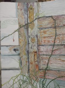
Which brand it it? you ask, dying to know by now.

“Grey MattersTM” by Jack Richeson. First of all, the color of the brushes is outstanding. The color whispers quality, class. That first impression doesn’t let you down, either, among this cluster of mostly long-handled brushes. The shaft is easy to hold, its texture a soft matte which doesn’t peel off like some of the lacquered brushes. The bristles are thick, sensitive to nuance, and yet, not floppy, like some very good brushes I have and have used in watercolor. This makes for easy, wet control, not dry, single-hair control: what I call THE difference in expert watercolors and simply nice ones.

As a European classical watercolorist, I have tended to buy no flats, as they control watercolor flow way too much. I use them now primarily for edges, sliding the straight edge along a straight passage to get a single stroke edge with wet watercolor. In this brand, however, I bought filberts, flats, rounds, shaders–every conceivable shape, simply because I could. I have to say the RichesonTM flats and filberts do not over-control watercolor flow. Nor does medium damage or alter the brush hairs when working in oils. Simply put, in opposing media usage, they hold their shape equally well. They allow for nuanced strokes and color additions. The natural-looking bristles are grey-brown, as well, and simply put, the best synthetic I have ever put to paper or canvas.

You probably got it–I am buggy over these brushes. Thanks, Jack Richeson GreyMattersTM.

This is an oil painting of mine in progress. I feel the canvas and first paint layer literally glows in welcome to the strokes from these brushes.

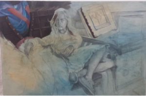
I am about to buy some of their Quiller Synthetic Watercolor brushes, too. Their ad copy says what I have been saying about their other line: ‘truly advanced synthetic brushes.’  It seems they are designed by a renowned water media painter, Steve Quiller. “Years ago, synthetic brushes were not much more than chopped up fishing line bundled up and stuck on the end of a handle. They were horrible for the user, especially for the young student who often received this budget-priced creation.” Yes, I agree.

Richeson discovered a way to taper fiber strands so each strand comes to a fine point. He selects 11 different weights of fiber strands, creatively mixing them into “a marvelous brush head.” Mixing weights makes the difference in getting the snap back you need, a solution to the floppy, sloppy brush, as I call it.

Here’s one happy painter. Some days your choices get you singing someone else’s praises. And that’s snap back for you, too. Check out the finished product: http://paintings.joriginals.net/product/grooves/
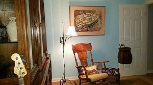
Learn more »
No Comment

HOBSON’S COLLECT ANOTHER ‘McKETHAN’: “Earthweave”

Painting Added to Collection at Hobson Private Home

“Earthweave” is the title of one of my most experimental paintings in watercolor. The painting, framed in a gold-gilded shadowbox frame, could be called a watercolor weaving, since individual strips of watercolor paper were painted and woven in and out of a stationary piece of 300# Arches watercolor paper, also painted.

David and Carole, former classmates of mine, 
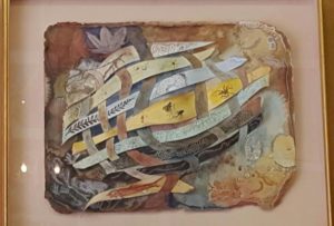
kept looking at the painting before deciding they had to have it. David helped get it down from the second story portion of my gallery/atelier. Now it hangs in David’s study in his new home in Pinehurst. Although a color match was not a primary concern, the effect was striking.

“I study it every day,” David said.

At the time the idea came to me I was fascinated with what fossils showed up in different earth layers. As a watercolorist, I loved painting with ‘earth’ colors, known in the trade as sedimenting colors–as opposed to the clearer, more transparent ones which leave no bits of pigment. Pigment that sediments approximates the earthy layers of ground I wanted to depict. Encased within these layers were all kinds of fossils, skeletons, flora and fauna.

These were painted to look dimensional which gave the shadowbox the overall effect of an aquarium. The work was one a colleague and friend of mine called “cutting edge” in a Henley Southeastern Spectrum juried watercolor show we both had paintings in in Winston-Salem some years back.

Over the years, “Earthweave” has remained viewers’ most popular pick when they visit j’Originals’, appealing equally to realists and abstract lovers. It just never found where it belonged until now.

Anybody who knows me knows I love research. This painting caused me to explore earth science in a new way. How exciting it was, then, in the last little while to have two friends and collectors–separately before they were married, and together–afterwards, decide they were fascinated by the painting and want to place it in their new home.

For my work, I used 300-lb Arches watercolor paper, a thick, multi-ply surface which I then tore the edges of to show the depth of the paper, and rubbed color into those edges to give the overall page shape interest. Organic, like the subject. I then thought of the warp and woof of a weaving’s cross pieces, a craft that fascinated me. I let each strand signify a different layer of earth. Each earth layer took the color that earth layer tended toward, whether blue, red, brown, or amber. Each strand, aka layer, contained the fossils and skeletons that would be contained in that layer. The finished work was an overwhelming hit. Everyone loved it. I nearly sold it several times. An ob/gynecologist from Fayetteville loved it so much he wanted me to paint a similar one, but in oils, on a light polyester canvas that could be turned into a motorized screen that would pull it down to hide the 70″ television, or roll up to hide for viewing programs. For him, I picked fossils indigenous to his home country, Costa Rica. Trompe l’oeil, a popular art term which means ‘fool the eye,’ it looked three-dimensional, but was not. David’s and Carole’s work is actually three-dimensional.

Fossils in furniture, coffee tables and counter tops turned quite popular, and to me was an artistry all its own. Although my research was extensive into earth science for both paintings for me, I only scraped the surface, to make a pun. However, the results are wide-ranged and expansive, rather than laser pin-pointed. In short, there are many layers in many different locales, and I am not knowledgeable enough to speak authoritative conclusions of how many there are, and the implications of evolution. So since there seem to be any numbers of earth layers, others are shown in the ground watercolor page, the colors on it continuing beyond those begun on the woven strands, around the surface of the painting.

There is, for instance, burial of nautiloids in a widespread limestone deposit at the Grand Canyon that formed rapidly, while other layers formed more slowly.

My chosen colors were amber/gold (middle), light blue, lime green, phthalo, green aqua, charcoal, pinkish-brownish: sandstone, light-colored like in the Grand Canyon’s bathtub ring. Fossils that can be found in this layer are brachiopods, coral, mollusks, sea lilies, worms and fish teeth. In the Tonto Platform, the color is a deep, rust-colored red. Fossils to be found in this layer consist of ferns, conifers and other plants, as well as some fossilized tracks of reptiles and amphibians. The Supai Formation displays a range of color from red for shale to tan for sandstone caps. Numerous fossils of amphibians, reptiles and terrestrial plants exist in the eastern portion which are replaced by marine fossils.

There is Redwall Limestone in the Grand Canyon, and behind the reddish face, the rock is a dark brownish color. Numerous marine fossils can be found in the Redwall Limestone including brachiopods, clams, snails, corals, fish and trilobites. In the layer called Bright Angel Shale, which averages about 530 million years old is primarily of mudstone shale, intermixed with small sections of sandstone and sandy limestone. The retreat of the Canyon rim is attributed primarily to the erosion of this layer which forms the top of the Tonto Platform, wider in the eastern portions of the Canyon where the Bright Angel Shale contains less sand and is more easily eroded. The color of this layer varies with its composition, but it is mostly various shades of green with some grey, brown and tan thrown in here and there. Fossils found in this layer are marine animals, trilobites and brachiopods.

The layer of Tapeats Sandstone is approximately 545 million years old, composed of medium-grained and coarse-grained sandstone. Ripple marks formed by ocean waves of an early Cambrian sea are common in the upper layer. The Tapeats is similar to the Redwall in that it forms a barrier between upper and lower reaches of the Canyon that can only be traversed where a fault has caused its collapse. The color of this layer is dark brown and it contains fossils of trilobites. brachiopods, and trilobite trails.

The Bass Formation layer of about 1,250 million years old, made up primarily of limestone with shale is grayish, its fossil record consists of stromatolites. Vishnu Schist and Zoroaster Granite layer is 1,700 to 2,000 million years old and consists of mica schist, containing sediments of sandstone, limestone and shale that were metamorphosed and combined with metamorphosed lava flows to form the schist. This layer along with the Zoroaster Granite were once the roots of an ancient mountain range that could have been as high as today’s Rocky Mountains. The mountains were eroded away over a long period of time and new sediments were they deposited over them by advancing and retreating seas. The color of this layer is dark grey or black.

Fossils gathered from shales of the Stephen Formation are in two strata, the lower quarry Raymond’s quarry. The dark blue indicates deep ocean basins, while light blue denotes shallow seas. Rocks found in blue strata belong to the Devonian Period.

This comprises only a fraction of the overwhelming information on earth’s layers.

It took two attempts for “Earthweave” to come to life, because the size of the strip must slip through the slit made in the paper at the right points without gaping open, as when too wide a slit is made for a wide passage. The heavy paper must then be affixed to the mat backing of the shadowbox. The box is between 4 and 5 inches deep. It was not easy working the woofs into the solid, stationery sheet.

That the owners of this work are fascinated with the story of its creation, as with the painting itself, and that they like paintings that are intellectually stimulating, is gratifying. I’m looking forward to visiting Carole and David in Pinehurst, and seeing my ‘baby’ in their new home.

Learn more »
No Comment

Back to Top