RED, GLORIOUS RED

Seeing Red Is a Good Thing

‘Seeing red’ is an expression for extreme anger, and cheeks turn red with embarrassment. Red stands for the spilling of blood or fires gone wild decimating acres of timberland.

However, we see red in so many ways that red does not just evoke negative emotions. Hearts in love are typically pictured as red. Red is the heat of a fire or ‘hot’ lipstick. Red is symbolic for the blood flowing through our veins, for life itself–blue inside, but red when it appears from a cut. Red is one of the most beautiful of the fall colors for leaves.

Red shouts the return of spring in canna lilies, tulips, roses, and azaleas. The color red commands attention and speaks hope every bit as much as it says danger. Red is the language of passion.Red is a language of its own that poets speak using various names–carmine, claret, wine-red, burgundy, fire-engine red, crimson, rouge, blood red, blush, rose red, poppy red, valentine, and alizarin crimson.

When I led the Artists Anonymous sessions of creativity at Manna Church in Fayetteville, our group brain-stormed names. This exercise was fun, and opened the mind to expansive use of its faculties rather than fill-in-the-blank answers which tend to limit, control, and shut its faculties down.

One remembers the seasons by the arrival of velvety red roses. Anniversaries are commemorated with red roses. Mother’s Day is honored by the red rose you wear on Sunday if your mother is alive. I remember red poppies blooming around Mother’s Day, as well, because they filled the ground sections along I-95 enroute to Rocky Mount, NC, the route I traveled for the juried art show I entered every year. In my attempts to advance I often missed being celebrated on that day, but I remember at least one occasion of my daughter’s taking me out to eat and her meeting me upon my return…usually after returning home with my non-accepted paintings.

Red connotes health, as when we say ‘in the pink of health.’ Late summer is set off by healthy, bright red tomatoes. The delicious tomato-mayonnaise gravy on gooey white bread, a Southern treat, was so delicious just the mention of them by my North Carolina friend at Waldschloessl made me homesick. Red tomatoes were instrumental in calling me home from our Youth with a Mission service in foreign countries surrounding Germany and Austria.

When fall comes, its beauty seems always measured by leaves turning to lustrous shades of red to herald in that season. My early primary family went on fall vacations to the mountains, in particular, Mt. Pilot of Andy Griffin fame, where my father grew up. Our eyes feasted on the view of leaves ever more glorious the higher we climbed. I collect leaves. Even now I have batches of leaves at my studio, waiting for the still life muse to prompt me to leap, set them up and create a new painting. Leaves have occupied some ten or more of my paintings in both oil and watercolor. Two of my red leaf paintings are in Cary, NC. I doodle leaves, as well.

At Christmas, the memory of my father-in-law’s greenhouse filled with rows on rows of red poinsettias he grew to sell fill the season with an aura of his generosity and his permanence. This was one of those things he always did, regular as rain. At some point he would tell us each to come pick one or two out for our Christmas decorations, a major part of our Christmas, his gift to each of us. Red poinsettias just are Christmas, along with all the other red Christmas decorations.

Really, I never realized until I started writing this article how many seasons use red. Add to the aforementioned: one bright red valentine in February. Not getting any shiny red hearts hurts the Charlie Brown’s among us. untitled
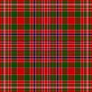
Then there is the red of heritage. My McAlester strain is characterized by a bright red tartan.

Recently I read an article that claimed sales on red lipstick rose to new heights in a down-turned economy. An odd claim at first, it makes absolute sense. If a woman doesn’t have much to spend to make herself look good, then she buys what gives the most pizzazz for the penny. Red will certainly do that: just thinking about buying red lipstick at the drug store makes my hope surge. Just the other day as I bought the makeup I had forgotten to take with me on my trip to my granddaughter’s, I saw a shade of red lipstick I couldn’t resist. That reminded me of the time I taught Sunday School at a church in Massachusetts, my pastor called me in to ask me not to wear a shade ‘quite so red’ for my internship from divinity school.

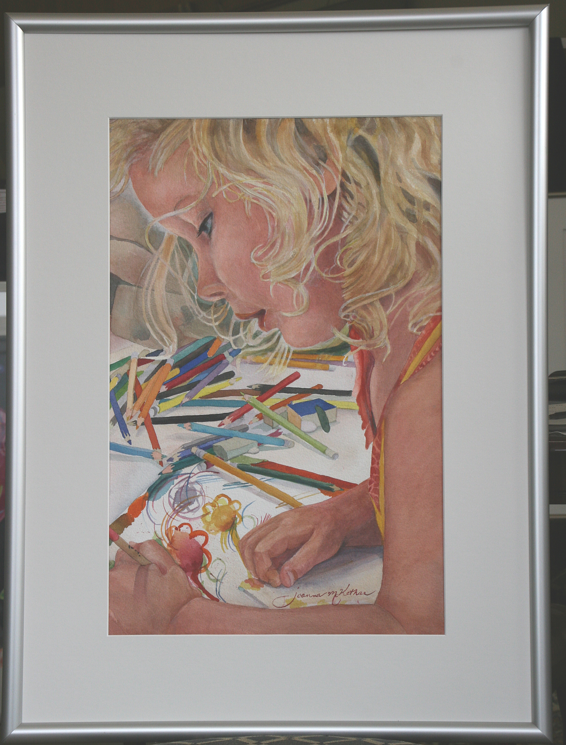
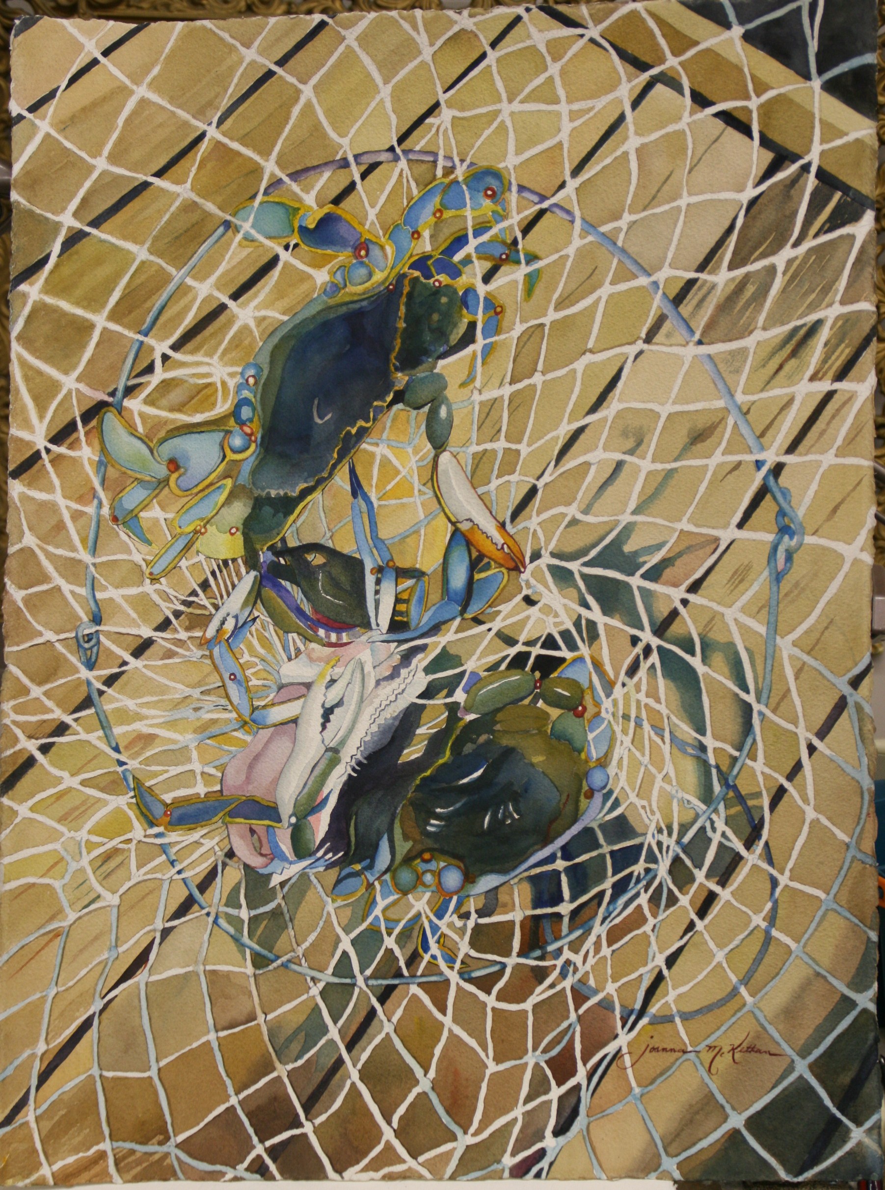
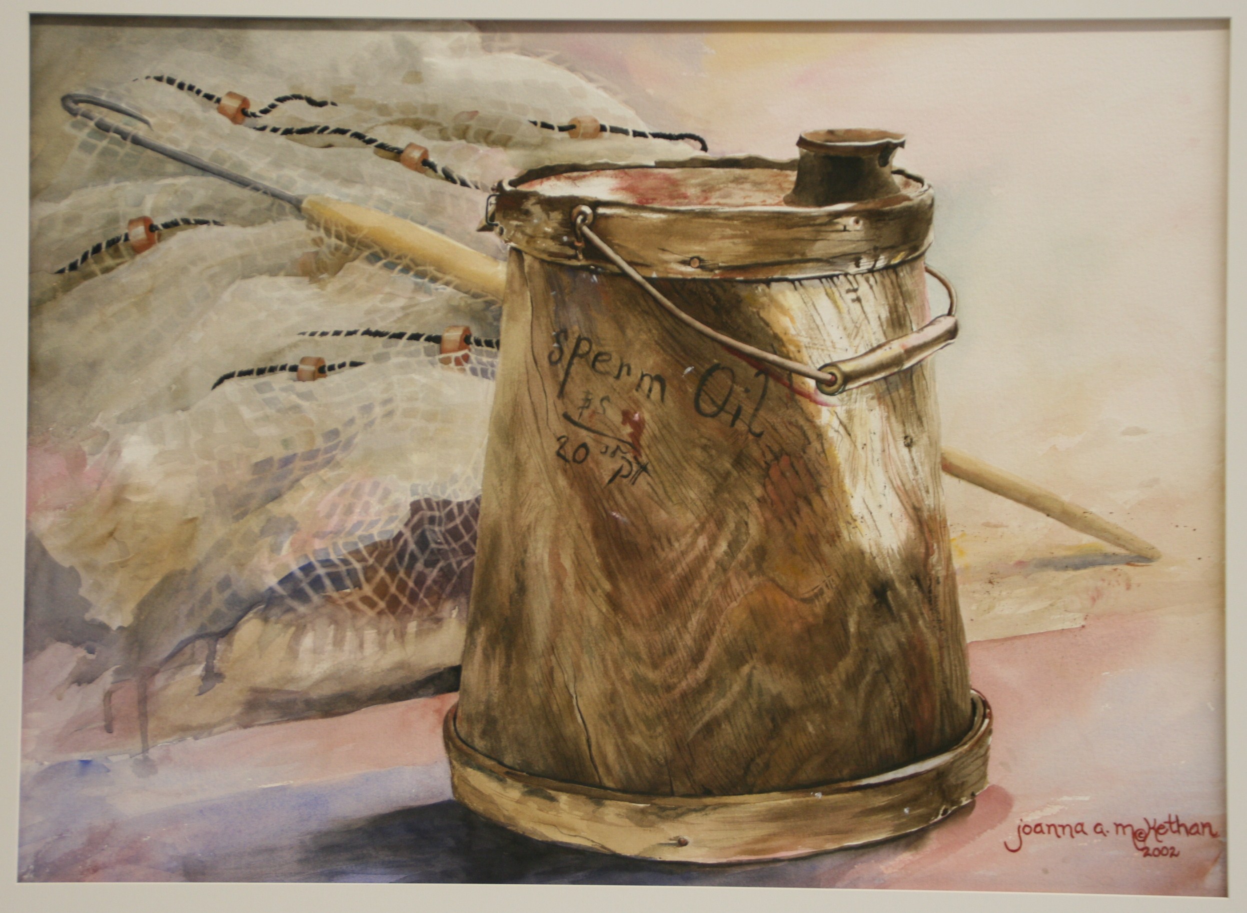
Then there is the red carpet treatment one gets as a special favor, such as the runway for celebrities. Maybe I should do more paintings in red. The color certainly seems to sell them. One of my favorites was of red poinsettias floating in deep blue, “Herald,” which was juried into the Durham Arts Council’s annual exhibit by a D.C. major juror, a curator for the Phillips Collection. It sold in Harnett County. One red leaf painting  hangs in Cary and another in the complex of buildings that is SAS Institute, Cary, NC, one of the largest privately owned businesses in the U.S. I believe the elephant-sized painting of bubbles that hangs in the insurance building in Raleigh sports a lot of reds. Three Red Leaves, IMG_8625
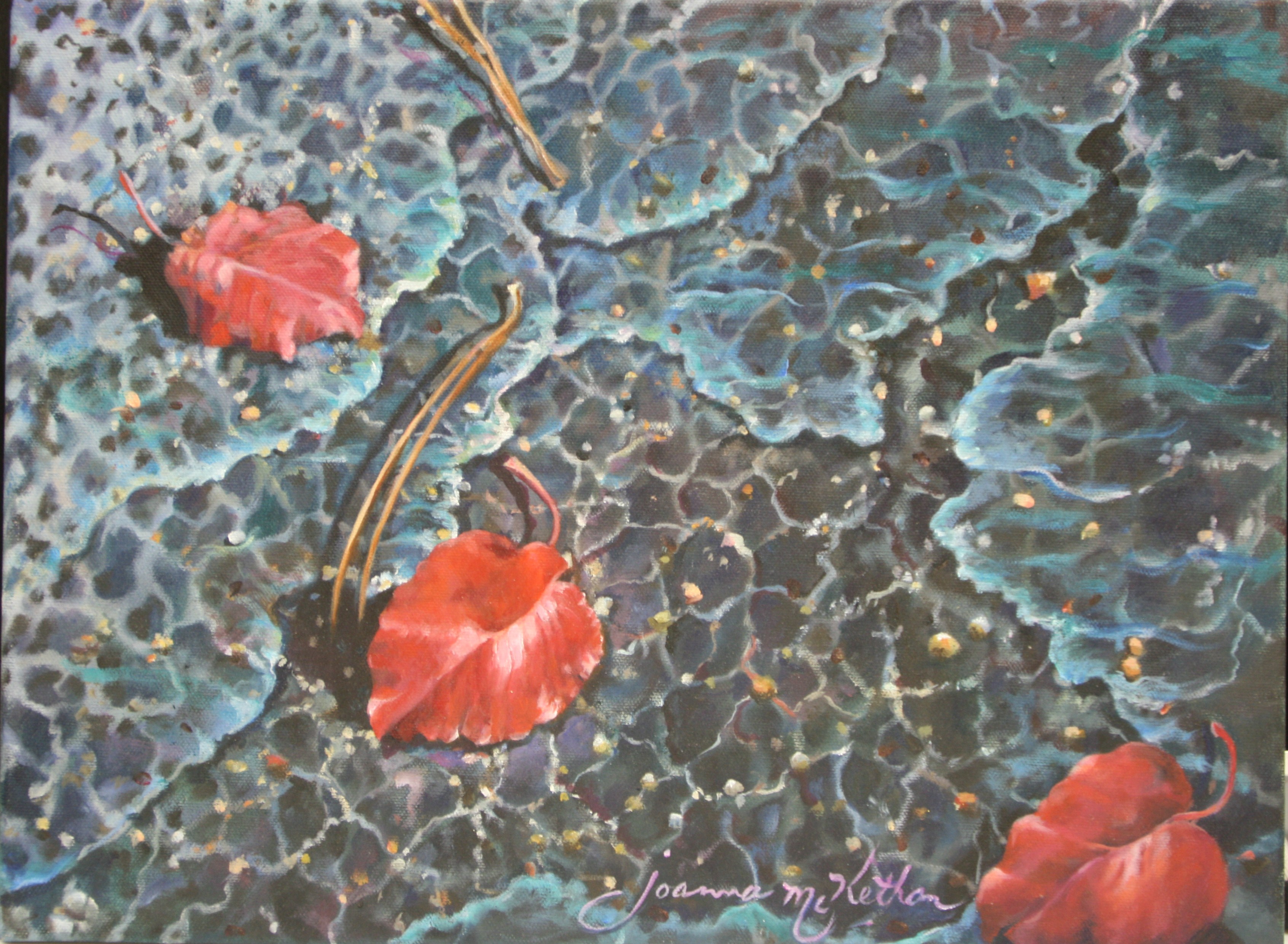
Just for fun, I’ll include samples of sold and unsold paintings with red in them.

One of my students who branched out to take a weekend course in Raleigh was told that in her beach scenes, one should never paint a walker wearing any red apparel. Tell that to some of the greats in museums, right? I suppose the taboo of today shows you ‘know’ what and who the current trendsetters are. Telling most artists not to paint something red is more than likely, however, just to make them see redder. Which reminds me of another way of seeing red–Spanish bullfighters waving the red scarf in front of the bull to make him charge. It definitely inflames the eye!

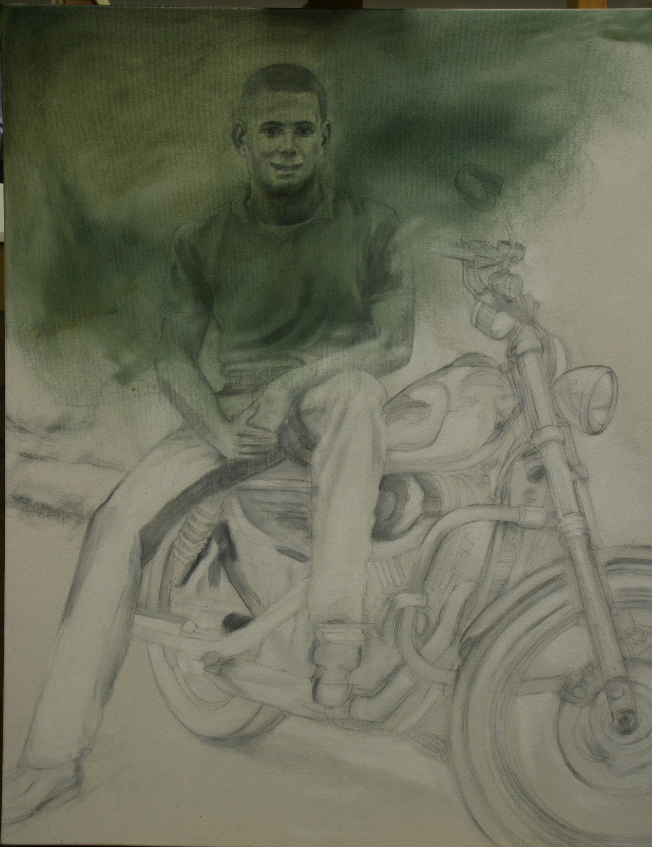
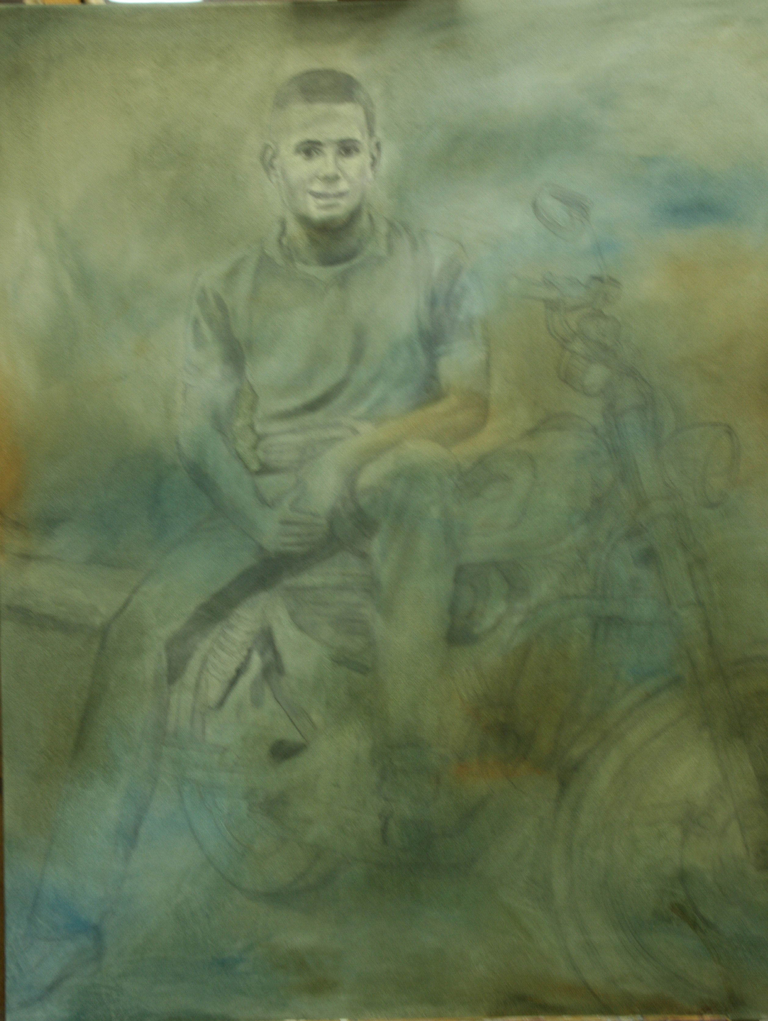
There’s a little bit of red in my most recent commissioned portrait, in the plaid of the little boy’s shirt. I changed his sweatshirt top to the plaid shirt in other pictures, and it ‘made’ the picture, my client said. Along with capturing his essence, which is what his mother claimed the painting did. In another article we’ll examine all the different red paints, which ones are reliable, and which ones we are told to avoid. Right now, I need to rest my eyes on a little gray.


Learn more »
No Comment

TEACHING ART TO MY GRANDDAUGHTER

Colby Lost in Art

Teaching art isn’t always about imparting knowledge. Take my lovely little granddaughter for an example. Was she born loving art with art-loving genes? I don’t know the answer to that, and it could start an endless theoretical debate which might be fun. Maybe it would give evidence in support of jumpstarting an experimental course in art within the school’s educational system. But the significance I’m about to share with you would be lost.

Teaching art, I believe, is a prospect of catching the fire. Fire comes often from a mentor. Art is caught, not taught, if you would like a catch phrase. My granddaughter, Colby, lives three and a half hours away. Whenever I see her, whether she comes here, or I go there, she starts off asking me, “Gemma, we go your art studio?” She just won’t let up until she has the response she wants or is confronted with the impossibility of having it. Whatever it takes in driving time, she’s up for it.

My daughter-in-law Christy tells me how she pauses before a painting of mine they have hanging and starts talking about it, about the pops of color. She asks questions of color and design seemingly advanced for one so young. She loves going with me to art exhibits, and at my most recent one-person show in Elizabeth City, NC, at Floor2Ceiling Design LLP, she sat with the adults for a–hold onto your socks–3-hour course in watercolor painting. Plus, she helped me set up for an adult course in watercolor I was teaching, possibly becoming my youngest art intern at 5 years of age. Asked in class what the primary colors are, Colby sang them out. Asked what mixing two colors produced, she chimed in with the answer. What’s the secret? Art is exciting for her. It’s a land of Oz.

Before that course of mine at one of the Watercolor Society of NC, Colby attended with me at what must have been a boring show for kids, but was a fabulous presentation by the judge for the annual exhibit of WSNC held at the Arts of the Albemarle where I keep a continuing presence in Elizabeth City. She sat through it all, coloring, wanting to get up, returning to coloring. The Friday night before she went with us on the artwalk where I first met Nick Nixon and his wife Amy which lead to my one-person show, and gallery representation. Colby was really into the whole event. If she bounced too high–well, on to the next art place, each one new, different, and exciting–usually because every one of the businesses encouraged some experimental testing of the waters.

We have re-visited the art scene several times, and she is still enthusiastic about it. Her own picture was included in a show at Floor2Ceiling, along with her sister Kimberlee’s–and of course, yours truly helped them like I do my own students from Art on Broad Atelier in Dunn.

View from the Studio

View from the Studio

Considering which, I ask, what makes it so special? A division of j’Original’s Art Studio at 217 East Broad Street, my studio is a designed-for-nothing-but-art one which my son and I own together. (By the way, he is proud of his mother.) I have it set up with the show window front portion purposed as the gallery, full of paintings framed exquisitely, on easels, and on the walls, some up a story. The two-tiered hanging makes it look like Soho or San Francisco or Paris, I think. That’s an ambience I love. Other than having Southern light source instead of the preferred-for-artist Northern lighting, it’s perfect.

The next part you settle into visually is the teaching area, a roomy place with simple, white, six-foot folding tables arranged in an open square, with table easels set up in close to eight spots, a board on the easel, and small easels beside each big one to hold a book. I have added two standup easels and am trying to convert the student area into more of this style, the typical atelier look. Long sheets of printing paper a student gave me a pile of over 20 years ago for testing strokes, colors, and ideas cover the tables. Its set up provides an open invitation to paint or draw.

“Draw” in both senses of the word, and draw, it does. As soon as we open the door, Colby runs to her place, pulls out her comfie chair and gets started. I find her watercolor paper, and pour out the tins of watercolor colored pencils all over the table. Generosity is the operative word here. I don’t mete out 2 or 3 pencils, I pour out the pencils. Anything a child gets must excite their imagination early on, or you’ve lost your window of opportunity.

Soon she is lost in the process and down under for the duration of the morning. Concentrating? I couldn’t pull her from it if I wanted to! One morning she was busy decorating flowers, using the colors to make a border, and so I took photos of her to paint the portrait of her later. I captured not some artificial setup of a photographer, but a creative child in her native habitat, a portrait of Colby I entitled, “Colby at Art.” IMG_0208,c,My framer commented on the difference in my portrait of her as he was framing the work. “You didn’t just put two or three pencils there like most artists would. The pencils are all over the place, and that’s how a child would like it!”

Couldn’t have said it better myself.

My son’s family owns the painting, of course, which I entered into one of my list of major art shows. And at my studio it displayed as an example of the portrait I could create for you of your child, lost in the activity or thought most native to him or her. I love the way Colby fills and borders the page, her hair dripping down over her eyes into the left frame, her intent expression of face filling the topmost edge, her shoulder the right side, and her arm reaching forward on the bottom edge, leaving just a small opening that isn’t her. I imagine this as the childhood opening which brings in a whole delightful world of art.

A world full of welcome, opportunity, new ideas, and love–a place where students can come and go–return and learn, and test their growing skills.

Learn more »
No Comment

MY NEW WATERCOLOR, CRAB-NET, SELECTED

Southern Watercolor Society’s 37th Annual in Kerrville, TX

“With great joy” the Southern Watercolor Society, an 18-state regional, which includes Washington, D.C., informed me they have selected Crab-NetIMG_2406 for inclusion into their 37th Annual Exhibit to be held at the Kerr Arts and Cultural Center (KACC), in Kerrville, TX.

Linda A. Doll, aws, nws is a painter, digital photographer, graphic artist, instructor and the juror of choice for the Society’s show. A teacher of workshops and seminars throughout the US, Mexico, Canada, France, Italy, Greece, Spain, Ireland and Bali, she is President (2012-2014), a Past-President and Life Member of the National Watercolor Society, a Past Board  Member and Juror of the American Watercolor Society, and a past Board Member of Watercolor West. She is a Life Honorary Member of the Federation of Canadian Artists and an Elected Life Member of the San Diego Watercolor Society. Her paintings and drawings are included in many books and have been used by several magazines for their covers. Linda is included in many Who’s Who Publications, including Who’s Who in American Art and Who’s Who of American Women.

People and Still Life Subjects that hint at the person just outside the picture plane are Linda’s favorite painting subjects. Perhaps my Crab-Net told a tale in negative blocks of color and circular bits of string that included the people lurking just outside the net who had caught the crabs pictured inside the net. Perhaps she sensed them relishing the moment and thinking about the seafood meal to come.

In any case, this watercolor painting of N.C. blue crabs came to Linda Doll’s attention and is one of the only 80 paintings, with 5 alternates, that she picked out of 362 submissions from 18 states and D.C to form the 37th Annual Exhibition for 2014. Lucky me!  This painting, a 29 x 37, was a fun subject, product of a fun day, about a fun sea life, crab, and using a fun medium,  watercolor. For all that, it was one of the most intricate and difficult of my paintings, involving a lot of struggle in the painting. I love negative space, weaving, and the sensational  blues which reverberate in the beautiful N.C. crabs. This painting was like a weaving within a weaving. Add to it a tangle of emotional struggles which I sometimes encounter when I take professional vacations, and you have what was a life journey untangling from the crab net.

Once I began, I kept seeing emerging patterns,  so I would re-do the drawing to include the new pattern. One was the radiant vortex of the simple trap. The subject emerged enmeshed in spirals of knotted twine which revealed as many holes in the net as it did crabs. Such a simple thing, string, to outmaneuver cranky crabs. It reminds me of a recent story of a whale entangled in multiple nets that rescuers released from the string prison. A sea mammal showed undying gratitude to each rescuer in turn–such a touching display.

Crab-Net is my most recent watercolor, and has hardly been let out the door, but it did visit the Arts of the Albemarle in Elizabeth City in one of their shows. It is part of a new series of paintings I am doing that involve the sea in some aspect. I call this new series “Sea-Escapes by Joanna. ” https://joriginals.net/product-category/sea-escapes/ Sea-Escapes can take you to a pier on  a July day where the crab pots are collecting piles of crabs, fishermen are fishing, and I learn how to crab–well, kinda, sorta. And the harvest of NC blue crabs turns into one of the funniest and simultaneously most beautiful piles of color in a painting.

Measuring the crab against one slat of the pier to determine if the crab was a ‘keeper’ or a ‘throw-back-in-er’ was one of the tips I learned. And scampering away fast so a loosed crab wouldn’t pinch a toe was a newly acquired skill, as well, and could well turn into a life lesson. What I took home with me was a stomach full of delicious white crabmeat dipped in butter and my own photos to work from on a watercolor which netted me the painting, Crab-Net, white string spiraling to a vortex over a circular metal loop, holding a complexity of colors and shapes that for me are pure visual escapes.

As for me, I am fully planning on attending the exhibit, as I did a couple of times in the past when my painting was included before, enjoy the members’ luncheon, the reception ceremony where I meet members from all over who are extremely friendly and rub professional shoulders. We may even visit family and friends while we are there on April 12th. I am one of the Southern Watercolor Society’s signature members, which means I get to sign my name, and add their initials afterward, SW.

Of course I will leave my picture through the duration of the exhibit which ends April 28, at which point, I will hopefully be in Washington, D.C. at the the Portrait Society of America’s Annual Exhibition, enjoying another topnotch show that expands horizons.

Such chances don’t come every day.

Learn more »
No Comment

PAINT WITH AN UNFAIR ADVANTAGE

Imprimatura, or Underpainting

Some painters never discover the explosive goodness of an imprimatura. They resist laying down a color opposite to the one they see. That runs counter to logic, evokes fear, speaks of time wastage. It messes with their sense of what is right. If you can’t see it, logic argues, why do it? What good is something you can’t see? Fair question, faulty answer. Because by taking this extra painting step, they would give themselves a leg up over all other artists.

408 - CopyBy not doing so, they delete a step in the painting process which so enhances a painting, it receives an unfair advantage over any similar painting. Let’s explore the question of what good an underlayer provides. Hmmm: What value does a skeleton add?  What does the third deeper layer of skin provide? The third layer of insulated glass? For the first, it provides the form to shape the flesh hung upon it. For the second, levels to prevent burns from reaching vital organs. For glass, the doubled cost keeps out ultra-violet rays which damage fiber and fade color. It also provides the painting with a skeleton, a third layer of skin, and protects against light damage, and more.

Let’s define imprimatura. The National Gallery of Art defines imprimatura as a thin, translucent layer of color applied to the ground (the ground is the board, canvas, paper or skirt painted onto) before beginning the actual painting. The imprimatura reduces the absorbency of the ground. What does that mean? Simply spoken, it means that all that luscious color you apply to the canvas, wood, paper, or wall will not sink down into the fabric, lost, a condition referred to as ‘sunken color.’ Instead, it will happily stay up near the top on the surface to shine in all its glory.

The word ‘imprimatura’ is Italian, meaning ‘first paint layer.’ Before dabbing the canvas with the first drop of paint, a thin, transparent layer of paint known as imprimatura, is applied on the entire canvas. Usually it is done in neutral olive or earthen shades derived from raw sienna. Imprimatura helps reduce the radiant bright light on the canvas and allows the final coats to exude their true colors.

Sometimes, the National Gallery says, it is used as a middle tone for the painting itself. Another way to put that in current terms is, an imprimatura gets rid of all the white. White is confusing to the eye, and the eye needs not to be confused. Any white that returns to the canvas is then, and should be, one hundred percent intentional.

In Old Masters training, I was taught that there should not be any more than three highlights (whitest whites, or brightest brights) in any given painting. That insures a better result to any painting right away. Historically, the imprimatura is a glaze coat intended to rid the canvas of white–one sees the drawing underneath, and proceeds by blocking in thin layers of paint once the imprimatura is dry.

Even when some painting has begun, it is important to bring the progress forward slowly, painting on firstglazes, then a reasonably thick layer of paint in middle versions of the differences you see. You needn’t paint entirely flatly in this stage of roughing in the large color shapes. You help your craft by approximating what you see without slavishly breaking out the small 3-hair brushes for intense detail, as with adding highlights to the hair.  As the painting dries, you slowly and deliberately decrease your brush and stroke size, not over correcting at this point. Continue the progression of the professional process as you have laid it out, following techniques that the Old Masters have used for centuries.

This primer paint, the imprimatura, is mixed with half Liquin ™ (the masters used turpentine oil) and half turpentine. This makes contrasts between bright & dark, while preparing the canvas for further layers of paint. When applying imprimatura, it is important to know the final color scheme in advance. The base shade is then chosen for the desired color and brightness effects.

Typically, using the opposite, or complementary color to the final color, will yield pleasing results, but trial and experimentation are key to discovery. Work fast and all at once. This is no time to fuss for detail, as The mix will likely become tacky when it is laid onto canvas surfaces. Before it has turned sticky is the time to stop. When the initial layer is done in the shade of gray instead of olive, it is known as Grisaille. I Personally do both a grisaille (first) and an imprimatura over it (second).

The key purpose of imprimatura is to seal with a priming layer so that the ground becomes nonabsorbent and radiates its colors instead of sucking them up, while also providing a quality visual unity.  Imprimaturas are used in indirect paintings where the sketch and first painting are allowed to dry for further work to be done. At times, one could proceed in the opposite fashion, making  a primary draft of the desired picture on canvas and an imprimatura coat applied over it. This safely seals the sketch as a foundational layer, while the artist prepares to paint over it (my preference).

When I have worked on commission and allowed the client to see the initial stages, the imprimatura stage has confused them. I say, “it isn’t painted,” and they say, but there is green all over your canvas. How can you say it isn’t painted? Then they begin with the directions. ‘Make the rose petal whiter, take out the brown. Make it more pastel, balance with the same length on the right.’ To think of an imprimatura, think of the concept of what a photographic negative is to a photo print. The colors are opposite to what you see. This is what lends the painting depth.Using an imprimatura actually causes the colors to multiply. The painter does not have to work so laboriously to accomplish slight variations in shades; they happen naturally with succeeding layers of paint, because the paint is not entirely opaque that tops it.Thomas High Drawing with Imprimatura

While in no way a final product, customers have loved the swimmy effect of the imprimatura and wanted to buy it just that way. Not using one, in my opinion, lessens the professional quality of the finished product. Succeeding glazes build up the color gradually, from underneath.  Goya, I was told, used red as an underpainting for his faces. The Dutch masters used the olive or earth green.

Either is good, but the effects are dramatically different. The process cannot be rushed. The stages of  painting are all necessary if you want the professional product I am committed to, which I produce each time, and struggle to convince my students of their necessity.  All of my own portraits always begin with an imprimatura and a grisaille. On the portrait page, in the stationary shots, I am actually working on an imprimatura glazed over a grisaille. The other two portraits were painted using an imprimatura and grisaille, as well. 014, Thomas for Twyford

In this portrait, I did not use the grisaille, only the imprimatura.

When you begin with an imprimatura, what is unseen gives you the clear advantage.

Learn more »
No Comment

RAPPEL UPWARD ON DREAM THREADS

First Steps to Fulfilling Your Destiny

Dreaming is a 100-percent effectual way to get ahead. Believe me. Nothing that I am now seeing accomplished professionally or personally would ever have happened without my first having dreamed it.

When I first began ramping up to do watercolors, I was full of fear. I must not have seemed fearful to my aunt who thought she needed to deter me from harmful activity. Long years before I had any paintings to my name, when I was pregnant with my lovely first-born daughter, my aunt said to me, “Well, I guess you won’t be able to pursue your painting now, will you?”

Add anger to dreaming, and maybe you have come upon a magic combo. I have never been so angry in all my life. I fumed, fretted, and banged doors and tables. Mean, I thought. I griped about it to my husband. Then the inherited determination from both sides  kicked in, and I thought to myself, you’ll see. To make sure I would continue, I locked in my supplies for watercolors. Watercolors dried quickly and emitted no poisonous fumes in the house that would threaten my baby. I could rely on them.

That new resolve had to be postponed due to our move to Germany, so until I had a stable base, my dream could not go forward. Once there, with house and furniture, I started on the dining room table in the middle of all the activity, because I knew I could progress in short spurts of intense activity in defying her pronouncement. I started out ever so tenuously; beginning with teeny antique bud vases filled with the miniscule violets Erika would later pick on her way home from where the bus dropped her.

At some point I began writing a poem from the experience. This has since been published in literary magazines and in an English-Russian anthology. It appears in Russian and in English. A phrase from it embellishes the book’s divider page. You can hear my anger in the ‘you say,’ I think.

“Of a Substance Strong Enough

Dreams are great, you say,  for night-time–

like wispy clouds  that disappear at noon.

But I say dreams  are spit and fiber

spun and thrown  like spider webs–

filmy filament  which sticks mid-air,

catches and holds tight enough

for you to climb, run, live  (nest your babies on)

and yet,  still make it there.”

2d Publication rights, Earth and Soul: An

Anthology of NC Poets, Kostroma, Russian/English, 2001

Crucible, Warren Wilson University and The Lyricist, Campbell University

Imagine my extreme surprise years later, when I read an article on the ballooning action of spiders. It seems airplanes encountered much difficulty running into systems of spider webs high in the sky. Spiders build webs higher than anyone would earlier have imagined possible.

It seems that spiders, especially small ones and some other creatures, propel themselves upwards with a mechanical process called ballooning, or kiting.

They spin a very fine silk, called gossamer, to lift themselves off a surface. Then they use the silk as an anchor in mid-air. This fine silk has been called ‘gossamer’ since 1325 according to the Oxford dictionary. Again, no one knew then that gossamer was derived from spiders.

After hatching, a spiderling will climb as high as it can. It then stands on raised legs with its abdomen pointed upwards, a process called ‘tiptoeing.’ Then it releases several silk threads from its abdomen which produce a triangular-shaped parachute which will carry the spider away in updrafts. Even small gusts work. They may not go very far, or they may end up in a jet stream, depending on many components, but their trip could extend into the upper atmosphere.

Sailors have reported spiders in their ship’s sails miles from land. They can live a month without food. Evidently ballooning is the main way spiders migrate to isolated islands and mountaintops. They have been found as high as 16000 feet above sea level and on the tops of mountains and can live without food for close to a month.

Even without knowing this I wrote the phrase, “Dreams are spit and fiber, spun and thrown like spiderwebs….” It is gratifying to describe how something seems and have it proved factual. The odd thing is that this was the one phrase in my poem contested by a Russian sister-city poet, the phrase, ‘spit and fiber,’ was deemed unpoetic.

IMG_2406It is no small wonder that one of my favorite artistic and written images is the spider web, lace, tatting, tobacco-twine-tied coverlets, and fishing nets. My most recently finished painting is Crab-Net, with beautiful North Carolina blue crabs caught in the holes. The entire painting, done in watercolor, is accomplished in the negative, a painting process thought very difficult by most painters. It involves seeing in the negative, and painting the holes is also the largest kingpin step in the discipline of using the right-brained creative process. Only the space between the threads is painted because in transparent watercolor, one must leave the white of the paper showing to create the white. Another painting, “Dockside,” uses a net as a portrait background for an old sailor. A third painting has a net background with a harpoon, “Sea-Lit, the Sperm Whale Era.”IMG_2394

About seven years ago, I began leading creativity courses from my business j’Originals Art & Teaching Studio, and through a local church. I had just finished reading Julia Cameron’s book, The Artist’s Way, in which we were encouraged to write three pages of unedited, stream of consciousness prose first thing in a day in a journal. We signed a contract with ourselves that committed to three months of seriously trying these things out. We agreed to make a ‘date’ with ourselves once a week to do something that our artistic child would love to do, all by ourselves. There was a creed and a prayer that we repeated for strength.

The purpose of the whole process was to make ourselves our own best friend, to bring ourselves to where we could trust ourselves. I began the experiment which I now cannot live without. After these seven years of more or less consistently doing this (I have around 30 journals to show for it or perhaps I’d better not show), I have learned its truth. What you dream, happens. Julia Cameron calls this ‘serendipity.’ Besides having the joy of that happening, I have learned that what you hate and journal, you can give up in minutes.

In short, this process recreated for me the means for ‘ballooning,’ for ‘tiptoeing,’ for reaching upwards and outwards from your gut, having faith, for trusting what or who comes in off the street, and for catching the updrafts of my dreams. # # #

Learn more »
No Comment

Back to Top