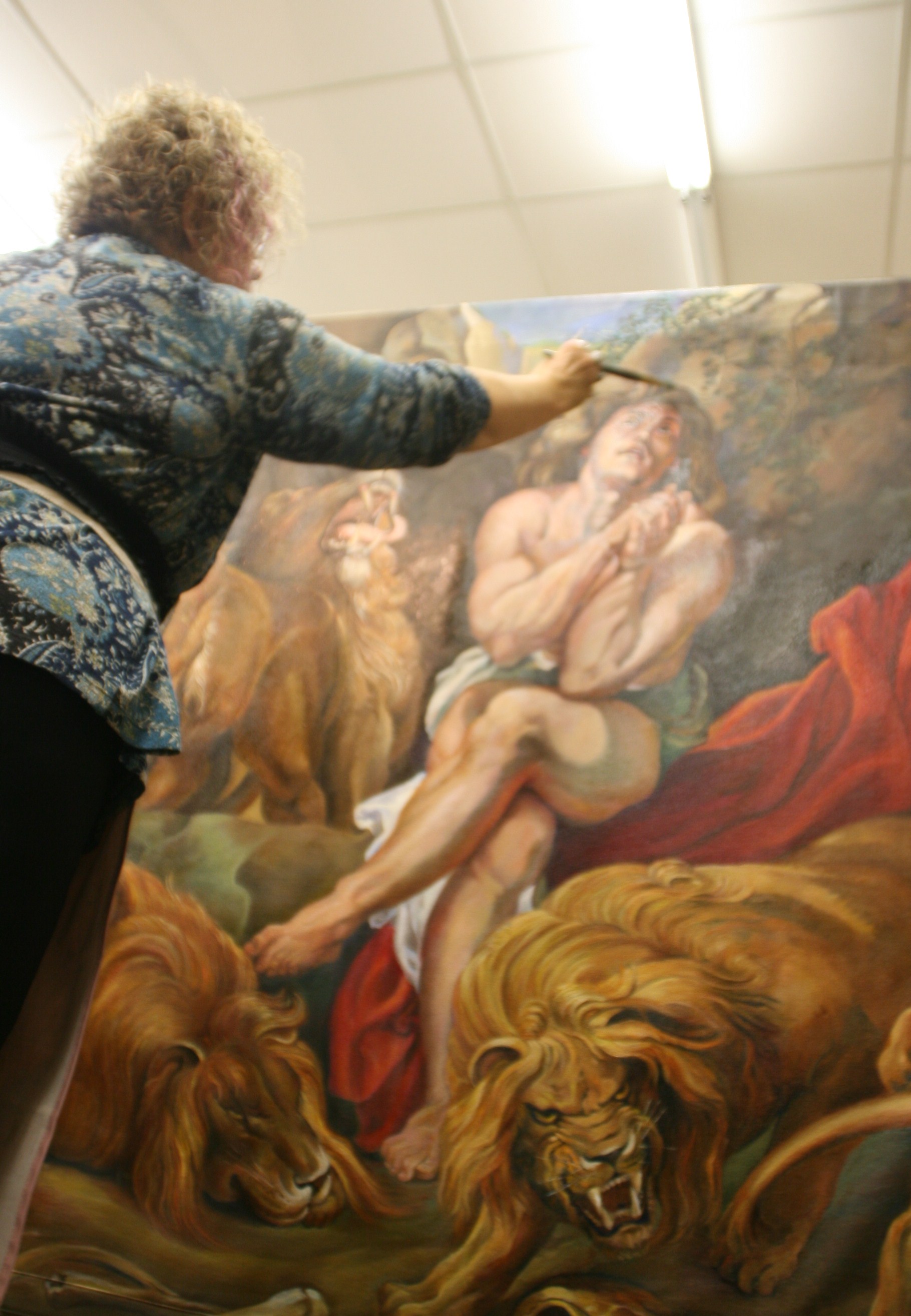
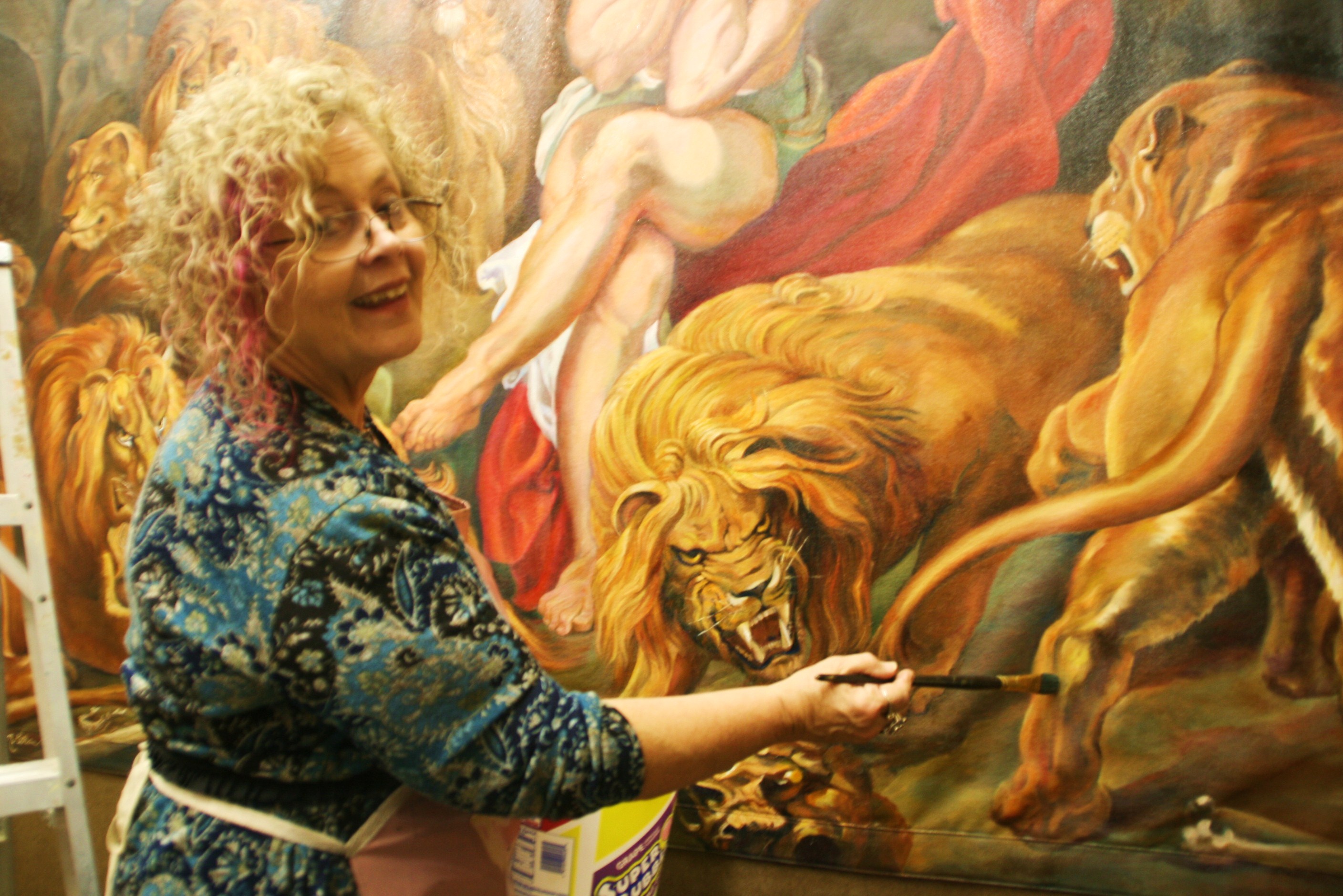
The time had come. The last strokes had been administered and were all dry to the touch.
My professional adult student had asked me to show her how I did a finishing glossy coat over the painting. I am not talking about the final varnish coat at this point, because I was a little afraid of using one due to the floppiness of the ground, the loose hanging, sewn canvas. Varnish can yellow and go brittle on you.
The method I was taught to use was with Liquin TM by my mentor Thomas Buechner, now deceased. Depending on the degree of gloss you wished your painting to have, you mixed turpentine with the gel medium and brushed it over the surface. This gives a similar effect to that achieved by oiling out which uses linseed oil. This substance I had already determined by my contact with Portrait Society of America to avoid, as the top chemist in the country had commented on the rigidity of the linseed oil medium, a rigidity which increased over time as the drying of the oils continued over the years.
This was an effect to be avoided at all costs as it causes cracking. So in proportions of approximately half-half, I mixed the two substances in a bubble gum container and applied the mix to the painting, under the watchful eye of my master student, who kept pointing out any dry spots that tried to hide as I painted it on. That whole process took an approximate hour, and was left to cure out until the next day. The difference in the look was astounding, similar to that of oiling out because it calls any pigment to the surface that had begun to sink into the ground or canvas, thereby turning duller. It added a sheen, but a matte sheen. Had I wanted shinier, I would have used no thinner solvent.
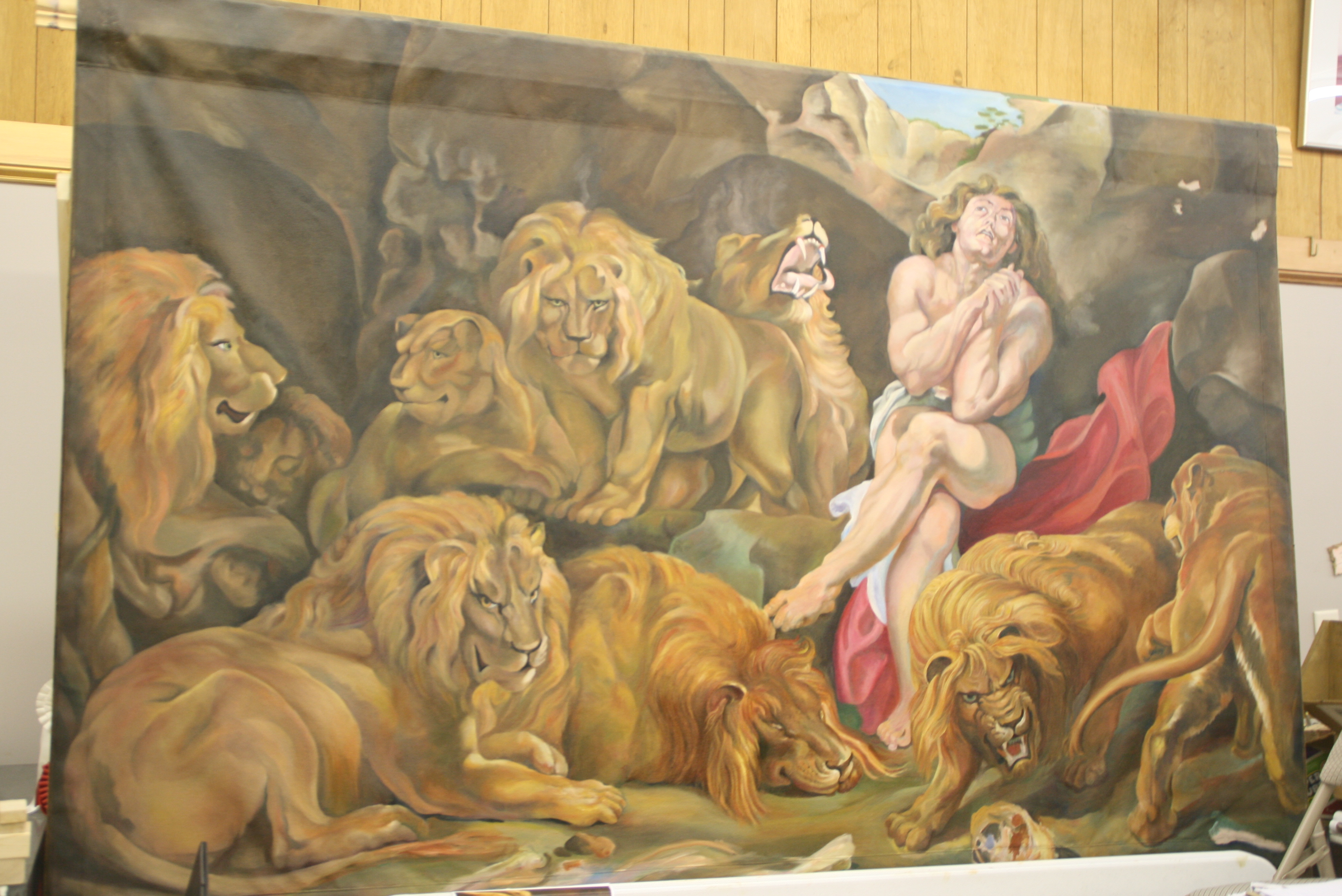
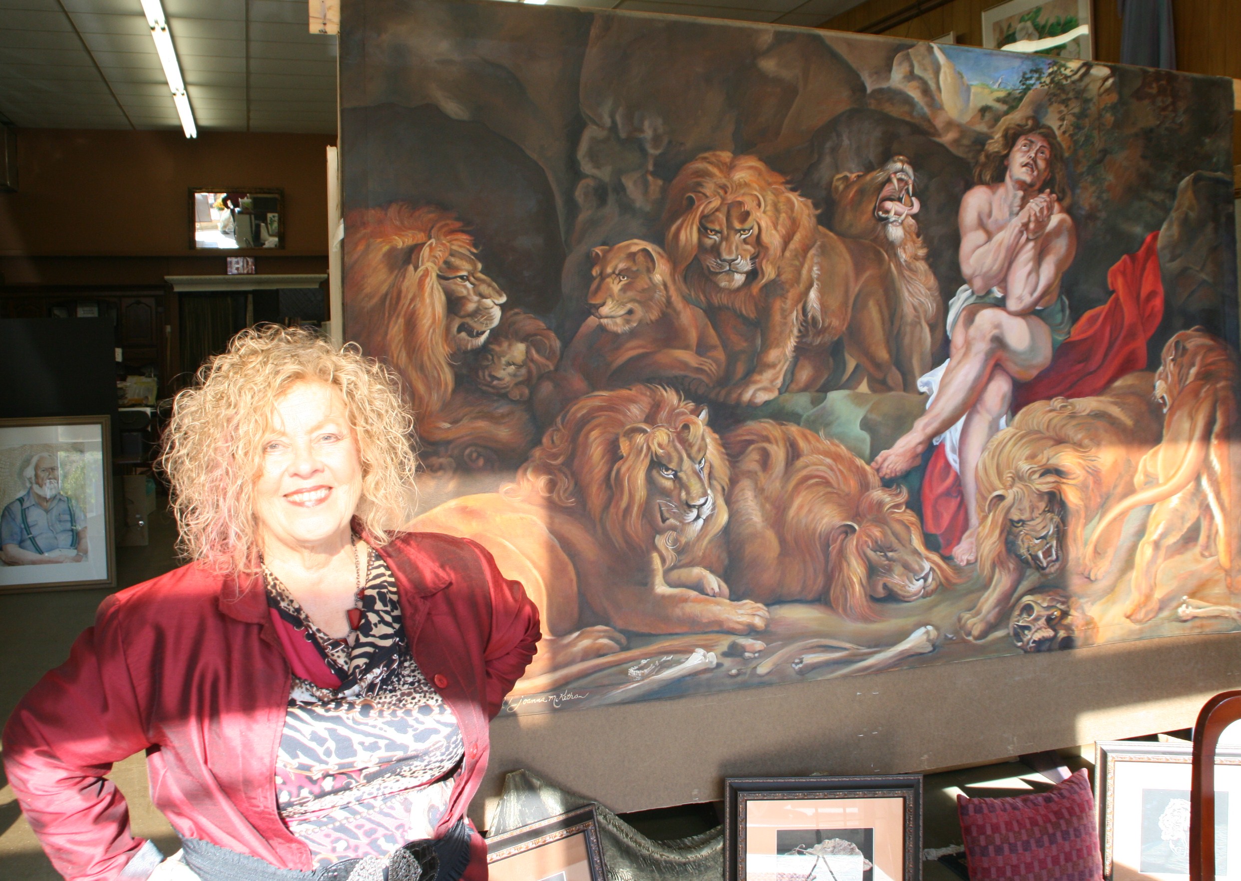 That day The Daily Record arrived to take a photograph of the painting and that was published in color in order to draw people to the Cotton Festival in Dunn, an event which probably brought in 200-some-plus visitors to see it.
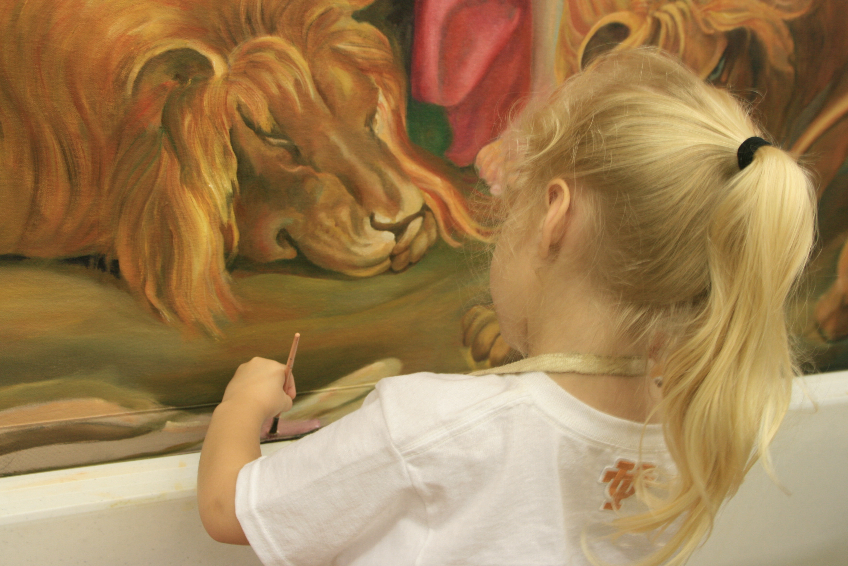
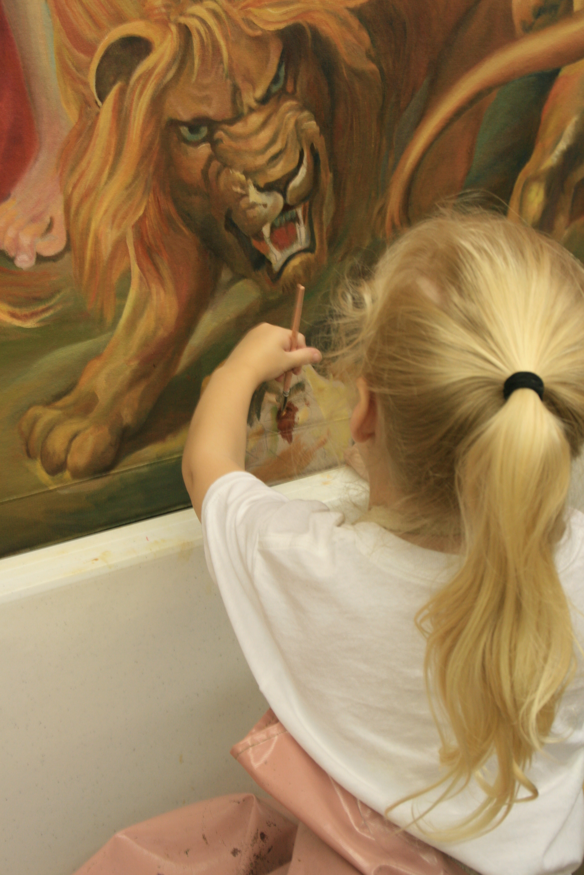
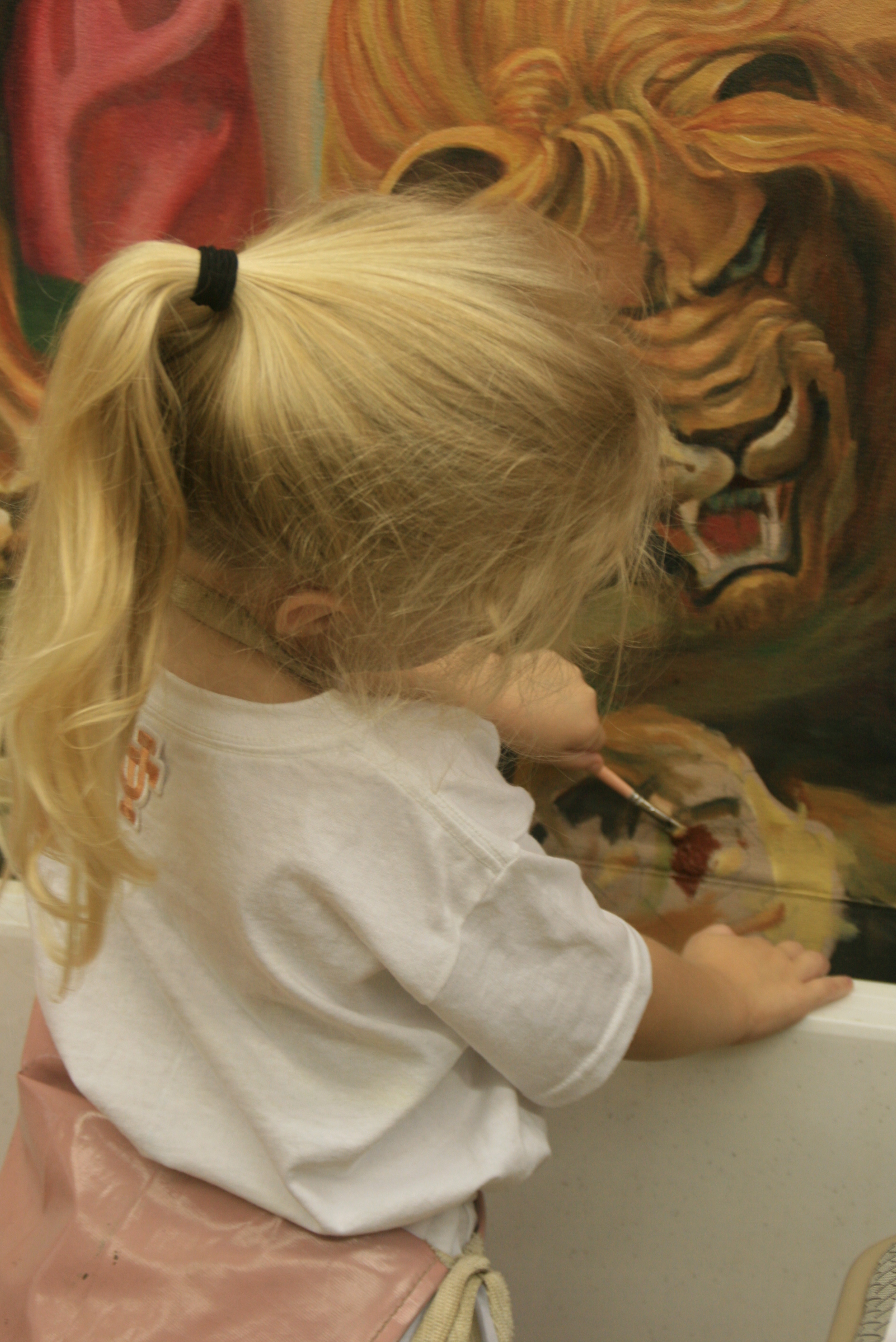
My photographers came to take a picture of it that would then form the base for my annual Christmas card.
My client had a dowel rod made for the rod pocket at the top out of acacia wood, in the red tones, or burnt sienna tones of the lions’ manes, with carved wooden finials at the end, all beautifully finished.
 the artist’s copy of the original one that hangs in the National Gallery of Art in Washington, D. C.
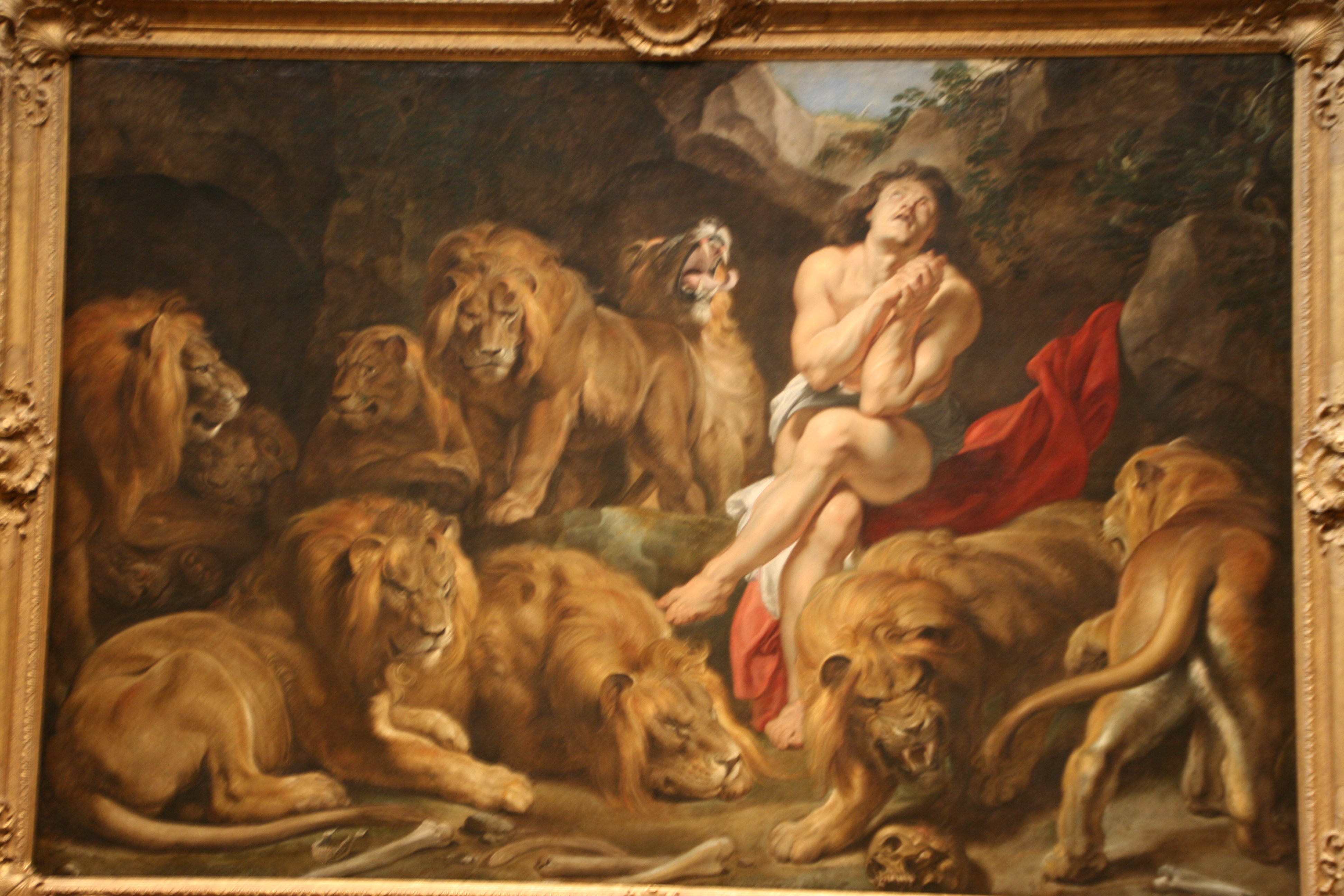
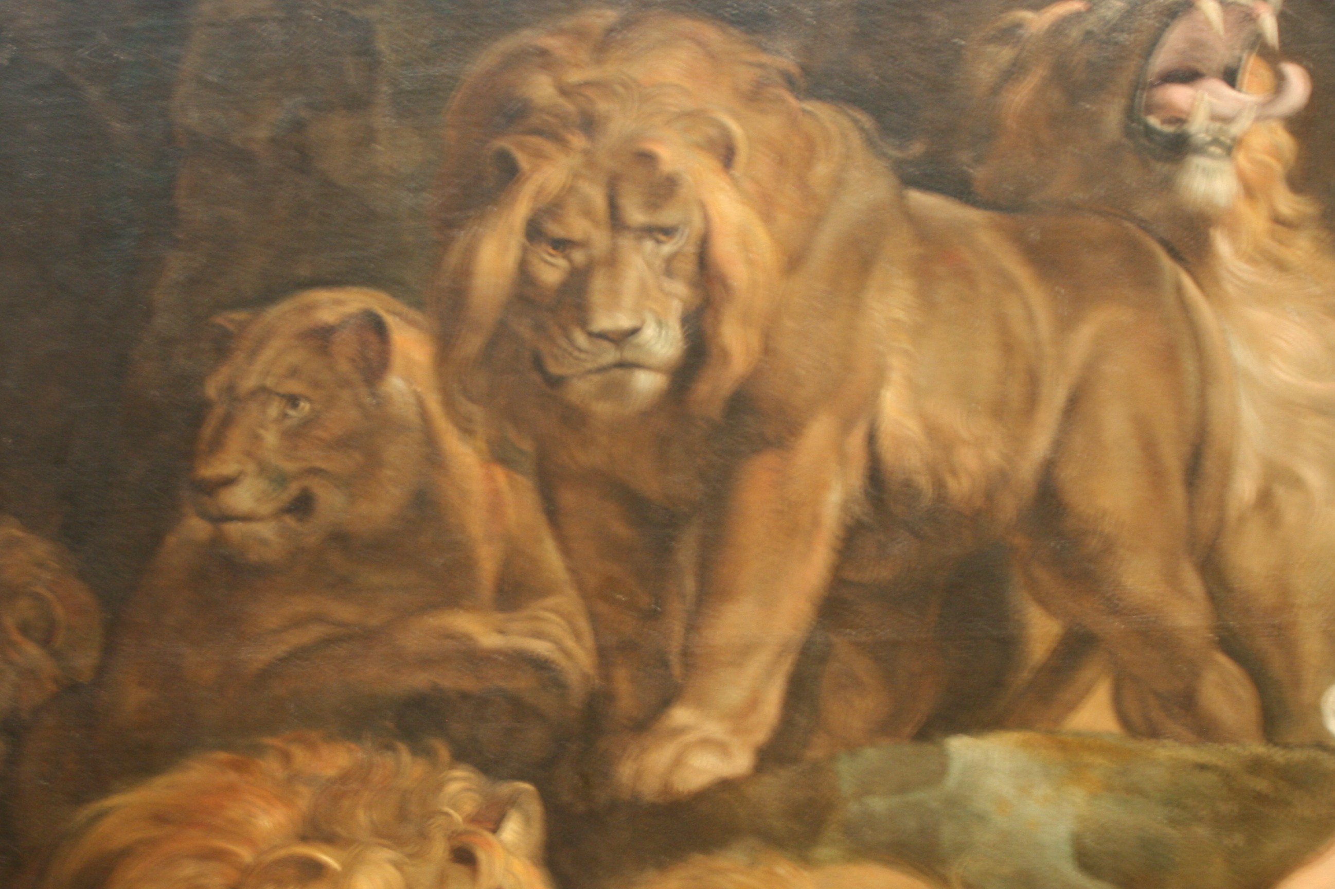
Peter Paul Rubens’ original work which hangs in Washington, D.C.
![541886_10151867873104694_1243631060_n[1]](https://joriginals.net/wp-content/uploads/2013/12/541886_10151867873104694_1243631060_n11.jpg)
And this, folks is the tail end of the story.
At the present writing, Daniel was rolled up on the sidewalk inside a protective sheet and delivered to the client’s house where it now hangs. Overtures have been made to the National Gallery for news purposes. I am about to send out my Christmas cards. My client is thinking about a new project to busy me. And I have begun my next portrait commission.
Learn more »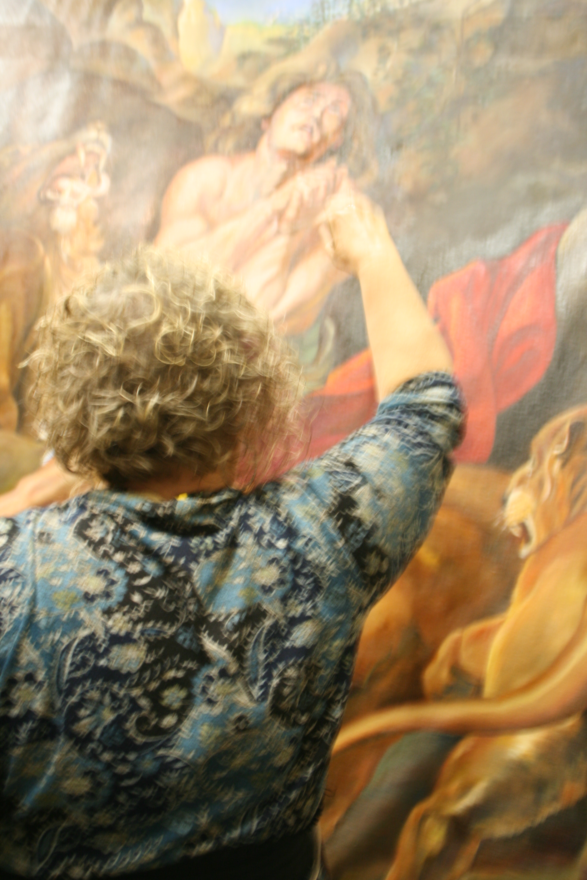

![1175134_595792013806191_1972117313_n[2]](https://joriginals.net/wp-content/uploads/2013/12/1175134_595792013806191_1972117313_n2.jpg)
![1378769_606341199417939_456327840_n[2] - Copy](https://joriginals.net/wp-content/uploads/2013/12/1378769_606341199417939_456327840_n2-Copy.jpg)
![541886_10151867873104694_1243631060_n[1]](https://joriginals.net/wp-content/uploads/2013/12/541886_10151867873104694_1243631060_n1.jpg)
![1175134_595792013806191_1972117313_n[1]](https://joriginals.net/wp-content/uploads/2013/12/1175134_595792013806191_1972117313_n1.jpg)
![1002335_581905468528179_106879984_n[3]](https://joriginals.net/wp-content/uploads/2013/12/1002335_581905468528179_106879984_n3.jpg)
![1098305_586382878080438_1748309898_n[1]](https://joriginals.net/wp-content/uploads/2013/12/1098305_586382878080438_1748309898_n1.jpg)

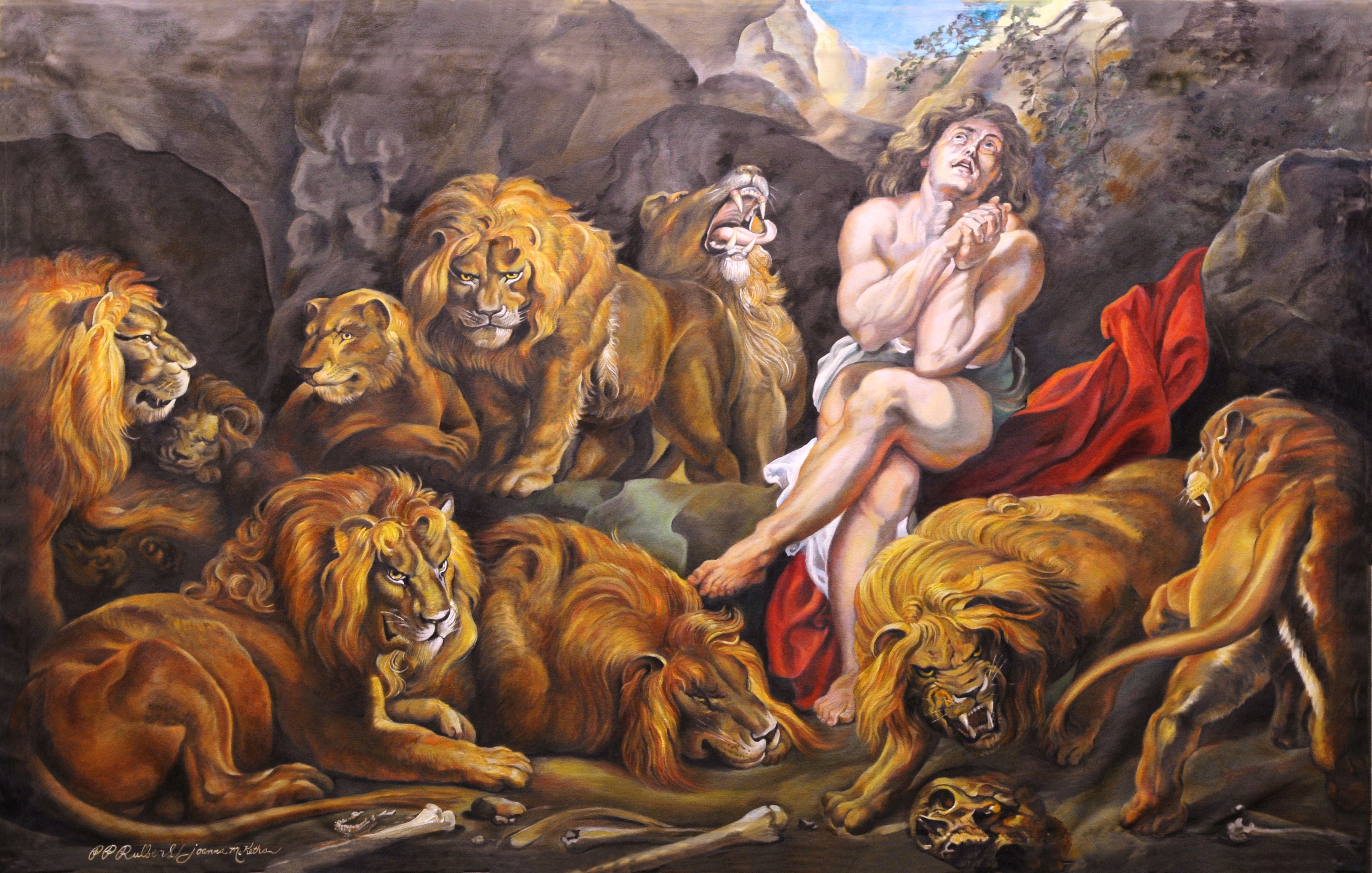
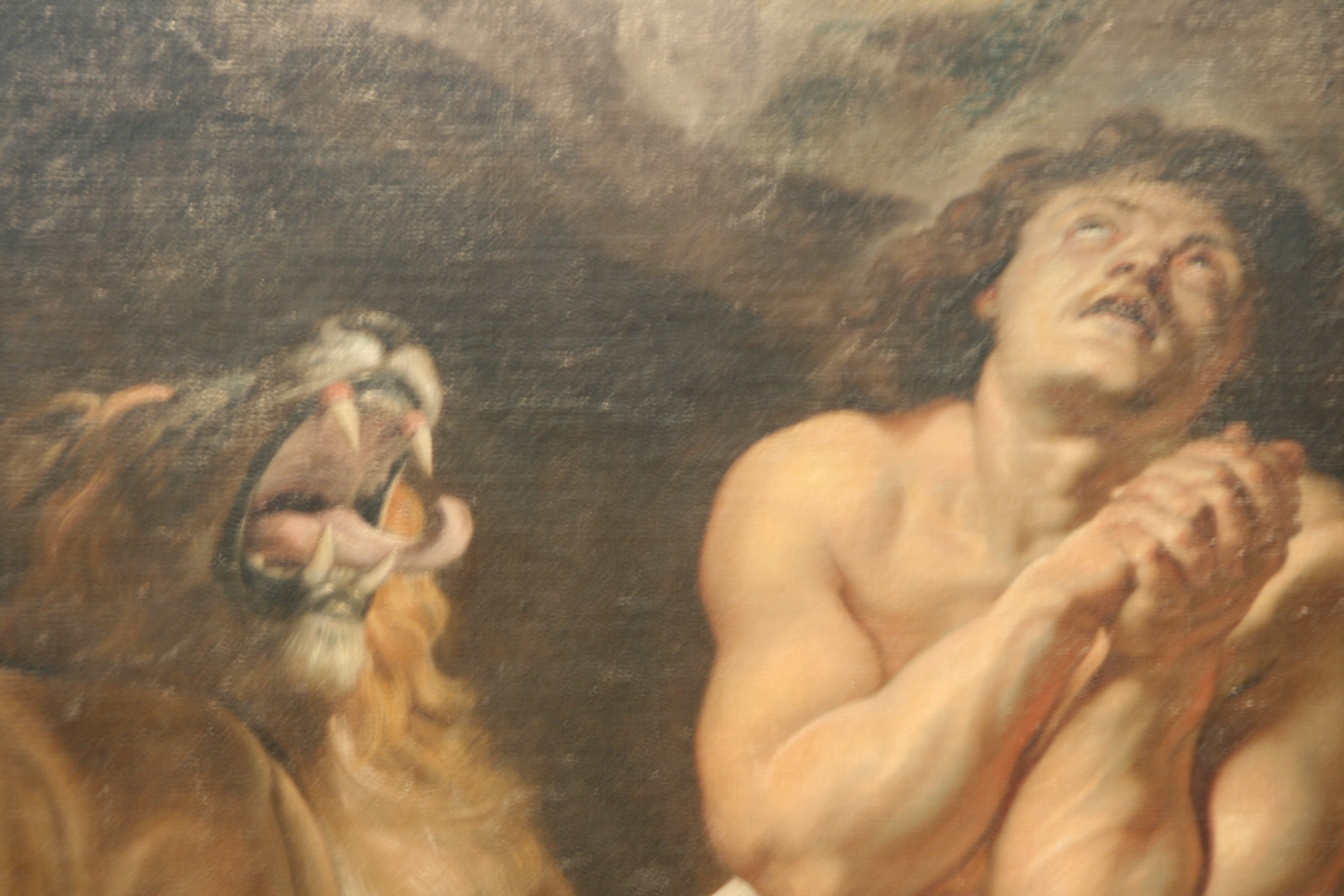
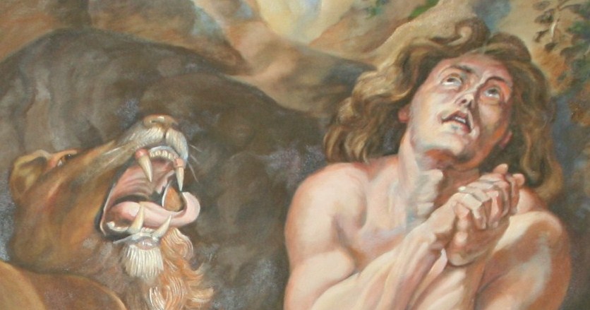
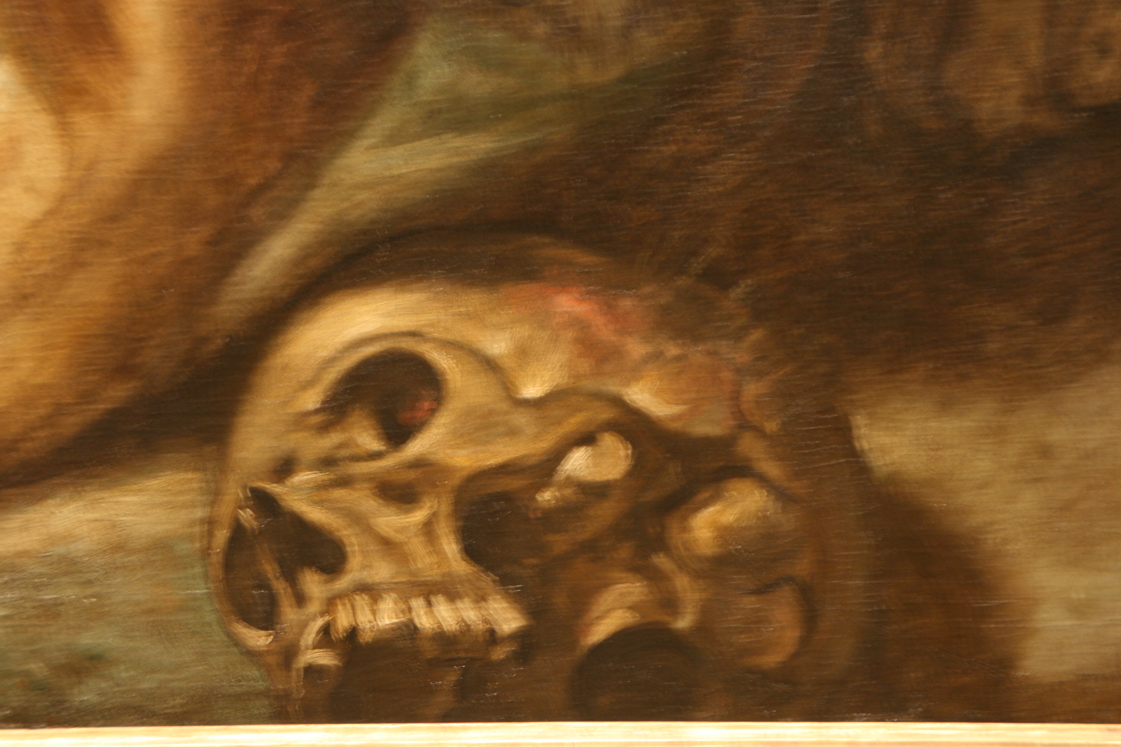
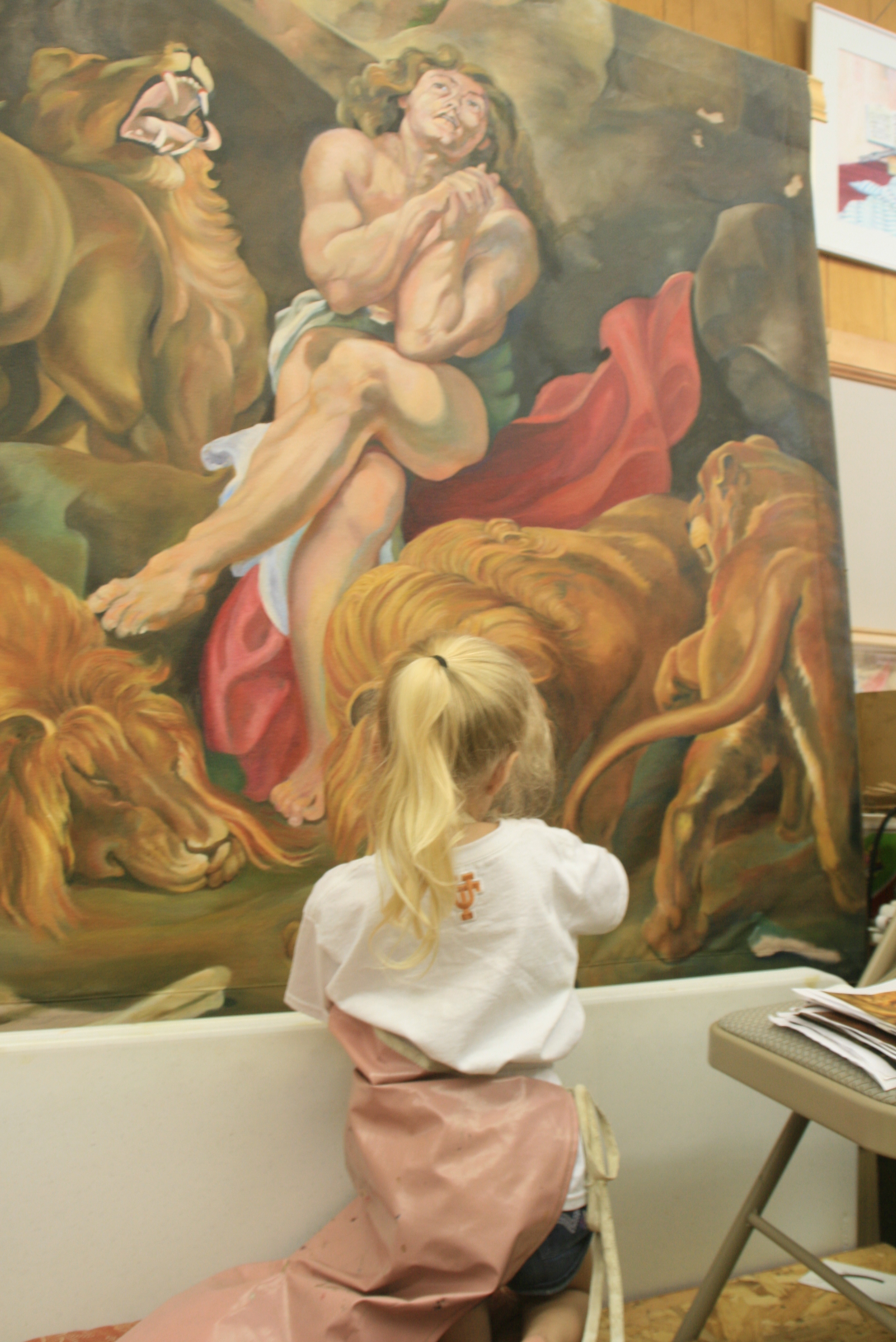
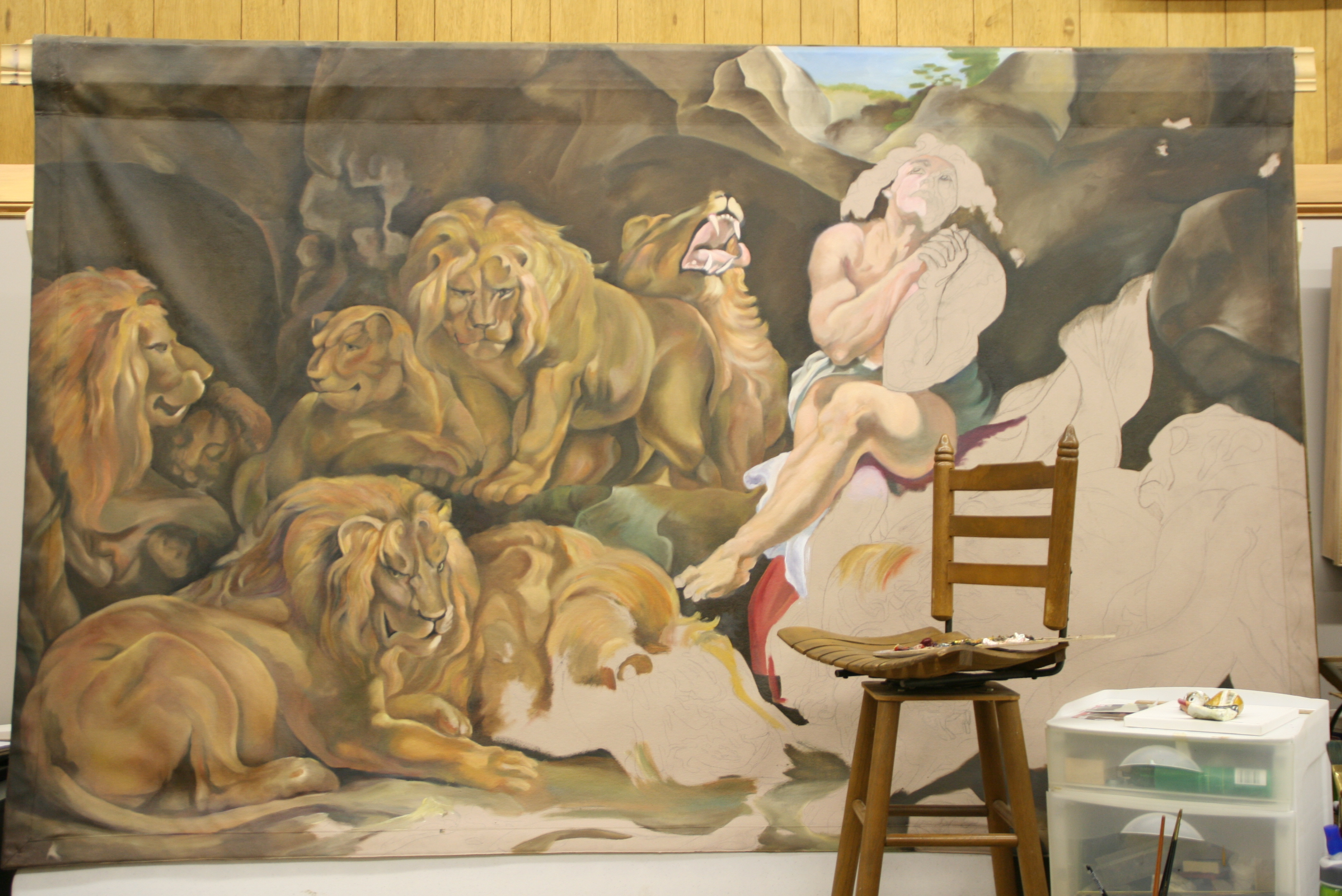
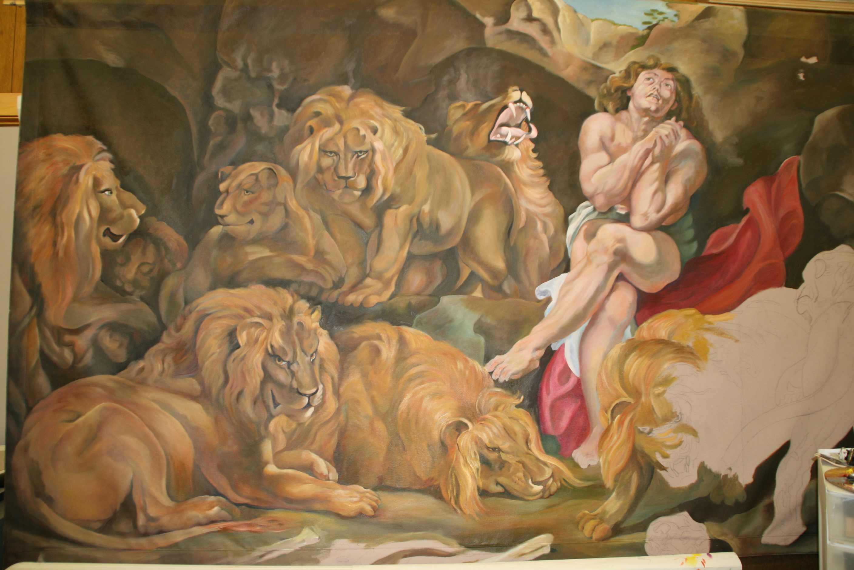
 the centerpiece of the Biblical story, at his moment of deliverance, when the King looked in and asked, “Daniel, was your God able to deliver you?” Even in the presence of the snarling lions, it is obvious this was not his moment of greatest fear, but was at a moment when he had a certain amount of peace and knew that the lions’ mouths were indeed shut, as the account goes. Emotion, attitude, and composition joined in this work of Rubens, and I had to study the emotional impact. I took particular note of the lighting and shadowing while I was there.
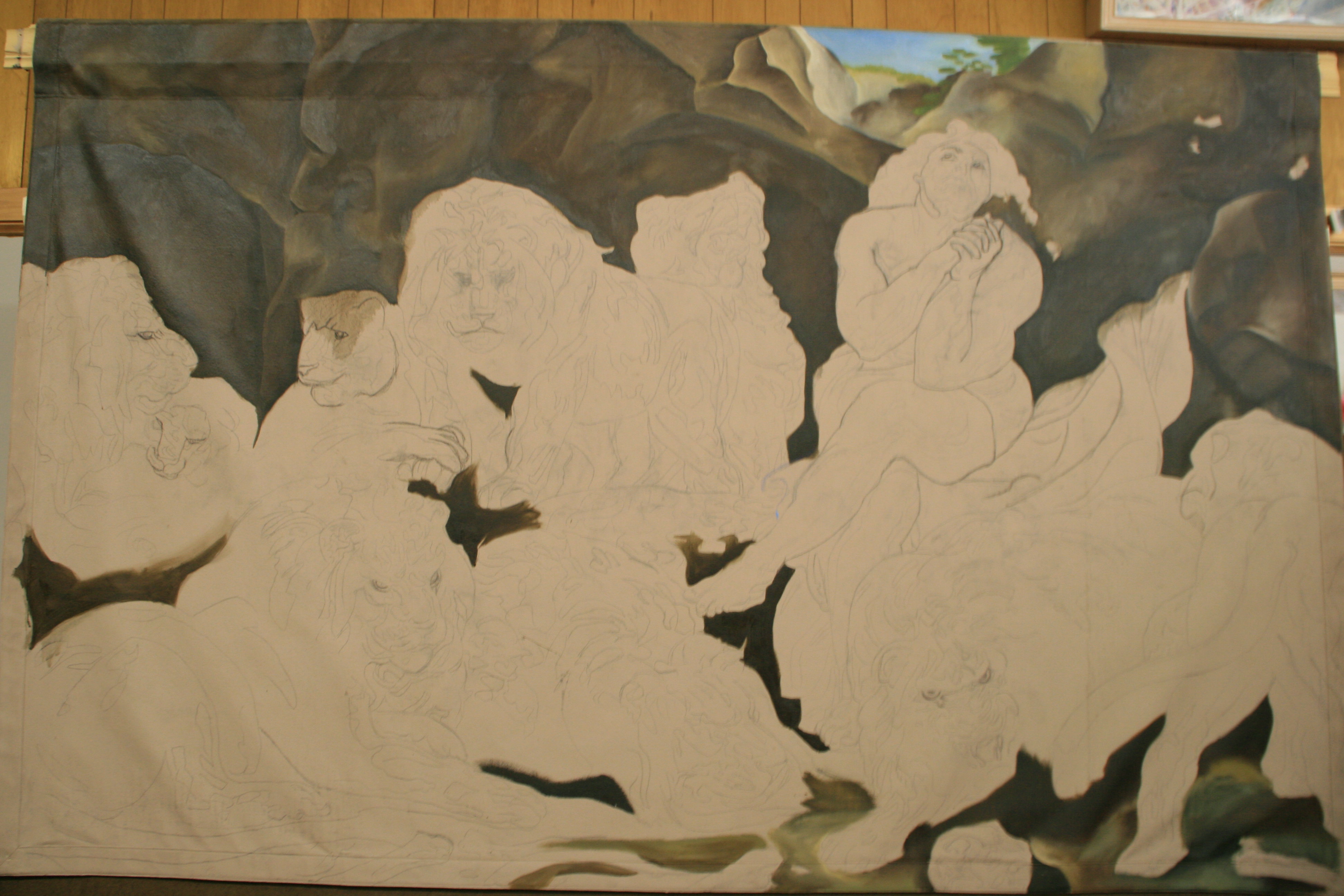
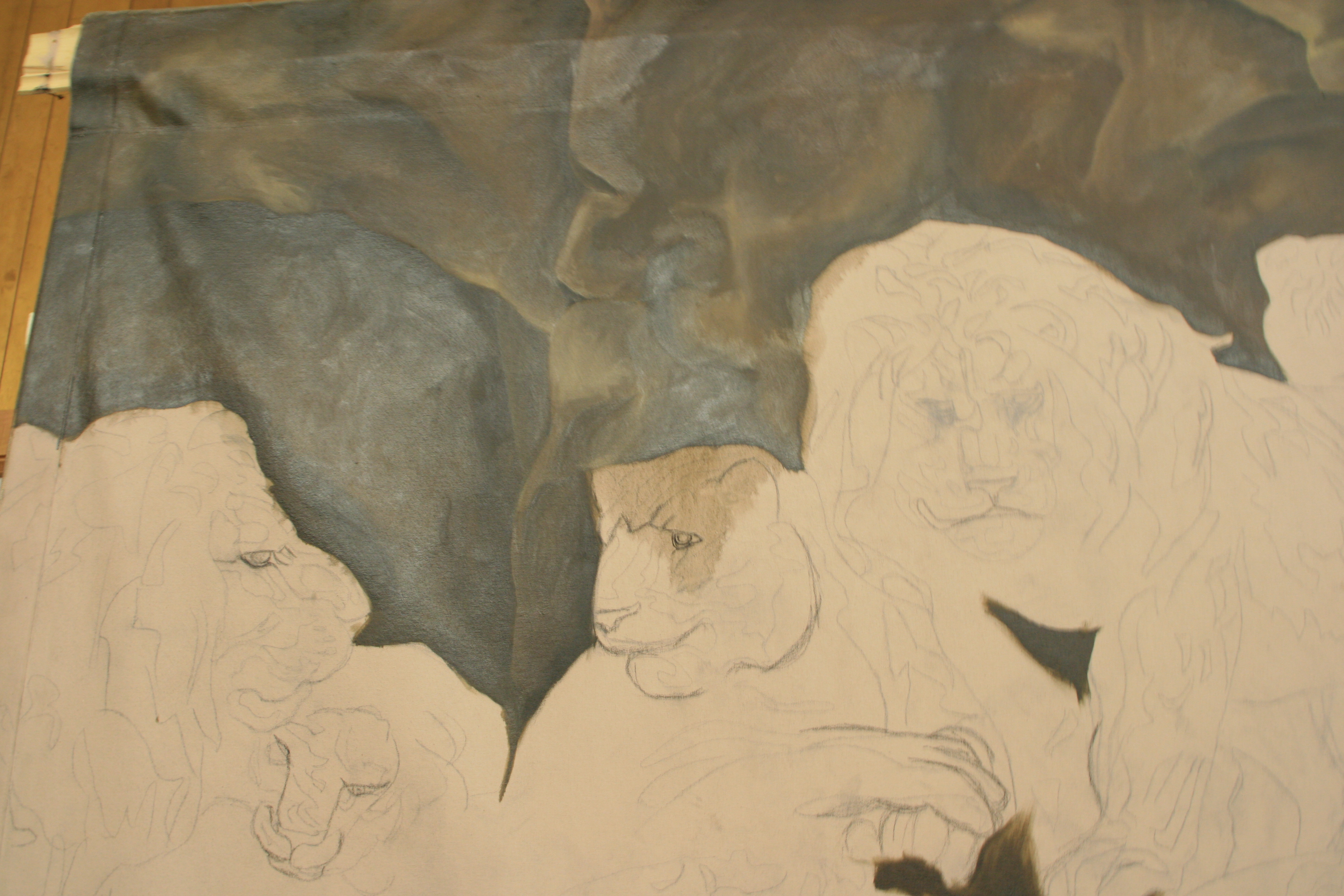
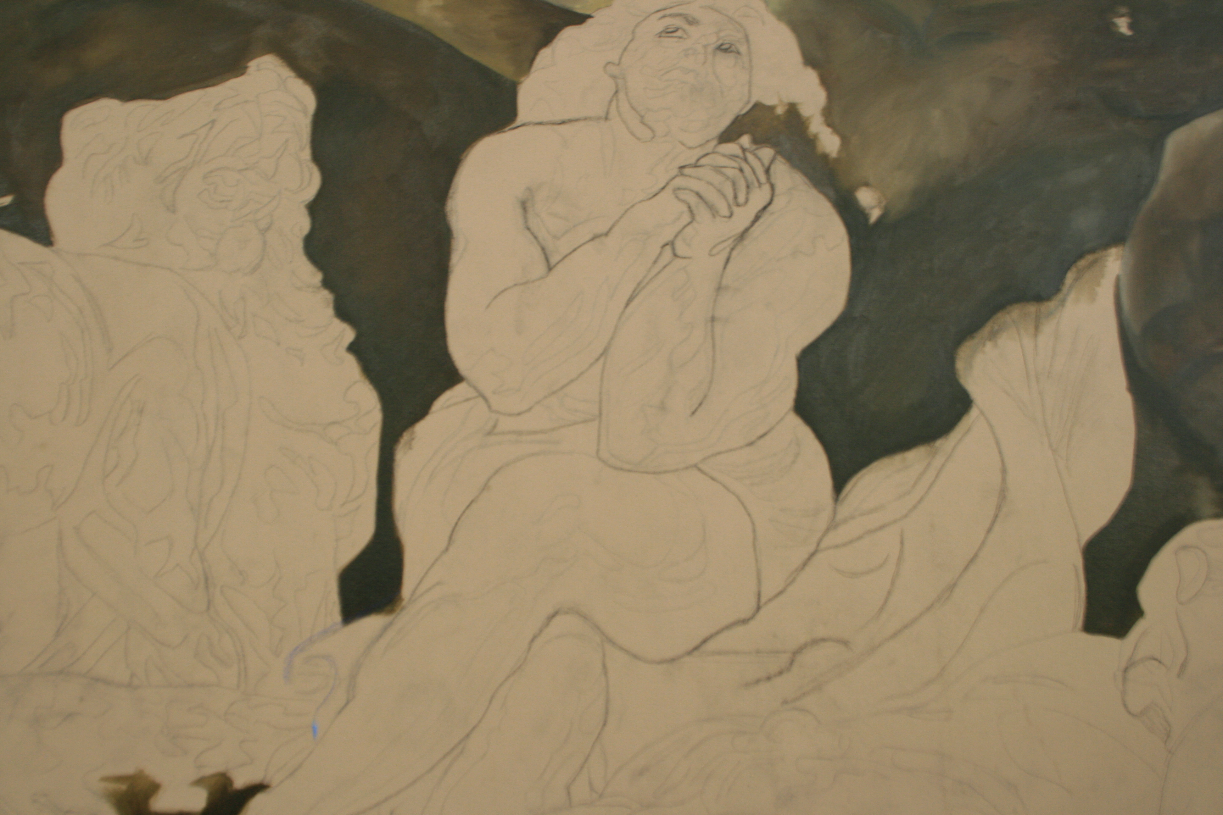
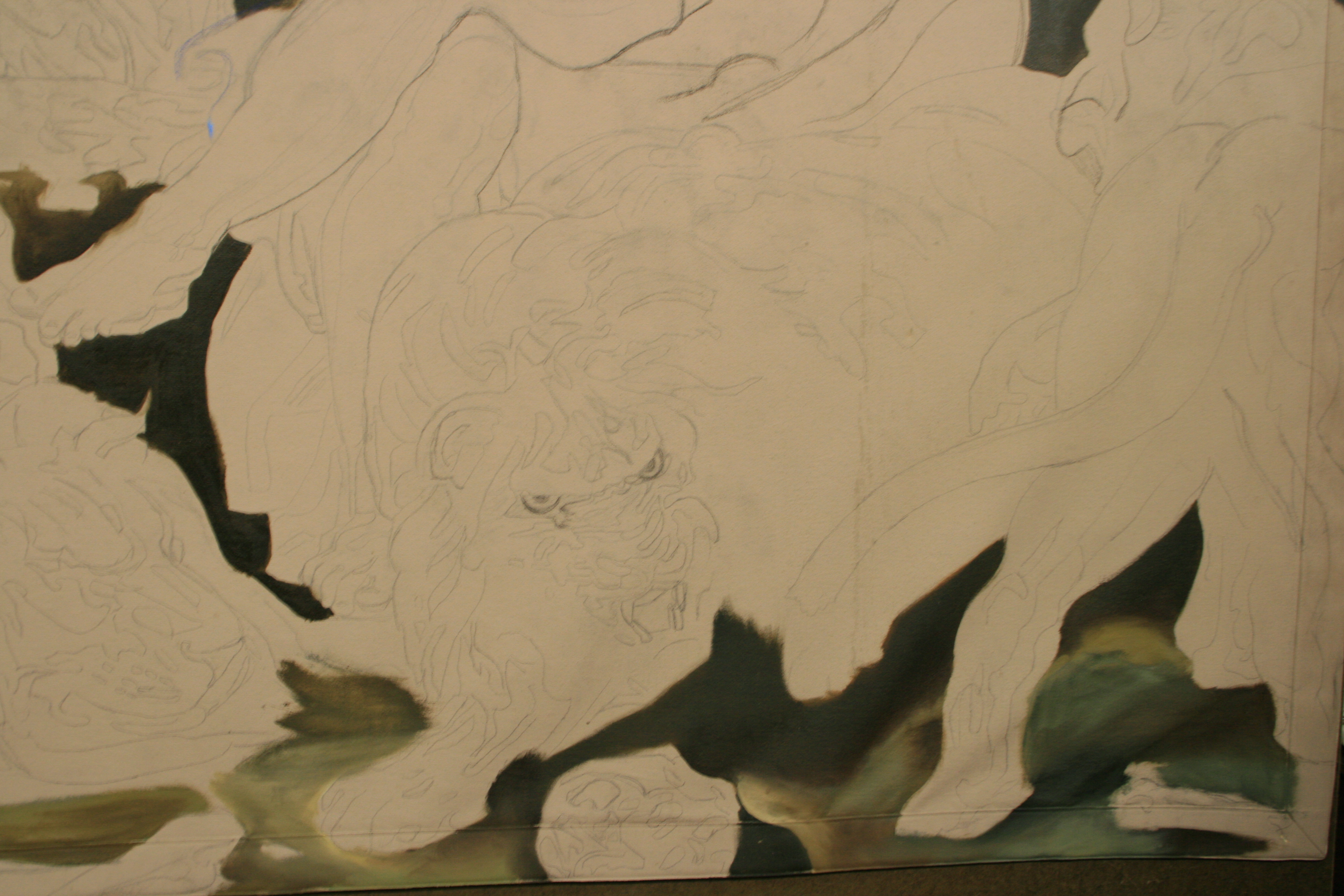
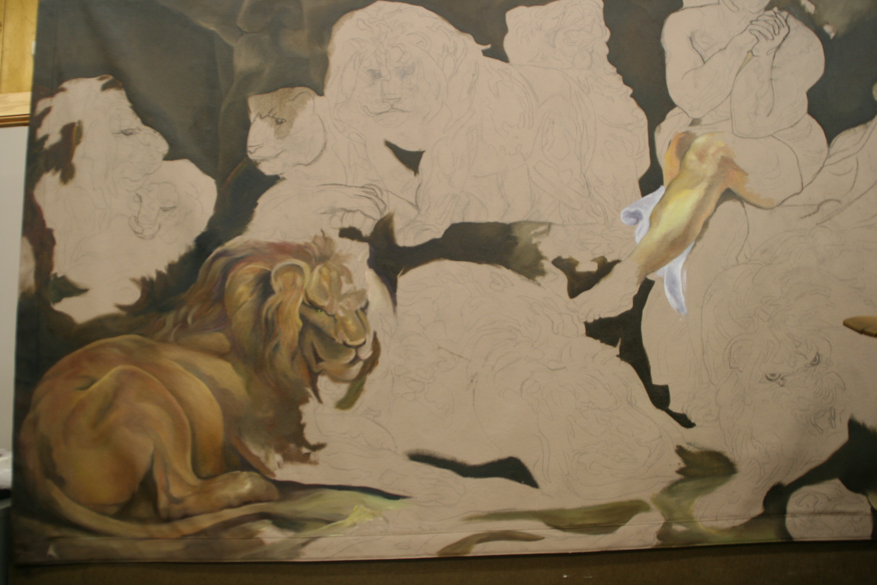
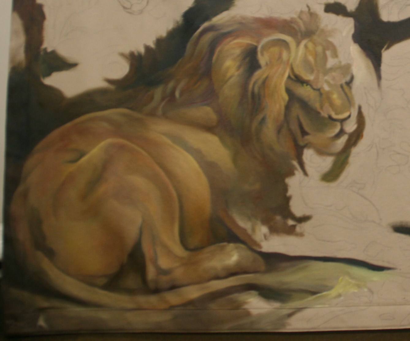
 Certainly in the extreme detail alone I had my work cut out for me. The hardest act an artist makes in the initial phases is to strip away all of the detail in his or her mind and take the figures down to their largest shapes and color. Think about it—you just can’t paint around a freckle or a hair, so it is useless to try setting that type of detail in in the beginning. However, Peter Paul gave his successors a road map in creating his wonderfully complex composition of organic shapes.